The story of Labyrinth is about a family that trapped inside their new house with unexpected spatial characteristics. They start a journey to find the front door. My initial idea is to create a pop up book with structured pages like a labyrinth.


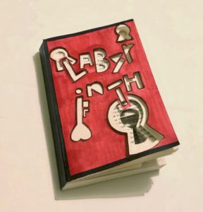
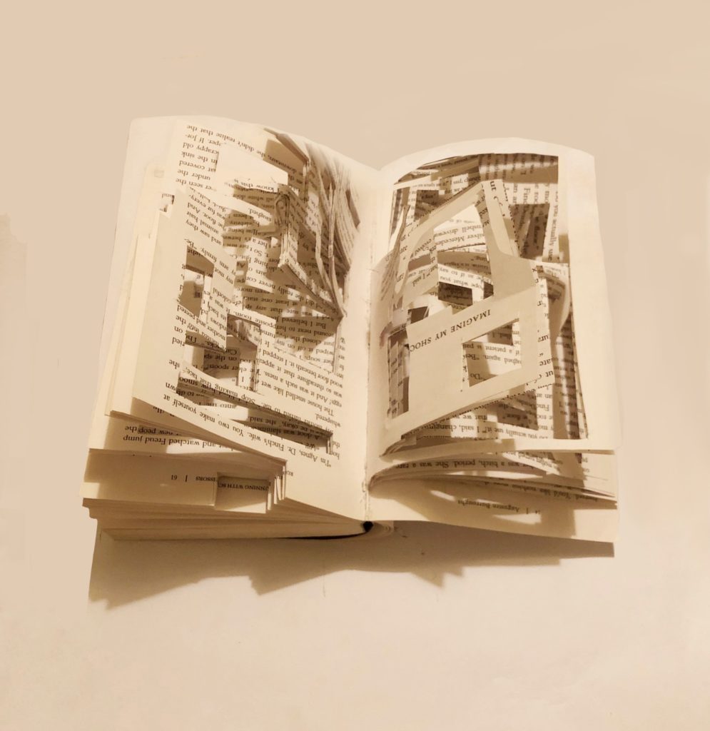
To represent the story and my idea visually, I designed both for the book cover and inside pages:
- The word of ‘Labyrinth’ are cutted out asymmetrically as the book title, which symbolize the shifting rooms.
- Symbols of keyhole added to features infinite doors to pass through.
- Colour scheme: Red and black are used to represent the mysterious story plot and anger of the family getting lost.
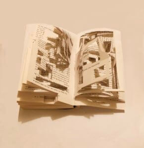
- Book pages: Geometric rectangles are cutted out randomly and create a sense of confusion. It also visualises their journey of finding the front door in the house of labyrinth.
Overall, I have experimented with drawing and cutting techniques on the book materials and played with the structure of the book. Although the result is not that well as I expected, I have gained experience of communicating and representing an idea through design but not just emphazise on its aesthetic.

