Background
Charles Mozley was an English artist whose paintings, illustrations and lithography was influenced by the style of French post-impressionism. After his death in 1991, his children and researchers have been dedicated to continuing his legacy through the Charles Mozley trust.

Brief
The founders of the Charles Mozley Trust required a website. It was clear that the design of the website would have a significant influence on the design of the Trust’s branding identity, which is yet to be established. The website would be an online presentation that displays the work of Charles Mozley and further information about the artist. It will be targeted towards people with an interest in British art between 1945–1990, gallery owners and academics. After a complete understanding of the client’s expectations, an objective of creating an online presence for the artist and initiating an online identity for the trust was formed.
Research
I looked into the style and work of Charles Mozley, and the client provided some resources to initiate a deeper understanding of the artist and his work. As an artist that works with different mediums, I wanted to place an emphasis on showcasing work that ranges from paintings, lithography and illustrations.
As my target market was individuals with an interest in British art between 1945–1990, I took a look at the website of different artists that were popular during that time period, such as Paul Guston. I admired how Paul Guston’s website was visual, containing a video that displayed images of the artist’s work. Although not relevant to the Charles Mozley style or time period, I also looked at some artists that I believed had an interesting website design such as Damien Hirst. Looking at the website of other artist’s initiated different approaches I could take to display the work of Charles Mozley on his website.


Designing
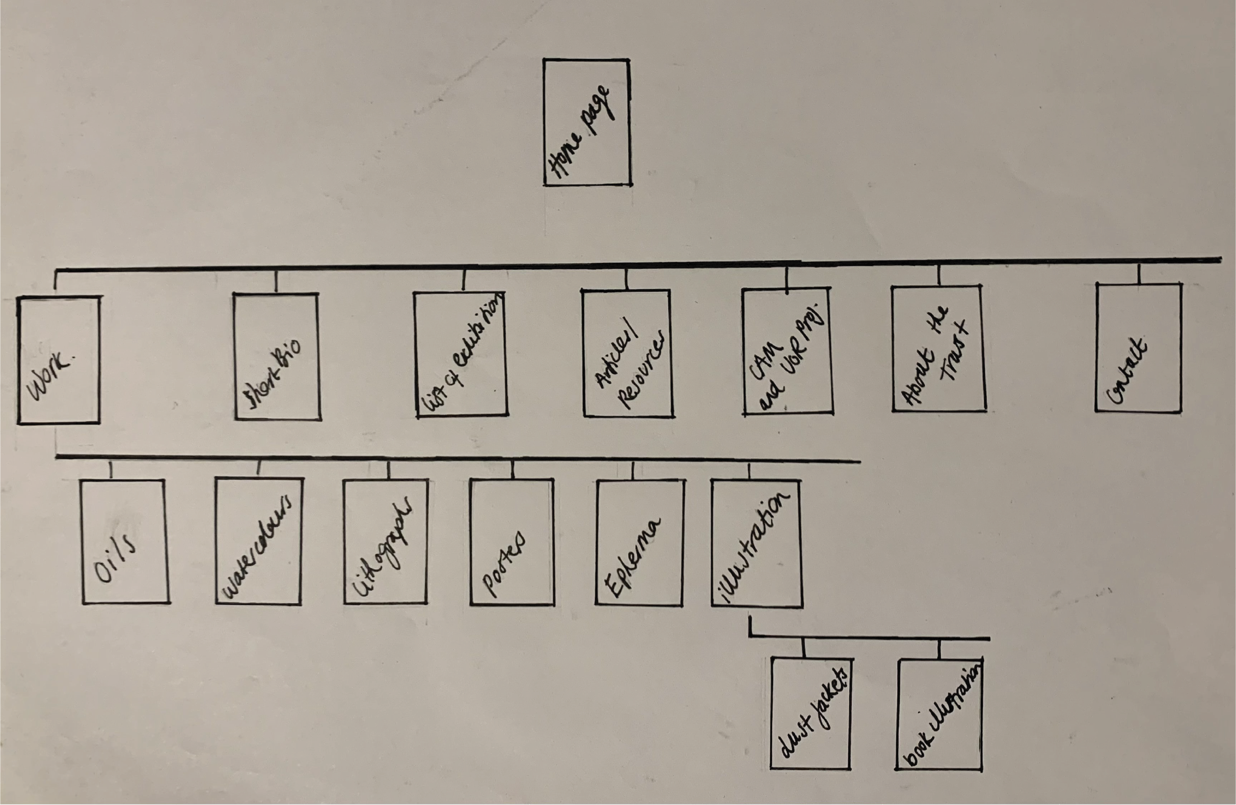
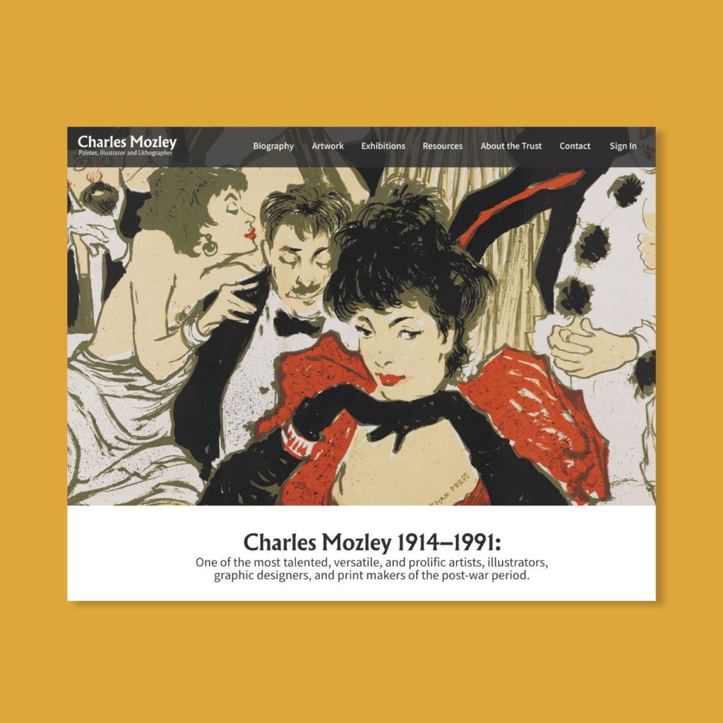
Before starting the design process, I meet with the clients to discuss their expectations and the general layout of the website. This information was useful when it came to visualising the navigation and format of the website. Based on the points provided by the client and my own judgement, I created a sitemap to display the different web pages and the navigation through the website. After creating a sitemap, a couple of sketches of different website layouts were selected. The wireframes show the different design concepts I had envisioned for the web pages. The clients stated that they preferred wireframe 2 and the design of the website proceeded to the next stage, creating the prototype. Initially, due to covid, the transfer of files that contained content for the website was delayed. I took it upon myself to use images available online of the low fidelity prototype, using the design concept from wireframe 2. The low fidelity prototype was sent to the clients, which they provided feedback and further suggestions on. The feedback and suggestions provided were carried forward into the next iteration of the website prototype. The client eventually managed to transfer a file of contents for the website, which was used to create the next iteration of the website prototype. Although they were overall satisfied with the initial prototype, the clients provided feedback and suggestions to develop the website further. They suggested a new layout for the “Artwork” webpage, where the images of the pieces of art would be arranged in one grid, regardless of medium unlike the initial concept where the pieces were showcased depending on the medium used to create them. To work with the material provided by the client, I sometimes had to break away from initial designs for certain web pages. For example, the initial design of the exhibition page contained images of the exhibition with some information, however, as the material provided was mainly text, the layout of the webpage had to be adapted.


Issues
The lockdown as a response to the COVID 19 pandemic had a significant impact on the progression of this real job. This real job was assigned to me a couple of days before the second lockdown had been announced. During that time period, I was able to create the sitemap and wireframes. However, the lockdowns that occurred between October—April meant that the client could not provide a majority of the material needed for the website as they were stored in the Typography Department or The University of Reading Museum. The material needed for the website was transferred to me towards the end of March and I have since been able to make some progress on the design of the website.

Reflection
Working on this real job continues to be a pleasure. The despite current circumstances, the client’s involvement and suggestions have been useful in producing new concepts to experiment with, deepening my knowledge of web design.
It is unfortunate that the lockdowns as a result of COVID 19 have prohibited the progression of the website, impacting the initial deadline of the website. The change in lockdown restrictions and current access to a majority of the material needed for the website will hopefully result in a smoother advancement of the website at a quicker rate. Although I am graduating this year, the client and I will continue to work together to complete this real job. I am excited to witness the final outcome of the website and the design skills that have thrived as a result of this real job.

