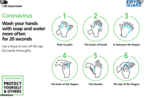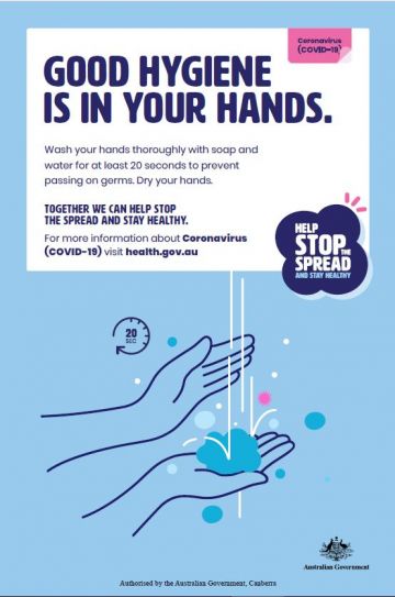

These two Covid-19 awareness posters communicate similar messages but use graphic language in different ways in order to present the information. The HM Government/NHS and Australian Government use graphic language to highlight that washing hands is a huge part of protecting ourselves and others from Coronavirus.
Both posters obtain similar audiences in which being the citizens of their Country. Whilst one being for the United Kingdom and the other Australia, they use similar approaches to convey the same message. Whilst the UK poster initially comes off as simplistic in comparison to the Australian one due to the lack of colour background, it makes up for it in a detailed set of pictograms which provide a thorough step by step process of correct hand-washing. This has been made easily identifiable with the use of numbering and green enclosing circles, allowing the pivotal message can be sent across to the audience effectively.
In comparison to the HM Government posters, the Australian awareness poster convey the message with less imagery and more text. The one simplistic image depicts hand-washing and although they just use one in comparison to the NHS six step process, the topic is still conveyed quickly. The audience know it’s about hand-washing due to the pictogram as well as by the accompanying title “GOOD HYGIENE IS IN YOUR HANDS’ in bold san-serif text allowing it to be easily legible.
However, to know the process of hand-washing the audience would have to actually read the writing which is seen comparatively small to the title. The informative text also isn’t detailed either which doesn’t exactly explain what good hand-washing is, only that it needs to be done and you should use soap and water for 20 seconds.
Due to this different approach the UK government/NHS’ poster convey their message better. Along with the step by step process, highlighting how to wash your hands thoroughly, they use text to further explain some key information. They include the 20 second rule along with extra precautionary steps on how to turn the tap off safely. This ultimately allows them to take the audience from A-Z without too much reading. Both posters do successfully present an eye-catching appeal with san-serif, allowing an easy read, with bold text where appropriate. They both nicely include a general message in their own box and bubble that we’re protecting ourselves and others and we can stop the spread through a collective effort.

