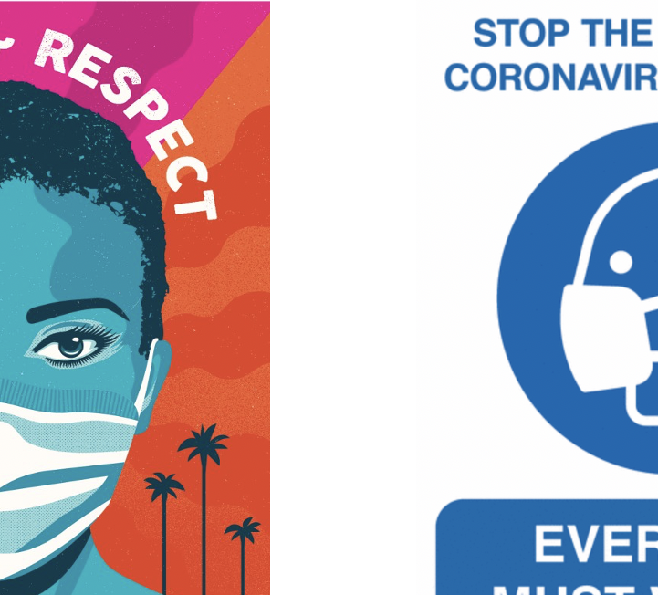
Our task for this project was to collect a wide range of communications relating to COVID-19. During this project, I learnt how to improve my searches on the internet to get the best and widest variety of results as I did the majority of my research online. I had discovered that the majority of the government official and NHS posters and signs were all in blue and white or yellow and black. The reason for this is most likely due to the NHS colours being blue and white and yellow and black signs used to stand out as they were usually associated with warning and poisonous signs. However, the issue is that they no longer stand out. I have found that we, as the consumers, have become accustomed to these warning signs now. They no longer grab our attention because we see them around so often.
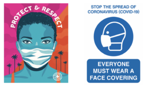
In Los Angeles (L.A ) the mayor introduced an initiative called the L. A mask print project. They ask designers and artists from across L.A. to produce posters, like the one above on the left by Camilla Lonis at Studio Number One, they are then made available to be downloaded for free by local businesses and residents so that they can be put on display. I think these more creative and colourful posters work better as they’re much more noticeable than the government standard ones that we have now become accustomed to. Adding a face that’s not just a basic outline perhaps will make the message feel a lot more personal rather than robotic. If it feels more personal people are more likely to want to make a change and ultimately that’s what the creates of these posters want. they want people to make the decision for themselves to wear a mask, and usually, if it’s encouraged rather than enforced, you’ll get a better response, although this isn’t always the case.
I think it’s clear that the Losin poster is for a particular audience. People in L. A are known for there glamourous lifestyle, they also have a rather large art scene and so to grab the attention of the creative inclined, you need to put up posters and signs that are just as, if not more, creative and bold as they are. Whereas the Government official and NHS ones are for national use, therefore, need to be more neutral so to appeal to everyone. As the UK is also very multicultural and we have people from all over the world the signs need to be clear and concise on what they want from the public so everyone understands no matter their language. The decorative posters can sometimes have messages that are vague or have a double meaning.

