So far Kim’s project was one of my favourites as it allowed me to explore something that I’ve been putting my free time into – Illustration design. Although the task asked us to design a monogram using our initials, it felt a lot more personal and therefore really allowed me to express the way I work and approach tasks.
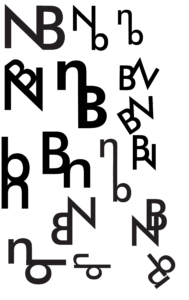
 As mentioned previously, the aim of this task was to create a monogram – a combination of two letters, using either Garmond or Futura typefaces. I personally chose Futura, as I am more attracted to the ‘orderly’ aspect of sans-serif typefaces. Initially, I started sketching out some ideas on my iPad, however, I then decided to go back a step and start designing on paper. Personally, I found this a lot more helpful as I noticed that I was generating more ideas while working on physical paper. After generating some sketches in pen etc, I then decided to go back to working digitally. As we were designing monograms (logos for our initials essentially) I decided to use Adobe Illustrator for this task. I first began recreating some of the sketches I have done previously to see what works best alongside the Futura typeface. The first ideas were quite simple and straightforward, a either one or both letters were upright and looked like two letters put together (literally). It wasn’t until I started looking at more abstract versions of my monogram, I began designing monograms that
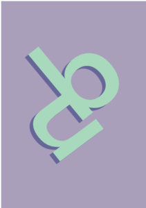
  had some interest to them. The 2nd photograph on this page presents the design development process based on one of the more abstract ideas I have created previously. First I started by rearranging the orientation of these letters, seeing what works and what doesn’t, and then once I was satisfied with the result, I began rotating the monogram in order to see if it looks different/more effective when looked at from a different perspective. My hypothesis was quite right, presenting the monogram at a slight angle made it look more stylised, almost lik
 e a logo.
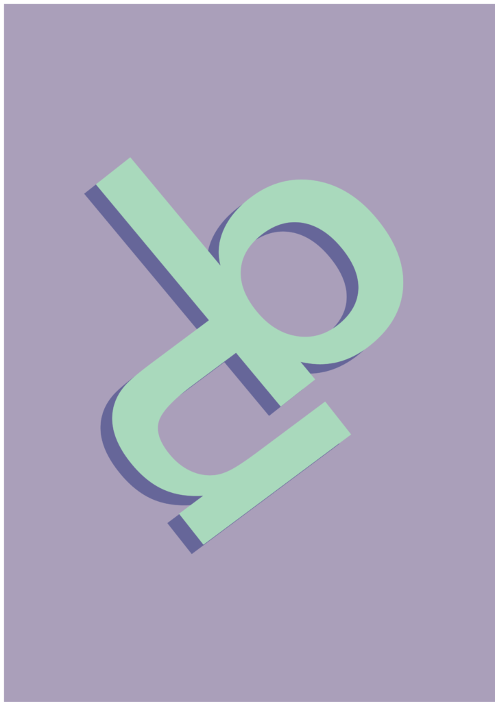
Lastly, I added some colour and drop shadow to the monogram I liked the most. I chose mint green as the primary colour and then matched it with a purple tone that I chose using the colour guide tool in Illustrator. Besides the overall look of this monogram and its colours, I personally like how the letters complement each other, without masking what they are; both ‘n’ and ‘b’ are completely readable but have a more abstract aesthetic to it then.

