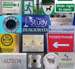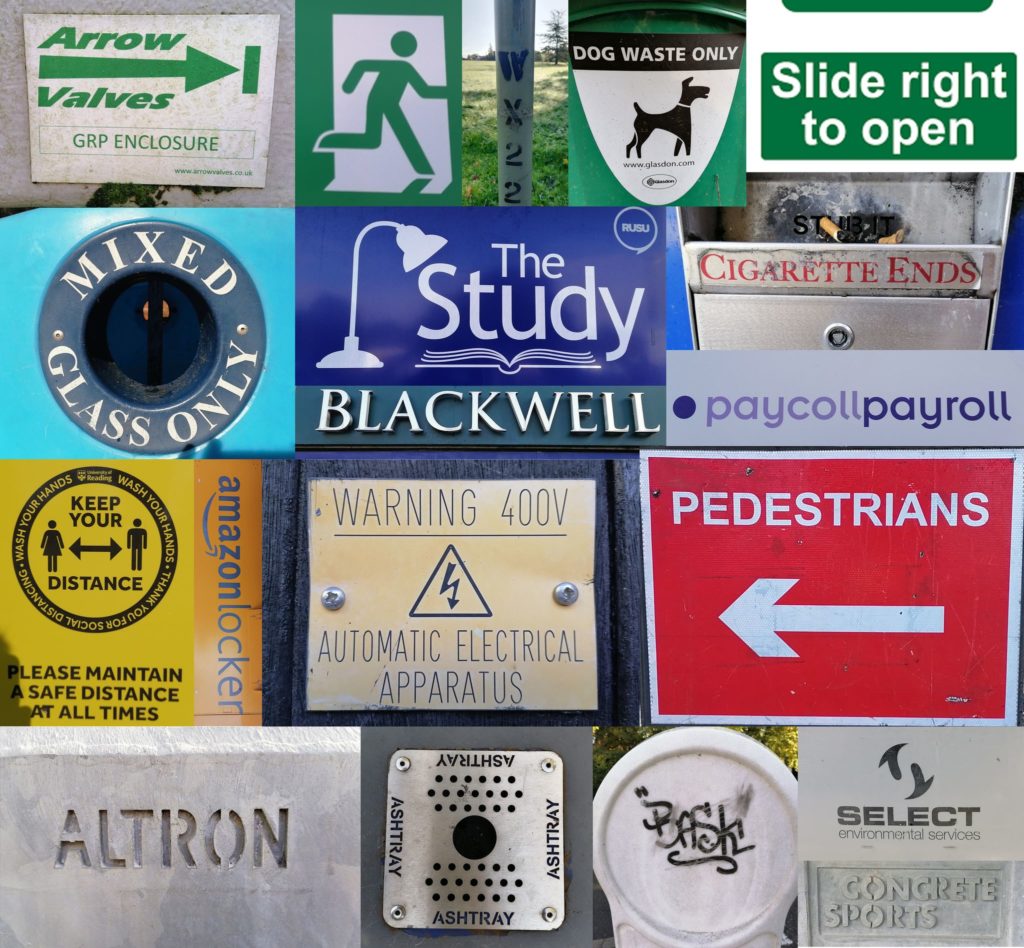
For Erics’s project we studied lettering in the environment. I tried to find lettering around the campus that i thought looked interesting. I liked a lot of the stencil lettering which there was a surprising amount of. After we had taken photographs we were asked to organise/arrange them in a way we thought was suitable. I decided to arrange mine by colour with the greens at the top, followed by the blues, yellows, reds and neutral tones. When looking at how my class mates had arranged theirs I realised mine was by far the least creative however Eric asked an interesting question about whether the colour groups I had split my photographs into had anything else in common. While the green lettering generally invoked safety or a message about the environment it was difficult to find correlations between the other colour groups.

