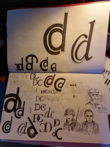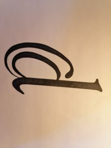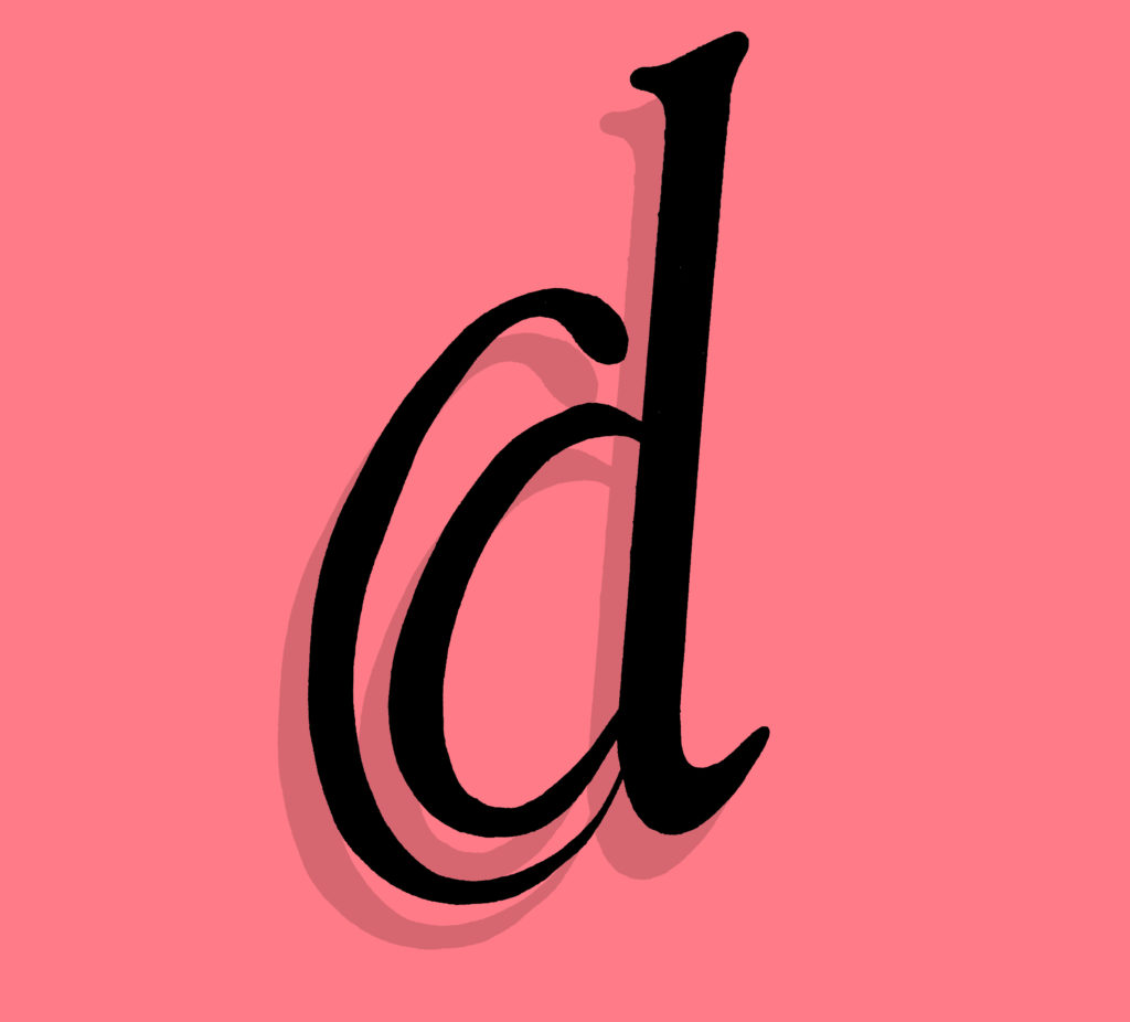

For Kim’s Project we were tasked with creating a logo like symbol that merged our first initial and last initial. I experimented around a lot to create many number of variations however in the end I decided to go with the lower case d inside the upper case C. I then played with the style of the glyph giving it serifs and adding an italic angle to it. I really liked the final outcome even if it does resemble the @ symbol.

