For this project, we were instructed to photograph lettering around the University. From what sounded quite a simple task, it was actually very interesting to see things I often overlook. We often don’t stop to thing why things look the way the do and what the impact that has on us.
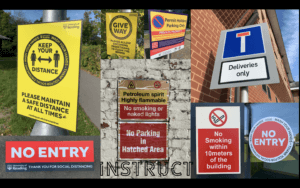
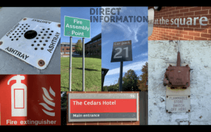
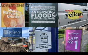
In the 2 hours we had to photograph, I walked around campus collecting images of signs, posters and words in the environment. Once the time was up, we were then asked to edit and organise the photos into categories of our choice. I chose to organise them into ‘Instruct’, ‘Direct Information’ and ‘Advertisement’.
I found that the ‘Instruct’ category featured signs with bold colours to catch attention and provide a warning. They also featured verbs to act as strong instructions.


