
In today’s session with Kim, our task was to create a process of transmogrifying our initials. We had the choice of two fonts: Futura or Garamond.
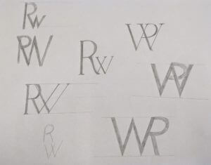
I began with Futura as I felt it would be easier to practise sketching out my initial ideas. However, I found that with the letters “R” and “W”, the characteristic of the R got lost in the ‘W’, and ended up looking like a ‘P’ – see examples below.
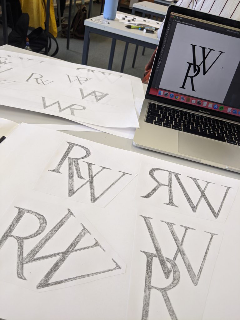
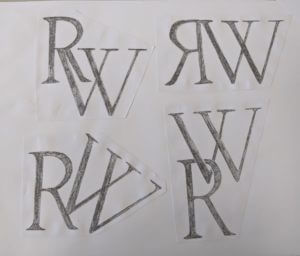
I then began experimenting with Garamond and found that the serif’s made it easier for the individual letters to be identified when merged together. I focused on creating stencils of my initials to replicate the font before experimenting with them and tracing them on layout paper in different ways.
I found this task interesting yet challenging mainly due to the letters I was working with. I struggled to find a way to find a process of transmogrifying my initials due to the curve of the capital ‘R’ and the angles of the ‘W’.
I did, however, create a series of initials layed out in different ways. I then took my favourite outcome into Adobe Illustrator digitalised it in there.
If I were to do this task again, I’d like to play around with different letters and different fonts. However it has taught me to look at things from a different perspective and pay more attention to detail.