
Background
Longhaul – an early stage start-up sports food company, specialising in savoury performance food – were looking for new a packaging design in preparation for the launch of their new flavours of endurance sports fuels, packaged in small hand-held pouches. Their main goals were to boost their shelf presence among competitors, and for the design to be easily adaptable for more flavours in the future. I took on this project as part of a team of 4.
Defining the scope of the project
To clarify and expand our understanding of the task ahead of us, we met with the client; from this we then restated the brief. As explained by the client, the standout feature of Longhaul fuels over competitors is that they are all-natural and free of sugar, allowing for slow and sustained energy release without a crash. This became part of our key focus, alongside designing appropriately for endurance sports – with energy and willpower – and for the target audience – aged between 35 and 55, primarily endurance athletes and secondarily hikers and outdoor adventures. The current strapline for the brand was ‘Prolonged energy release food’, and from experience the client recognised that it didn’t make immediate sense to the average consumer. In other words, it was difficult to grasp. We agreed, and decided to help in devising a new one. One of the main challenges I anticipated at this stage was the technical challenge of designing for a flexible material – food pouches were not something I was used to working with.
From our discussion, we agreed that 2 deliverables were necessary to fulfil the brief:
- A revised logo and strapline design
- A series of pouch designs for 4 different ultra-fuel flavours
We also agreed to examine their current visual identity and provide any recommendations for changes which might enhance its appeal and presence.

Research
We examined a wide range of packaging solutions of competitors to Longhaul. From doing this, we quickly identified trends on the current market. The most similar competitors to Longhaul tended to use bright and bold colours with large-scale and confident sans serif typography. Some fuels used illustrations of specific activities such as rock climbing, while some pictured their ingredients and others simply relied on colour and typography. A popular graphic element was a composition of prominent swooshing or diagonal lines suggesting energy and action. Examining competitors developed our understanding of the market, putting us in a better place to begin design; we now had to decide how ‘on trend’ to aim. We also took into consideration what information might be the most important for consumers to see on the front of the packaging (e.g. calories, protein, carbohydrates etc.).

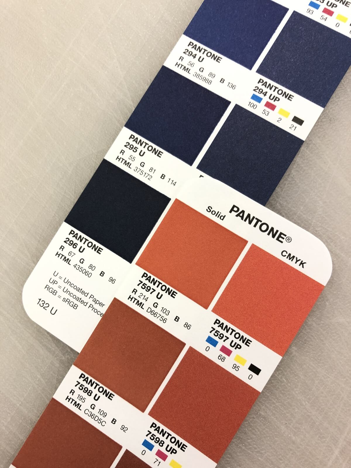
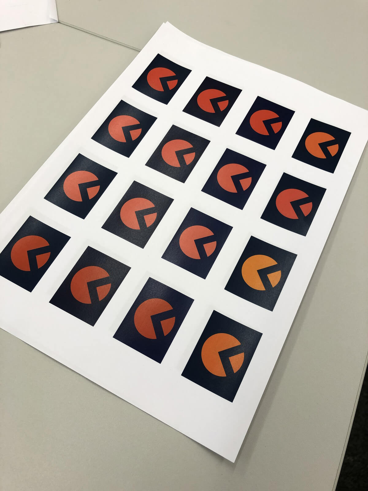
After looking at the core visual identity of Longhaul, we deemed that making significant changes would be unnecessary, as the brand was strong and had already gained good following and recognition – this matched the client’s thinking. We did investigate the primary colour palette and found that the application of the brand red on blue, present in certain applications of the logo and strapline, was not optimally legible. Ultimately, after suggesting minor alterations to the brand Pantones, the client was unmotivated to make a change given that it would be fairly unnoticeable. However, I still value the opportunity we had to exercise our attention to detail, use of Pantone colour books, and to gain familiarity with the brand assets.
Design process
Initial concepts and ideation
We began the design process by sketching different concepts in rough form for the front of the pouch. The challenge was to find ideas which were inline with the market whilst also a good fit for the Longhaul brand. These sketches were presented to the client; from them we did not settle on a certain design but gained a better insight into what the client liked and disliked.

Having been provided with preliminary copy and brand assets, we moved to digital design to get a better feel for our ideas, and to allow the client to more easily visualise and understand our concepts; we also used mockups to better this. In this case, dealing with only a small-scale design, going digital at this stage was quick and efficient for progressing through ideas.
Digital development
Working digitally did have the advantage of speed, but it also meant that we had a tendency to produce a larger volume of work. This caused us to initially struggle to narrow down on options and decide which concepts to take further and present to the client. Looking back, I would say that we overproduced on design variations – which was great for hunting down solutions – but it left us a little overwhelmed. Nevertheless our supervisor and client were pleased to see a range of potential concepts. We agreed with the client that illustrating any specific type of sport, i.e. a runner or a cyclist, was not going to be right for Longhaul as it may exclude part of their audience. We did propose to illustrate multiple endurance sports to show the diversity of use of the fuels, however we felt this was still limiting. We also avoided photographic solutions as this was something the client wanted to move away from, and so we established that flavour differentiation by colour would be most suitable.

‘At this point you need some steer from the client so that you can narrow down to one approach.’ – Rob Banham, Project supervisor
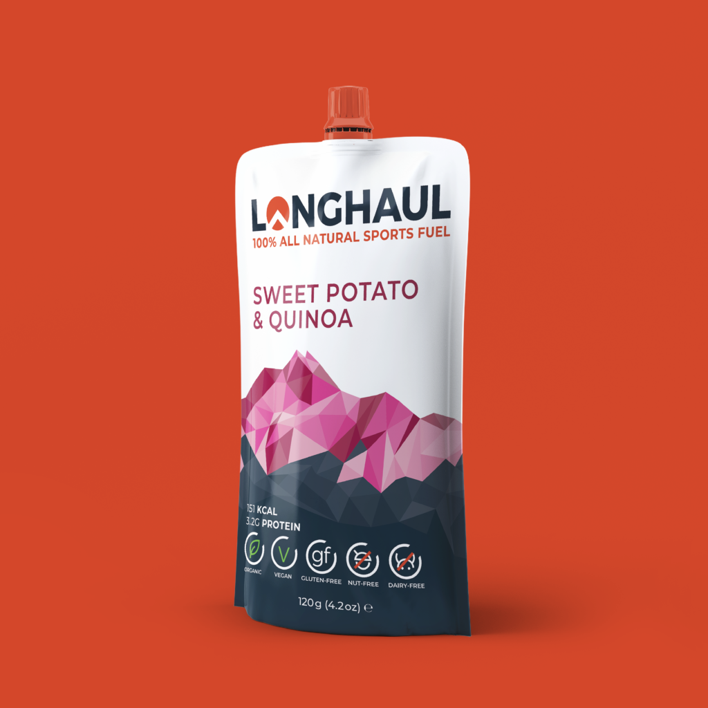
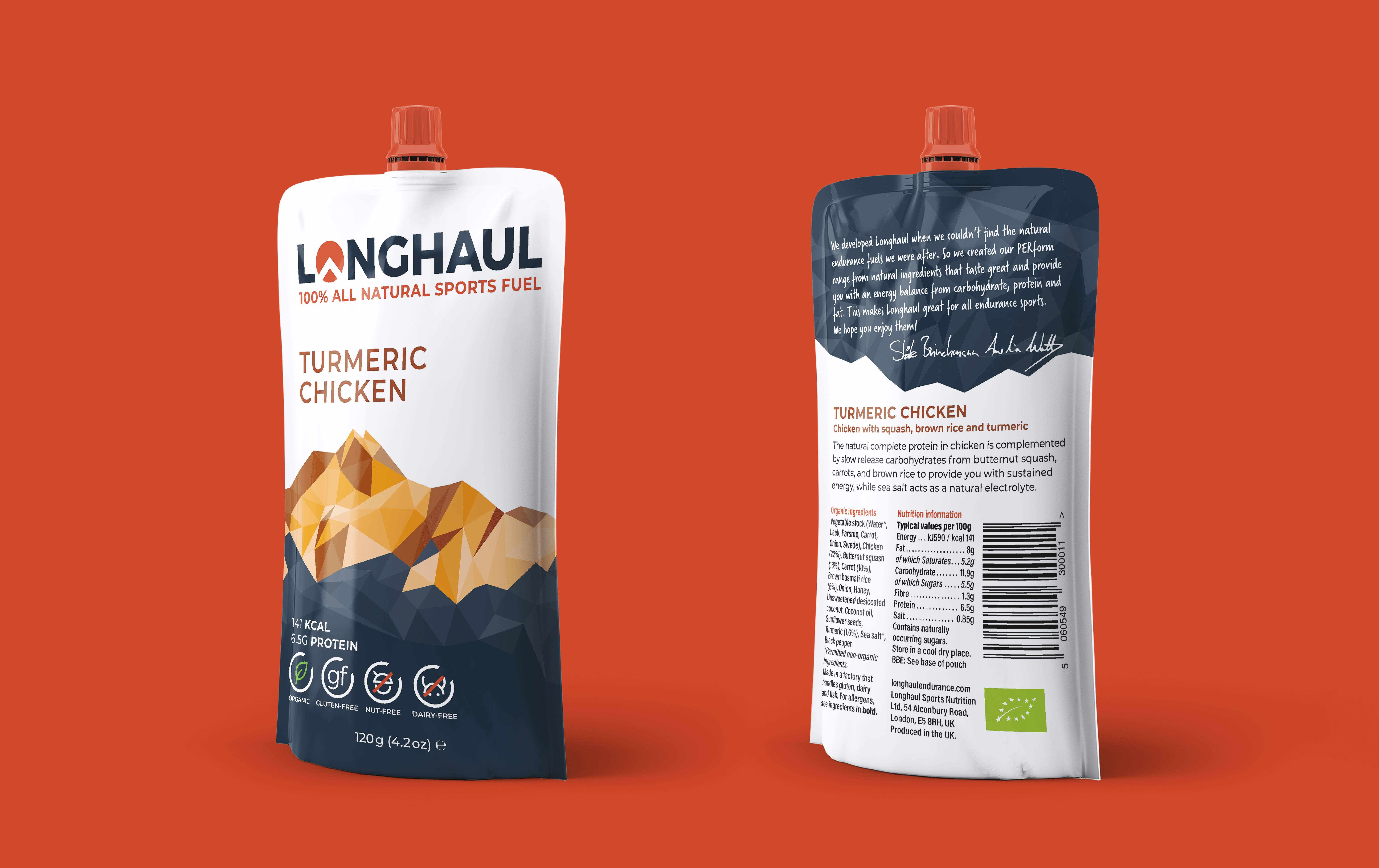
Once we obtained the physical pouches it was much easier to get a sense of scale, correct type size and hierarchy, and make comparisons between our design and that of competitors. Our work up to this point had established a preferable layout that seemed to work well with the information we had: an order of information from top to bottom, with brand blue at the base to emphasise the benefits of the fuel. Meetings with both our supervisor and client helped us to narrow down and move forwards. The client rejected placing the logo down the side of the pouch at risk of it being squashed and obscured more easily in the hand of an athlete. Our decision on the primary graphic for the front of the pouch was mountains. Longhaul already used a ‘mountain’ in the ‘O’ of their logo, and so continuing the theme on the packaging seemed fitting. We believed they also fitted the product well; both share natural qualities.


Exploration of mountains
Neither us or the client were quite satisfied with the current representation of mountains that we had; they were too abstract, lacked visual impact and didn’t appear natural. We therefore proceeded to explore various visual styles and illustrative techniques for the mountains; settling on one was tough. In hindsight, we could have worked to rule out approaches, before putting them into practice and testing them, by studying the visual identity more comprehensively. Working on this more collectively, and coming to more defined decisions on which styles to try out would have been more efficient. For example, rugged and free-form mountains failed to fit with the cleanliness and solidity present in the visual identity – a mismatch we could’ve more quickly avoided.

We settled on a polygon illustration style to depict the mountains. Using this approach we could now make use of a variety of different shades of colour, adding depth and helping to increase the shelf presence of the design. These colours could still be switched for each flavour, retaining flavour identification at a glance. I implemented the colours using 3 swatches to ensure it would be easy for future designers to create new designs for more flavours. The packaging now felt on-brand and attention-grabbing. Our client was pleased.

‘The use of a mountain is very well aligned with the brand image we want to portray. The design works well as a concept that we can apply to new product ranges. It is both clean and eye catching.’ – Staale Brinchmann, Longhaul
The back of the pouch
At this point in time, Covid-19 delayed our progress and took out our deadline; the client lacked time and priority to provide us with feedback. I took the initiative to begin work on the back of the pouch. This was a battle with type size as we had been given a little too much copy than comfortable for the format. Cutting out what we felt wasn’t essential lead to a solution with improved clarity over the existing design. It also ensured we could meet the requirements for the minimum type size at press. The same colour differentiation for flavours was utilised in part on the back, and we separated the blurb from the ingredients and nutritional information by again using the mountain graphic.


Concluding adjustments and design sign-off
After regaining contact with the client and setting a new deadline, feedback was positive. From this point forward we were down to refinements. These most crucially included: finalising the colours of the flavours, the copy (as far as possible), and implementation of the Longhaul nutritional symbols on the front. Assigning colours to flavours was difficult, as we wanted them to have some logical connection to the ingredients, however each flavour’s ingredients had similar colours. Both us and our supervisor noted that in order to help consumers, flavours needed to appear easily distinguishable from one another. We proposed a mint green for one of the flavours, but the client thought that it didn’t chime with the warmth of the other colours, leaving us with fewer options: we returned to a deep purple. For me, this highlights the difficulty of working with colour for differentiation, particularly in many shades and tints.
As a final personal touch to the back design, we added the handwritten names of our clients, the founders of Longhaul. The blurb also takes advantage of a handwritten typeface for more personal appeal, given that it is a personal message. The client decided that the design should switch to being primarily left-aligned, which resulted in a greater connection between the tip of the mountain and the flavour name; this also relevantly gives the design a little more motion. Once all the adjustments were complete, we signed-off the design with both our supervisor and client.
Technical preparation
The client was not yet ready to go to press with the designs as the copy was not finalised; we agreed to hand over the source files, in an easily adaptable state, for future designers to edit to the client’s needs. We ensured our files were fully in line with the specification from the printing company in order to ensure only minor adjustments going forward. Understanding the specification was a challenge; it certainly made me more aware of real-world and mass-production printing requirements. Whilst we did examine it throughout the project, ensuring we understood every aspect of it from the start would have been better. We had made use of non-solid CMYK coloured type in our designs, and it became apparent that it needed to be set in solid Pantones to ensure readability on the press. Ideally we would have noted this earlier, but it was easy to correct.
Reflection
Despite the fact that completion took longer than we had all expected, we met our renewed deadline for handover. I am pleased with the outcome; it fits the Longhaul brand, speaks clearly to consumers, and meets our brief and the client’s expectations. Perhaps the hardest challenge of this project was working out what graphic should dominate the packaging; we could have worked a bit better as a team to do so more efficiently. However, I value the experience this project has given me. I am now in a better position to take on future team work, packaging design and to understand more complex production terminology.
‘It’s been a pleasure working with you all and I’m very impressed and pleased with the final result. So thank you for all your efforts, and for your patience during these lasts few months.’ – Staale Brinchmann, Longhaul
‘We have been extremely impressed with the designs that you have all put forward. We both wish you all the best for the future.’ – Amelia Watts, Longhaul