Banana Logo

Design ideas and design process

First logo design – starting point

At the beginning of my design process watching tutorials and exploring different levels of design were extremely helpful. However, the first of my designs that were created was not carefully thought about. Upon opening Illustrator, I went straight into it, without any inspiration at all. I mainly wanted to test out the certain tools that I had learned through watching tutorials and apply them to my design. The first tool learnt was called ‘type on path’. This was the tool that I had used for most of my three logos, and it helped them to have a clean and professional look. Despite my hatred for my first design, it really helped me to develop and think carefully about what I wanted to design next.

Second logo design – inspiration was used

My second design was a lot more successful and thought out. It was inspired by the KA drinks logo because the colours and typefaces that it had used really stuck out and caught my attention. This was the effect that I felt all logos needed to have. They needed to be eye-catching and interest the viewer when looking at it. This helped to develop my understanding even further and made my second design a more successful one. Instead of using the ‘type on path tool’, I used illustrations and large type instead. I drew a simple sun design and large type to create a simple and minimalistic design. However, despite its minimalism it still makes an impact.

Logo 3 – first stage, crescent moon drawing
Logo 3 – stage 2, adding text and dimension
Logo 3 – stage 3, adding stem and banana elements
Logo 3 – stage 4, adding outline to create more dimension and finalisation

My final design was definitely my favourite. Initially I wanted to design and draw a crescent moon logo, in contrast to my second one. However, while designing, it miraculously turned into a banana, due to elements that changed its appearance. Instead of starting my logo again, I wanted to just go with it and see how my design would progress further. Even though it didn’t go how I originally planned, I definitely think it was my most effective and interesting creation.

Final logo design – most developed design

Software tutorials

When learning how to use certain tools and looking for inspiration, the tutorials provided were extremely helpful. The adobe ones were mainly my favourite, purely because of how simple and easy they were to follow. Step-by-step tutorials are usually the ones I go for because I feel more comfortable when I see how things are done visually and what it takes to progress designs further. This tutorial: https://helpx.adobe.com/uk/illustrator/using/creating-text.html was the first one I had watched. It taught me how to use the ‘type on path’ tool, which assisted me in all of my designs. When starting the task, it was a little scary since I didn’t know my way around the software, things can seem quite daunting. However, when tutorials like this are made, it helped me to become more comfortable as well as understand more and apply it to my designs. By learning these skills, it will not only benefit me with this project, but with many more to come.

The next tutorial: https://helpx.adobe.com/uk/illustrator/how-to/change-font-typeface.html was a step-by-step written tutorial. This taught me how I can use the ‘selection’ tool to adjust type and create a unique typographic design. In all honesty, I really do wish I had used this effect in at least one of my three designs, but I think I got carried away with using the ‘type on path’ tool. Through learning this skill, it inspired me to design a more creative and colourful logo, hence why my second design was so different from my first. Other tutorials such as: https://helpx.adobe.com/uk/illustrator/how-to/combine-simple-shapes-to-make-complex-shapes.html also taught me new skills. The ‘shape builder’ tool taught me how to combine shapes easier and more effectively. Again, I wish I had used more of these skills in my designs, but they have definitely made me more comfortable with the software and understand more when creating simple designs.

Design resources and articles

Inspiration for logo 2

My design resources were mainly an article that I had found, and the KA drinks logo that I used for inspiration. The KA drinks were fairly simple, the designers had used a bright colour for the main text and a tropical background to make the name stand out. The sense of hierarchy and importance helped me to develop my own designs and think about the different levels within my design.

On the other hand, the article helped me to understand the significance of a logo and the meaning of what it stands for. The article I had used: https://sproutsocial.com/insights/how-to-design-a-logo/ was written by Michelle Grano. Her article stated so many different aspects and features that really made me think about my own design. From identifying what a logo is, to mentioning different fonts, design tools, emblems, symbols and so much more, her article was thorough in describing what logos are and the effects they can make on people. Not only did I gain knowledge and understating from this, but I applied the same comprehension to my own designs.

Learning across the module

Throughout the module I have definitely learned and achieved a wide range of knowledge. I have gained much more confidence and become a lot more comfortable with using the various different softwares. Compared to my quiz from last term, I have improved my skills a consistent amount and applied them to all my projects, not just this module. Software skills such as the ‘type on path’ tool, ‘selection’ tool, ‘shape builder’ tool and ‘type’ tool have all helped me to broaden my understanding of certain effects and also how to use them effectively.

My design skills have also improved vastly. From knowing how to develop certain designs and have a level of significance behind them. I have learnt that research really helps when going through the design process. It has helped to inspire me and spark ideas when I didn’t have any, and also helped me to understand the meanings behind certain designs as well as how they can affect people when they look at them. As a whole, both my software skills and my design skills have improved considerably, and I will continue to use the knowledge I have gained throughout my various other projects.

TGC Podcast Cover – Photoshop Task

Design Ideas and Design process

At the start of my design process I decided to research and look at pieces of work that would inspire me or trigger ideas. I wanted to use typography and colour in a creative, effective way to give my podcast cover an attractive look. Going into Photoshop my initial idea was to use the title of the podcast, ‘typography and graphic communication’, in a repeated fashion, creating a ‘trippy’ or ‘disruptive’ looking effect. With the success of this idea, I decided to implement it in all of my other tasks as my first design. I had used the same effect for my postcard and for my sticker, the only difference was I had used various colours and word effects. My podcast was an electric blue (which I struggled to recreate) and my postcard was a vibrant pink, using the same image and font. In my final task, I wanted to bring all of my ‘first idea’ designs together and combine them in a harmonious way. My sticker involved both colours from my previous tasks and similar effects in the distortion of my type. As a set of designs, I think that they all work together and you can see that they have distinctive similarities.

Initial Photoshop Podcast design

For my second podcast idea, I wanted to do something simple, yet effective in the way that it’s put together. I wanted to draw peoples attention to it, making it appealing to look at and easy to notice. I started with a simple background colour with some text and added some circular shapes. As I lowered the opacity of these shapes, I noticed that the text was also affected by the colour. This was not intentional, but the outcome was extremely effective. I think that both of my designs are very different in terms of colour and overall aesthetic, however, repeating the words definitely makes it a strong noticeable cover. Overall, making these covers were relatively easy if you know what you’re doing. I didn’t decide to use any fancy effects as I just wanted to create something simple and straight to the point. I think that the covers simplicity and minimalism is what makes it effective.

Podcast 2 – base colour
Similar text design with repetition
My second podcast cover

Software tutorials

In terms of tutorials that I had used, surprisingly, I didn’t use that many at all. We were provided with some mini tutorials on Blackboard so I mostly followed them and learnt some basic skills. When creating my designs, I was mostly just playing around with the software and exploring different ways to use it. I already had some knowledge when using photoshop as I did photography while I was in sixth form. However, I still think that I still have a lot more to learn. Looking at everyone else’s designs on our shared Padlet board, really gave me insight about how many different effects you can create in just Photoshop alone. I remember being taught how to use the magnetic lasso tool in Photoshop. (This is the tool that I used to cut out the podcast microphone for my first designs). I watched a few tutorials of how to do this, but this one really helped me: https://youtu.be/0rQEctxkjBM.

The tutorials on blackboard were also a huge help for me, especially for the Illustrator sticker task. I had never used Illustrator before, but by learning just a few basic tools, made me feel more comfortable and confident with using it. The tutorial showed us how to use a type and image distorter feature called ‘envelope distort’. When you click on an image or a sentence of type, the feature allows you to create different distortion techniques and shapes. I used this tool for my sticker design, I created different waves of text that flowed around the shapes. I also ended up distorting the podcast microphone accidentally, but it ended up working so well. I think the envelope distort feature really helped everything come together and flow effortlessly in a simple way.

Envelope distort feature found in Illustrator

Design resources and articles

For my design resources, I mainly looked for inspiration using Pinterest and other art sites. I researched the general look for ‘podcast covers’ and came across so many different designs. For my other tasks, I didn’t really research many things as I had already come up with a set design aesthetic of my own for all of my first designs. One helpful resource would definitely be Padlet, as I mentioned before, it really inspired me and gave me ideas of my own. Again, at the start of the design process I really had no idea where to start or what I wanted to do. I looked at various pieces of work on the internet and watched a few videos, but I came across this article: https://99designs.co.uk/blog/design-other/how-to-design-a-podcast-cover-the-ultimate-guide/.

This article was the ultimate guide of how to create a podcast cover. It is a guide of how podcasts should look and how it should be very simple and straight to the point. In this article it says ‘let your typography talk’. This is exactly what I had followed throughout all of my designs. It gave me the idea of creating that initial ‘trippy’ affect. It also helped me with the layout of all my designs, keeping them very minimal and easy to recognise what’s going on.

Zee Graphics

For this mini-project we had to brand ourselves and create a logo, with research from a particular theme. I was struggling with my own theme at first as I chose 90’s. It was a lot harder than it looked. There were so many different themes and colours, styles and fashion so I decided to choose something a little more simple.

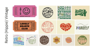
I was going for a “groovy” or “hippie” kind of aesthetic where the fonts are  a little loose and wavy. The theme, as a whole, is very colourful and I loved how the words are distorted to fit into or create different shapes.

I found these movie tickets while researching my theme, and I thought I could use them as part of my final outcome for my logo. They matched the theme in my opinion as they shared similar aesthetics, colours and typefaces.

Real mermaid

This was a news notice that I had found within the collections. This particularly stood out to me because someone had written on it in the top right corner. To me this made the piece much more personal and unique. I loved the look of the handwriting and how there was a slight bleed in the ink, giving it a more historical feel. The notice declares that a “mermaid” was caught alive on the coast of the Shetland Islands. However, the writer of the notice conveniently didn’t include an image of the mermaid to prove his claims. I think that was intentional to entice more people to pay and see the exhibition.

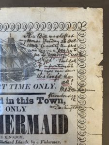
Mr Darlington’s note (in the top right corner) was very hard to decipher. I couldn’t figure out if he was amazed by the exhibition or if he was disappointed. To me, the description of the mermaid sounds a lot like a large fish with hair, I can’t say I was surprised, but I’m sure that this must of been news to spread around town. I think everyone would have their own opinions about whether it was true or not, even today.

Caution

For Eric’s project we had to take images of signs or letters in our surrounding environment and come up with a theme. My chosen theme was “caution”.

I wanted to portray how signs can be used in a way to inform people of danger or important information. Different shapes and colours are used to catch the viewers attention, such as the continuous use of bright yellow shown in danger or informative signs. Some signs have further written information whereas others don’t. This may be because people are used to seeing the symbols, making it easier to get information across.

Labyrinth

Using the removed cut outs from the inside of the book, I created my own version of what I wanted Labyrinth to look like. The title and door was cut out of a magazine I had brought for the project. I wanted there to be a sense of unknown and mystery to match the brief of the story.

Labyrinth Interior

We had a number of different themes to choose from. Each theme had a name and a story to go with it. I chose the theme labyrinth. This was a story about a family who were trapped inside a house. Every-time they opened a door it would lead them to a different part of the house, preventing them from leaving.

At the beginning I was playing around with different cuts and rips inside the book. I created diagonal and horizontal cuts trying to imitate different textures, or in this case, different rooms of the house. For my final cut (which I wish I had done throughout the whole book) was kind of like an illusion. I wanted it to look as if it was a tunnel going through the book, falling and disappearing into the distance. I cut out triangles in different sizes and angles turning and twisting throughout the pages at different thicknesses. My thought was to make it look never-ending, much like the house in the story.

Milk and Honey

This was for James’s project. We had to create our own versions of a penguin book that he taught us how to make in InDesign.

For my own design I chose one of my favourite books Milk and Honey by Rupi Kaur. I kept the same traditional penguin design, but I made it look like Kaur’s original book by changing it to a black cover and different fonts. I did some research and found the bee images (since I had no idea how to draw them) and got rid of the penguin. I wanted it to give off the same feel of the book I was recreating.

The only thing that bothers me is:
– the crop lines within the cartouche and the fact that it’s slightly placed more to the left and not centred (maybe I’m being paranoid, I’m not really sure)
– and how the image looks pixelated and not clear
Other than those two things, I’m quite happy with it.