Real job by Zainab Hussain and Jaflenur Rahman
Apples, sausage dog and travel
I was given three words by Neve. Apples, sausage dog and travel. I decided to create an apple basket in the shape of a sausage dog because Neve said she “absolutely loves apples” and really wants a pet dog. So I wanted to combine both of her likes and interests into one useful product which she can use over and over again.
Funeral Card
The object I chose to write my blog post from Emma’s collection is a funeral invitation card. I chose this object because of the different typographic elements used.
Printing Process
The art work has been printed in many different ways.For example, the name ‘Mr Biscoe’ is handwritten but the actual invitation information looks as though it has been typed using a typewriter. The details around the text such as the skulls, coffin and the signs etc all woodcut images that have been engraved into this thick material of card/wood. I think once the engraving was done a stamp or a press was used to spread black ink over the engraving to show all the little details more effectively, and then the writing was added in the empty white space.
Use of Colour
The only colour used for this funeral card was black. And this could be to signify grief and solemnity. Black was a colour used in the 19th Century for mourning and the loss of an individual and if any women was seen in black when not in a mourning period was seen as dangerously eccentric. The black colour in contrast with the half white background makes the writing really stand out.
Lettering Style
The letters used in the text is a serif font. The spacing between the lines is quite small. The writing seems together. But the spaces in-between words are quite bigger than a normal space. There is text used for the actual invite message but also in the engraving. The engraving has texts such as ‘remember to die’ and these texts in the graving are all in caps and this could be to ensure the text is bold and stands out.
Audience
The audience was adults, those invited to the funeral. They had to bring this card with them.
RFL 02
RFL 02
RFL 01
RFL 01
Staircase theme
For the broken narrative task I decided to chose the theme ‘staircase’. I really enjoyed working with this theme because I was able to create a staircase effect in the centre of the book. I cut this out to give a spiral staircase effect. As you go through the book (down the stairs) you can see the pages from inside start to get darker and the corners start to tears away. This symbolises how the man from the theme is getting more ill every time he goes down one floor of the sanatorium. Towards the end on the last page you can see the page fully turns black. This shows his sudden death.
Instruction signs

When taking pictures of the signs I started in the Typography department, and I started to take pictures of signs and posters with serifs. For example, the road sign that reads ‘MINISTER AVENUE’ has serifs on the typeface.
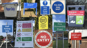
As I left the department and went outside I noticed numerous signs with information and instructions. I then found a theme of ‘instructions and informative signs’. I continued taking pictures of bold instruction signs. I organised my pictures into two categories. Instruction signs with text and instruction signs with icons. The first set shows instruction signs with text. An example of one of the sign is the blue one that reads ‘staff parking only’. The blue colour for the sign shows that this is a positive instruction sign that must be followed. Another example with the colour blue is ‘fire door keep shut’, again this sign represents that these doors must be kept closed at all times. The colour blue for these instruction/informative signs will draw attention. The sign that reads ‘drop off only’ and ‘no entry’ are in red. Red symbolises important and strong instructions. The colour red can also be seen from a very far distance making it useful to be in red to inform people on what the sign is about.
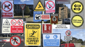
The second category I chose was instruction and informative signs with icons. One example I really liked was the yellow sign which read ‘floor may be slippery when wet’ and has an icon of a person slipping. This sign caught my eye because the sign is showing you the effect of what can happen if you walk on the wet floor. Yellow signs are simply warning signs but they are still informative as they are warning you on what could happen. Yellow also suggests danger. An instruction sign with icons which reads ‘no smoking in this building’ is a command and is telling people not to smoke. The icon with a cigarette with a red line through it makes it very clear that this must be followed, and with the sign being red it makes it stand out more. Other signs such as the ‘give way’ sign with arrows shows to allow drivers to pass by coming from the direction of the arrows and signs like ‘CCTV cameras in operation’ with a CCTV camera icon makes it noticeable that there are cameras in this building. Again this is a yellow sign suggesting the danger on what could happen if instructions are not followed.
The Great Gatsby
Elmer and the rainbow
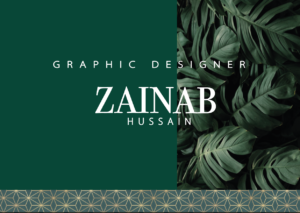
Shades of green
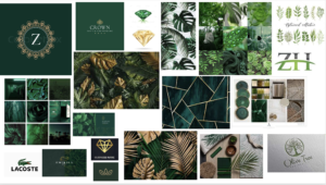
My mood board started off with different shades of the colour green. It then developed into a darker emerald/forest green, and then I incorporated leaves into the board along with the colour gold. The final colour theme I went for was emerald green and gold. I wanted the background to be green so I added a leaf texture effect on one side and a solid green on the other. And then I added a geometric gold and green pattern one on the bottom. I then went onto the text. I chose a serif font for my first name as I wanted my name to have a professional look, but I did the ‘graphic designer’ text in a sans serif font because I wanted that to stand out a little bit more to show what I do. I finally did my surname underneath and kept the spacing in-between both “A’s” in my first name to make it all equal. The leaf pattern was a good choice for me because when I think of green the first thing I think of is trees and leaves, so I feel it fit well in this context. One thing I would do to improve is make the text of my full name a little bigger or maybe spaced out a little more.
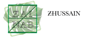
I also went on to creating a smaller logo design shown below. I wanted this logo to read my name but also represent my initials ‘ZH”, the square has my initials in it in a darker shade of green than the outside square and also added more squares to give it a geometric/ symmetrical effect which went well with the letters.