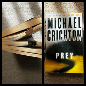
LOOP PREY MURDER TIME
What is a book? Why are we so scared to damage them? Why is this format invincible?
This mini brief required us to question the ‘concept’ of books, alongside with their composition, layout, binding etc. True enough, I had never thought or even considered the importance of visual dimension within books. We have all become so accustomed to flipping the pages in a certain pace, holding the spine in a particular manner and feeling the repetitive texture of paper, that all of these aspects are almost ‘forgotten’ by our conscious self. And bringing in this element of ‘connection’ to a reader, can help to create powerful and immersive experience.
With ‘loop’ as my chosen theme, I decided to narrow down some factors aside from the provided storyline/narrative (which is based on a female, that hired to kill her partner, with the help of an assassin, who is reading a book about, female, that hired to kill her partner, with the help of an assassin, in reality).
The creation of loop sits on-top of the temporal dimension: time. Without the fourth dimension, a loop wouldn’t exist (whether it may be in the narrative or in reality). Instantly, I knew that alongside with the murder narrative, the blend of time could add in an interesting imagery.
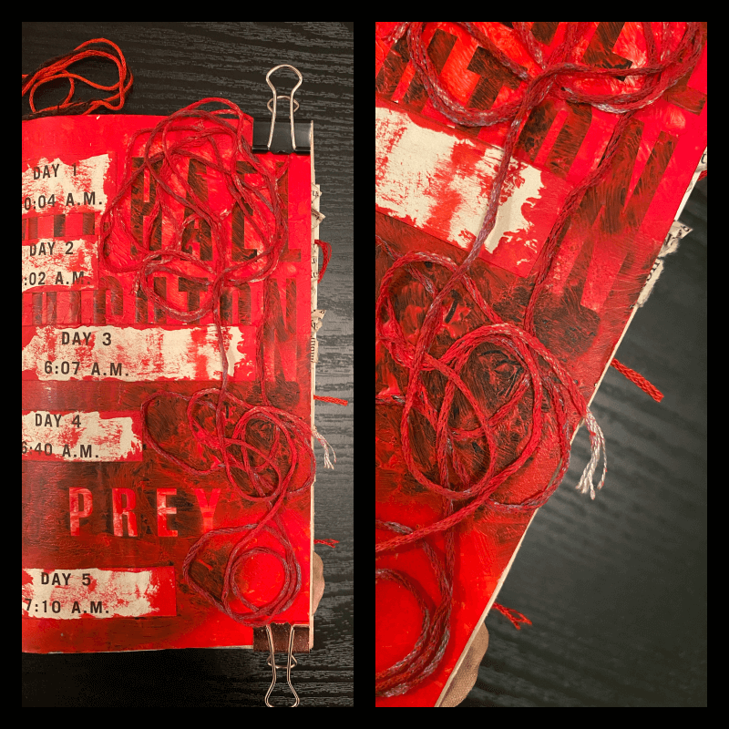
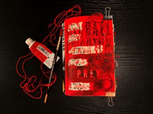
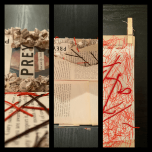
I have always been extremely interested with texture and the sensations it can provide, therefore I wanted to draw severe attention towards it. But the material couldn’t just be anything. It also had a make a connection with loop or the narrative of murder. After some quick research, fabrics, especially threads seem to have a portrayal of ‘loops.’ With their never ending entwining threads curling each other, they almost seem to reflect some aspects of loops and temporal dimension. Thus, the need to experiment with threads seemed very important. Whether they may be glued on or stitched into the texts.
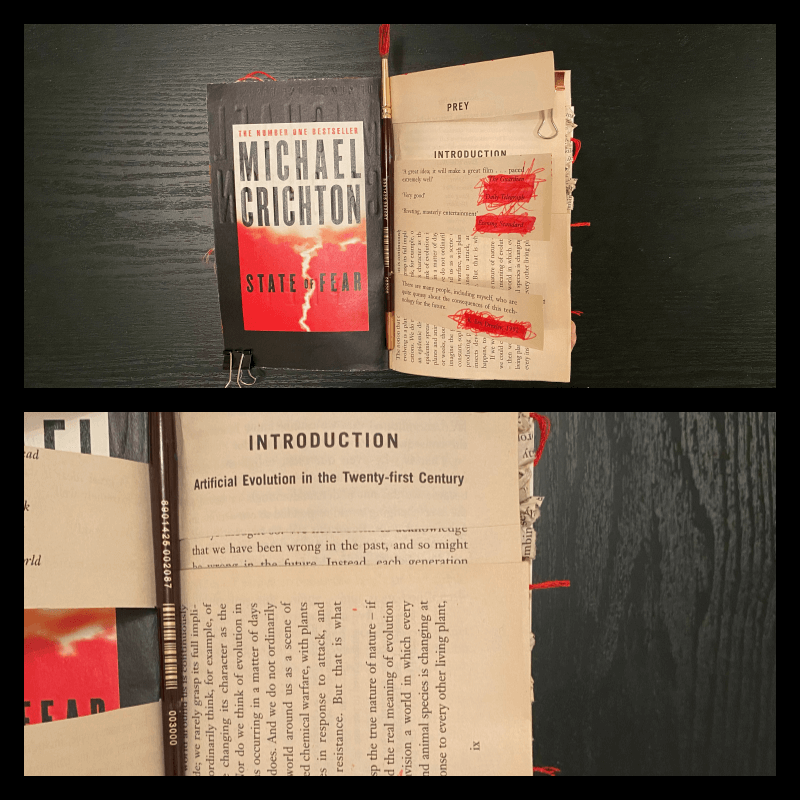
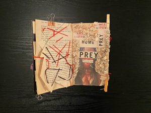
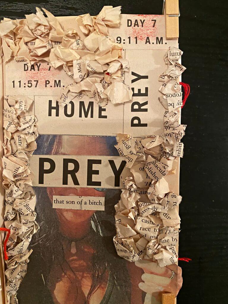
For one the ‘main’ concept page, I decided to create a collage based on the predator (who is a female and hired to kill her partner, with the help of an assassin, in the book he is reading, in reality) before linking it with the prey (who is the man). Of course, I also wanted to created some repetition from the cover, so I brought in the element of time (and day) to mimic the loop of reality and fiction. Lastly, I paired it with some sewn in lines, to support the madness, that a loop in time could create, especially with a murder.
The ‘taboo’ of not destroying books. The page flipping pace. The feel of paper.
These ideologies can easily be altered through movement, sound, pace, time, involvement, shape, space, 3d, scale, texture etc and in return, they can make the reader more connected with books physically and realise that we have all been missing out a lot on the ‘experience’ of reading.