Author: PhilippaLane

BrEDS Eating Disorder logo

Background

The British Eating Disorder Society is a new organisation aiming to improve awareness of eating disorders, and the care and treatment of people with eating disorders and their families. The society is a body representing people working in the field of eating disorders across the United Kingdom with the intension to host conferences and meetings, as well as elevate their form, to create a well-supported of professionals. Their main aims are to promote communication, collaboration and consensus amongst people in the field of eating disorders, especially disciplines, professions, academic and clinical settings and sector. BrEDS will represent the views of people working with these people to the media, the public, businesses, government and relevant bodies. Simon Chapman, the main point of contact, is a Paediatrician at King’s College Hospital and specialising in Eating Disorders, as well as working with obese patients. He is part of the Child and Adolescent Mental Health Clinical Academic Group.

Restated Brief

BrEDS would like a clear brand identity, specifically starting with their logo design, to be applied across their website as well as using the logo on social media. The image and feel needs to appeal to professional and hold authority in the field, whilst still being sensitive and subtle with the subject matter of the cause.

The main points of focus are:

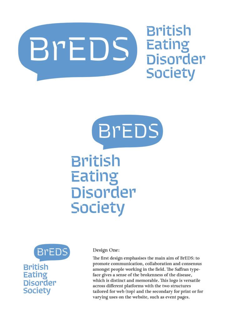
  • To create a simple, clear yet impacting logo that communicates with their audience and the wider public. This will need to convey their main aims of working with professionals to improve awareness and care of people with eating disorders. The Society intends to be far reaching and influential with government and media.
  • To re-structure and apply the logo and secondary branding to the website
  • To present a positive/collaborative view of the disorder: it is about recovery, restoration of health, food as medicine and essential to physical and emotional wellbeing. It is also about communication.

The client has not set strict guidelines or preferences for the style or approach for the deliverables. The items should however explore their initial idea of wheat and be sensitive to the subject matter and their audience. The basis of the deliverables and necessary to carry through to the other items is the logo design.

The key deliverables are:

  • Design the logo for BrEDS, to be used on website and social media.
  • Assist with brand guidelines and website recommendations for a coherent and consistent brand identity. This will include providing a brand guideline document as a PDF
  • Design a one-sided business card
  • The later request for an A1 poster was added two weeks before the final deadline

Process

Initial contact with the client

Despite being my first real job, I was feeling comfortable with working with an external client having experience as a freelance designer. With a personal investment in the cause I was eager to build a strong and trusting rapport with my client from the very beginning and showed willingness and enthusiasm in my initial correspondence. I was privileged enough to be a part of the BrEDS committee skype meetings, held every two months, from the very beginning of the process, giving me a well-rounded perspective of the whole organisations and the different voices beyond just my main client. The first skype session coincided with the start of my project and I was able to gather the key points that were the basis for my research and design ideas moving forward:

  • Remember that BrEDS is a professional body
  • There needs to be a balance between medical and emotional in the overall visual identity of the charity.
  • It is important that there are no religious connotations, trees or apples
  • The preference is to take a more simple approach, with inspiration such as NEDA and AED for their logos.
  • Charities show the positive so remember this within the approach to any visuals
  • It would be good to have a subtly of the overall intention of BrEDS, which aims to connect with lots of different professionals who deal with treating eating disorders to work as a stronger body of people.

Research

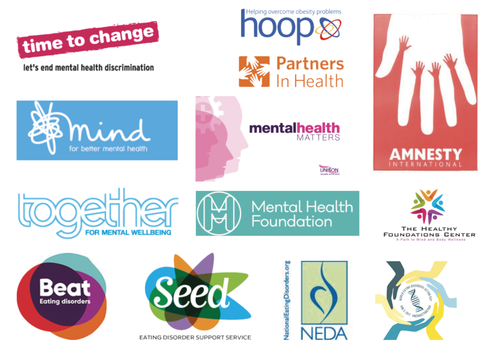
In order to inform my design stage I spent time researching a range of logos, from mental health charities, wellbeing logos and more generally medical branding and logo designs. I look specifically at logos of those mentioned by the client to ensure I was keeping in line with their preferences, as well as trying to form a wider understanding of potential directions that the logo design could go. The research was valuable in showing attention to colour palettes and how these can help create a medical identity without obviously having imagery of something more specific to the cause. Blues and purples appeared to be popular in medical branding.

A collection of logos considered during the research stage, paying attention to the use of typography and colour palettes that make them successful or unsuccessful.

Sketches and initial ideas

From the research done, I created mood boards for presentation, which included ideas for secondary branding and tag lines. As part of the presentation document I became to sketch 10 ideas to show the client as the first stage of the job. Consideration the a predominately illustrative or typographic logo was key and understanding how the graphic style of the illustration or typeface personality needs to be appropriate for both the eating disorder subject and the charity as a professional body of health care experts and doctors. I used Illustrator to both digitalise hand-drawn sketches as well as outline typefaces for greater flexibility and ease of modifying positioning and scale.

Considerations of different typefaces for the logo, with Neue Haas and Proxima Nova creating a more neutral and clean appearance whilst Saffran and Twine show some what of the fractured nature of eating disorder diseases.

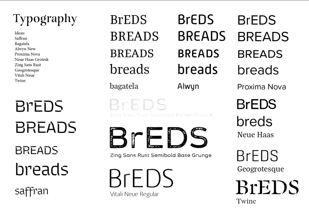
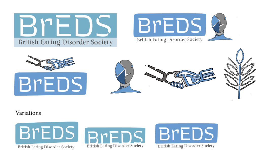
In response to feedback I refined three ideas to take forward to show the client and wider committee. Through this I learnt the attention to detail for how best to present the concepts on the page, drawing on information design, to ensure I kept the description of the idea in the same place on each page as well as keeping the description away from the graphics. Including a short description of the concept and design outline for the designs was a good exercise to consider a concise and professional tone to present my designs to the client and committee. This was a helpful aid for the those considering the designs and the client provided thorough feedback and opinions from the committee that brought together the general consensus in favour of one design. The client also provided a new focus to consider in moving forward with ideas: the group’s wish to focus on integration/collaboration – I would echo this: BrEDS seeks to represent some very different professional groups all of whom work with adults and children with eating disorders. Similarly, another member of the committee emphasised that “For what it’s worth re: logos – I agree with others. Need something more rounded, and welcoming than the fractured images. It’s about bring together. And should be aspirational, and warm.”

“Thank you Philippa for all your work on this – some imaginative and beautiful designs.”

At this point in the job it was clear that the design store would not be working as systematically as I had hope. Attention to adding new concepts and designs to present to the client I learnt how to adapt and evaluate where further designs and concepts needed to be explored rather than pushing on with my own expected deadlines and refinement of one idea. Still considering the preferred design by the client and committee I created two variations of that design whilst presenting two new designs. I spent time digesting the comprehensive feedback I had received to focus more on the togetherness of the charity itself and how differing professionals are coming together under one cause. The new designs were presented in a similar way but it was of benefit to join another skype meeting which fell at the same time as sending through the designs. Before the meeting it was interesting to consider with my supervisor the expectation of the design they would prefer. Up until this point the job had taken a natural course, with there being a general development of one idea leading to the next more refined concept. It was therefore surprising to receive, for what seemed to me, a complete change in direction as the committee all unanimously agreed on a new approach to the brief, overlapping letters, with differing colours to show how differing voices and professionals are coming together to make up BrEDS. This new innovative design was, from my perspective and shared by the committee and client, a fitting direction for the charity and when put against other similar charities. Unfortunately, however as it had been viewed as an alternative approach that would not be chosen the design was very much a draft design, with the overlapping letterforms in need of attention to create a clean and precise composition that would be successful at both a small and large scale. The typeface itself had some awkward curves and inconsistent characteristics that meant that the general appearance was not as crisp as it could be. Whilst this would be expected to go through two stages of refinement to get to the final design there was a turn of events that meant that the committee was now in need of the designs within a week of the skype meeting. The short deadline meant that it was agreed that the design presented would be used as an interim in order to have an identity for the conference. This was a real challenge for me as I did not want the charity to define a visual identity that then may change, even if in a small way, but with such a tight deadline this was necessary. It taught me how as a designer it is important to still maintain a level of refinement of visuals through every stage as people are susceptible to getting attached to ideas and designs. Once sent to them it was hard to retract or modify the designs within my own bounds as a designer which has been an important lesson for me to consider for future jobs in my career.

Final stages

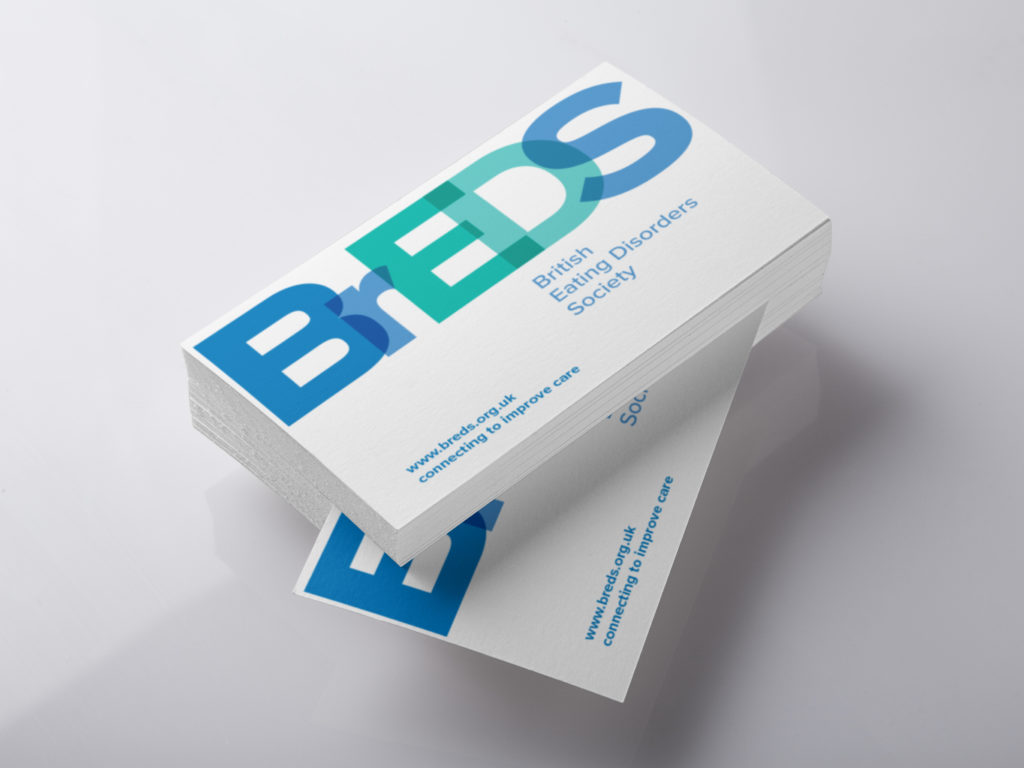
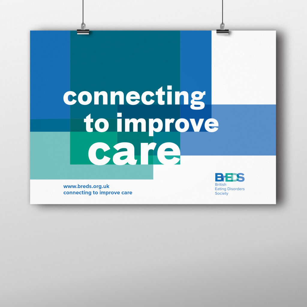
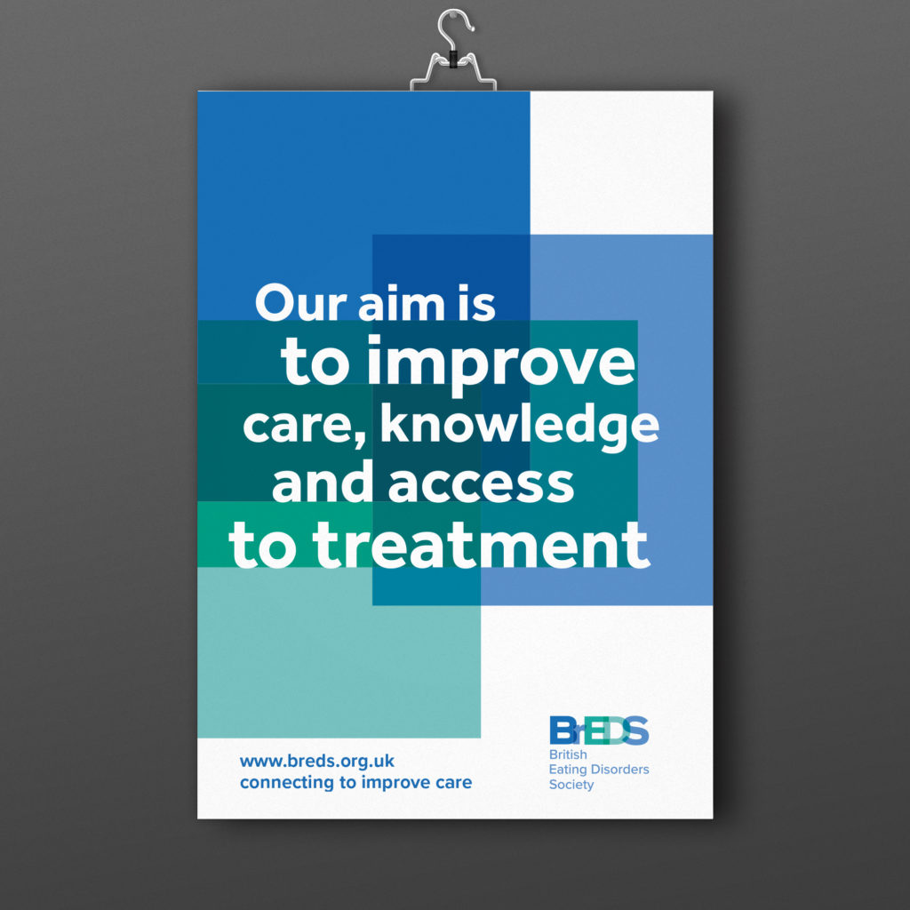
Following on from this the final stages of the job was about creating a more refined identity for the charity within a need deadline. Despite presenting a more visually dynamic and balanced design it was clear that the committee favoured as little variation as possible from the interim design. With this in mind I chose a more structured and uniform typeface that was stronger in overlapping the typeforms to create a clean and crisp logo. Understanding the large and small scale of the logo was crucial as the colours used at times meant that letters got lost at a smaller scale, at times it meant that BEDS or even BS stood out more than the full BrEDS, an issue that needed resolving. In solving these conflicts and balancing the typeforms and points of overlap the final design was approved. In using this and the composition of BrEDS alongside its full name I provided the client with the small scale and large scale variations. Following this I create business cards and posters that used a clearly defined colour palette and drew on the visual identity of overlapping colours, particularly seen in the poster designs.

Final design

The final designs of the logo incorporates overlapping letters to create a typographic identity. The blue and green colour palette clearly defined the logo as a medical charity and the differing colours of the letters is indented to reflect the joining of different voices under one charity. The refinement of positioning of the overlap ensures the logo is success at different scale. Creating a variation in composition allowed the client to use a stacked or more horizontal position in accordance to the overall design that it might be featured on. The business cards play to the striking nature of the logo, with a more simple and clean approach to the design. The geometric Proxima Nova typeface is used for the website and slogan to balance the dynamic typographic logo. The poster plays to the logo and uses blocks of colour, in line with the colour palette, to create a strong visual identity of the overlapping colours. Ensuring the type sits and interacts with these blocks in a crisp and uniform way the posters maintain a medical professionalism whilst ensuring that there is a bold and eye-catching poster for the committee to use.


“Very happy with our new identity – already loads of followers on twitter”

TY2ED Copyediting project

Background

In 2017 a new format was created for in-class tasks for Part Two which incorporated the University of Reading’s branding. Applying this same template to other areas of the syllabus was needed to help standardise and update worksheet in different modules. The key module where resources were in need of updating was Introduction to Editorial Design, which includes the focus on the importance of copyediting and proofreading and creating specifications for editorial work. The issue with current material for the tasks surrounding these elements were that they were outdated and were not fully relevant to the current students. The handouts were also in need of further copywriting to help the students understand the task that they would be assessed on and engage with how the task is relevant in the wider design context. The explanations of assessed tasks needed to be more in line with how the Department’s pedagogic approaches have more recently evolved.

Restated Brief

 The Department would like a series of tasks for Year 2 students to be updated, taking inspiration and clear guidance from the new Inclusive Design worksheet. Taking copy from the original task sheet, rewriting copy and creating new copy, the new design should be easy to follow whilst creating a relevance of information for the students and a level of engagement.

The main points of focus are:

  • To create a series of worksheets for the Introduction to Editorial Design Part Two module, including the copyediting task and specification task
  • For the both the copyediting task and specification task the worksheets will be uploaded to the online Blackboard system as well as some sheets being printed for class use.
  • Each document should be engaging, well-structured and relevant with a balance between an interactive experience and clarity of instructions. The copy should also ensure the students understand why the task can be applied to everyday practise.

The worksheets should work alongside the University of Reading brand guidelines and in a similar style to Inclusive Design worksheets. The copyediting task should be set up in three documents including an introductory sheet to be uploaded on BB, a task overview and the task itself. The specification document should include an introduction about specifications, top tips and analysis of past specifications, including helpful visuals.

The key deliverables therefore are:

  • Design and update the copyediting task and specification task of the Part Two module Introduction to Editorial Design, each being A4 two-sided worksheets for electronic and print use.
  • The copyediting task should follow the document structure of:
    • 2pp of handout that can go on Bb
    • 2pp of instructions
    • 2pp of actual task that they mark up and has names of both pairs plus actual mark

Process

Having taken the same Part Two module only a term before, the material and experience of the module were very familiar to me and it was an exciting opportunity to bring my own feedback to the design brief. For both sides of the brief the main focus was to update, develop and add additional copy to the worksheets to be more appropriate and engaging for the new Part Two students. The first three months of the project focused on the copyediting task.

Research in response to feedback

To ensure I designed a document with both clarity in the visual design and written copy I spent time revising my knowledge and understanding of copyediting. I used documents already in place from the module resources and other modules, as well as spending time with the teaching staff of the module itself and similar modules to gain more information on common mistakes and extra copy for the worksheets. As the worksheets are intended to encourage more student engagement I spoke to peers and other students about their experience of the tasks and areas for improvement.

Copywriting

In considering the concept of gamification for a more interaction experience, I identified that the structure and copy of the worksheets, and choice of text for the task itself could be a way of bringing freshness to the task and a way to draw links with other modules. The first part of this was to therefore gather multiple sources to add more detail and examples of the application of copyediting and proofreading in potential jobs in the future. By comparing sources about copyediting I was able to build coherent and thorough copy for introducing copyediting and proofreading and the process of how to best approach the skill.

Having gathered the information for the overview of copyediting and adding in original copy about the task structure I began to focus on the assessed task and the piece of text used required for students to copyedit and proofread. Looking at the Part Two’s Design Thinking module the text choice could introduce important historical designers or design historians, building a bridge between the modules as well as drawing attention to influential and dynamic graphic design writing. Texts that were explored included First Things First manifesto, an extract from an article with Ellen Lupton and The Crystal Goblet by Beatrice Warde, which was the decided text for the task. In line with the BSI guide, I used the symbols outlined and common mistakes that students might make with their work and applied these to the chosen text. I added mistakes such as using a different typeface for a word, adding unneeded line breaks, the wrong use of em-dashes, incorrect capitalisation and the colour of a word from black to registration. Having added 60 errors, I marked up the document using the correct margin symbol and in-text symbol for the mark scheme.

Initial ideas for the copyediting task sheet, including First Thing First Manifesto 2000.
Initial ideas for the copyediting task sheet, including an interview with Ellen Lupton.

Document format and graphic style of illustrations

Ensuring my InDesign file was set up with the character and paragraph styles in line with the Inclusive Design worksheet I also began working on a similar graphic style for the illustrations for the new worksheets. Sketching, scanning and editing in Illustrator, I hand drew small cartoons to bring more playful and student-based quotes as well as adding visuals that break up the body text; integration the text with the illustrations was an important consideration.

The use of headings and subheadings was essential and made successful by the typographic hierarchy already in place. Negotiations with the copy to retain and copy to cut in accordance to space on the page and amount of information to provide to students was a careful consideration and one that was supported by my supervisor. Once the content was placed illustrations were used to bring engagement, secondary levels of instructions or subtle guidance and a break from the amount of written information. The working document, having been determined by a previous visual identity, went through small changes during feedback, usually just movement of information or rewording content to keep it concise.

The inclusive design worksheets, the visual model for this brief.

Specification

After completing the copyediting task, the second task of the brief was to focus on the specification task in the module. Understanding the tone and desired appeal from the copyediting task I was confident in creating illustrations that would assist the document, with my supervisor expressing her like for my first attempts as they were ‘nice and lively’. With the template in place on InDesign and a collection of new illustrations the substantial project of writing, sourcing and editing copy to create a new document for the task began.

Copywriting

With my own understanding of the project I put together a first attempt of the copy that may be of relevance and assistance for students. I spent time researching academic writings and syllabus documents that might help shape this, but the majority of the writing was taken from my experience and others about what we wanted to know and helpful instructions for the assessment. As with the previous task I spent time talking to tutors who were involved in teaching the module. Working with less of a firm structure it meant that I was aware of the feedback and input of a secondary person with reading through my own writing and structure. It was reassuring to receive my supervisor’s encouragement, saying ‘You’ve done a good job and are talking about the right kinds of things’. The development of my own copy was refined and added to by my client, bring a more clear and concise voice to the process. Further content and revised writing were sent from my supervisor via email which I was able to place and typeset in my template. With hindsight it is my hope that I did still play a key part in generating ideas for the writing.


‘Thank you for all your work on this,

you’re doing a great job’

Jeanne-Louise, supervisor and client


Copywriting and use of visuals

The copywriting of the main document took a considerable amount of time in the design process, but a firm priority set by both myself and my client was ensuring the use of visuals and their annotations were a key strength to the document. Having spent time talking to my supervisor and peers it was generally agreed that, whilst past specifications had been provided, understanding the strengths and weaknesses of the examples would be of benefit. For my own project I had spent time comparing and contrasting past examples in order to take each one’s strength and use the structure, content ideas and document layouts to ensure my own specification was to a high standard. With this in mind I collected screenshots from specifications that I felt were most helpful in discussing areas of interest, making key notes on each one that could be included in the document, ready for feedback and points to consider from my supervisor. I was clear on the layout of these pages, large visuals with defined text boxes for short points for consideration and more detailed advice. I was able to put these together ahead of confirmed content and I thrived in using my own conscientious approach to my learning to this part of the job.

Final design

The final designs of both the copyediting task and specification information were both delivered on time despite coming at a busy time in the term and over the summer holidays. Both documents provide a standardised approach to the tasks, in line the University of Reading’s brand guidelines and the Part Two Inclusive Design worksheet and bring additional content to help student engage more with the task. The task resources also show a greater emphasis on the wider context of the taught skills in industry and the expectations of students in the deliverables. Published on Blackboard as well as provided as print outs in briefing and assessment sessions the documents are intended to be easy to navigate and follow on screen and printed. They work as a set in the Part Two syllabus material, creating a consistency of material for students.

The copyediting and proofreading document, uploaded on Blackboard for student use.
Page one of the copyediting and proofreading task giving an overview of what copyediting is and the process involved.
The mark scheme for the copyediting task, which I designed and marked up.
Page one of the specification resource introducing students to what specifications are and why they are important.
An example of the visuals and annotations included in the specification resource, uploaded on to Blackboard. Previous specifications from the module are annotated to provoke students to think about what they want to include in their own work and how this can be done successfully.


Reflection

Whilst the two stages of this job were working in line with an established visual identity, working to a template, the end results were two functional, informative and consistent documents that are aimed to improve resources for students. Having been asked to take on the real job because of my interest in the task it was a great opportunity to bring my own experience and initiative to feedback. I approached the brief with my own aim of wanting to help implement change in content and energy of existing and new documents for the module. This was also paired with my previous experience as a designer, before starting the Graphic Communication course, which was particularly relevant to the copyediting task. Creating collateral for a brand and website blog content the importance of copyediting and proofreading is a key skill that the designer should see as part of their own job, not just creating a visual identity. I was able to draw on this knowledge and understanding of the skill to make the content as tailored as possible to those in Part Two.

With experience in how the skills can be used and an interest in assisting the resource development I was efficient with my communication and response to feedback with my supervisor, putting the job as a clear priority in my schedule and to work at all times to the design schedule agreed upon at the beginning of the brief. I enjoyed bringing my input of copywriting for both documents to the brief and whilst at times the copy was changed and developed by my supervisor, I learn a clarity of writing style in the process that has helped my own report writing in later modules. The amount of copywriting for the specification document and the new initiative of the whole document has created a piece of work I am proud to discuss with employers as it fills a gap in the resources that students were clearly asking for.

Comfortable with working with a supervisor and client this second real job helped me implement some of the more refined lessons I learnt from my first real job.

Combining face-to-face meetings and intentional email correspondence I worked on being realistic with working to deadlines to ensure that meetings and emails were constructive, with suitable work to show and discuss. Delivering the brief at a busy time of term for my supervisor I was even more waring of ensuring that I was direct and purposeful with her time and emails with queries that I might have. The pace, communication methods and clear direction in the relationship between me as the designer and my client and supervisor was naturally developed.


‘This has come a long way

so thank you for all your hand work’

Jeanne-Louise, supervisor and client


Unfortunately, at the end of the project, time was running short and I was disappointed that the job had a very quick wrap up, with my supervisor doing the final proofread. I always like to finish a job to the highest standard, ensuring that I as the designer have proof read for myself and had a final sign-off with good time. Whilst this was clearly done for the copyediting task the nature of working in the summer holidays and the time pressure of getting the resource uploaded on Blackboard as soon as possible meant that the project took an abrupt end. Part of this attention to detail at the end of the project I would have also liked a little more time to fully assess and improve the finer details of the typography of the document. Looking again at final designs more refined typographic attention could be given to the design, including using a baseline grid to keep captions and main body text more aligned.

Aside from this whilst both myself and my supervisor/client were happy with the final designs the true success of the pieces can only really be measured by the students themselves. Having received some practical revisions for the copyediting task, such as the change in time allowance of the task, I would like to aim to do a focus group about how the material was received and how small alteration could be made to improve the documents again moving forward. This brief was a unique experience of creating something that can directly improve resources of modules of students who follow after me and whilst the finer attention to the design should have been more attended to the true success of the job was creating an informative and more dynamic resources to assist students with their assessments. It is my hope that these designs have helped at least some students engage a little more with their tasks in hand.

The final copyediting worksheets.