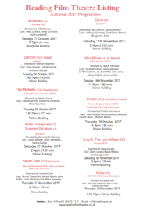
Cinema listings for Elderly People who are passionate for old Hollywood films:
I chose to design my first listing for older audiences who have a passion for certain film production because I wanted to experiment with the hierarchy of information they would look for first. My main focus was to make sure that the typography and layout is clear so that older audiences don’t have difficulty reading through it and finding what their looking for. I wanted to draw more attention on the production and origins of the individual film, so I placed where and when the film was made, the director and cast at the top of the list. In order to present a sense of clarity I used a san serif font to help the text be ‘more easier’ to read but I chose to do the title of the cinema in a traditional serif font to present a classic feel to the cinema.
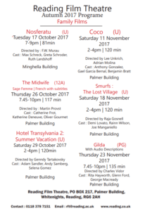
Cinema Listings for families:
For my second listing, I focused on the information that a parent with children would look for including age ratings and times of the screening. I decided to create a separate type of cinema list and put six out of the ten films on the list as families including younger children would commonly be looking for films ages U, PG or 12. As the age rating was an important part for parents to look for, I placed it next to the film title and at the same type size. The date and time of the film screening is also an important factor so families can schedule watching it around work and school. I placed the location and contact details of the cinema itself at the bottom of the list so as it created a nice parallel with the title.