Author: MalaikaJohnson

Art in Business

Background

The client is an Art PHD student at the University of Reading who set out to create a ‘document’ that visually supported and demonstrated his findings on the artist Sol Hewitt. The aim was to create a document that served as an exhibition that demonstrated and mapped out methods that artists could use to create works (like framework/a guide). The document would feature different sections that demonstrated these methods with business logos and material, created by the client. The art works ranged between black and white and colour, as well as larger and smaller dimensions (so quite dynamic).


Brief

The brief was to design a document (precise dimensions and materials unspecified). This included organising and compiling the client’s own works alongside written work as well as visual examples of certain methods being put to use. The document was set to be printed on as opposed to digital outcomes and was meant to be adaptable as reading material as well as exhibitory.

Initially, the client and I were working and planning for an A4 format (this later changed to A3). The document was to be printed in colour and able to be put into a ring binder similar to traditional business design specs. The paper stock to be used was traditional business paper also often used in these design specs. Overall, the document needed to look ‘clean’ and minimal in design as it was important for the content to be followed as well as viewed.


Research

Due to the nature of this particular project, there wasn’t much research to be done aside from getting to know more about Sol Hewitt. Together, we were creating something new and original, so it wasn’t necessary to look for specific inspiration. I did however have a look through the department’s collection, where we have and keep old business specimens. This was useful as it gave me insight into what we were going for in an aesthetic sense.


Communication

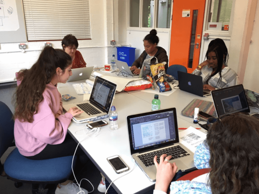
Throughout this project, the client and I had regular meetings whenever we were both available for a couple of hours to discuss specific work that couldn’t be done over email. Throughout, the client and I communicated over email equally to meeting in real life. I would personally say that it was more effective to meet up in real life as it allowed for easier communication and direct alteration. I was the only Typography student on the project so that also allowed for a simpler and more straightforward stream of communication.


Schedule

The original deadline was not met as we were still working together past that date. This was somewhat predicted by the client as we got to this date. This was due to the fact that from the start of the project, the client made it clear that the document was very much a work in progress. A work in progress can’t really have a timestamp on it due to the fact that it is ever changing and thus, the deadline probably served merely as an estimated time of finishing.


Design

Similarly to the research process, the designing process wasn’t a method I was necessarily used to. The way we worked together went as follows; the client would prepare the work in the way that he wanted it to look, then sent it to me to ‘design’ it in a more professional manner (on InDesign by use of a grid system and correct margins etc.), finally it was sent back to the client for approval. This process of working applied to all sections of the proposed document. This method of working collaboratively was different from the work I was used to within the department where I was instead encouraged to come up with design solutions myself. Getting instructed to do specific things (with not as much personal input) although quite relaxing and straightforward wasn’t the most exciting experience in terms of designing. This has made it clear to me that I much prefer being in control and having more of an input into certain projects. However, due to the nature of this scheme and the job that I signed up for, this could be said to be a process that simply ‘comes with the job’ of being a designing within certain industries or practices.

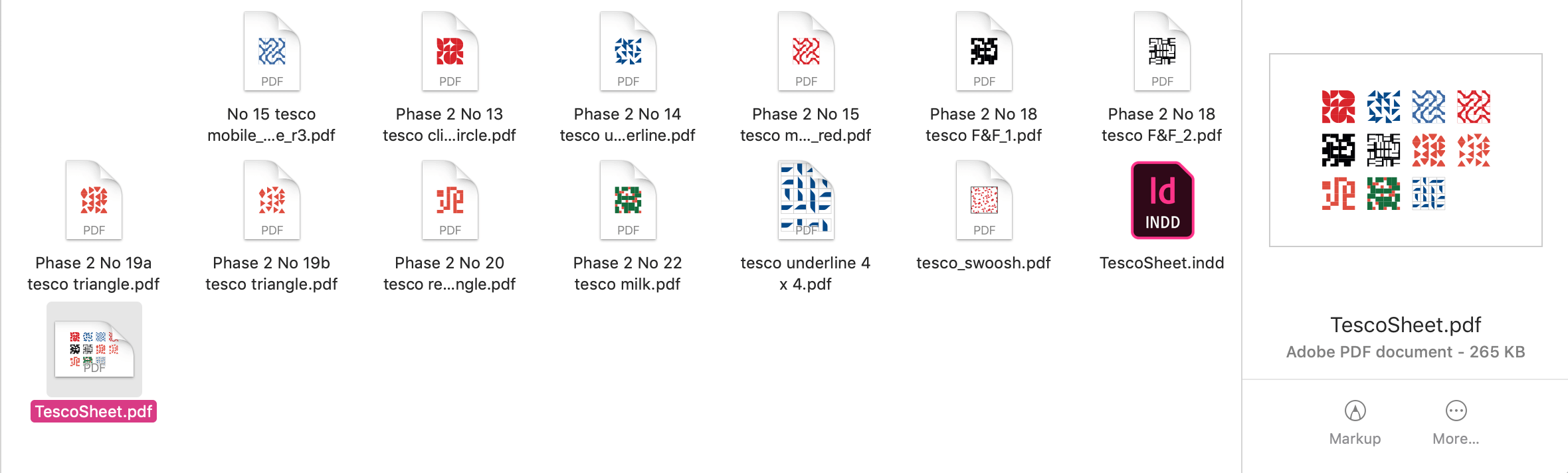
An example of the working process can be seen in figure 1, where the pdf’s demonstrate original examples and work that was provided to me to design. The highlighted pdf showcases a finished design where all of the original prints were compressed to one A3 (the final decided format). This was the process for all sections of the document.


Figure 1 – Demonstration of collaborative design process


Feedback

Feedback received from the client throughout the project was constantly encouraging and uplifting. These were always positive exchanges that highlighted the fact that collaboration at this level can be effective as well as pleasant. Some minor feedback received usually was surrounding paper stock and which were more effective, similarly to dimensions of certain art works in relation to each other.


Conclusion

Moving forward, I hope that the work I helped the client produce was up to standard and that they can be proud of the way in which their art work looks when organised and designed at larger scale than the comfort of A4. I also hope that work continues to be done and that the work truly reflects the amount of thought that went/goes on ‘behind the scenes’.


Tate Exchange Diversity Project

Background

Alongside my I am, We are Different by Design group members, in March of this year (2019) we held a workshop at the Tate Exchange in London. We led a creative workshop with members of the public during the schools Reading Assembly. The theme of the Reading Assembly event/workshop day was movement. We set out to creative a fun and interactive activity for people of all walks of life to do collaboratively and/or independently. This experience has led us to develop our organisation skills as well as event planning and execution which isn’t necessarily a ‘designers’ job.


Brief

Our brief was to establish, create and execute an activity to be done with the public at the Tate Exchange representing the university, and primarily the course of typography. It was an open brief to come up with any type of activity trusting it could be done by children as well as adults, could be done within the given space and involved typography and movement in some way. The downside of having such open briefs is that it can be quite overwhelming to make decisions and come up with ideas because the list of options appears non exhaustive.


Research

In order to come up with a concept for the activity we looked online to see what kinds of activities were plausible. This was necessary due to the fact that we had to create and conceptualise an idea ourselves. But also it allowed for us to test out different activities to determine which served as most effective and more importantly fun!

IMG_1894.JPG
Team brainstorming

Communication

Again throughout this project, we all communicated through Trello, Facebook and with weekly group meetings that always took place on a Wednesday similarly to the way in which we did so for other projects we worked on together. These sessions usually lasted between 1-2 hours, so we often discussed more than one thing we were working on collaboratively.


Process

After researching what activities were possibly suitable, we tested them out on each other. Eventually, after discussing many different options (see figure 1 and 2) we decided to initiate an activity that involved participants creating their own flags.

As the theme was movement, we connected that to the idea of migration and immigration. With this, we also attached the idea of citizenship and nationality. Not in a way that made people explore patriotism, but more so to give them the power to create their own flag that represented their identities as opposed to where they were from (unless this was what they wanted – there were no rules).

IMG_1635.jpg
Test run of workflow

The participants would be able to create their ‘flags’ by cutting out (or using pre-existing) pieces of paper to paste onto an A4 sheet. This A4 sheet that contained their flag was to then be printed onto tote bags for them to take home with them. The fact that participants were able to take this keep sake home was alone successful as tote bags are commonly favoured as collateral. In order to get the bag printed, the ‘flag’ was scanned in and flipped on laptops provided by the Tate. Once scanned and flipped, the prints were printed onto transfer paper that was to then be heat pressed onto the tote bags. When we practiced this at the university everything went seamlessly, however on the day, after confusion surrounding the use of a heat press on the premises, we had to use hand held irons instead of the heat press (which made it quicker and easier to process tote bags). This did not set us back too far however, as it allowed for us to interact with people more whilst they waited for their bags to get printed.

IMG_1498.jpg
Test run of using the heat press on the tote bags

Feedback

Feedback we received from the public was very positive as we asked many of them what they thought of the activity and if they enjoyed it. It was also clear to see the satisfaction on their faces once seeing their designs printed on bags they could use. This made me realise that that was how we had the privilege of feeling way more often whilst being on the course, that the everyday person does not.

Additionally, the Reading Assembly organisers and course leaders from different courses within the school had positive words for us as the organisation and planning led to positive execution.


Conclusion

In conclusion, this experience was completely different from what we’re normally used to on the course. We did not design a product or piece of work, but more so designed and curated an experience for the general public. Being able to produce work and an activity for an institution such as the Tate was a great experience as well and probably something not everyone gets to do.

I am, We are Different by Design

Background

In the beginning of part 2, myself and other students that ranged across the three-year groups started, alongside staff, the I am, We are Different by Design group. The group set out to create a sense of diversity and inclusion within the department as we felt this was somewhat lacking. We aimed to do this in a range of different ways, this specific reflection however relates to the process and creation of the first edition of an annual zine. As a group, we received funding from the university’s Partnerships in Learning and Teaching (PLanT) scheme to create this zine and send it to print in order to distribute it across the university. Our motivations stemmed from believing that the zine would be the best way for us to communicate our opinions and also it gave us all an opportunity to use out graphic design skills learned on the course.


Brief

Our brief was to create a zine (mini magazine) that showcased work from current and past students within the school (Art, Film and Theatre and Typography). This included sourcing content, conducting interviews and designing the entire zine within a short time. Our production time was quite short as we all had different schedules (due to the different year group scheduling) and the moment we got funding to the deadline for production being quite close to each other.

We planned for an A5 dimension as it allowed for more content to be included and more copies to be printed and distributed. Additionally, we collectively decided on a matte finish to ensure durability over time. Due to the nature of the content we aimed for the zine to look fun and exciting and like a celebration of the diverse work that is created at this university. Our main aim was to showcase this and allow for people to see and read about work they normally would not be exposed to.


Research

For inspiration and research, we looked at different zines and magazines. The tasks were delegated between us so some of us researched typography whereas others researched layouts etc. Although somewhat useful, sketching out themes and ideas served more effective than looking at other examples as we were creating something that closely reflected the content used throughout.

Communication

Throughout this project, we all communicated through Trello, Facebook and with weekly group meetings that always took place on a Wednesday. This was due to the fact that this was the only day where we all had time to meet for a couple of hours at an appropriate time. Having weekly group sessions was really useful as it added to a sense of community we were all lacking, but also made it easier to collaborate and bounce ideas off of each other.


Process

Our process started with discussions concerning who and what we wanted to feature and why. Our featured contributors needed to be engaging with diversity in some kind of way as that was what we aimed to showcase. At times this was quite challenging considering we didn’t want to interpret certain works in the wrong way if they weren’t intended to be about diversity and inclusion (but instead merely personal projects – so diverse by default).

In order to compile and design content, we interviewed individuals across the school as well as researchers and graduates. In order to do this we needed to do research and get ethics approval beforehand. This process of conducting interviews was very useful as it allowed us to explore and develop our professional skills as we had to be respectful and professional in our data collection.

The interviews we conducted allowed us to create articles and spreads showcasing a nice range of work showcasing projects that explored diversity, identity and inclusion (as hoped). Some examples of works that we featured is artwork representing equality within visual arts as well as more researched based content focussed on assisting medical staff.

The cover design of our zine featured a motif of camera lenses – this represented seeing things from different perspectives and capturing these. The range of colour used reflect inclusion and add to the fun and inspiring aspect of the zine. Overall, I can say we were collectively pleased with the outcome and reception.

Example spread featuring work by a typography student

Feedback

After completion of our zine, we received a range of positive feedback.

“We are very inspired by the whole project and how we can expand it to other departments. The zine turned out so well!” – Lisa Woynarski (School diversity lead)

Encouraging words like this have led us to be even more motivated to continue to do this kind of work, which we did having recruited members in this year (and hope to continue to do so throughout the years).


Conclusion

In conclusion, this project was one of the most fruitful and beneficial personal projects that I have been involved with throughout the three years of my time at the university. Getting to know members from different year groups allowed for us all to experience diversity and a sense of community in a way that isn’t very common. I am grateful to staff members that allowed for this and encouraged it as often times extra-curricular activities may seem overwhelming or big commitments. We were never made to feel like we had to attend the session, or we would get into trouble. Due to this, it seems we were more inclined to get involved because that pressure was lifted. Additionally, being able to create collaboratively whilst not being marked gave a different perspective into what and how design work can be (considering in most cases this is paid work that doesn’t always serve the designer themselves). Now being at the end of my journey here I really encourage other students to get involved with groups and communities such as these, and if in the future I am, We are Different by Design doesn’t exist, I hope our efforts can inspire others to undertake their own projects within the school.