LCH³

Design Ideas and Design Process

Design Idea 1

For my first design I decided to start off with the basics of Illustrator due to not having much experience using the software. Using the distort envelope tool, I was able to warp my initials to take the shape of an ellipsis. Once this had been done I wanted to experiment further with the design as it looked too simplistic. Using the direct selection tool, I was able to pull and push corners to manipulate the text.

Design Idea 2

My second design I decided to again use a tool that would allow for text to be wrapped around a shape, which I did for my name on the left of the circle. After this I simply placed my initials in the middle of the circle, again I have used the direct selection tool to be able to pull on the corners of the letters to create a more abstract looking final product.

Design Idea 3

For my final design, I wanted to create a 3D looking design I believe I have achieved quite well. I could have probably used perspective grid tool to aid me in creating this design, however I opted to use the polygon tool to create my grid lines, but I will get onto that a bit later on in this blog post.

For my final design I started off by using the rectangular grid tool to set up the letters that make up my initials. My reasoning for placing them in the rectangular grid is to make sure that they are all uniform.
This screenshot is to showcase how the initials looked when all at the same size.


Once I had my letters set out, I used the polygon tool to create my guidelines for my 3D box. To do this I would create the shape that I was happy with and then use the keyboard shortcut ‘ctrl 5’ to turn the shape into a locked grid.
I then started to fill in my guidelines with my letters that I had previously created.
As this was a 3D design I needed to make it look layered by using slightly darker tones on the L and the H but work still needed to be done for the C.
For the final touches of my design I added more depth to the C, while also adding shadow for that final piece of perspective.

 Software Tutorials

To start I decided to use a ‘YouTube Tutorial’ to get me started in letter manipulation when using Adobe Illustrator. The tutorial showed me how to use the envelope distort tool to be able to transform my initials into different shapes such as an ellipsis or a triangle. This tutorial helped me figure out and experiment when using the direct selection tool as well as the distort envelope tool. For my second tutorial I followed an ‘Adobe Tutorial’ that explained how to create your own monogram. This tutorial helped me develop my text skills further as it showed me how to place text around a path. I followed this up by deleting a certain area on said path to create a gap for my text to sit nicely between it. The final software tutorial which is a ‘YouTube’ one I found myself shows me how to create a cube using custom letters, in this case it was my initials. This tutorial was extremely useful as it showed me how to create guidelines using shapes that I have drawn myself, the ability to create guidelines using my own drawn shapes was a new skill to me but I managed to grasp the concept rather quickly. For further development I would like to be able to create more realistic looking design this was due to me being unhappy with some of the elements on the final design such as the C, as it is not quite fully 3D.

 Design Resources and Articles

When searching for design resources and articles on logo design – which this Illustrator task essentially was – I started by searching through and reading on some different articles that were online and I stumbled upon this article. The article itself pretty much runs through the steps needed to be able to create a successful logo, although parts of the article may not apply to me directly as it goes through the entire process but I can still take away certain aspects from it.  The second article that I looked at was an ‘‘Adobe Tutorial’ that again looked at the essentials when it comes to designing a logo. The article took real life objects and turned them into illustrations which I could have used to influence some of my design choices.

Learning Across the Module

Using the quiz results from this term I definitely retained some skills and learnt some new ones along the way. My quiz results are very similar from last one but I believe my overall knowledge on certain topics has improved overall as I did guess some of the answers when completing the quiz back in the first term. To improve on my quiz results I need to look into the technicalities of certain software, an example of this is questions on the best dpi’s to be using on certain files.

The software tutorials that I have used throughout the module were very helpful as they acted as guides for taking me through the use of certain tools. Throughout the module I have learnt many skills, these include advanced work with the pen tool in Illustrator, being able to edit photos to a high level in Photoshop and formatting texts at a professional standard in InDesign. Skills that I would like to develop further are being able to work with curved lines at an effective standard and the ability to transform images in Photoshop with ease and efficiency.

InDesign Blog Post

Design 1
Design one features one of my designs from my photoshop task. I have added a bar on the right-hand side of the postcard. I have used a white font that has a rule set to below the text in colours that help add to the design while not taking away too much from the main image. The design is effective at telling you what the postcard is about. Experimentation could be carried out to make the text more legible and not make the postcard look to blocky.

Design 2
For the second design I decided to go for a more relaxed and simpler look. The only piece of ‘flair’ that has been included into the design is that the type has been ruled below and then I have applied a character style to certain letters that make them drop slightly below the rest of the text on that line. By using paragraph and character styles it made the creation of this postcard very straightforward.


Design 3
This design focuses on the opacity of layers and the use of type with strokes instead of a fill. I reverted back to the original image and just placed it in the back. I then added a layer over the top of this and reduced the opacity of it. Once the text was added the postcard was completed. Again, simplicity in the design does work in this case, the subtly of the type also compliments the postcard.

Final Design
For my final design I tweaked design one to give the text more of a connection to the postcard. The use of drop shadow helps accomplish this, I also lined up the angle of the box to be parallel with the neon triangle. Leaving the overall postcard with a more refined look.

I start off by using the image that I edited for my photoshop task as I will be using it as the main image for the postcard
I then added text which I selected to have a rule below on. I also placed this text into a rectangle that I placed on the right hand side of the page
Some of the paragraph rules that I set out for the text to follow

I decided to move the text from the right hand side of the page to instead having the rectangle be placed diagonally across the bottom half of the postcard. Having also added the drop shadow effect it makes the text feel more connected to the actual postcard. As shown by the image I have also added a colour overlay just to give the overall design a pop of colour, almost making it feel electric.

Software tutorials
After watching the tutorial on Adobe help on applying colour and effects my understanding of the software grew and it was easier to work with the tools that were available to me. Being able to use the eyedropper tool to capture the right colours was extremely useful. In addition to this using the eye dropper in combination with swatches allowed for me to create a pallet of colours that I used throughout the design. The tutorial also explains the use of effects such as drop shadow which I ended up using for the box with the text. This helped the text play more of a role on the postcard as it is emphasised by the drop shadow. In future I would like to develop on using layers more effectively, the implementation of using more effects in my work. ‘Effects Tutorial’ the following tutorial shows of how blends and effects work on InDesign. The tutorial also helped me understand how to go about drop shadows as well as the adobe help pages. In addition to this I also watched videos on understanding how to ‘work with layers’. This video did help although it may be seen as a simple concept it was still very important that I fully understood how to work with layers as for my designs it was more important to have multiple layers in use to create certain effects.

Design resources and articles
The David Pearson article helped me develop my ideas looking the different proposals that had been shown. The amount of variation and different ways that the same cover had been presented gave me inspiration to chop and change my own designs. This method of experimenting was effective in my designs as it enabled me to see what worked best. Following on from reading this article I was able to implement this way of working into my own work. I would base my decisions on not just how something looked but instead compare it to different variations of the same element of the given design.

B.O.A.C

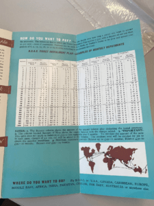
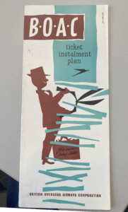
After initial research into this British Overseas Airway Corporation ticket installment plan brochure which dates back to 1960. The colours used throughout the brochure consist of brown, black and blue. There are san serif and serif fonts used throughout brochure with most of the more important information being bold and in a san serif font, making it more legible and obvious to the reader.

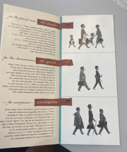
The brochure again hints at when it was dated through the use of predominantly male figures. The wording they use is also very ‘one gender dominant’ the last paragraph where it states ‘every man’. This clearly resembles a time similar to the 60s where women were seen as less than when compared to the man. This can also be seen in the images used where there is predominantly men.


While the colour choice is quite unique, using brown, it does still work effectively. The use of colour does not take away or distract the reader, it does rather the opposite and compliments the brochure. Although the use of colour has been implemented correctly, there are still a few issues that I had when looking through this collection piece. I felt the way that they presented the pricings for the ticket installments could have been presented a lot better than how they were originally. After first looking at the brochure I was hit with instant confusion, the way that the numbers have been presented.

Multiple shades of green

For Sophia’s logo trends project I was instantly drawn to the ‘Multiple shades of green’ theme. I chose this theme as it best resembles me as a person, being quite reserved, relaxed and very chilled. I wanted to show a sense of purity/naturalness in my logo and going off of the images that I had collated for my mood board it felt right to choose nature. I felt that choosing a more natural themed logo would be fitting as it fits with the green scheme and there is also a surge of a more ‘green’ approach to the way we live as people. It started off with a simple idea, by using photoshop tools I was able to duplicate a pattern of leaves which parts of it were then blurred. I then added a font that I found on DaFont, which I used my initials and name in design.


The Great Gatsby

Completing the first task for ‘making a penguin’ was straight forward due to video tutorial. I enjoyed setting the typefaces and manipulating the tracking, leading and the horizontal and vertical scales. I will be able to use this new approach on how to set up words on a page to make using InDesign a much easier process. The part that caused the most difficulty was when making the ‘cartouche’. At times, when trying to manipulate the pen tool I would need to go back and re-adjust slightly. After a while I became accustom to this and the whole process was easier. I would then go on to use these same techniques that I had learnt on my next book cover that I designed.


Penguin Book Cover

The Shining

For my second design, I decided to base my approach around ‘The Shining’ and because of this I have added many nods to the Stephen King novel. I started by recreating the famous carpet that is seen in the hotel, this process was a lot easier than I initially thought it would be. I made the first initial shape and once that was made it was simply a process of copying the pattern. The font used for the title, author and the brief description is a very similar to the one that was used throughout the posters and book covers for the original. Room 237 has also been included. Although there are many nods to The Shining, I have also kept many of the Penguin book cover conventions. The ‘cartouche’ still remains and the original page layout has also been kept the same. I decided to change the penguin logo, on this cover the logo is white making it slightly more legible to the reader but I still feel like this could be improved upon.


Drain Covers and Raised Lettering

I decided to focus on drain covers and raised lettering while out taking photographs. I was interested in the way that the text on the covers had been formed. There is also some signage in this collage so the difference could be seen between the two different types of lettering.

Cambridge Institution

When deciding what brief to choose for Berta’s project I was instantly drawn to ‘staircase’. It was like I had the perfect book to do so, I decided to put my own spin on the project while trying my best to stick to the brief. The front cover is a man looking onto what seems to be nothing, for me this character was at the front of what was the ‘Cambridge Sanatorium’, which is shown from the first two photos.

From there you can see a clean descendance into the 7 floors of the Sanatorium, as you get deeper the darker it gets which is reflective of the on goings. As you get right to the bottom you start to see bars, showing the Sanatoriums darker secrets as it is actually more of a prison then anything else. The book itself is based on slavery so I used this as my reasoning as for why the man is being moved down the ‘hospital’, it is because of his race instead of whether he is ill or not. As a result of this I decided to stick racial slurs right at the bottom of the staircase.

Philippine Skateboard

Tristian was my partner for todays session, the three facts that he gave me were;

  • He is half Filipino.
  • He likes skateboarding and used to do it.
  • He recently got into basketball and enjoys it.

I decided to go with a skateboard as the main idea. The Philippines flag is also incorporated on the board. My random words were Eyes, Bee and Army. I decided to place eyes behind underneath the wheels as both the wheels and your eyes guide you. For the other two words I drew the patterns that most associate with the words.