Background
Huntercombe Prison have worked alongside Reading University’s typography students to create communication materials for the prisoners for many projects. Huntercombe is a Category C, foreign national deportation prison for adult males in Oxfordshire. The client wanted to improve the attitudes towards violence and make the inmates aware of the consequences in a clear, structured way that would be understandable even for inmates with poorer linguistic abilities. In order to ensure this, we collaborated with two English Language students from Reading.
Brief
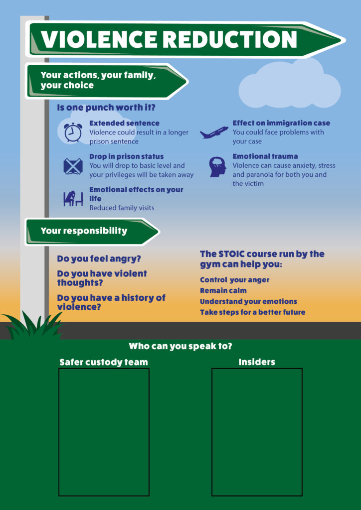
The brief for this project was to create an A0 printed poster on violence reduction which would replace an existing board of text heavy information that is regularly dismissed. The poster would aim to educate inmates on the importance of avoiding and resisting violence. Principally by explaining the consequences of committing such offences and provide information on who they can speak to in the prison for support or help.
Communication
All communication to the prison was done through Suzanne Portch, a teacher for the University’s Linguistics department who had previously worked at Huntercombe Prison. Suzanne supported us with the design of the poster and was readily available to answer any questions as communication to the prison is very slow. We also conversed with our supervisor about design and typographic features, though he admitted that most feedback about the suitability and content had to be done by the prison staff.
Visit to the Prison
On 30 January, we went on a trip to visit the prison to talk to the staff and inmates about what specifics they wanted from us. Upon our visit to the prison, both inmates and staff highlighted some features we needed to consider when designing the poster:
- No complex language can be used due to many of the inmates having very limited language skills.
- Inmates are not allowed to loiter in the corridors so therefore cannot stand and read the poster for a long duration of time.
- Prison staff mentioned avoiding colours and imagery of a stimulating nature.
- The inmates expressed a wish for the new design to be visually engaging as it is to replace the existing, boring notice board. This was made up of A4 sheets of white paper with large blocks of all-caps, black and red text.
- The correct prison specific terminology must be used.
- There must be an area of the poster not designed on, allocated for the staff to stick their own images on of people the inmates can turn to for help.
Development
After visiting the prison, the team discussed the angle we wanted the poster to take. The poster needed to explain to inmates how their violent actions have consequences, such as impacting time they are serving or having their privileges removed. However, we decided that the poster would aim to connect with the inmates on a more emotional level which would help them properly understand the consequences of violence in a more human context. During the visit one of the inmates had made a comment saying avoiding violence is a choice that every inmate can make. This decision not only has an effect on them, but their family too as visiting privileges could be removed, or more severe punishment may be implemented. We decided this is a really important message to convey, particularly as it was bought up by the inmates themselves. It was therefore decided that we use this concept of ‘choice’ to inspire the design and the direction we took not only visually but linguistically.
Both design students brainstormed and sketched out a few ideas and as we progressed made sure to compare and discuss our potential ideas. Together we decided on our two strongest ideas which we presented to the rest of the group [fig.1&2]. Ultimately we decided the signpost concept was more effective [fig.1]. Though this design does not directly illustrate violence, it focusses more on the idea discussed previously of the inmate having the ‘choice’ to take the correct path for them and their family. Though the second idea [fig.2] of the fist is more obviously linked to violence, the imagery has the potential to be inappropriate or even stimulating for some inmates. This could risk encouraging violent tendencies and having the opposite result to the purpose of the poster.
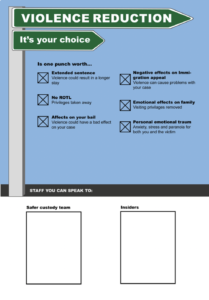
Sign post concept: Representing the idea of choosing the right (non-violent) path.
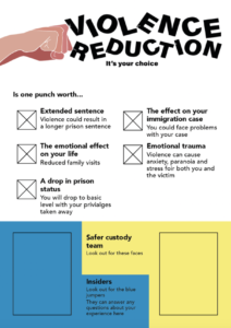
Punching concept: Fist punching the text, symbolising the idea of breaking the norms.
To combat the poor language skills of some inmate’s and the fact they cannot loiter, we tried to use as little text as possible, in the simplest terms. This was challenging however as we were required to use the correct terminology. Therefore, in order to aid understandability of more complex terms we experimented with the use of icons. We designed them as simply as possible, so they were easily recognisable yet conveyed a lot of meaning. As the poster is so big there was room for the icons to have some detail and still be clear. Meaning the finished icons were both useful and visually interesting. We experimented with colour pallets to see what worked best for the text and icons to be most legible. Eventually deciding on a background colour scheme representative of a sun setting, which was chosen due to the calming manner of the tones. The text is largely set in navy blue as this colour is dark enough to be legible but not too harsh against the background.
In a further effort to increase readability we had to carefully consider the typeface used. During research we looked at typefaces used for education purposes that are highly legible, created for children who are developing their language skills. We considered using one of these to improve the readability of text. However when testing these typefaces found they were too juvenile and considering the subject matter and the adult audience would be inappropriate. The font we used for the final design is a bold sans serif typeface called FatFrank Heavy. This font has a similar feel to the educational ones we researched as it is quite thick, rounded and clear, yet it is not childish.
Working with linguistics students presented some challenges as well as benefits. It was useful to have more people with ideas and to get feedback from, but their job was far simpler and at times felt unnecessary. However, it was good to get experience working with and organising a team of members from multiple disciplines. Particularly as we gained valuable skills in communication both with clients and team members who are not designers.
Final design
The poster aims to make the prisoners think twice before lashing out or getting involved with violence. We hope this will make them consider the consequences and result in a reduction of violence at Huntercombe. The use of colour and imagery will make the poster stand out from the dull prison walls meaning the information is more likely to be read and absorbed by the inmates. We placed A4 rectangles at the bottom of the poster where images of staff members can be stuck who can support the inmates in dealing with violence. Having these areas blank mean that the images can be easily changed so the poster does not go out of date so fast. In comparison to the existing notice board of text heavy sheets of information, this poster embodies that same information in an interesting, calm manner that is useful and understandable for the inmates.
Feedback
Once the poster was finished, we had hoped to go and visit the prison again to showcase the design and receive feedback from the staff and inmates. However, due to complications with COVID-19 we were unable to deliver it in person. Despite this we still received positive feedback from Suzanne who thought the emotional direction of the poster was thoughtful and more beneficial for the prisoners. In addition, the overall design succeeds in presenting violence in a calm manner and bringing an element of colour and life into the prison. The feedback implies that the poster will be effective in this way and benefit the prison in tackling violence.
Conclusion
We found that working in a team of multiple disciplines was challenging at times, but it gave us the opportunity to learn communication skills and the importance of properly organising a team. We learnt that working with people other than designers means adjusting the design process slightly and being sure to articulate ideas and concepts as well as possible.
In terms of difficulties we faced when designing, tackling prison terminology was challenging, especially for programmes that are specific to Huntercombe. For this we communicated a lot with Suzanne, who had some knowledge of this, and the prison staff who were very helpful and ensured that the information on the poster is accurate. This element of the process was a good experience of designing within strict constraints, considering the appropriateness of all design elements and keeping good communication with the client.
We found that talking directly to the inmates was the most effective way to discover how the audience would respond to the poster. Male prisoners with limited language skills are an extremely niche audience to design for, meaning we had to consider things that other projects simply never present. By talking to the inmates, we learnt about prison life, the rules there, and how some inmates manage their mental health in an effort to avoid situations of violence and other offences. The group of inmates we worked with were of the highest level of education and comprehension who explained that they are more conscious of getting out of prison to see their family than committing any violent act. However, they explained that this is not the case for all prisoners and that is why this poster is so essential. This experience was extremely insightful and gave us an opportunity to design something that has the potential to educate and make difference to someone’s life. Encouraging and informing someone who has made mistakes to make good decisions and take steps for a better future.