Author: Jason Yung

Typography Publicity Team

The Brief
During the end of my first year in Reading, I had invited to be part of the publicity team of the Typography & Graphic Communication department. I have always enjoyed sharing my stories and updates on social media, which I thought it is an excellent opportunity for me to develop my communication skills through this position; therefore I have taken it as my first real job.
The job aims to increase students’ engagement in the department’s events, showcase student’s work to the public, and enhance the public recognition of the department by providing a global platform. Roles included blog writer, event organiser, event photographer and marketing material designer.

The Client
Our team has the same lecturer as both our client and supervisor. As I am not a talkative person, I rarely gave opinions throughout the first few meetings with our client and fellow teammates. However, I started expressing my thoughts more after, and I noticed the importance of having every member of a team to speak up. Even if my idea were not impactful, it would lead the team to discover other possibilities when solving problems.

The Process
We first started by having a job rotation system, but shortly, we have set specific roles in order to smoothen the process. During the whole experience, I did mostly event poster designing and some event photographing. As I am away in the second half of the year, I had decided to help the team a lot in the first term, especially for the Wednesday department events, since it is impossible for me to take part in the events in person. Therefore, I volunteered to design all the posters and social media graphics for the events in the first term solely, with one poster created as a group.
The most memorial task I did was to write a blog to share my study abroad experience and to promote the opportunity for future students. The blog is written in a weekly format and in both English and Chinese, along with photos featuring throughout the blogs.


The Challenges I Faced
As each event has only a short preparation time, there are always sudden changes in the plan. For example, once I was in charge of the poster making for an event and I was told to change the poster design the day before, which this frustrates me. However, after these experiences, it trained me to work better in the real world, where schedules can be changed in a sudden.
For the study abroad blogging task, as my supervisor and I have not set an exact deadline before the end of term and I seldom check my university email during the summer break, therefore, I have missed the deadline my supervisor wanted. At the end, I wrote the blog in English, Traditional Chinese and Simplified Chinese and published them as soon as I received my deadline. This experience taught me to check my email daily to prevent creating any problem.

The following link is the English blog I did to promote the study abroad program: http://typography.network/2018/08/09/study-aboard-at-monash-university-melbourne/

The Experience I Gained
I have gained confidence in my graphic design skills through this real job. I still remember our team has to create the first event poster and refine the existing template few days before the event, which I volunteered to fully in charge. After showing my design draft to my supervisor, he was happy with the outcome, even though it was just the first draft.
Even though it is not the first time my designs have been used by real clients, as the posters are stuck throughout the department hallway, I felt delighted and happy every time I passed by them.
I found myself good at finding supporting images and creating designs in a consistent style as well. Since we have a fixed template for the event poster, all we need is to find the appropriate supporting images and edit the title and headline. Both elements have to be consistent with the posters that were made previously. However, I seldom have to change the supporting images after my first draft.
Moreover, with the blogging task I did, it helped me to practice my writing and improve my translation skills. I have learned how to impress the readers, who might not know me in person and the program in the first state, but still willing to read my blog. The content choosing and placement have to be well considered, as it would affect readers’ curiosity.


Final Reflection
Lastly, I would like to thank James. He is not only my supervisor and client but also the one who chose me to participate in this real job. As I have learned a lot throughout the process, even though I could not help much in the second half of the job, I pushed my limit to help my team in the first half and the blogs at the end of the year.
If I could do this real job again, I would try to create a new template for the event posters and social media graphics. Even though the existing template is well designed, it has been used for the previous years, which it would be refreshing if a new template is used.
To conclude, it was a fantastic experience to be a student publicity officer in this department. It broadens my future career as it provided me practices of designing marketing materials within a short period, and strengthen my writing and other transferable skills.


References:

  • http://www.reading.ac.uk/research/themes/theme-heritage-creativity/rd-typography-and-graphic-communication.aspx
  • https://www.penguin.co.uk/books/571/57191/down-and-out-in-paris-and-london/9780141393032.html

Empiribox Science Education in Schools Poster Designs

The Brief
My second real job was to design posters with numerous illustration for Empiribox Ltd, a nationwide primary school science provider. My team was first started with two members, and one additional member has joined the team after my departure to exchange.
The job aims to let the students discover science excitingly and enjoyably, broaden their horizon in the field of science, informing parents about science-related careers and positive impact of science education.

The Client
The first client meeting went well; we were able to understand a lot from the client side, including their needs and expectations. As our supervisor, Alison Black, was not able to join us for the first client meeting, we have met her separately. Alison is a researcher on user-centred design; she shared many suggestions on how different users will interact with the posters, and how complex should the posters be. We have started writing our restated brief right after the first client meeting, as we wanted to have a fresh mind on what we are supposed to design.
The overall idea is quite straightforward; we have to design 24 posters in total, which has changed to 12 later in the project. However, we have faced challenges in identifying the categories of the posters. As there are three subjects in science, and there are two different poster types with different audiences and functions, we were confused at first. In the end, we have solved the problem by making a table on dividing the posters, in order to make a clear mindset.

The Process
In the pre-production process, we have made a few mood boards and initial sketches on the cartoon illustration and poster styles. In particular, I have researched both the general and science-related illustration and posters, in order to gain creative ideas throughout the process.

Mood Boards:


Layout Sketches Examples:


After our client has chosen the style that we should pursue, we have started on designing the main elements, including the layout, mascots and main scientists. I have designed all three mascots for different categories before my exchange program starts, and I am grateful that my mascot designs were chosen. With the layout, three of us have proposed different ideas to our client, and we all have decided on the most user-friendly one.

Mascots:


Illustration-wise, since my style is different from team members’, we started by separating the illustrations into three categories and each of us in-charged one each, while Fay helped to edit all the illustrations to the same style. However, after my departure from the United Kingdom, it was difficult for us to meet up and unite the illustration style. I have then gradually shifted from working on the illustrations to the fonts, header, footer and layout, in order to smoothen our progress.

Illustration Examples:

Moreover, since I have more experience with the Friday real job meetings than my partners, which they were new to it, I know the process quite well. Therefore, I prepared on the issues to discuss for the first few meetings.
At the end of the real job, we have designed 12 A2 posters with numerous illustration. Although the company ended up not using the posters as they wanted to change the brand direction and the poster concept, our illustrations have been featured on their website. It is a grateful moment when we saw our design used in real life.

The Challenges I Faced
I have learned that it is a hard task to work as a team when a member is away. Even though I enjoy creating cartoons, I still have to consider my team members and the outcome of the project. At first, we are working on all parts together, then we have separated our specific role, in order to smoothen the process.
On the other hand, the communication between me and my team members has been affected during my away. It is mainly affected by different schedules, deadlines and time zones. My members did not reply my messages often; as I know they have tight deadlines in Reading, I frequently approached them that I can help on aspects outside my role, but their replies were always delayed.

The Experience I Gained
I am not confident to use illustrator to illustrate before this real job, as I found illustrating digitally is quite difficult. However, I have gained confidence after forcing myself to apply to this real job. I found it is always good to challenge ourselves, in order to strengthen ourselves.
Also, I have learned to approach our client proactively. Since my departure to the study abroad program and my team members might be busy with the coursework in Reading, we have less contact with our client in the second half of the year. Therefore, as we wanted to provide a more professional look to our client in year 3, we emailed and called her proactively. Unfortunately, our client’s company has been rebranded, and she only needs the illustration, but not the posters.

Final Reflection
Even though there were many difficulties during the process, I have learned a lot from this real job, which could help me to develop my communication skills, such as contact both of my co-workers and client proactively, provide updates to people in-charge progressively, and the way to deal with unexpected situations.
If I could do this real job again, I would set and follow a more detailed schedule for my team, my supervisor and our client. To conclude, it is still an amazing experience to work with my members, supervisor and client, especially seeing some of our illustrations are used in their brand.

Final Design Examples:


Mood Boards References:

  • https://www.flickr.com/photos/flopdesign/3600278534
  • https://www.radiotimes.com/tv-programme/ymy/horrid-henry/
  • https://peanuts.fandom.com/wiki/Charlie_Brown
  • https://hero.fandom.com/wiki/Mabel_Pines
  • https://imgbin.com/png/X6Ydiugh/sonic-mania-doctor-eggman-metal-sonic-segasonic-the-hedgehog-dr-robotniks-mean-bean-machine-png
  • https://homedesignersuite.co/top-3d-home-designer-for-your-perfect-home-design-project/
  • http://hasshe.com/cartoon-people-human-5c148cc58719620724a8bd54/
  • https://www.pinterest.co.uk/cupcakeshunshin/chibis/
  • https://cartoon-image7.blogspot.com/2019/02/attitude-boy-cartoon-images.html
  • http://clipart-library.com/boy-cartoons.html
  • https://www.pinterest.co.uk/pin/407857309975059109/?lp=true
  • https://www.freepik.com/free-photos-vectors/cartoon-characters
  • https://www.freepik.com/free-photos-vectors/businessman-character
  • https://www.vecteezy.com/vector-art/77164-cartoon-scientist
  • https://www.pinterest.co.uk/nnedv/positively-safe-the-intersection-of-dv-hiv/
  • https://www.shutterstock.com/image-vector/traders-going-down-trends-stock-financial-1247669584
  • https://www.shutterstock.com/search/mad+scientist+mascot
  • https://oceansciences.wixsite.com/core/single-post/2017/11/21/Share-Your-Science-Outreach-with-Dr-Laura-Good
  • https://www.behance.net/gallery/704035/Mad-Scientist-Illustrations
  • https://www.istockphoto.com/gb/illustrations/young-inventor?sort=mostpopular&mediatype=illustration&phrase=young%20inventor
  • https://www.iconfinder.com/search/?q=scientist
  • https://www.vecteezy.com/vector-art/160608-scientist-working-at-laboratory-illustration
  • https://www.clipart.email/clipart/girl-scientist-clipart-1418.html
  • https://www.amazon.com/Forces-Motion-Poster-Laminated-Full-Color/dp/B071LQQXYG
  • https://www.pinterest.com/accessbiomed/
  • https://www.pinterest.co.uk/dudley1700/
  • https://www.daydreameducation.co.uk/poster-light

Review of Daily Hazard Assessment

The Brief
My third real job was to design the Daily Hazard Assessment for the Met Office, which is the national weather provider in the United Kingdom. As the headquarter is located in Exeter, this job was communicated and delivered via phone calls and emails.
The job aims to improve user experience with current user research and testing. As the final product is for future design referencing and the organisation has limited resources with this project, the goal is to create an easy editing document with Microsoft Word that could be edited by any employees.

The Client
The first client meeting was communicated via phone call, and it went well; we were able to understand a lot from the client side, most importantly, the constraints from the organisation as they wanted an approachable and clean design that can be easily edited by employees who did not study design.
During the process, our client has been changed twice. Our first client had left the organisation, and it was handed over to a temporary client. However, it was handed over again to a new employee of the organisation, as he needs time to adapt his duties, our schedule has been pushed back. Our clients were so nice that they were willing to accept our request to end the project as soon as we could in order to submit this as part of our real job submission, and we finished all the materials by early May.

The Process
In the design process, we have first made initial layout sketches as the layout has considered the main issue to solve. With a clean and organised layout, it helps users to be able to identify their target information intuitively. At the same time, we had studied the user testing undertaken by the organisation. We have noticed the order of the information being seen, and the existing information order is not parallel. Therefore, we reordered them, starting from the maps, then summary and details, and ending with future issues.
We have tried complicated and fancy designs at first. However, we figured out the usability is lower with these concepts and layout. After discussing with our supervisor, we then focused on making the design as clean and clear as possible, with less decorative elements.
Afterwards, we have focused on refining the typographic issues, such as text length, rephrasing terms and copy editing. This is a new challenge for both of us as we were usually only correcting simple typographic issues like punctuation, readability and hierarchy with the provided text. We gave many thoughts on using the correct terminologies and erasing the unnecessarily needed sentences.
During the Friday real job meeting, we have also discussed our problem with our lecturers and getting comments from both our lecturers and fellow classmates. These feedbacks are useful as the document is for emergency use, which the first impression and intuition of the information are important.
My partner and I have consistently refining small details of the document in the later part of the project. As our client was happy with the layout and concept, we tried to refine the document as error-free as possible, in order to make the document to be used as smooth as possible.
In early May, we have called our client for the final phone meeting. Our client has expressed his joy in receiving our design, which he thinks the document we created would definitely help and influence his team for future document design. He also stated the clearness and linkage between sections work well, while the way we ordered the sections are well considered.

Initial Ideas Examples:


Developing Ideas Examples:


The Challenges I Faced
As this real job was promoted as a digital product, my partner and I thought it would be an app or website. However, we later figured out it is a word document that contains images made with powerpoint. Since we usually design fancy products with Adobe Creative Suite, this job is a challenge for us, as the aim of this job is to create a clean and approachable design with Microsoft Word.
Moreover, as we communicated via phone call and email with our client, sometimes we might not receive their reply as quick as we wanted. Therefore, I have learnt that we should approach our client proactively when we want a quicker reply, as they might have other duties to work on and lower the priority of this project.

The Experience I Gained
As we rarely use Microsoft Word as the tool to design, it is an exciting challenge for us. We had overcome it by the help from our supervisor and lecturer, Matthew and James. As images and text can be placed freely in Adobe Creative Suite, Microsoft Word has limits with this. This might due to the software’s target audience is the general public, while Microsoft aims to design the software with an approachable and fixed setup. Since most users used Microsoft Word as a text document, images have to be locked to prevent moving along with the text, while text should be placed in a table in order to create a less problematic file for our client for their future use.

Final Reflection
Even though there were many challenges during the process, I have learned a lot from this real job. For example, as our client is working in a big company, the volatility of its employees and department structure change are high. As a designer, we should expect sudden change and allow more time for them to give us replies and comments. In addition, the employees might have many duties to follow up; the priority of the project might be affected as well.

Final Design:


Study Aboard at Monash University, Melbourne

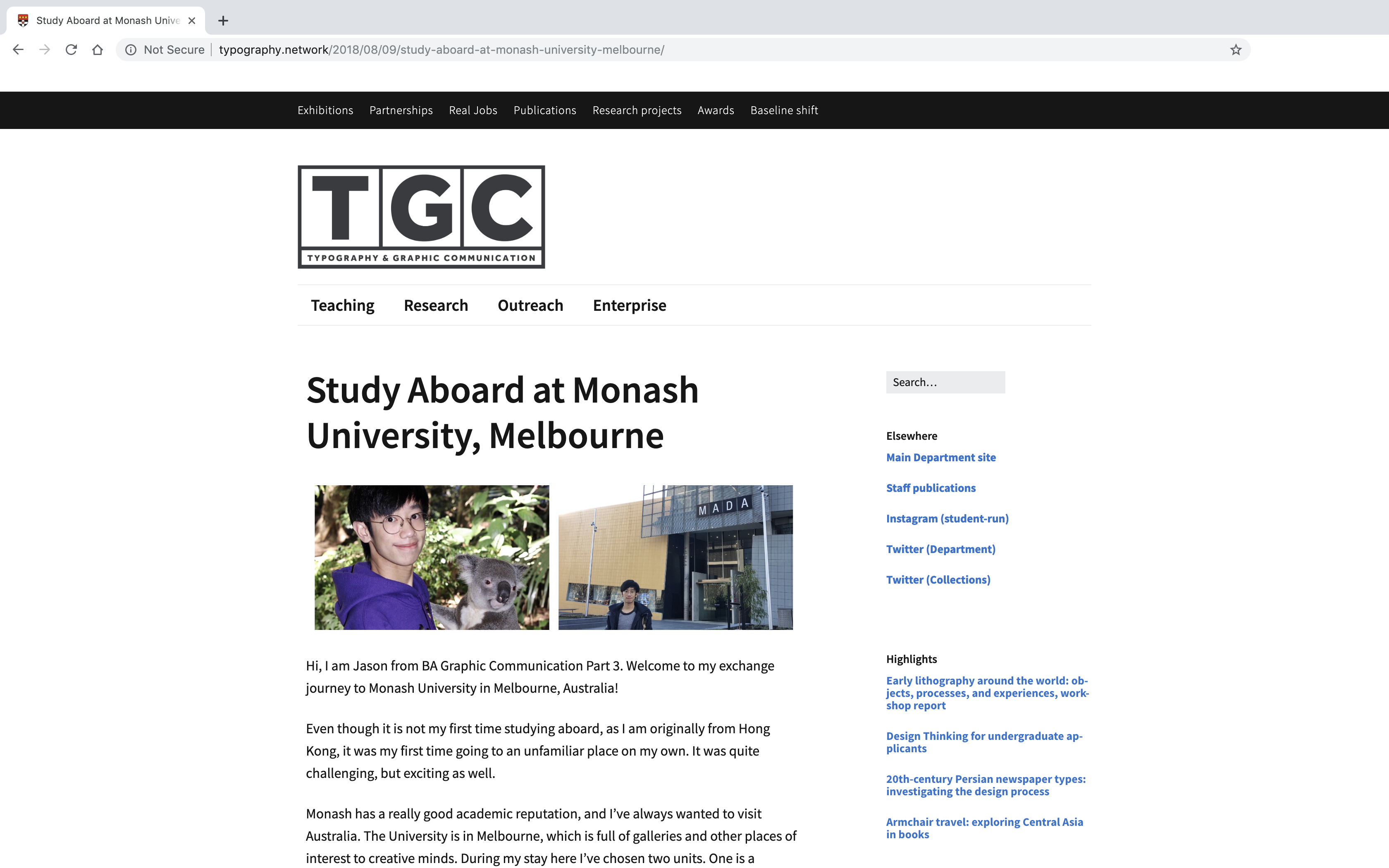
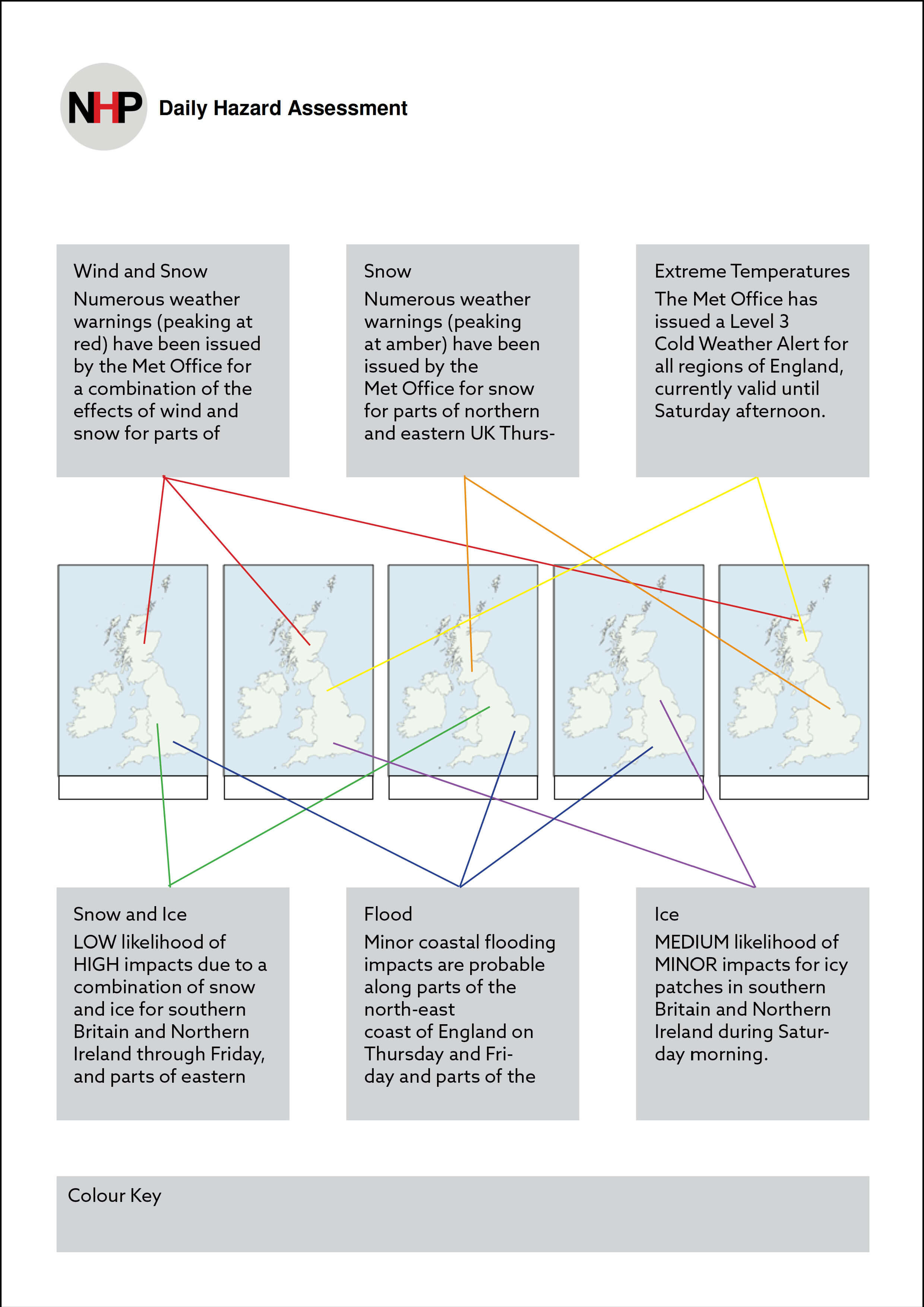
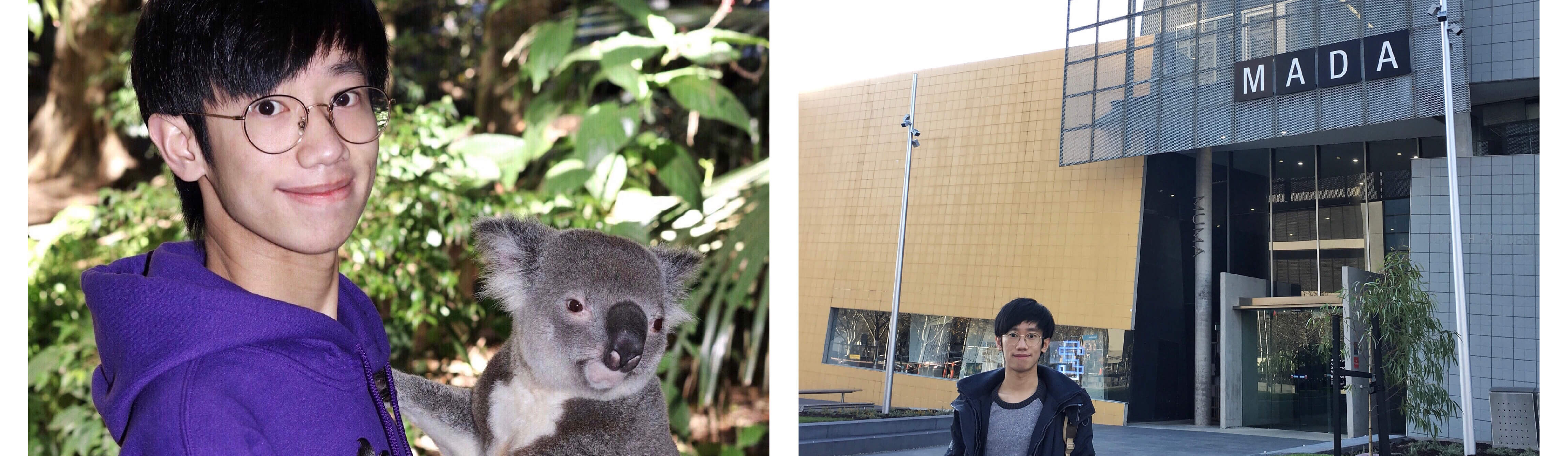
Hi, I am Jason from BA Graphic Communication Part 3. Welcome to my exchange journey to Monash University in Melbourne, Australia!

Even though it is not my first time studying aboard, as I am originally from Hong Kong, it was my first time going to an unfamiliar place on my own. It was quite challenging, but exciting as well.

Monash has a really good academic reputation, and I’ve always wanted to visit Australia. The University is in Melbourne, which is full of galleries and other places of interest to creative minds. During my stay here I’ve chosen two units. One is a Communication Design Studio with UX workshops, and the other one is Illustration to Animation. The main reason to choose both units is to get more exposure to the digital aspects of design. Anyway, let’s see what have I done at Monash University for almost 17 weeks.

Week 1 (12–18 Feb)
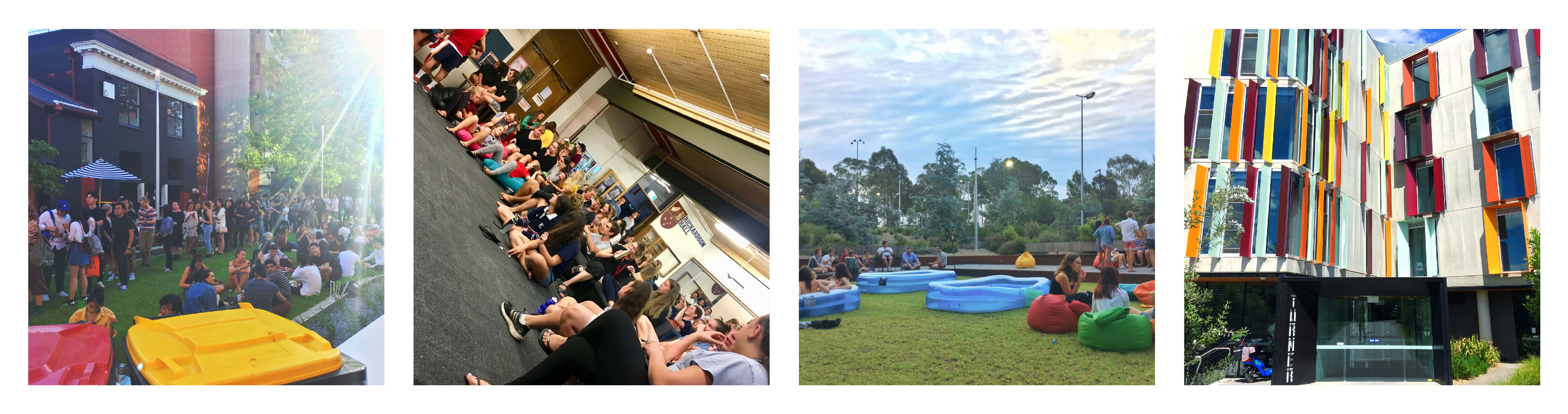
The first week in Australia can be described as the most tiring week, physically and mentally. I have to set up my new room, completed lots of documents and forms, and attended all different kinds of orientation events. However, I felt so blessed to meet my first batch of friends from my exchange journey. We met in all different kinds of events that were made for exchange students, and so we are really globalised – Thai, Canadian, Malaysian, Chinese, Hungarian, Korean and Danish.
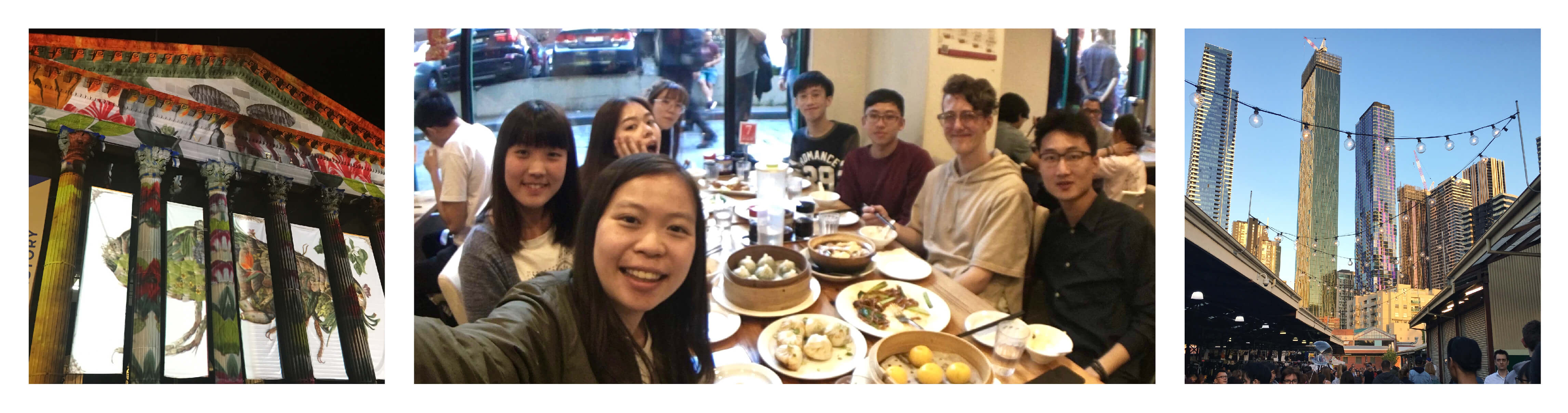
On the night of Saturday, we have been visiting the White Night in Melbourne CBD, which is an event to showcase interactive art pieces around the city centre. It was a new kind of experience for me, as I have never imagined an art show can be held throughout the whole city.

Week 2 (19–25 Feb)
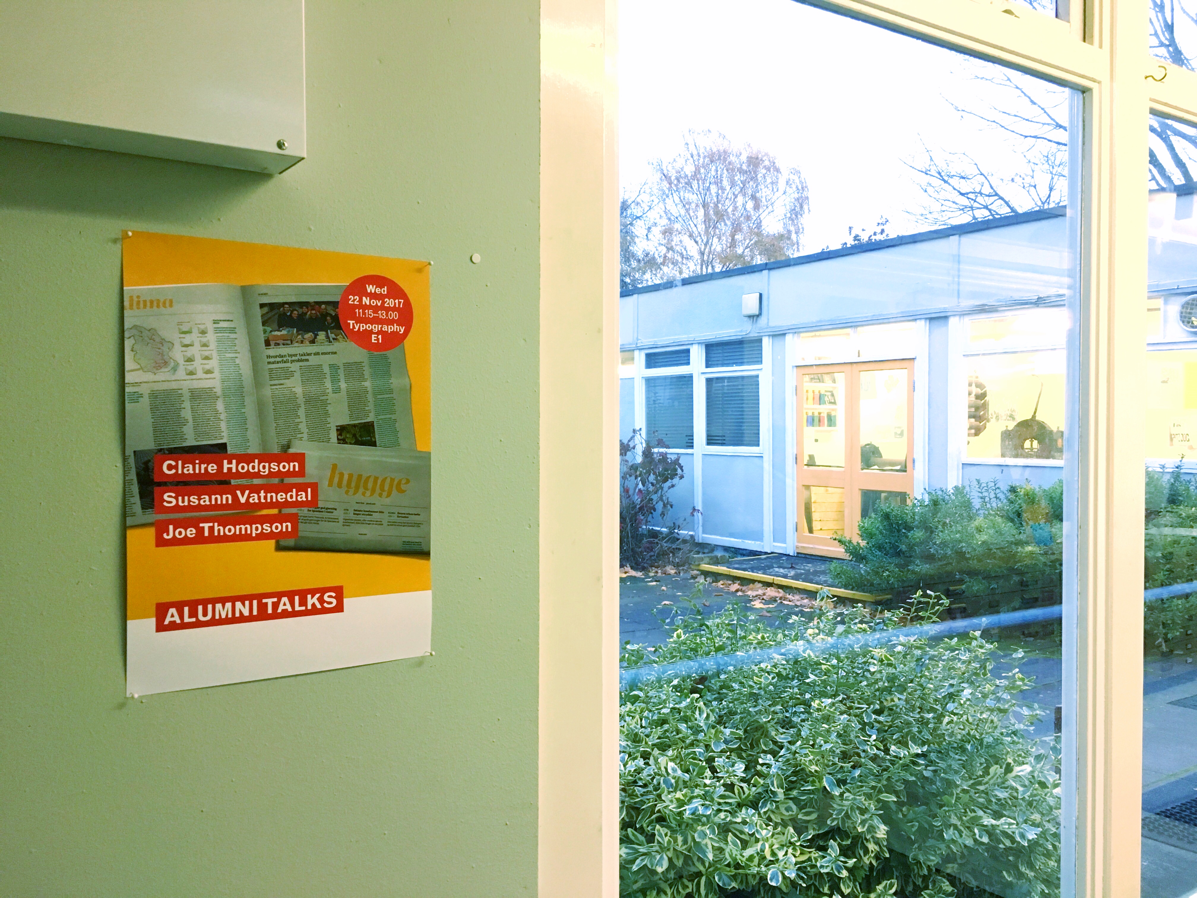
The second week was the orientation week for all students. Not only there were events from each subject department, but the accommodation halls also held events, including carnival and talent night. In the meantime, I have walked around Clayton, where the main campus of Monash is located. Even though it is quite far away from the CBD, buildings around are very unique as well. This shows Melbourne is really a creative place.

Week 3 (26 Feb–4 Mar)
This was the first week of class, which was one of the exciting parts of the journey. From my past education experiences in the UK, Hong Kong and South Korea, design classes have been taught differently in different places and cultures. Design classes in the UK tend to follow the traditional methods of creating designs, Hong Kong loves merging different places’ designs together, and South Korea likes to combine futuristic designs with traditional art.
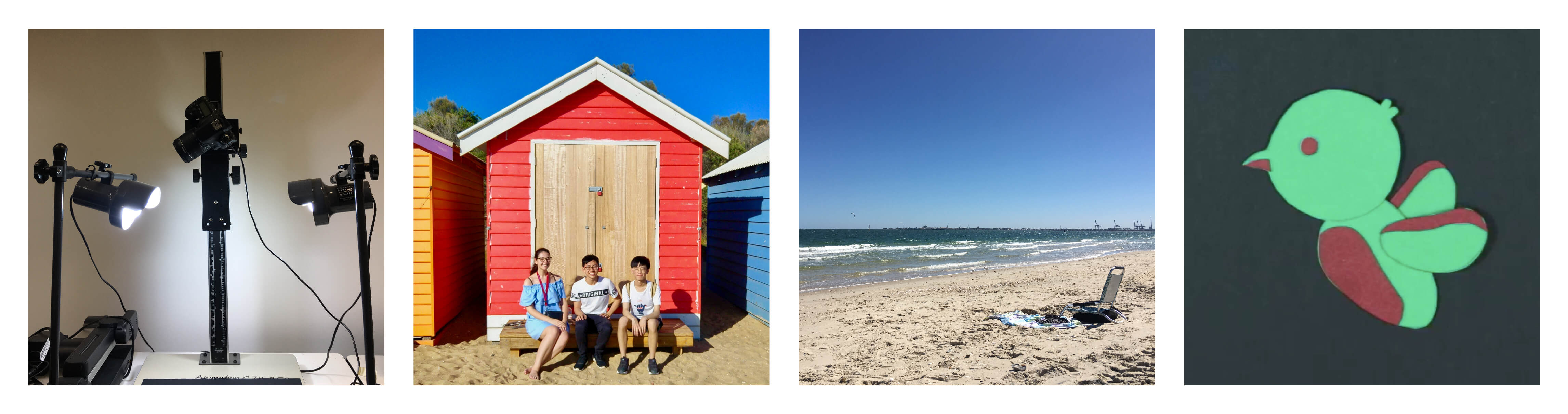
The size of class is also different comparing Reading and Monash. In Reading, we have around 40 students per year, and there are around 150 students per year in Monash. One of the most memorable class activities that I did this week would probably be the paper cutout animation. It was my first time doing it and making a character-based animation.
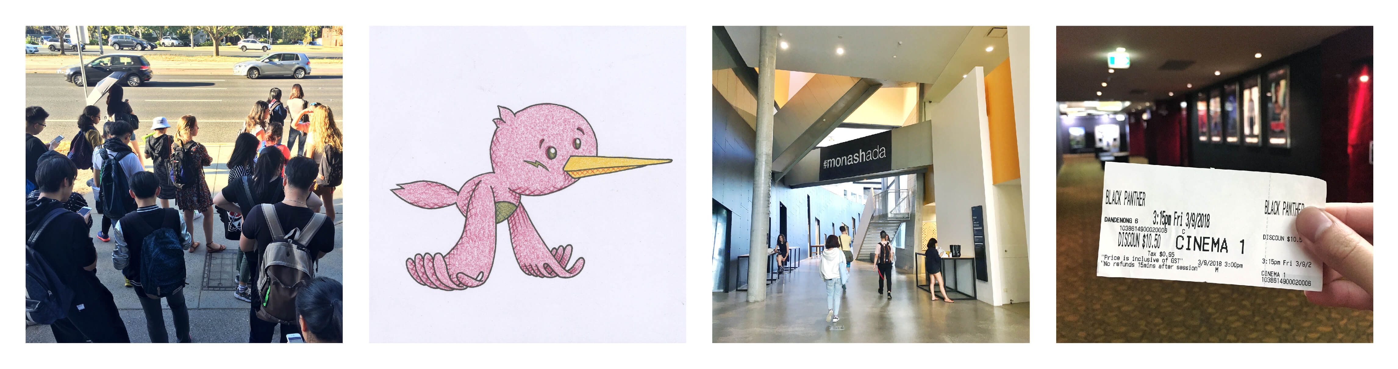
Besides having my first week of class in Monash, I have been to my first beach in Australia, the St. Kilda Beach. As I visited the beach on a weekday, there were extremely few people on the beach, which allowed me to take some good landscape photos.

Week 4 (5–11 Mar)
In the second week of class, I have already got used to the long hours per session. Each session takes 4 hours at Monash, However lessons in Reading are usually around 1–2 hours each.
The moment when you finished lessons, there is always a challenge waiting for you – the rush for the bus. Students have to take a 20 minutes bus ride to the dormitories. A bus waiting game will start right after 6 pm, when most classes end, and many students will run to the bus stop and wait for it.
The first assignment to hand in was a UX diary recording for the fitness app that I have to enhance. Basically, I have to write down the UX structure of the app, rate them and determine which functions are more useful and which are less.
To relax, I watched my first movie in Australia, which is the Black Panther. As our campus is quite far away from the CBD, me and my friends went to Dandenong instead, which can be described as the little India in Melbourne.

Week 5 (12–18 Mar)
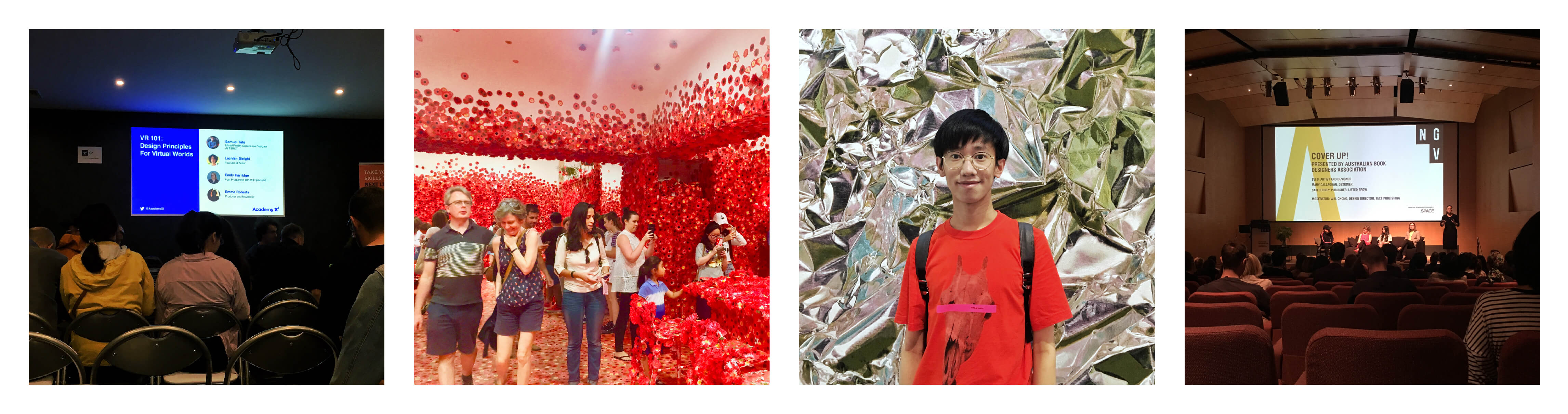
Week 5 can be described as the most artistic week. Firstly, I have visited the National Gallery of Victoria. Triennial was exhibiting during that time, which is famous for the Flower Obsession piece by Yayoi Kusama. On the same week, Melbourne city was hosting the Melbourne Design Week, where many design agencies, galleries and studios were giving talks, guided tours, as well as Design Week exclusive activities. Therefore, I have attended a VR related talk that was held by Academy Xi, a company that provides design training, as well as taking part in some other exclusive activities.

Week 6 (19–25 Mar)
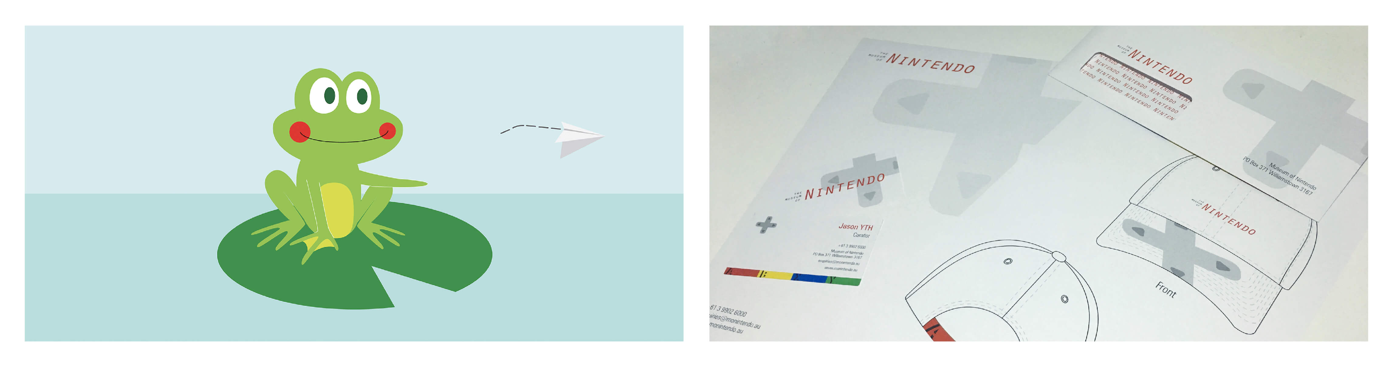
My first Communication Design Studio brief to hand in is called Museum Identity. Students have to brand a fictional museum, which I have chosen to brand the Museum of Nintendo. In Reading, students will usually print their projects within the department building. However, in Monash we print our project in the printing store. As it was kind of a new task for myself, I did struggle a bit at first. Since I have to prepare my own paper stock as well as a ready-to-press file and take around an hour transportation to the city centre for the print, it took me a whole afternoon to get my final product printed.
On the other hand, I have created a looping animation for the Illustration to Animation course. For my animation, I have made a frog that throws a paper plane and it returns from the back. The whole animation is made in Photoshop, which was also new to me, as I have only tried creating animations with After Effects.

Week 7 (26 Mar–1 Apr)
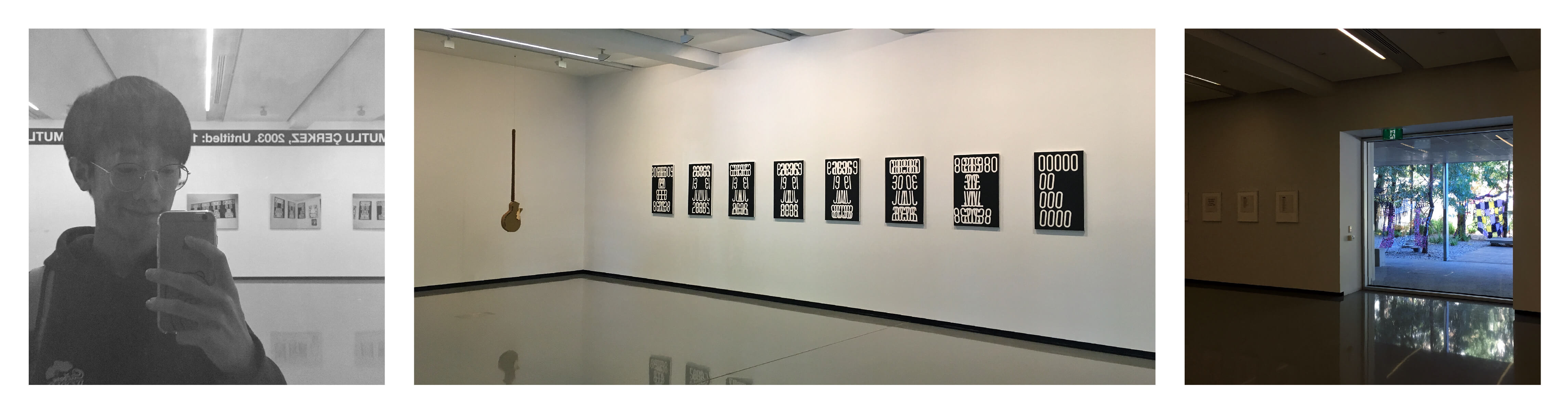
I have visited MUMA (Monash University Museum of Art), an Art gallery that operates by Monash University. It not only showcases students’ works but also opens to public artists. I really like the gallery concept of letting students visit the gallery after classes or during their free time.

Week 8 (2–8 Apr)
Week 6 in Reading is a reading week. However, the equivalent week in Monash is a mid-semester break, which is a week off. There is no activity specifically for the week, but students might have deadlines after.
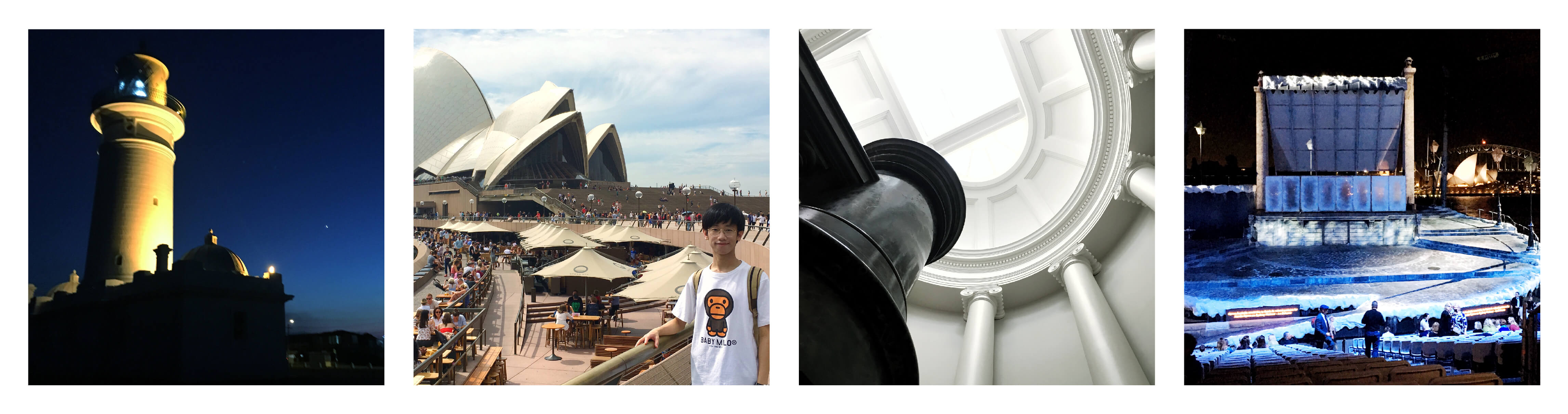
During this week, I went to Sydney for a few days to visit my high school friends, who are currently studying over there. During the stay in Sydney, I have visited a few art galleries, including the Museum of Contemporary Art, Art Gallery of NSW, Art Space, as well as the Power House Museum. And of course, I have watched an opera since Sydney is famous for it. However the opera was held on the harbour, but not in the Opera House. After this short trip to Sydney, I felt not only Melbourne, but Sydney is also a really artistic place, where you can feel the creative atmosphere throughout the city.

Week 9-10 (9-22 Apr)
After the whole week of mid-term break, I have quite a few deadlines. Around this period of time, resubmissions deadlines for Reading are also coming. Therefore, I mostly work on them in these two weeks.
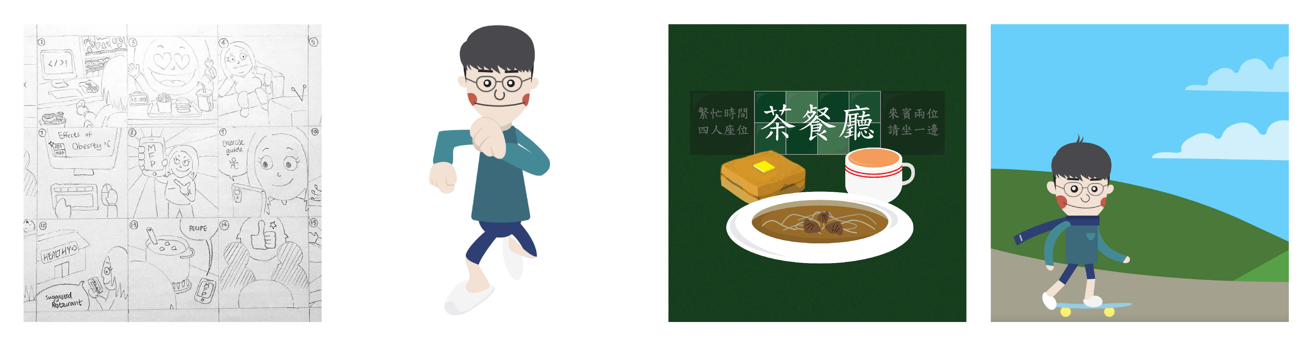
I have submitted the second brief for the Communication Design Studio, which I have produced an online archive with Squarespace, with nine images for three categories of Hong Kong cuisine. Moreover, I have done a few Adobe Animate and After Effects tutorials. These helped to equip me with the basic knowledge of animation, especially Adobe Animate, which was new to me.
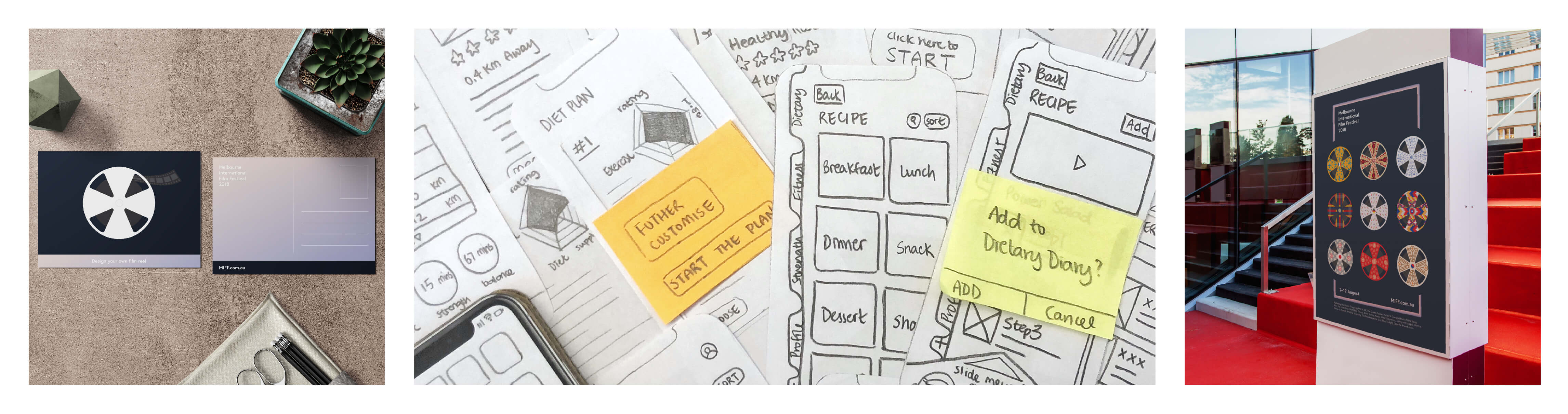
I also handed in two tasks for the UX workshop. The first one was a pre-production report that includes persona, scenario, user flow diagram for the fitness app that I have to enhance. The second task was creating a paper prototype, which we will test it in front of the class with the lecturers. I have done both tasks in a similar way back in Reading, and so I am quite familiar with the format and the aims of doing these.

Week 11 (23–29 Apr)
After the resubmission for Reading and my third Illustration to Animation brief, which is to create a storyboard, visual concepts and animatic for a fictional animation, I have treated myself a pop concert that held in the Melbourne Convention and Exhibition Centre. Even though I have watched the performance in Hong Kong before, the atmosphere is totally different here in Australia. It might due to the people here are more energetic and higher in spirit.

Week 12 (30 Apr–6 May)
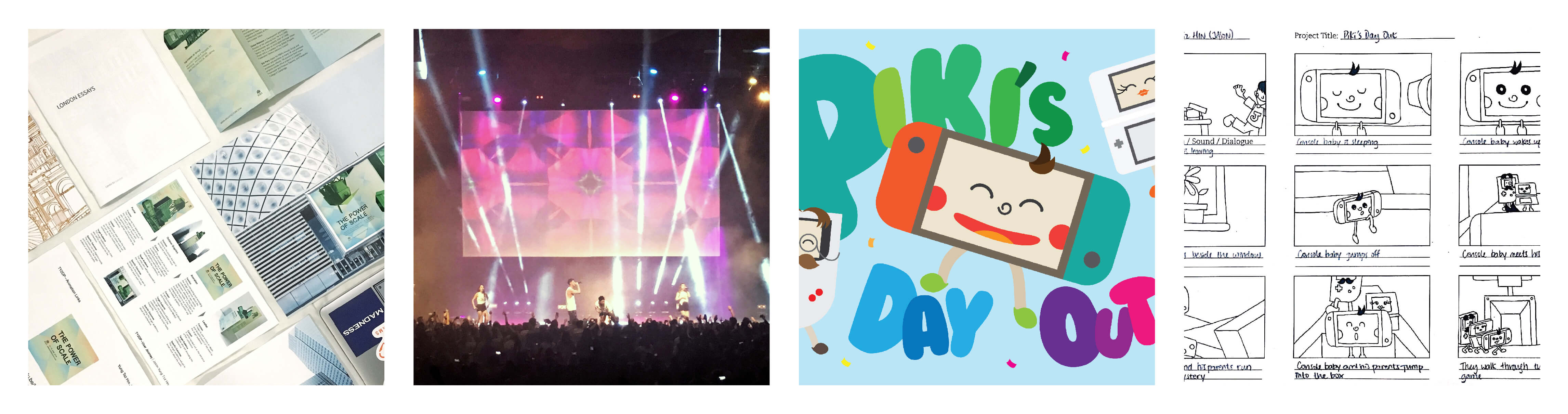
In this week, I have submitted the third Communication Design Studio brief, which I have designed a big and a small component for the Melbourne International Film Festival. The aims are to think creatively across both large and small items and explore the potential of the big item as a powerful contribution to our contemporary visual landscape. After the submission, I have decided to join the Adobe Design Achievement Awards with this piece.
(Update: This piece is a semi-finalist for the Commercial—Print/Graphic/Illustration category.)

Week 13–16 (7 May–3 Jun)
It is nearly the end of the semester, which means deadlines are coming. I have to work on a few deadlines, including 2 briefs for the UX workshop, the last studio brief for Communication Design Studio and a final full narrative animation project for the Illustration for Animation course.
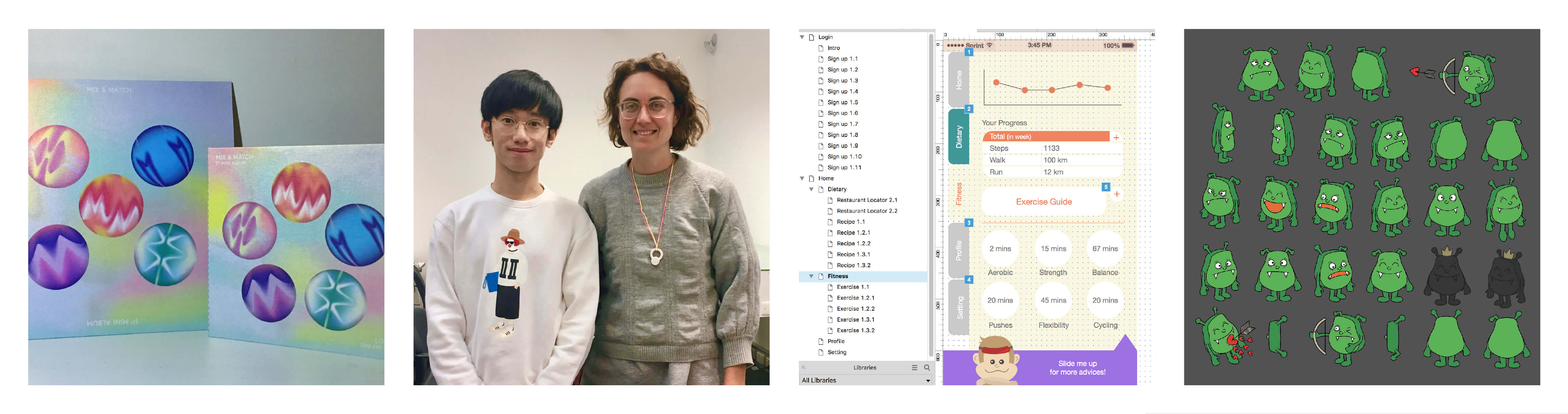
On week 13, I have submitted my app wireframe for the UX workshop. The wireframes were made with Axure RP. This is different from my previous experience of creating wireframes, as students in Reading will usually use Sketch and InVision.
Week 16 was my last week of class. The classes were mostly consulting on our final briefs, with lecturers giving feedback to students one by one. To help me remember this experience in Monash, I have taken photographs with the lecturers and said a big goodbye.

Week 17 and so on… (4 Jun and so on…)
Although I do not have lessons this week, I have three deadlines in total. The first one is a full narrative animation with our own concept and idea. The other one is exploring typefaces with sound and music, and I have designed an EP sleeve, CD cover and Spotify thumbnail for the album ‘Mix & Match’ by LOONA. The last assignment is designing the UI for the fitness app, along with the A/B testing. Therefore, I have designed two app prototypes, equipped with fully designed UI.
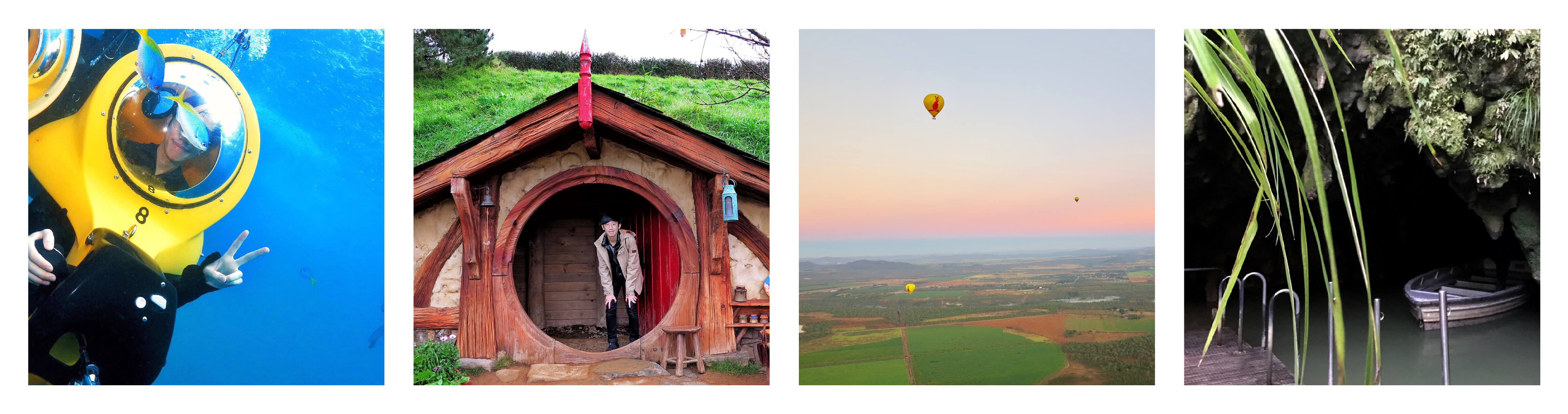
Even though the lessons here are over, it is actually the start of further exploring Australia, and beyond. I met up with my family and we went to places including Brisbane, Cairns, Gold Coast and even Auckland in New Zealand.

After the whole exchange journey, I feel like students at Monash have more freedom to decide what to design. They really push students’ creativity to the maximum and apply many artistic decisions into their design pieces. However, students in Reading is more like being taught to survive in the market. It provides training and knowledge for students to become an outstanding graphic designer in the future.
I really enjoyed the whole exchange journey and did not regret at any moment. I really encourage fellow students from the future years to join the study aboard program and choose somewhere you have not yet been to. Even though you might struggle a bit at first, you will experience things that you would not expect. Good luck with your journey!

Jason (Yung Tsz Hin)


Mockup Credits (Week 12):

  • Postcard Mockup—https://www.freepik.com/free-psd/realistic-postcard-on-desktop-mock-up_1188830.htm (Designed by Freepik)
  • Poster Outdoor Mockup—https://sellfy.com/p/qKab/