Brief
To create a monogram, a graphic representation of your name. Develop ideas of ways your first initial could transform into your second initial – a metamorphosis.
Process
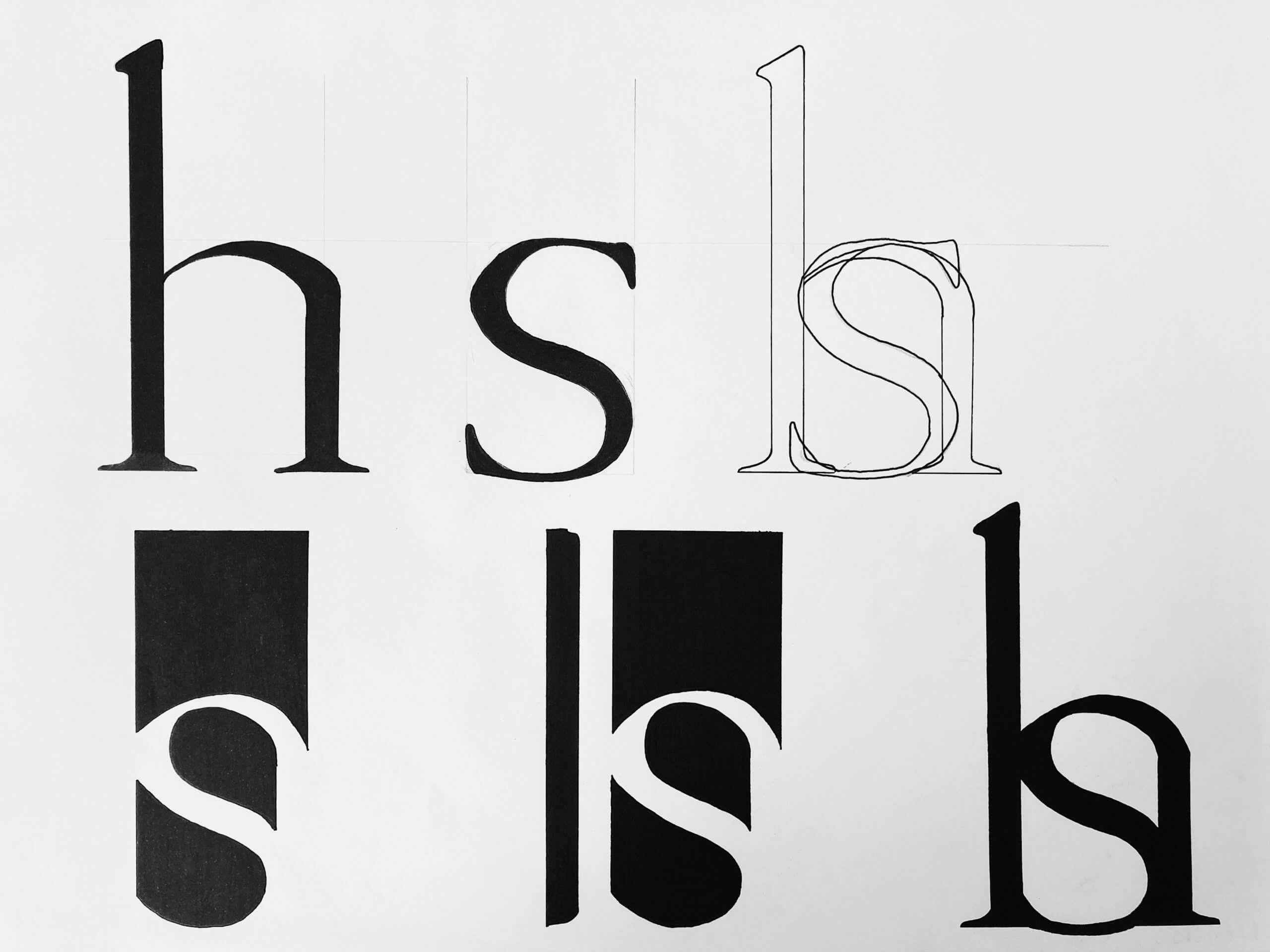
We had the choice between Futura (san serif) and Garamond (serif). Though I began open to both fonts, I was drawn to Garamond because I really like the added detail in the serif and found that the letters created more interesting shapes to play with. My early ideas were playing with the H and S in capitals, however I quickly found it was hard to blend the two together. Therefore I explored the option of using the lower case of each of these letters.
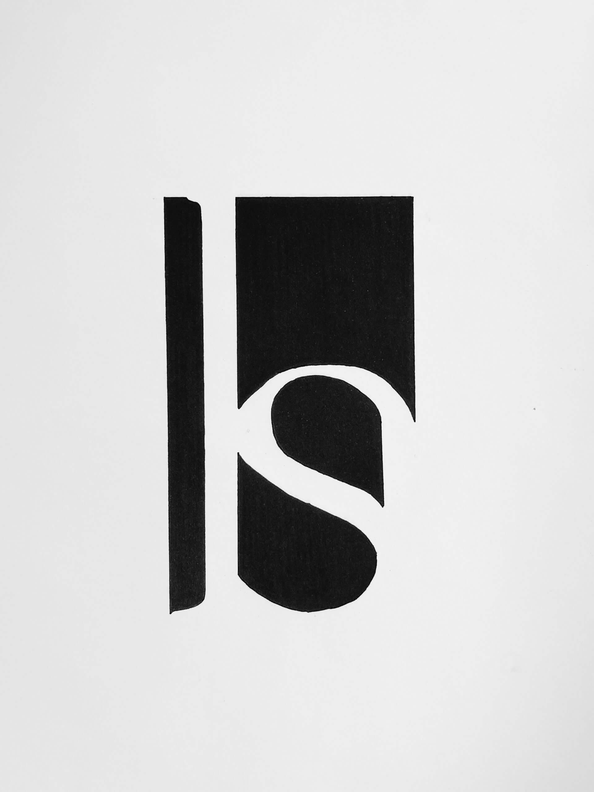
Garamond is quite a round font and so when I put the lower case ‘s’ inside the lower case ‘h’ I found they blended really nicely. I had thought I’d need to scale down the ‘s’ for it to fit the ‘h’ counter but both letters were consistent with the x-height so no alterations in size were needed. Once paired, I thought it would be interesting to play with the negative space as a means of forming the monogram. My idea was to keep it quite simple and minimal but my first draft proved to be too abstract for this brief. The ‘s’ was the only prevalent letter. To rectify this I added a rectangular block to represent the negative space to the left of the stem belonging to the ‘h’, this gave me the opportunity to display the serifs.
Another modification which increased the readability of the ‘h’ was that I decided to follow the shoulder of the ‘h’ rather than the ‘s’. This is why the top of the ‘s’ is thicker than that at the bottom. However I think it works well in this design as it blends the two letters together nicely and is not too noticeable.
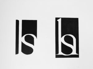
As a final exploration I wanted to experiment with adding a matching block to the right side of the monogram, to mirror that of the left. I did this because I wasn’t sure if it looked unfinished having it on just the one side. Adding the second bar however created a black box around my monogram and in some ways made it too obvious. It gave the whole shape away. I really like in my final monogram how you get to look for the finished shape a bit. The eye is taken down the right hand side of the shape through the point and so naturally completes the shape. This I found to be a much better ending than to simply box in the monogram.