
Design 1
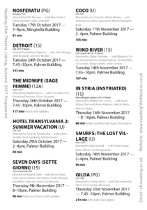
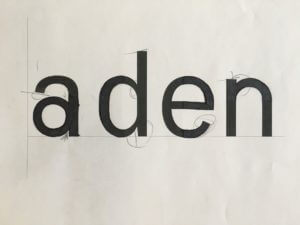
In this task I had to complete the missing half of 4 letterforms — all of the same typeface. I made several mistakes that made the features of the letterforms inconsistent: the apertures on the ‘e’ and ‘a’ do not match in size. The gaps between the bowls and stems of the ‘d’ and ‘a’, and the gaps between the shoulder and stem of the ‘n’ do not match either. From the weight of the existing parts of the letters I came to the conclusion that the typeface has little contrast between thicks and thins. After seeing the actual typeface I realised that I should have added some more contrast where the shoulder and stem of the ‘n’ connect as this can be seen where the bowl of the ‘d’ joins its stem.
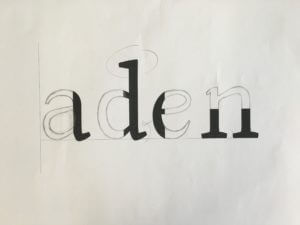
The secondary font left a lot more room for mistakes as seriffed typefaces are a lot more diverse in style. It’s hard to make out some specific elements of a typeface with little information given, for example: there’s no way to tell that the ‘a’ should have a terminal. An error that I shouldn’t have made was making the serif on the ‘n’ too small. The serif on the ‘d’ should have made this obvious.
The secondary task presented six full letters to use as references. Seeing the whole letterforms made it a lot easier to predict the characteristics of the typeface. However, having to draw entirely new letters from scratch presented a new challenge of its own. The letters I drew came out looking too square, to avoid this I should have focused on the shape of the letterform as a whole rather than focusing too much on drawing the parts of the letter bit by bit. An important thing that I learnt from this task was that the serifs on the ascenders on b’s and d’s always face left (I made the mistake of making the serif on the ‘d’ face right which looks odd, especially compared to the b). In my opinion having serifs that both face the same direction helps the flow of reading.
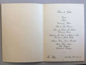
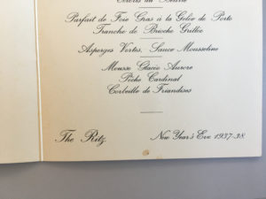
 For this mini brief I’ve chosen to write about a menu for New Year’s Eve 1937 at The Ritz. This particular item grabbed my attention with its print design’s minimalist use of colour, and hints of Art Deco style. The gradient in the background shifts the viewer’s focus to the face of the clown and the type by giving the upper half of the design higher contrast between dark and light. The arch in the ‘1938’ frames the clown nicely and draws together the focal points of the image further. The design successfully conveys the theme of celebration which is appropriate for the occasion.
The fun outside cover of the menu is juxtaposed, on the inside, by a formal choice of typeface which matches the prestigious image of The Ritz Hotel. Rules are then used to break up the separate dishes on the menu — this is especially helpful seeing as the highly embellished ascenders tend to slightly obscure the lines. The layout is very simplistic and the items on the menu are ordered in a way that gives the body of text a diamond shape which is an elegant stylistic touch.
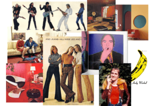
For this project I chose the theme: 70s retro. I started off with a mood board trying to capture the aesthetic of the decade. I compiled images from pop culture, such as Andy Warhol’s iconic banana graphic for the band ‘The Velvet Underground’, and added photos of things such as interior design. These images gave me a clear idea of some colours that were in at the time and, usefully, these colours complement each other well.
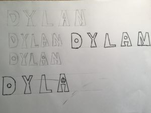
I took inspiration from the shape of flairs and invented a triangular, bottom heavy typeface. I tried to replicate the flair shape at the bottom of every stem. This led to some of the letters having a rather irregular shape to them – you can see that the space under the A’s crossbar is upside-down. I decided to refine the typeface further by experimenting with using circles as counters. This gave the font a more playful feel.
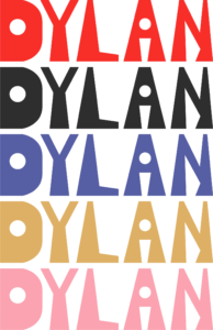
I took this concept into adobe illustrator and created a cleaner version of the typeface. I didn’t focus too much on making the shapes anatomically correct as the slight inaccuracies give the logotype character. It has an artisan look to it.

I sampled some colours from my mood board and made some coloured variations of the logotype. Bright colours were popular in the 1970s so I chose a bright red then used more muted colours that fit with this well. I think my design would also fit into the psychedelic 60s style – this was a notable influence on 70s culture.
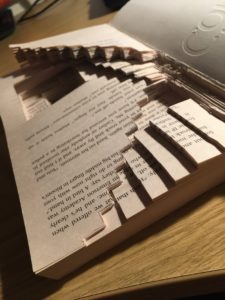
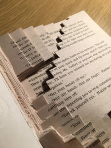
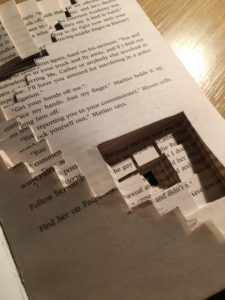
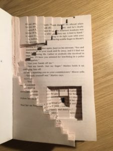
For this brief I decided to pursue the staircase narrative. To represent the idea of the man gradually descending I carved out a variety of staircases which lead you further and further down (or up) the page. Eventually you get to the very bottom which is coloured in black – this creates depth as you cannot tell where the staircase ends. I made the staircases on varying dimensions. This reminded me of M.C. Escher’s illusions.
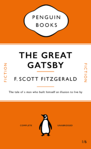
This is my Penguin Book cover. I used the Gill Sans typeface instead of the Gill Sans Nova used in the video as it was already a font in my InDesign. Here’s the pdf version of the cover: Penguin Book Cover.
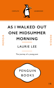
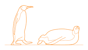
This is my messed up version for the Penguin Book Cover brief. ‘As I Walked Out One Midsummer Morning’ by Laurie Lee was my book of choice. My first edit to the original cover was to shrink the size of the title to make room for the longer title – this created more space around the type which makes it slightly easier to read without your eyes running off the edge of the cover. I kept the layout of the text the same but played around with other elements of the design. I swapped around the Penguin Books logotype and penguin illustration as I thought the logotype made the cover look top-heavy (it looks more balanced being bottom-heavy). To add to this effect I decreased the height of the orange space at the top. This also makes the design look less centred. My final tweak, to link the cover to the content of the book, was to change the penguin illustration. In my vector graphic version of the penguin I changed two things: I made him appear to be walking to represent the long journey Lee embarks on, he is also carrying a violin – an iconic item Laurie Lee took with him.
PDF version: Penguin Book Cover Laurie Lee Version
Reference Images for penguin:

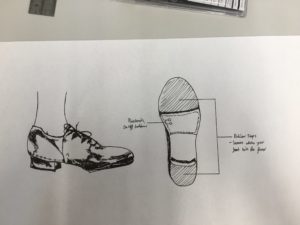
These Tap Dance shoes are completely silent allowing the wearer to practice without disturbing anybody else. Connect to headphones to hear the sound detected by the rubber taps.
These were invented to suit someone who: