
Design ideas and design processes
For the ‘Editing Images’ task, we had to make a change to an image. This included, but was not limited to, changing the colour of a part of a photo, lightening or darkening an image, or removal of objects from the background of an image.
Idea one
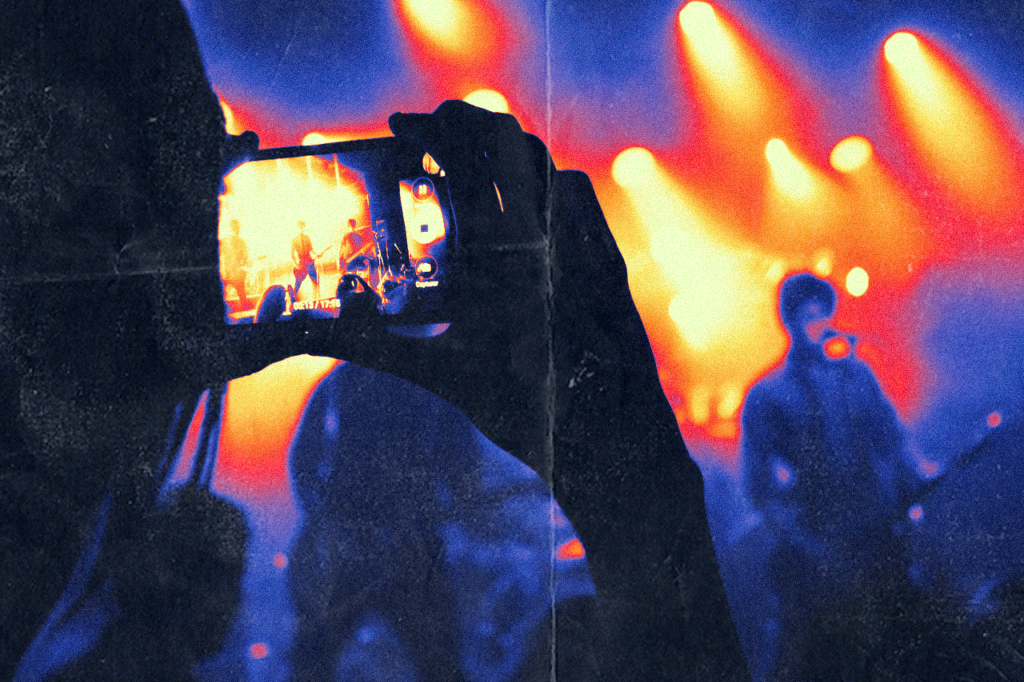
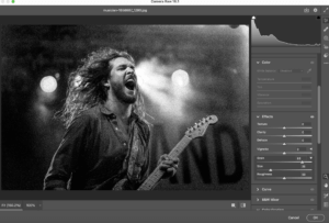
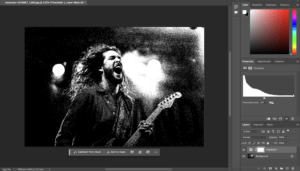
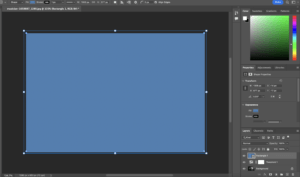
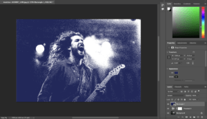
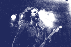
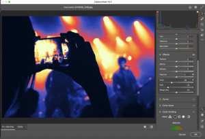
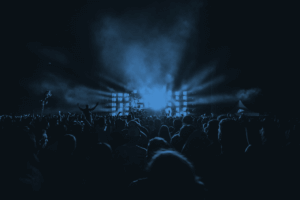
For my first idea, I chose to add the effects of noise and threshold. This effect is quite popular on media such as recreations of vintage horror posters and album cover art, so I decided to give it a go myself. For this image, I added noise through the camera raw filter instead of the filter gallery. This is because the grain on the camera raw filter is more precise and allows the user to adjust the amount of noise they want. I then applied threshold and adjusted it accordingly so that the background and foreground did not blend into each other. The background was fairly dark apart from a couple of bright stage lights, meaning that it was not difficult to get the balance right. I wanted to add some colour to this rather than leaving it black and white, so I added a blue rectangle that covered the entire image on a layer on top of everything else. To apply this colour to the black parts of the image, I set the blending mode of this layer to screen.
Idea two
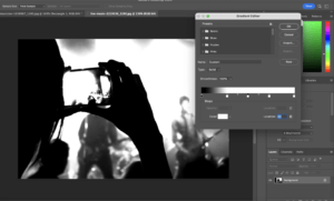
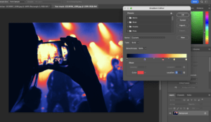
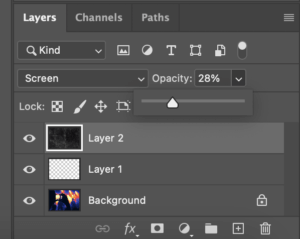
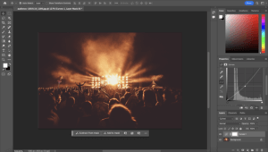
For idea number two, I experimented with gradient maps. I chose an image that I knew I could incorporate a lot of bright and colours with high contrast into. Going into gradient map automatically inputs one black and one white handle at either end of the gradient bar. I added more so I can add more colours into my gradient map. I chose vibrant colours that make the image look clearly distorted and more interesting. I then wanted to add texture to this image, so I added grain through the camera raw filter and a paper texture I found online on top. For the paper texture layer, I changed the blending mode to screen in order for the texture to be applied to the image. I also changed the opacity of this layer to 28% to avoid it being too overpowering. This is my favourite outcome from this task, as it is very visually interesting and eye catching.

Idea three
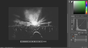
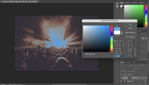
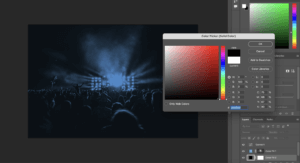
For the third idea, I created a duotone image. This involved working with channels, which I hadn’t done prior to this. Before starting the duotone, I adjusted the image using curves to increase the contrast of the image. I did this in order to get an effective final result that provides high contrast between the two colours. After doing this, I navigated to the channels and selected the RGB channel that provides the most contrast. In this case, it was green. I made the green channel a selection by clicking on the dotted circle icon at the bottom and pasted it on top of the background layer as a solid colour. This solid colour would be the highlights, so I chose a light blue. I then selected the background and made it a solid colour which would be the shadows, for which I chose black.
Software tutorials
I did not know much about working with channels and how to create duotone images. I used a tutorial (https://youtu.be/TVJqG8HrJwc?si=nCwqflv4arL7hVF8) to help me with this. It gave me an understanding of RGB channels and when to use each channel to achieve different effects. I learnt that in order to create an effective duotone image, the channel with the highest amount of contrast should be selected. To create less visually intense duotone images, channels that provide less contrast should be selected.
To create the gradient map, I followed a YouTube tutorial (https://youtu.be/kjKfz9KXgPo?si=-KILb-3zMc9vX5_l) in order to achieve this effect. As I was new to this, I chose a tutorial that used vibrant colours rather than trying to piece different colours together myself. This was so I could get a basic understanding of gradient maps before personalising them completely. This video taught me that gradient maps are quite customisable, as extra handles can be added in places of the user’s choice.
Design resources and articles
Finding inspiration for this task was not difficult, as I took inspiration from images that I commonly see on social media. The work of Jesse Nyberg (https://jessenyberg.design/) features effects I attempted to recreate such as using noise and threshold. He also utilises gradient maps in his work, that mainly consists of posters. Looking at his work helped me develop my design ideas as it gave me an idea as to how to make my work look appealing. For example, I knew when to stop adding noise in order to make it look not too overbearing, and I chose colours in my gradient map and duotone image that were cohesive.
An article I found (https://proedu.com/blogs/photoshop-skills/what-is-threshold-in-photoshop) gave me further understanding into the threshold tool and included links to useful videos.
Learning throughout the module
Throughout this module, I have learnt a lot of new skills. During the first term, I developed basic skills in Photoshop, Indesign, and Illustrator. This was useful as I had no prior experience of using Adobe apps. I learnt how to work with adjustment layers and the filter gallery in Photoshop, along with learning how to deal with paragraph and character styles in Indesign. In Illustrator, I learnt how to manipulate type into shapes. During the second term, I used After effects for the first time. This was challenging but I learnt the basics of the app such as how to use graphs and add effects to texts such as glow. I also became more familiar with different Photoshop tools such as masks, channels, and how to use the pen tool to cut out images. In Illustrator, I learnt how to manipulate type itself rather than morph it into different shapes.