
Background
Dragon Rouge London are part of a global creative agency, ‘powering brands across the world’. Who help their clients with their strategy, insight and innovation, design, activation and language. Covering the whole brand world, and brand expereince. For the second year running they have come up with a competition to see what people have got and to seek out young designers to work with them at their company. There were three briefs too choose from. From there think of a brand, Either pick your favourite one, one that deserves an overhaul, or create your own brand from scratch.
Pretty Difficult, represents the collaboration between Urban Decay and The Mental Health Foundation. With the idea in mind to communicate the positivity of makeup and how it can help aid alongside mental health. As 20% of adolescents may experience a mental health problem in any given year. 50% of mental health problems are established by age 14 and 75% by age 24. The intended audience will be teenagers to young adults. Who will be buying and using Urban Decay products. But also, on social media. To help communicate a positive message around makeup, whilst supporting mental health.
Brief
I chose brief 3 Mash up, Liven up. Which focused on the theory that opposites attract. The brief asked you to think about this, and how it could inspire the creation of an innovation new product, service or experience. The outcome needed to create a collaboration between two unlikely brands, services, products or apps to create something new. I focused on how this collaboration could help solve a current issue.
In the brief I restated, I decided to focus on researching makeup and mental health as my two areas I am going to create a collaboration between. I chose mental health as this is an on going problem that most people experience at some point in their life, whether it is personal or through someone they know. And makeup as this is an area that I know about and enjoy. And thought if I get to choose and design this project from scratch, I may as well choose topic areas I enjoy or are passionate about. I knew I was going to design three proposed deliverables but I was not sure what route I was taking at first so did not narrow this down till after my research.
Deliverables
- Four A3 sheets Showing my strategy for solving the problem, and how I arrived at the idea – as well as the exestuations of that idea coming to life.
- Information Post Card A clear message to the campaign, with information on mental health.
- Social Media Graphics Engaging and informative graphics that communicate a clear message to the campaign, with information on mental and the benefits make can have.
- A3 Poster A clear message for the campaign, mainly imagery, with the title and tagline, to get viewers to read more.
Communication
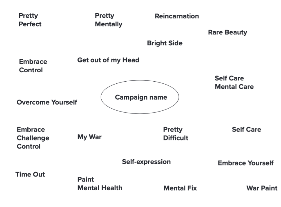
Throughout the design process, I regularly emailed my supervisor with my experiments and ideas, to get feedback as I did not have a client. I also saw my supervisor during real jobs meetings, this allowed me to not only keep her up to date, but to also receive consistent feedback on my designs. I found these real job meeting as I was able to get feedback from other students, who may come into my target audience. One example where this was helpful was coming up with a name for my campaign. Where we had a vote between three chosen names from the brainstorm below. The three options were: Pretty Mental, Pretty Difficult, Embrace yourself. Pretty Difficult got the most votes followed by Pretty Mental. What swayed the vote was the idea that some people don’t like to identify their mental health issues or rather label it. Which is why Pretty Mental could be too labelling. Embrace Yourself is a bit long worded whilst the other two are snappy and catchy.
Research and ideation
I began this project by looking at previous design entries to see that standard and sort of designs that have won. I found that each design was unique in their own way and completely different from the next. I started off my brainstorming topics and areas that I am passionate about and find that could be interesting. I came up with mental health, makeup, and animals, and drew connections between these. I found makeup and mental health to be the best to collaborate as there was a few routes that I could explore down. Once I knew my topics I researched each individual and together to find any cross overs I could include. I found two articles in particular very useful which I have attached below for you to have a read yourself. How Makeup Became A Powerful Tool In My Mental Health Journey in Vogue, shows how one writer opens up about her own journey and the healing power of a beauty regime. Which I found interesting as normally when makeup and mental health is talked about together it is to discuss the negative affect it has on body image.
https://www.vogue.co.uk/article/mental-health-week-make-up-help
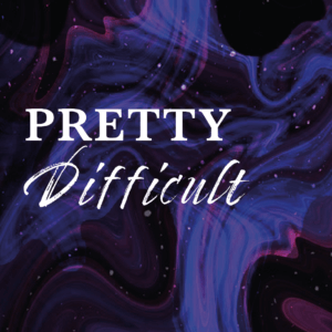
This is how I came up with my tagline: Overcome Challenges by, gaining Control, Treating yourself, and Embracing your own skin. I wanted users to understand that everyone suffers from mental health, but it is how we handle it and deal with it. Pretty Difficult communicates that there is more to makeup then just beauty and shopping. Rather, can provide a creative, enjoyable outlet for self-expression that can help you during tough times.
From here I researched the popular companies for both makeup and mental and decided to go with Urban Decay and the Mental Health Foundation. I thought it would be good to go with a well known company as then the campaign and message will have a greater impact. Also, Urban Decay has been known too for its campaigns for important topics such as individuality and LGTBQ. I researched Urban Decays previous campaigns and decided I wanted to create similar deliverables to keep coherent with their brand and social media pages.
Questionnaire
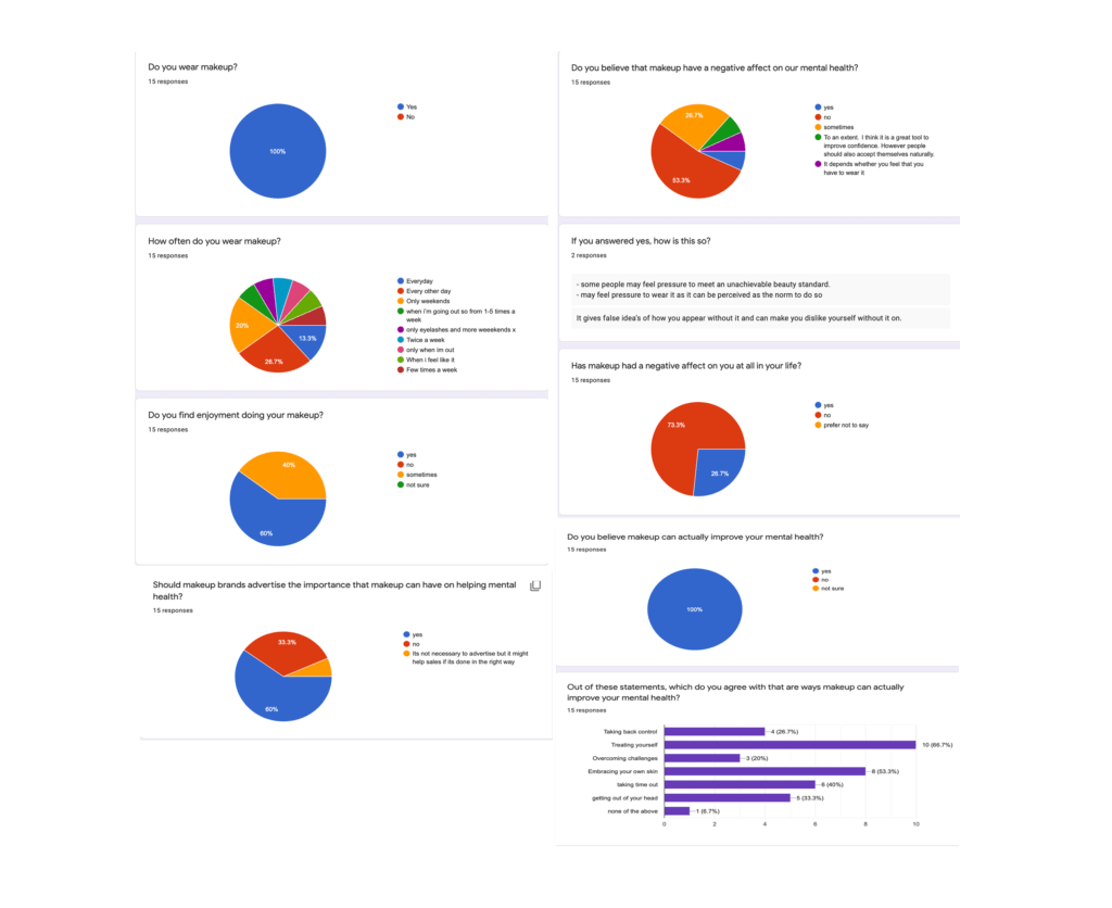
I carried out a questionnaire to find out how users feel about makeup and mental health. I asked people ages 18-25 as I feel this is a key age group of people buying makeup, who are affected by advertising and marketing of makeup. Below are my results. From this questioner I found that instead of talking negatively of make on mental health. I can advertise it in a positive way to help mental health. As it can create a routine for people struggling.
Design process
Branding
I needed to come up with an identity for the campaign. I knew that it was to be a collaboration between Urban Decay and the Mental Health Foundation, but I needed to create a campaign to convey the message to appeal to the target audience. I started off by playing around with different typefaces on the campaign name.
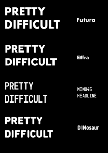
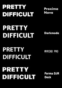
Later down the line, I felt that none of these experiments were commenting the campaign properly. So I went back and experiment with some more typefaces. In the end I went with the combination of Sweet sans pro and Timberline. This improved the design of the campaign as a whole just by changing the typeface. Sweet sans pro is a modern but quirky typeface with a lot of style variations. Whilst Timberline enable me to to add that feminine touch to the word difficult.
Imagery
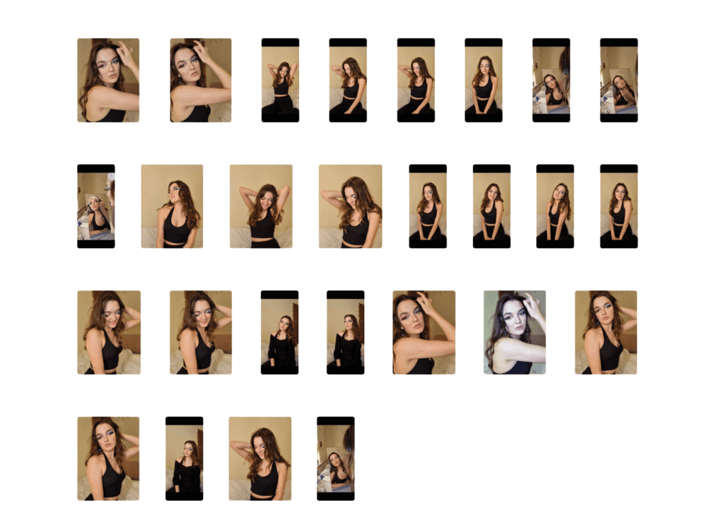
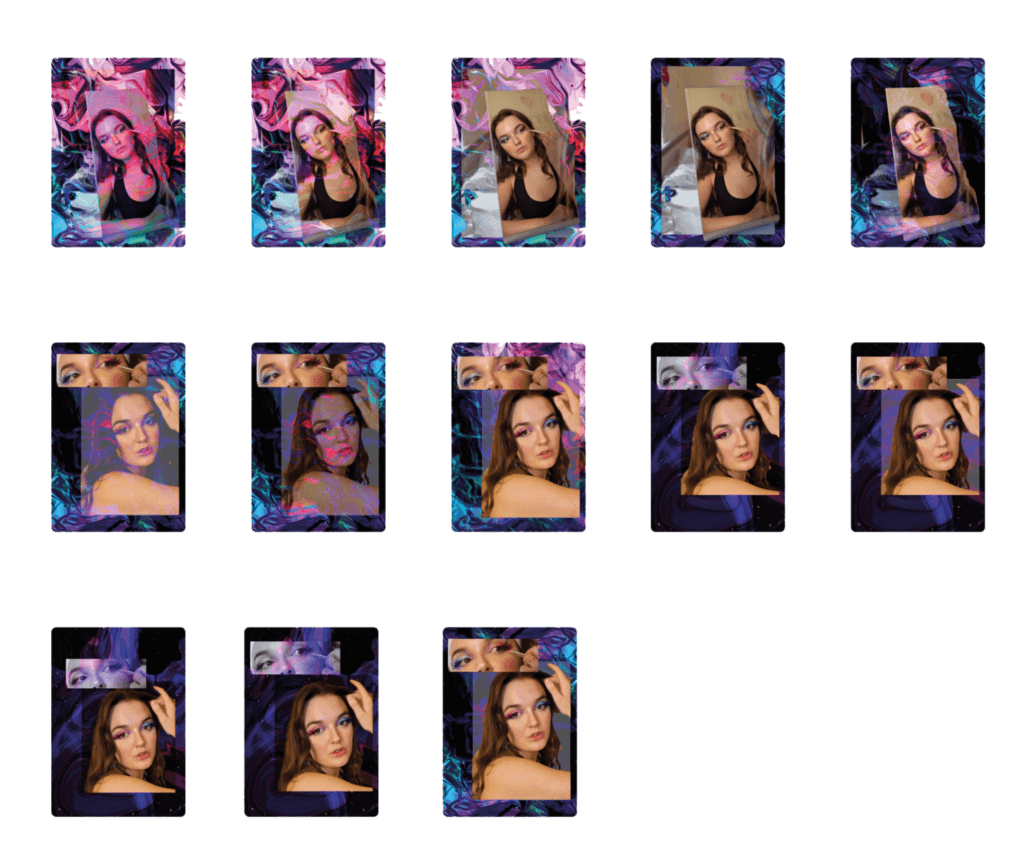
The thumbnails below show the initial photos before edited. The mood for the photo shoot was to use a young adult, with not too heavy makeup, but quirky eye-shadow. To represent a more realistic, but creative look to connect and communicate to the audience. I feel that the photoshoot was successful, factoring in there was no budget or professional camera used.
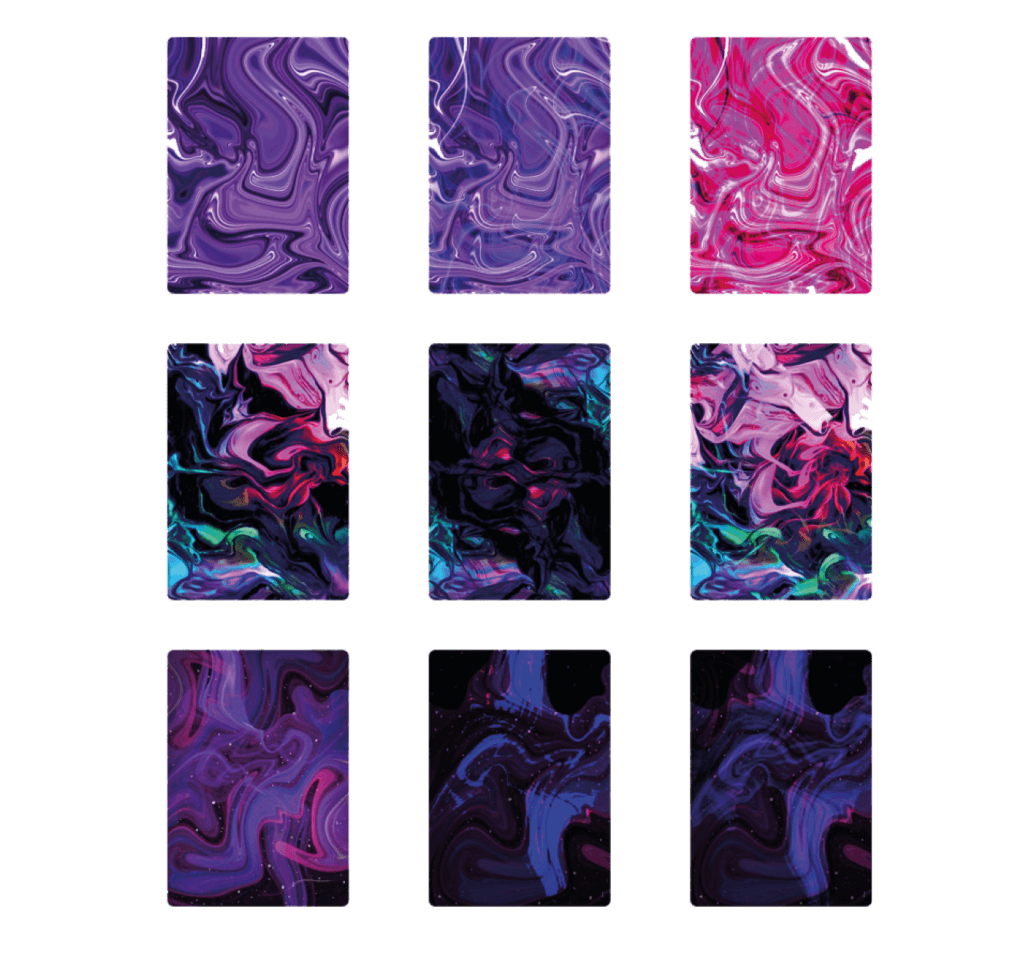
The thumbnails below show the initial background experiments to explore the right message through patterns and colour to communicate the campaign. I created these using Adobe Photoshop where I manipulated colours and opacities.
Experiments
The imagery below shows initial experiments combing the photography and background experiments shown previously. I created these using Adobe Photoshop with the idea to explore the right imagery for the campaign, to communicate the message. This was done before any text was added.
Final deliverables
Poster
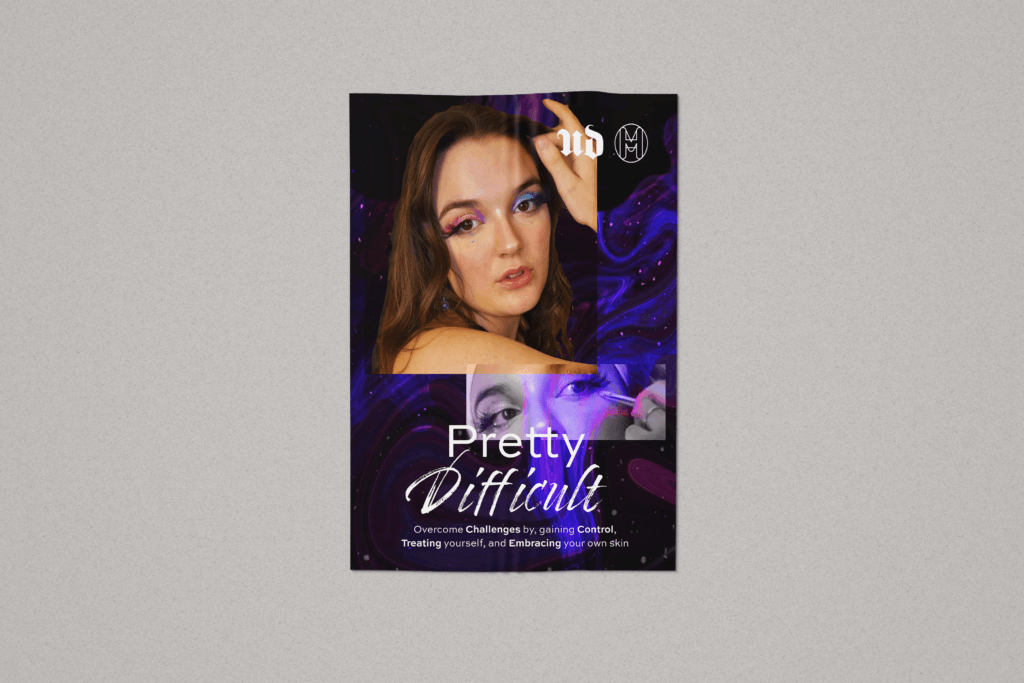
The poster is there to be the main imagery to the campaign. Keeping it simple with the photography and title and tagline, just enough information to catch peoples eyes without over loading them with information. As user tend to not focus on posters that are overloaded. This poster is to tell viewers about the campaign and persuade them to read more. The poster is designed to match certain design elements that relate to the other posters within Urban Decays advertisements. Whilst also creating a new campaign representing how makeup can work alongside mental health.

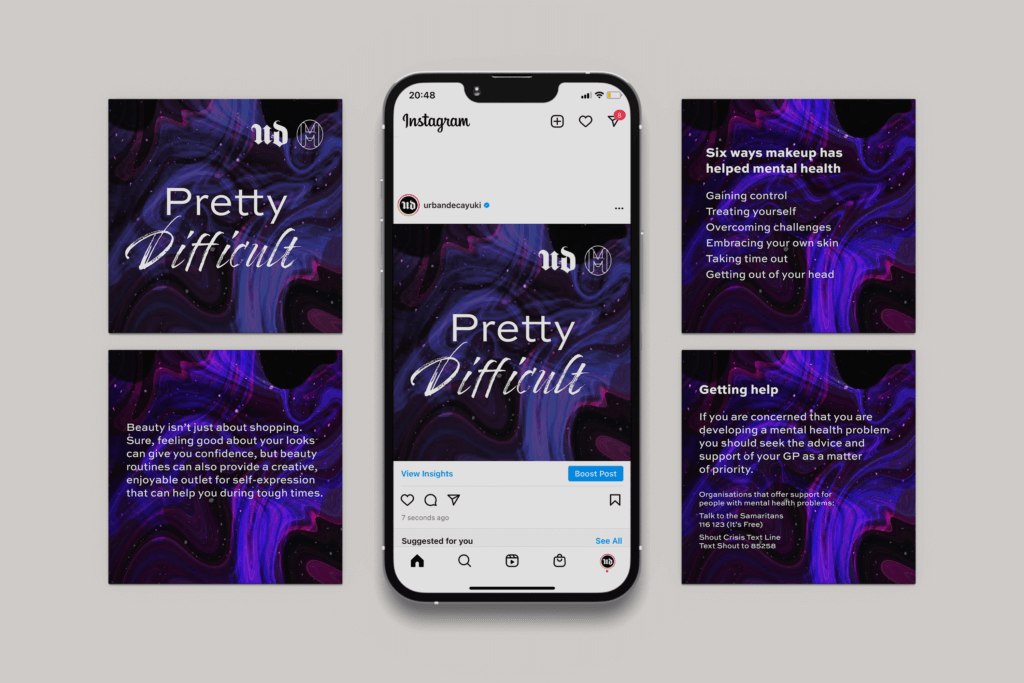
Social media graphics
The social media graphics are designed to be used as a carousel on instagram. As this means more information can be shared, without it looking too text heavy, which will result in people not reading them. The information communicates the message behind the campaign of there being more to makeup then just beauty, and the positive outlet it can have. With information on where to get help on the last page. To put push people to get help, but letting them know there is help available. The social media graphics are designed to match certain design elements that relate to the other instagram posts within Urban Decays feed. They are designed to catch the users eye whilst conveying a positive message, as you never know what someone is going through and seeing a positive post may be really helpful. The aim of the design is to be firstly engaging and secondly to be informative. Being informative does not necessary mean to have a lot of text, as social media posts need to communicate the message as simple and quickly as possible.
Information postcards
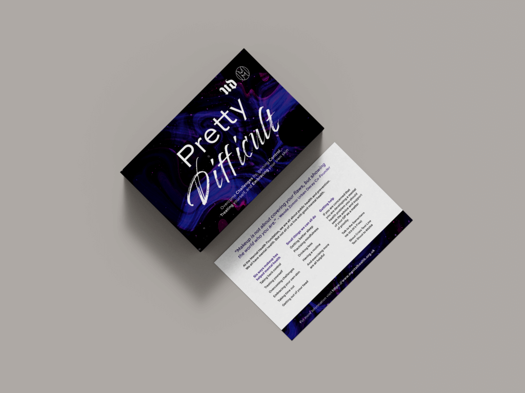
On the information postcards, you can read an opening positive quote from the co-founder of Urban Decay. Followed by information from the Mental Health Foundation, on changes and small improvements people can do easily. With also contact information, if they seek greater help. This is important as people has stated that when they are struggling they do not know who to turn too. The information postcard (suitable for both print and digital outputs) is designed as an easy read and pick up to go alongside peoples purchases, or as a pick up whilst in store. With important information of the Mental Health Foundation on how to deal with mental health and also where to get help.
Reflection
As this was a competition, I technically did not have a client to communicate with and get feedback from. I found it hard initially to write a tailored brief, as the brief I was given was so broad and I did not have a client to redefine the brief with and to ask questions too. It wasn’t until after I started researching and braining storming ideas that I was able to provide a tailored brief. As by now I had a clear idea of the path I was taking. As the only feedback I received was from my supervisor and the real jobs team, the success will be measured by the satisfaction of the judges and the outcome on their judgment over the next coming months.
Overall creating this real job has taught me to be more independent and to trust my ideas. As I am used to briefs given for modules which tend to be more focused, with a set outcome. Whereas, this project was very broad and I had to come up with my own brief, and own outcomes, and own concept. I found it hard at first as I wanted to create something that would stand out or be affective. But I found that I was better off at brainstorming topics that I like, and seeing where they could come together to create a collaboration, to solve a current problem.