
While this task was mainly about establishing visual hierarchy, I ended up learning a lot more about how different types of information should be presented.
How to Format a Date
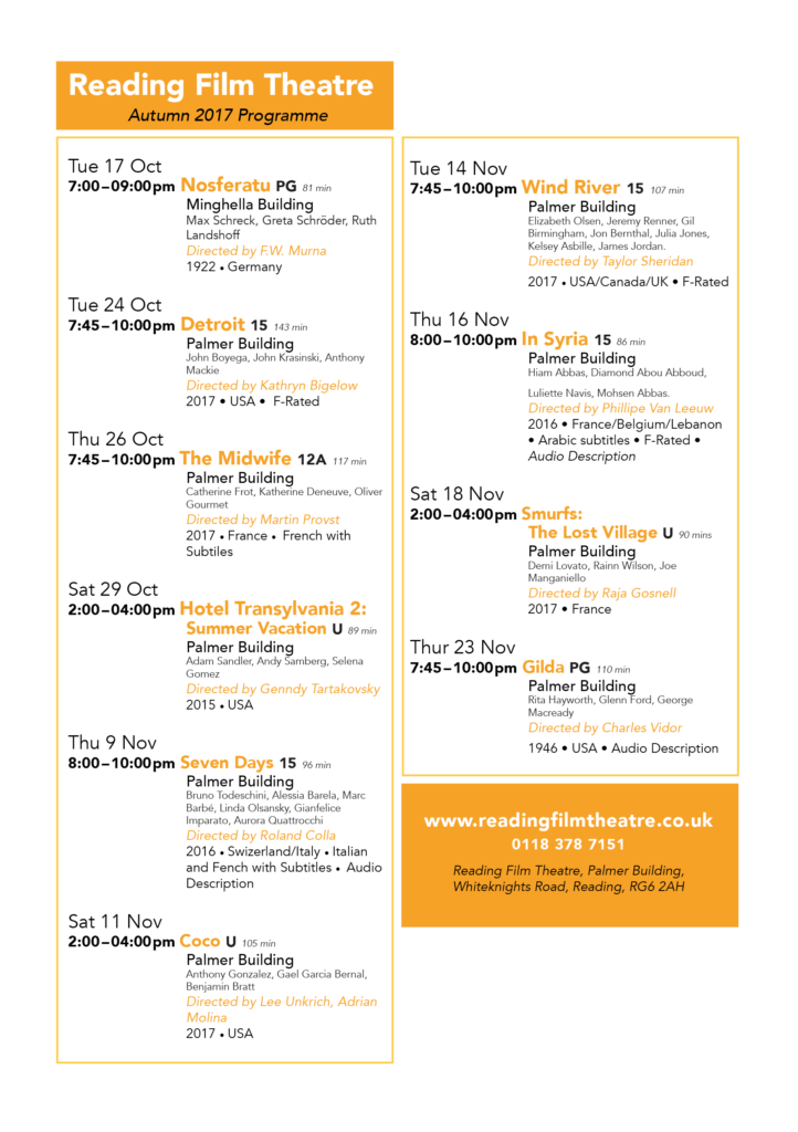
In the “raw text” all the dates were set out like this: Tuesday 24th October 2017. In the “Typographic style Handbook” it states “Only numbers should be used for the days, not 1st, 2nd, 3rd etc.” (Mitchell and Wightman 2017: 77). Before this task I didn’t know that dates had to be formatted without the “th” bit, so I listed serval of the different date options.
Tuesday 24 October 2017, Tue 24 Oct, 24 Oct, 24.11.207, 24/11/17
For the flyer aimed at family I chose to format the date as Tue 24 Oct, omitting the year 2017, it does say “Autumn 2017” in the title. Many families have weekly occurring events, for example every Wednesday is an extra curricular club, and so would have to work out which day the 24th is, and see if they are free next Tuesday.
For the flyer aimed at the old couple I left out the date, 24 October. With the assumption that if they really want to see this film they would make room for it rather than just wanting to fill their day.
How to Format Time
In the unformatted text there were a range of different foments for the time. Younger children struggle with reading the 24 hour time, and so I chose to use the 12 hour version, and kept the time in the 24 hours for the retired couple.
When to use an En dash
“A spaced en dash indicates spans of time” (Mitchell and Wightman 2017: 77).
How to Format Names
Names are important and so they should not be hyphenated over a line break, or having the name go over two lines. By using a “soft return” I was able to keep the list of names in the same paragraph but was able to respect the actors and keep their full name along one line.
Hierarchy
In the text there are 12 different pieces of information, listed here in alphabetical order:
Age Rating, Audi
o Descriptive, Building, Cast, Country of Origin, Date, Director, Film Title, F-Rated, Language, Time, Run Time, Year of Origin
![]() A new concept to me was brainstorming with having a user in mind, rather than just having ideas. When having a user in mind, you can make design decisions to support their needs.
A new concept to me was brainstorming with having a user in mind, rather than just having ideas. When having a user in mind, you can make design decisions to support their needs.
For the flyer aimed for families, this is how I ranked the information:
Film Title, Age rating, Date + Time + Run time, Building, Cast + Director, Year of origin + Country of origin, Audio descriptive, F rated, Language.
I grouped like information, that would be in the same paragraph style. This helped me to know how many chunks of information I had to design for.
Design Process
I found it helpful going over the printed version with a class mate, and could pick up on a lot of the silly mistakes, where the spacing or formatting is simply missed out. Printing out the flyer means I could see that the text was simply too small, and printing in italic yellow isn’t really that clear. Even now I have realised that for the 24 hour time I have typed “pm” which isn’t required. This has highlighted the importance of going over the printed copy and spotting errors, serval times.