The aim for this mini project was to create two different flyer designs for the Reading Film Theatre.
To begin I sketched out some rough layout plans focusing on the different ways I could present the information given. I chose the layout that I thought displayed the information in a hierarchy where the most important information was displayed either in a larger font size of a different colour. In my two designs I had to make sure that I was considering the target audience these were
- A father with two children under 10
- A retired doctor and her husband, both of whom have a passion for old Hollywood
- A visiting professor working in Reading, but originally from Switzerland
 Before I started my design I made sure that
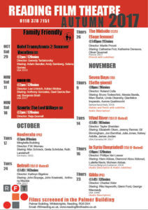
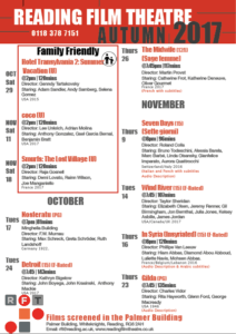
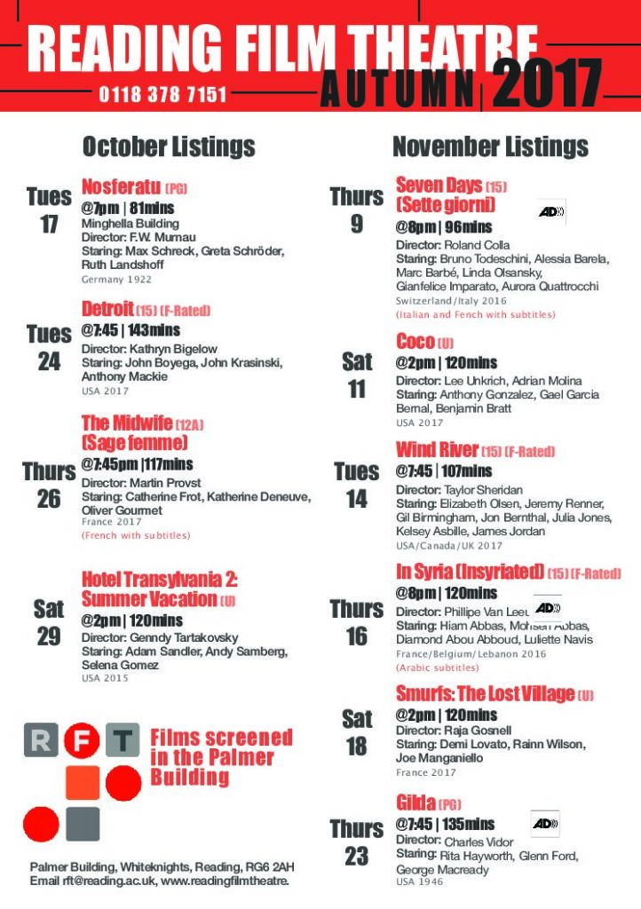
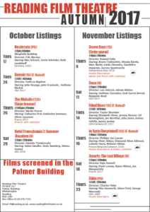
This was my first design. I chose to use red and black and white as these were the colours used In the Reading Film Theatres logo, also I found that these three colours are commonly associated with theatres/cinemas.
We were told to use two columns, so I decided to have one column for October listings and one for November listings. and in my second design I had one column for ‘family friendly’ listings and one for over 12s. I used black lines to separate columns of information. However, in a feedback session I had one of my peers suggested to me to remove the black lines and she thought it was a bit too much and actually looked more overcrowded and messy.