

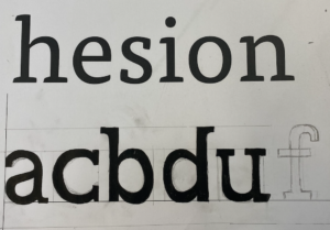
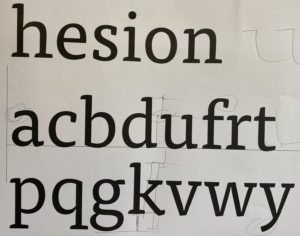
On the second task, being given certain letters of a particular typeface, I then designed other letters in the style of this such as a, c, b, d, u and f, following the form of the existing letters and how they curve varying in thicknesses and size. I have also learnt how letters work to be visually aligned, with the use of over hangs and ascenders, however the letters could be shaped slightly better, to provide a more accurate reflection, especially the serifs on the upper side of the U, I have learnt how they only form on one side, rather than across the stroke.