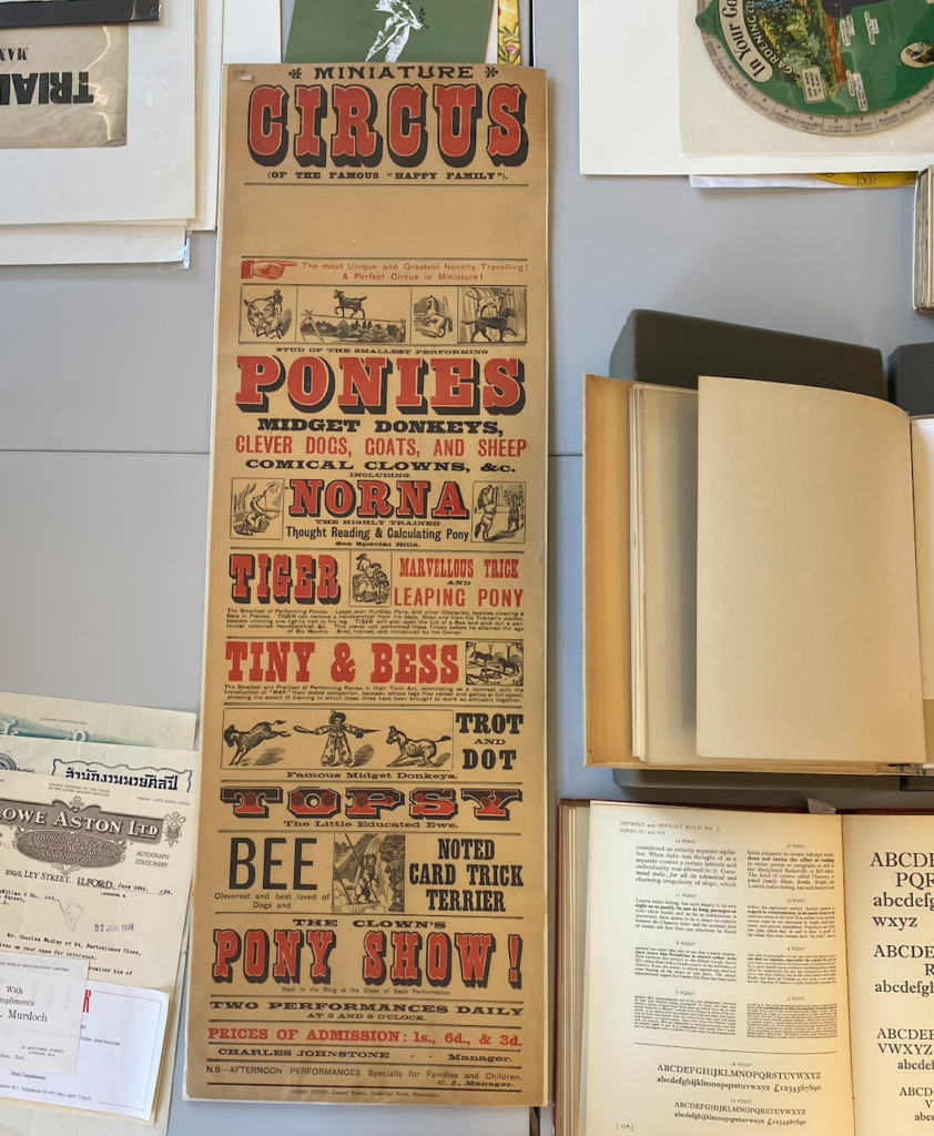
In Emma’s collections session, the circus advertisement really caught my eye, as the shape was odd in comparison to modern posters however the style of writing and colours remain quite similar. It’s interesting to see the development of posters from what they used to be to now and the hierarchy of importance for each aspect, however in this poster, there is quite a large proportion of empty space, which could have included the dates and times as it does not appear to. e there. The images are simple illustrations demonstrating the age of the work, and the lack of technology that was created at the time. The amount of typefaces used however show how they could be new designs so want to show it off. Overall, I like how unique this poster is in comparison to regular shaped ones and how the colours compliment each other well, however it is quite misleading to the eye as everything is of similar size so is difficult to understand which is the most important.