
Following the Thursday interactive session from Emma about the introductions to the collections that the Typography department have relating to Typography and how it was created/used over time; I took an interest in evaluating and researching the music sheets and covers of Francis, Day & Hunter Ltd.
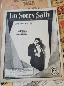

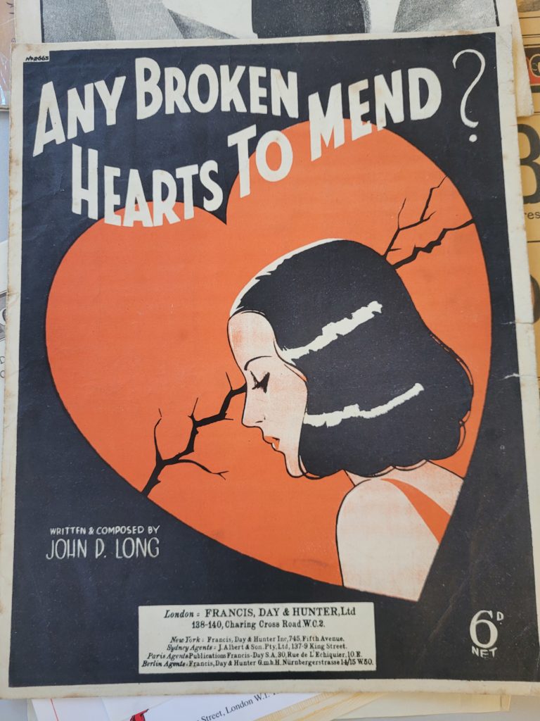
The origin of these particular music sheets originate from 1938 (Any broken hearts to mend?) and 1928 (I’m sorry Sally) and were published by Francis, Day & Hunter Ltd. From first glance the covers conveyed a sense of nostalgia, as the old minimalistic style as well as colours fit the interwar era of design as it was a rather depressing/lonesome era (as the vast majority of men were fighting at war). The purpose of these music sheets were for families to purchase to be able to play the most recent songs at home on the piano, as most households owned a piano for entertainment. Additionally, Orchestras and bands that would play at venues, would also purchase these music sheets as playing the most recent music of the time was there occupation.
The front covers of the designs connotate a sense of melancholy and intense sadness relating to love, which clearly relate to the historical context of lost love/missing a lover due to the war. The cover for “Any broken hearts to mend?” has the female character possess the same colour scheme as the background itself, to possibly minimise the printing cost as well as having the correct blend of colours for the tone of music. The layout of the title suggests a sense of optimism as the flowing/rhythmic text suits the curiosity of the question if there are “any broken hearts to mend”. Whereas “I’m Sorry Sally” has only used black and white to present the cover, possibly due to the fact that this cover was 10 years older than the other cover, showing the development of the publishing company. But more interestingly, the typeface included possesses serifs compared to the other cover, to potentially emphasise that the music included is of a more serious or somewhat “classier” fashion as the typeface has more visual flair. The age of the music sheets clearly show, due to the fact that the price that is present on both covers is “6d”, or is more commonly referred to as a sixpence; thus the historical context suggests that these are older published music sheets.
To conclude, observing the vast examples of the collections within the typography department has aided me in recognising how old style of print was developed/conceived for particular genres or styles; as well as understanding the potential ideas that were intended when publishing designs and other forms of media.