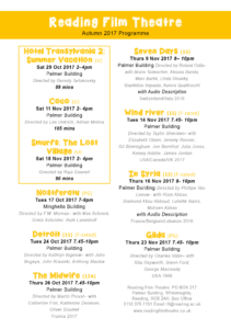
For my cinema listing design, I decided to aim my first one for ‘A retired doctor and her husband, both of who have a passion for old Hollywood’. When researching, I looked at old, vintage Hollywood cinema listings, movie posters and screen prints in order to help me with the colour scheme, layout and font. I first chose quite a bold font for the title, however, I did not really like it when I wrote the rest of the information out as it did not have the old style Hollywood theatre feel that I wanted. So I searched for more fonts and found a very eye-catching, retro style one which felt very suitable for the theme.
I then looked at colours and thought that red and black had a very distinct look, which is quite conventional when looking back to older cinema listings. When focussing on the text of information, I decided to order the films in terms of age rating; the films more appropriate for older couples would be first, then the more family friendly ones would be at the bottom. However, after the feedback session on Friday, I realised that this order could be slightly misleading as all the dates are jumbled up and in most cases, people would not read this listing in order from top to bottom, but instead, scan through and see the films that look most interesting for them. Therefore, I decided to group them into adult and family films, then order them by date.
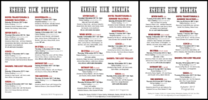
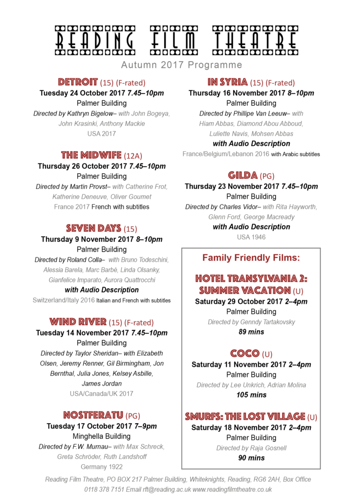
For my second cinema listing sheet, I wanted it to target ‘A father with two children under 10’. I copied the same layout from my first one over and changed the font to make it more exciting and fun. Then I also changed the colour from red to yellow, again to make it seem brighter, happier and more inviting to a younger audience.
And similar to my other one, I decided to group them again by age and date by boxing up the family friendly ones and putting them at the top, and then leaving the other non kid friendly ones for adults to browse around in their own time.