
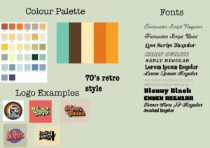
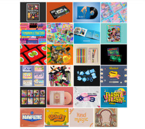
For our design class on 14/10/2021, we were joined by Sophia White who taught us about logotypes and the trends surrounding it. We were asked before hand to look at 10 of the themes she had given us and choose one that we liked. For me, I went with the 70s retro style and based on that, I did some prior research on the style and came up with these results:
Sophia showed us some of the brands she had worked with and the process of creating for those brands, and we were taught a master class on creating mood boards, which was the first process in terms of creating something, as mood boards help with giving inspiration and visual ideas of what a theme is and so on.
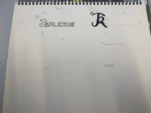
After creating mood boards, I went straight to sketching ideas for logos for branding myself as this was the task given to us, however, I soon decided that I wanted to go straight onto InDesign to create my designs, but nevertheless, I did sketch some ideas on my sketchbook.
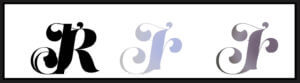
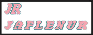
For my first design, I started out with using my initials and I used the font ‘Lust Script’, which I downloaded from Adobe fonts. I typed out my intials in different ways:
- all uppercase
- all lowercase
- normal
Then I proceeded to kern the letters together until they merged together. After this, I used the gradient tool to give colour to the design. I used a random colour I liked instead of using the colour palette for the retro style, as I was just experimenting with the elements.
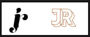
Here is another design I did, where I also used my initials, but using the font ‘rig solid’ in bold and used one of the colours from the retro style colour palette. Similar to my first design, I also kerned the letters here until the letters merged to each other side to side.

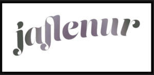
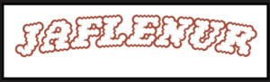 Onto my third design, I used the font ‘Narly’ in outline, and this time, I typed out my first name as I felt it would look much more nicer in this font. I really liked this design as I felt it expressed the retro style very effectively and was also simple in the same time. I had also tried it out using my initials as well and made two different versions using different colours from the colour palette.
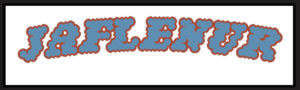
I had also edited these designs and filled them in using the bucket tool on photoshop to test out how the design would look like when coloured in and I was satisfied with the results. I had used a colour wheel to find complementary colours to the outline of the words to fill the letters in.
For my fourth design, I took a different approach and tried to type out the letter in a curved shape. For this, I firstly used the ‘pen tool’ to draw out the line and using the move tool, shaped my line and then used the ‘type on a path tool’ to type out my first name on it. I had used the font ‘Lust Script’ for this. I was quite impressed with the results as this was something new I had tried out and for a first try, I believe I had done a good job in doing so.
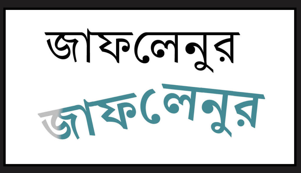
For my fifth and last design, I took a whole different turn by designing my brand in the Bengali language, as it is my second language, and is reflective of my cultural background and ethnicity. I was quite shocked to find an Adobe font for the Bengali letters, and immediately thought of making a design using the font. First, I had typed out my first name and then I used the same process I used in my fourth design to create the branding design. It is quite simple but I do like it as a first try in terms of designing logos.

Overall, this session was very enjoyable as I was able to learn about the different steps of designing logos for brands, as well as got to try out different apps in the Adobe softwares. Although I think most, if not none, of my designs don’t reflect the 70’s retro style, I think this was a good practice for me for future projects.
Link to the PDF file of all of the designs together: