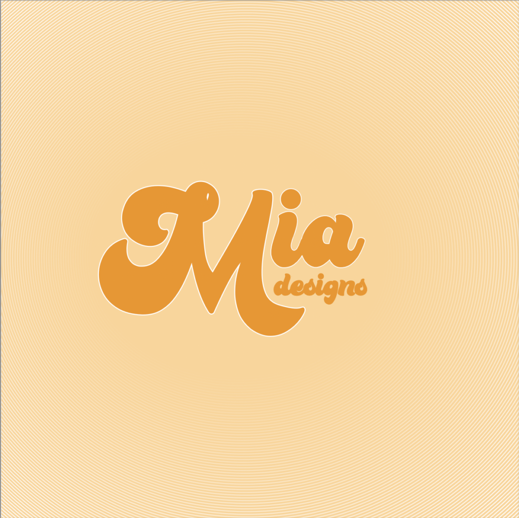
Initially, I started my logo thinking of mainly curved lines and neutral, warm tones. As I began to work in illustrator, I experimented with curved typefaces and settled on this chunky and organic shape font. I separated letters from my name to create a larger ‘M’ which allowed the letters to fit together better and create a more rounded appearance when alongside one another. I also decided to use a white stroke around the main name, to highlight this above the ‘designs’ below which I wanted to be secondary to the name and then closed off the negative space by using two circles and the ‘blend’ tool, to create a background reminiscent of vinyl records and in line with the curved lines I initially wanted to pull into the logo. I tweaked these variables until i found a balance i was happy with; however I would prefer to use this logo in a circular format rather than a square to eliminate some of the empty space and draw the eye back again to the centre logo.