
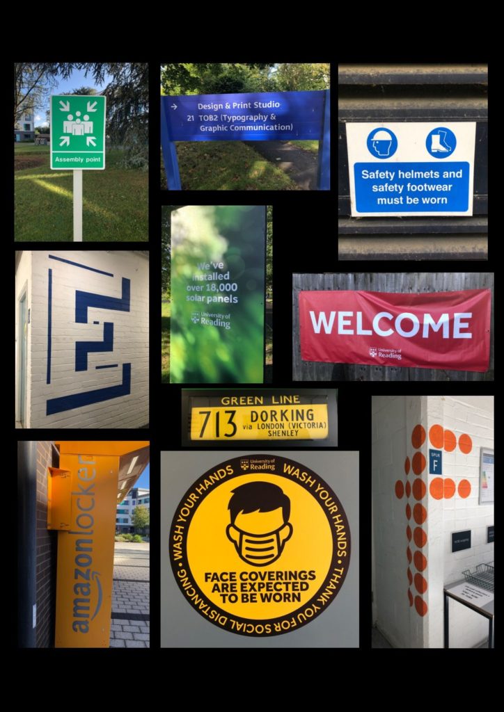
Signs around Campus
I decided to focus on the relationships between colour of letters and the background they are presented on for this project, where I found that the majority of lettering is white or black and surrounding by a bold and eye-catching colour. When looking at the majority of signs it is evident that this design choice is made to initially capture the attention of a passer by through a large body of bright colour and then have the lettering as the secondary, despite the text being the core of the sign. I found that this technique is more effective than say, a white sign with red lettering, since there is a larger body of white which does not grab the eye as efficiently as a bold colour.