
Design ideas & process
I wanted to show two very different design layouts and chose a non-linear and a linear design. For one I wanted to use a lot of images with not a lot of space between the writing and for the other I wanted it to be very striped back in terms of visual design features.
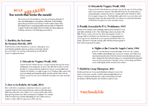
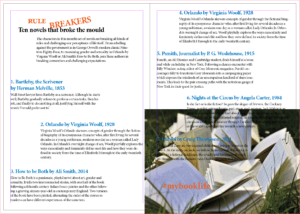
For the very stripped back design approach I wanted to let the typography do most of the visual effect and only used one photograph. This was possible through the use of the text wrap panel. Wrapping the text around the image it could add extra visual to the spread and tie into the text so it doesn’t seem out of place or forced. To stop the image from taking over I used the direct selection tool to cut the image in half so only the right bottom triangle remained, thus allowing the text to wrap around the photograph in a diagonal line to bring it together.
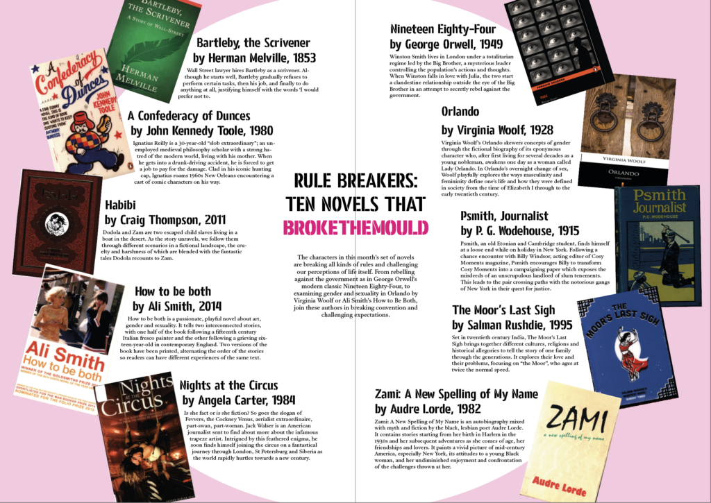
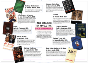
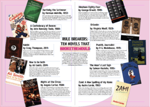
One of my design ideas was to create a circular layout, with the individual book covers surrounding the middle, creating a boarder for the circle. As it is a circular design the most important information goes to the centre, the core of the design. Individual book’s descriptions and information surrounds the title and introduction ,which the reader needs to make sense of what is going on – otherwise they may believe that it’s an ordinary list of books. Another reason for the book information going around the circle is to ensure it is clear that all the books are of equal weight in the hierarchy. There can be no mistaking one as more important than the another. To emphasise the purpose of the article I changed the colouring of the words ‘break the mould’ as that’s what it comes down to, these books aren’t the norm.
Software tutorials
Building on the skills I learned from my previous experience with the Adobe InDesign software when we did the book exerts last term I used my notes to reiterate the principles we touched upon already. This helped me a lot in terms of setting up the hierarchy – especially with the non-linear design as it is an unusual spread for people to come across. Following the rule that something new catches people’s attention, but too many new and unusual things may end up confusing the reader in the end I drew from my experience of common and uncommon techniques. In order to get the spacing between the linear design right I used the guide lines. Similarly I ended up using the guide lines to centre the title and article introduction for the circular spread.
I did use the Adobe InDesign tutorial for Adding work with graphics to learn how to use the text wrap panel. This allowed me to further develop both my designs. Another good thing I learned from this tutorial is how to use the direct selection tool to alter the frame of an image in InDesign. I used this for the chosen photograph to become an integral part of my design to ensure I wouldn’t overwhelm my design with my chosen image. It allowed me to incorporate the photograph into the existing design, while keeping the balance of the layout. With the text wrap I managed to generate more space for the non-linear layout while also linking the individual covers to the corresponding information.
While it wouldn’t have worked for my designs, I do want to learn some more about how to wrap text around an object. Especially as the object doesn’t need to be removed from the image before being placed into InDesign. There’s so many possibilities I can explore with this. Moreover, in future, I would like to explore some more magazine layout styles, in particularly the call out features they use.
Resources for research & inspiration
One of my hobbies is Bullet Journaling (BuJo), so I create layouts a lot within my life to keep myself organised, jot down my ideas and thoughts and to relax. This meant that when this task was presented to me I already had a lot of different inspiration from creating my BuJo. As I wanted to do something that was non-linear I used a double spread layout I like to use on occasion as I felt it would suit the purpose. While I cannot recall who initially introduced me to this particular layout The Petite Planner uses a spread like this for her weekly spread to give you a better idea. Many others in the BuJo community use a similar layout for some of their spreads – the most popular ones I believe are to ones for tracking habits to improve them.
In terms of my other design idea I didn’t have a singular inspiration, I simply knew I wanted to create a large contrast between my two designs. I’m also rather fond of simply having text be the visual as I feel it is being often overlooked. Since I knew the other design would be quite heavy with images, colours and not have a lot of space I wanted this design to show the opposite (within reason of course). After having looked at some of my peer’s designs so far I developed a better understanding of what exactly I wanted my linear layout to look like.