
In the second week of Spring term, Baseline Shift hosted our own Gerry Leonidas, who talked to students about fonts and typefaces and how one can approach designing them.
Gerry’s work involves knowledge transfer projects, consultancy, and course development but his specialty is typeface design. He been based in our Department at Reading since 1998, and has been working in the field since 1986.
‘All people who work in the font industry tend to have passion for what they do.’
Gerry began his presentation by saying that type designers usually have enthusiasm for what they do because of their love for the subject. It is very unusual to find many people who work in the type industry and do it as a normal job; for everyone, there is an element of passion.
Almost everyone knows what fonts are, we see them everywhere in our day to day lives, we use them in Adobe software or download them into our systems from font foundries. However, in corporate environments fonts are increasingly turned into a centralised resource, the same way music went from being on CDs and cassettes into something digital which one can rent or buy.
Fonts
Fonts are a databases holding outlines and additional instructions about how they assemble and combine. He explained that if we open up a font, we will find it has a lot of characters – much more than the usual uppercase and lowercase that we know!
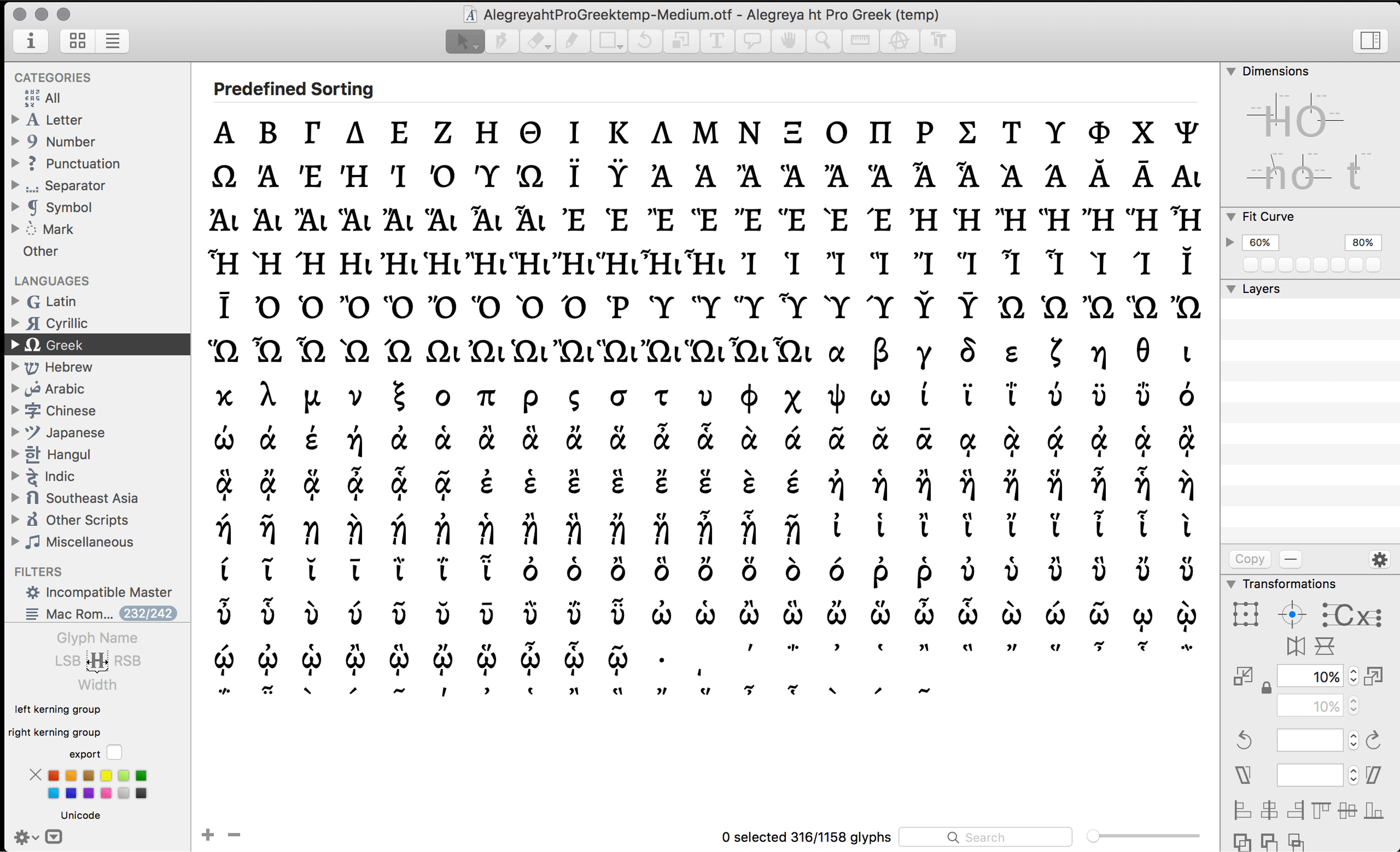
Increasingly, fonts cover multiple languages; if you open up Glyphs – one of the main pieces of software used for creating typefaces, you will see a lot of options on the left sidebar for different scripts that cover different languages, showing how typeface design has now become a global business.
If you look through a font you will see some glyphs have additional outlines connected to them which will appear conditionally (or not). For example, in Spanish the letter ‘N’ is used as a base character, but it can also function as a base character for the ñ, which has a diacritic above it.
Type designers make the shapes of the outlines, but also specify character sets and behaviours. For example, they create different variations of the characters, including small capitals, multiple numeral sets, as well as being very creative with alternate stylistic sets. Similar features are used to support complex scripts, which may require glyph substitutions.
‘Fonts are at the heart of the authoring environment and
channels of distribution.’
Consistent growth in the type design industry has mirrored the growth of digital content more widely. An example of this would be the new technology markets – tablets and phones – which needed special new fonts that will respond to different screens and rendering environments. In our current environment of online education, there are resources which enable students and teachers to work from home. As we adapt, even fonts need to support thistles changes and innovations. This is recognised by the industry, which sees that fonts adapt to enable growth in a certain business.
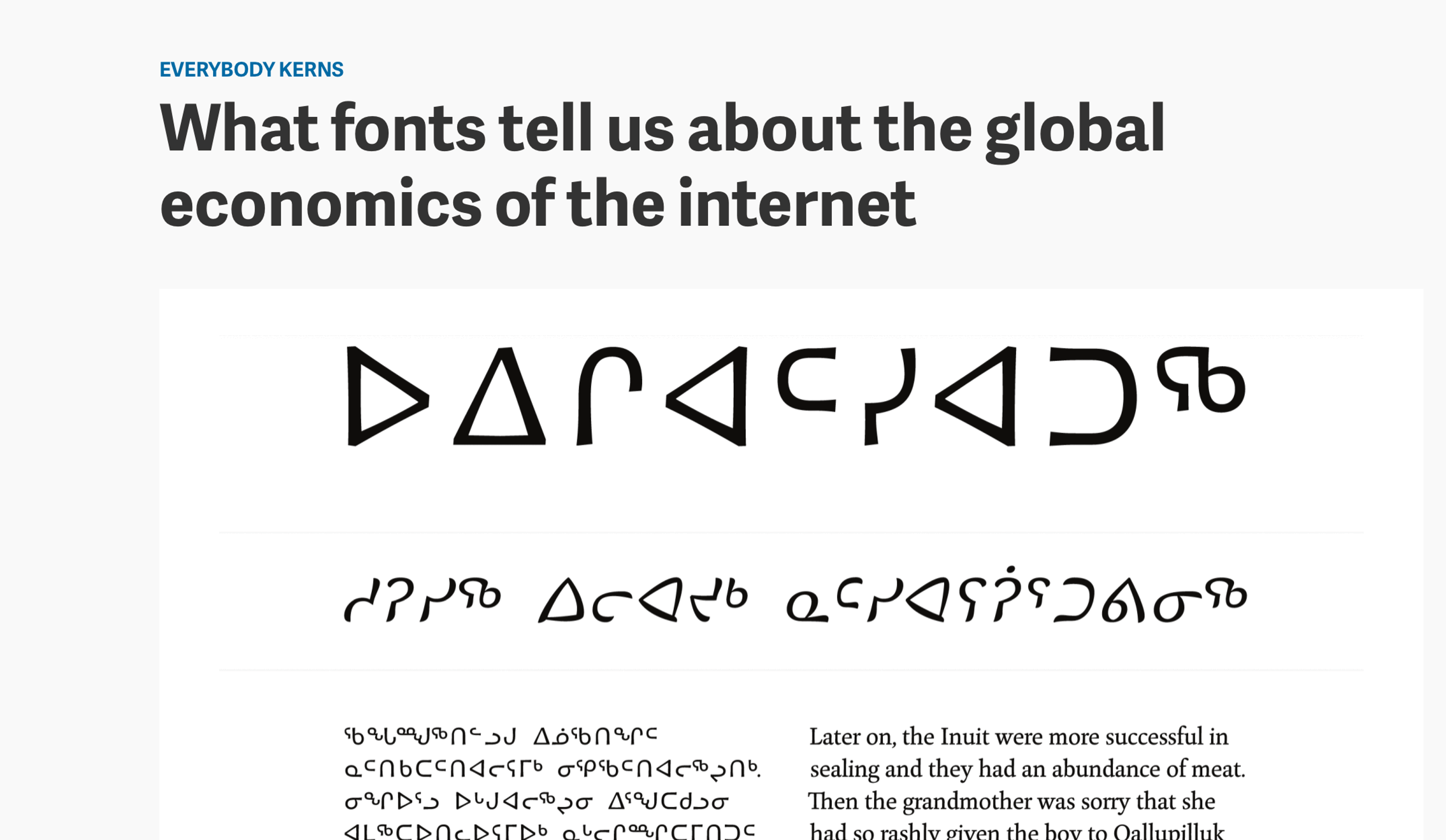
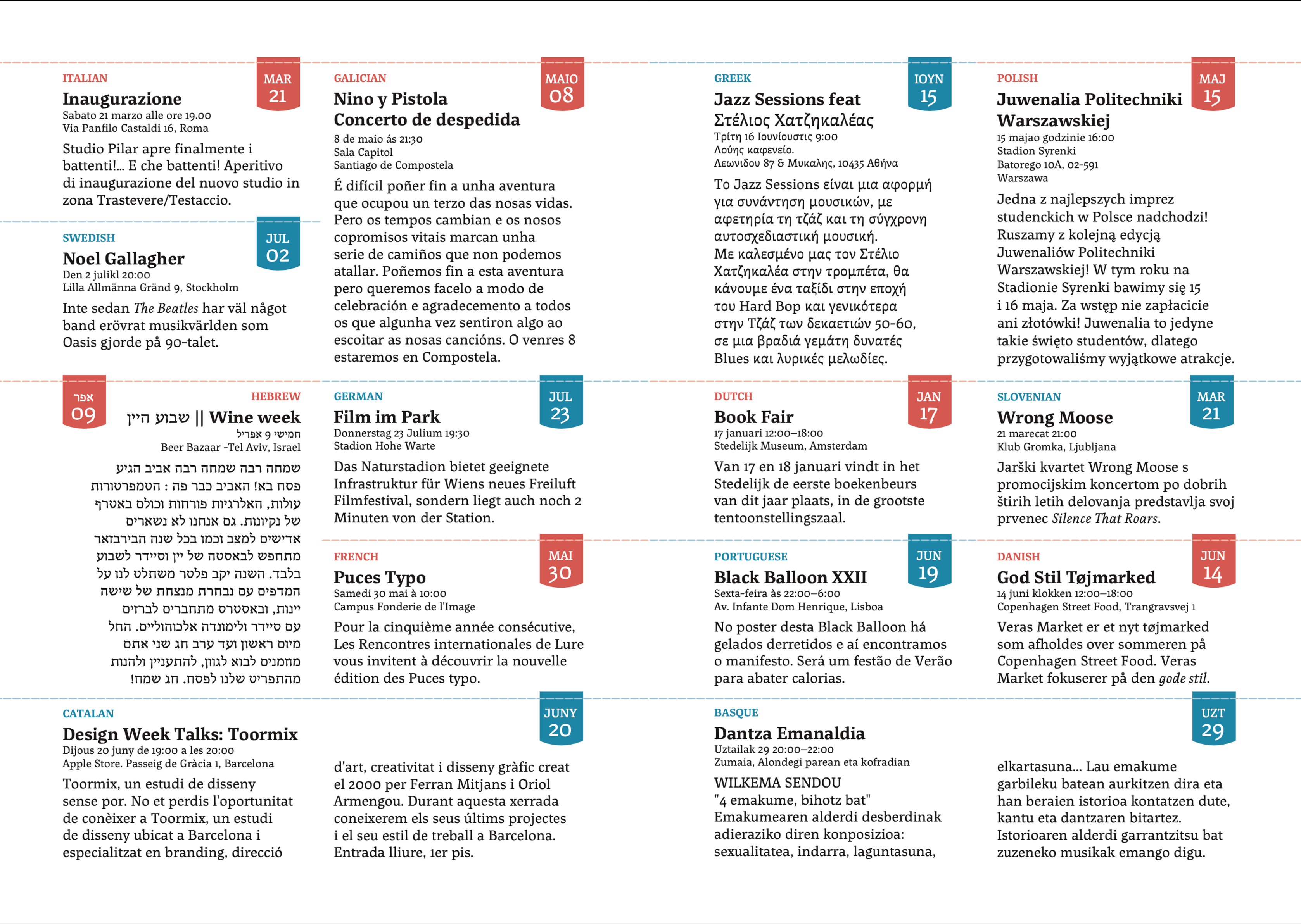
Beyond business concerns, fonts should adapt to meet ethical needs, too. The image below shows glyphs which minority communities use but which have been excluded from common use by global economics. This exclusion can become a barrier that prevents participate in education, trade and other commercial fields.
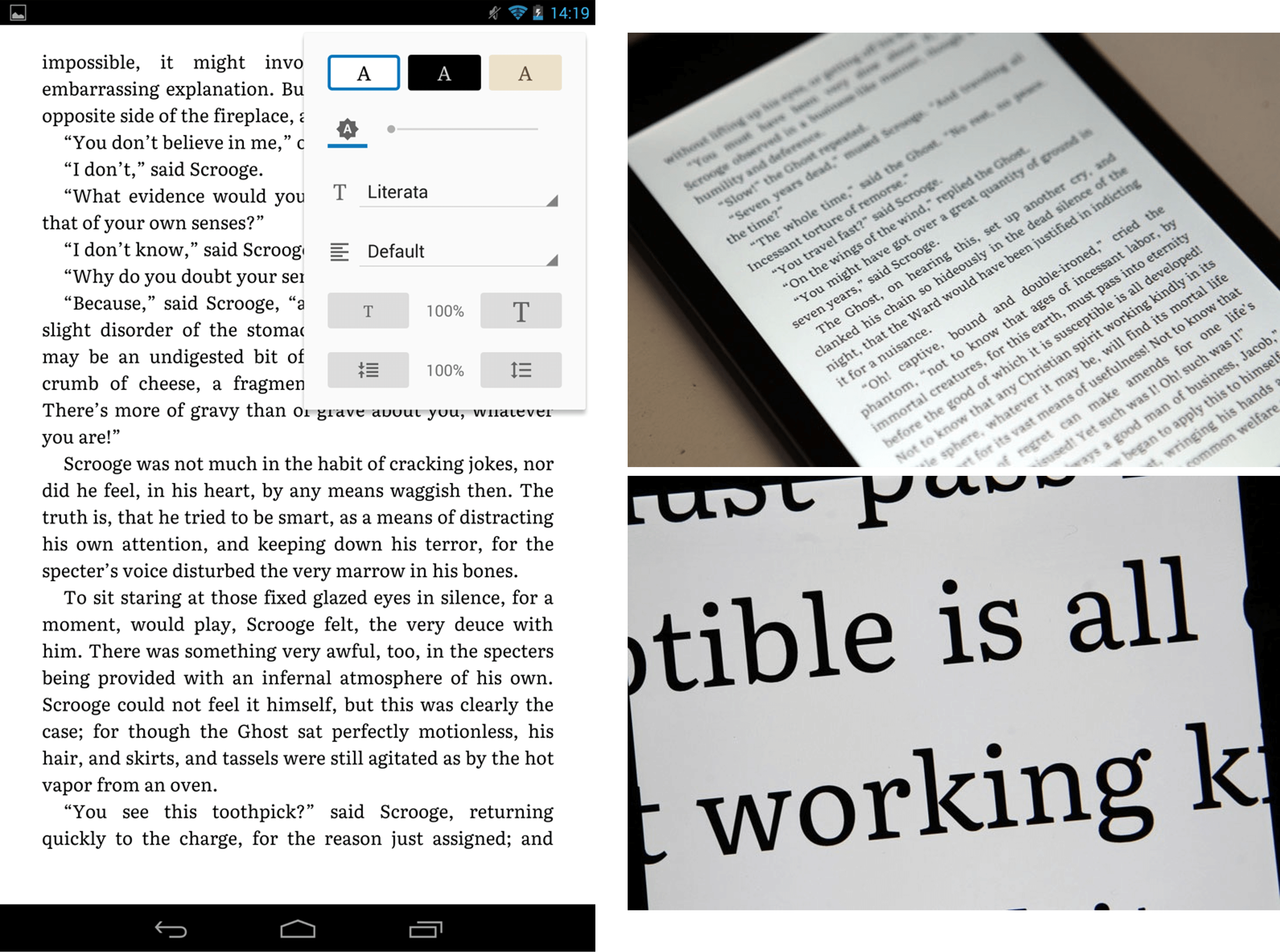
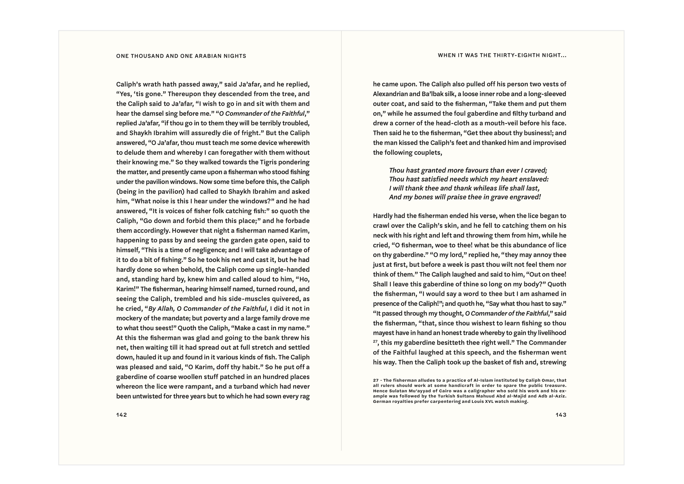
New publications also need competent fonts (see mockup below created by postgraduate students for a medical project) which are able to translate critical information such as medical data. This is important as we see the rise of mobile medicine, especially when handling viruses.

What does working in type design look like?
The image shown below was Gerry’s example of a best-case scenario – an office of two type designers with their work distributed on multiple screens. These are home office environments, but type designers are certainly part of bigger, international teams, as this is a collaborative distributed enterprise where people work digitally.
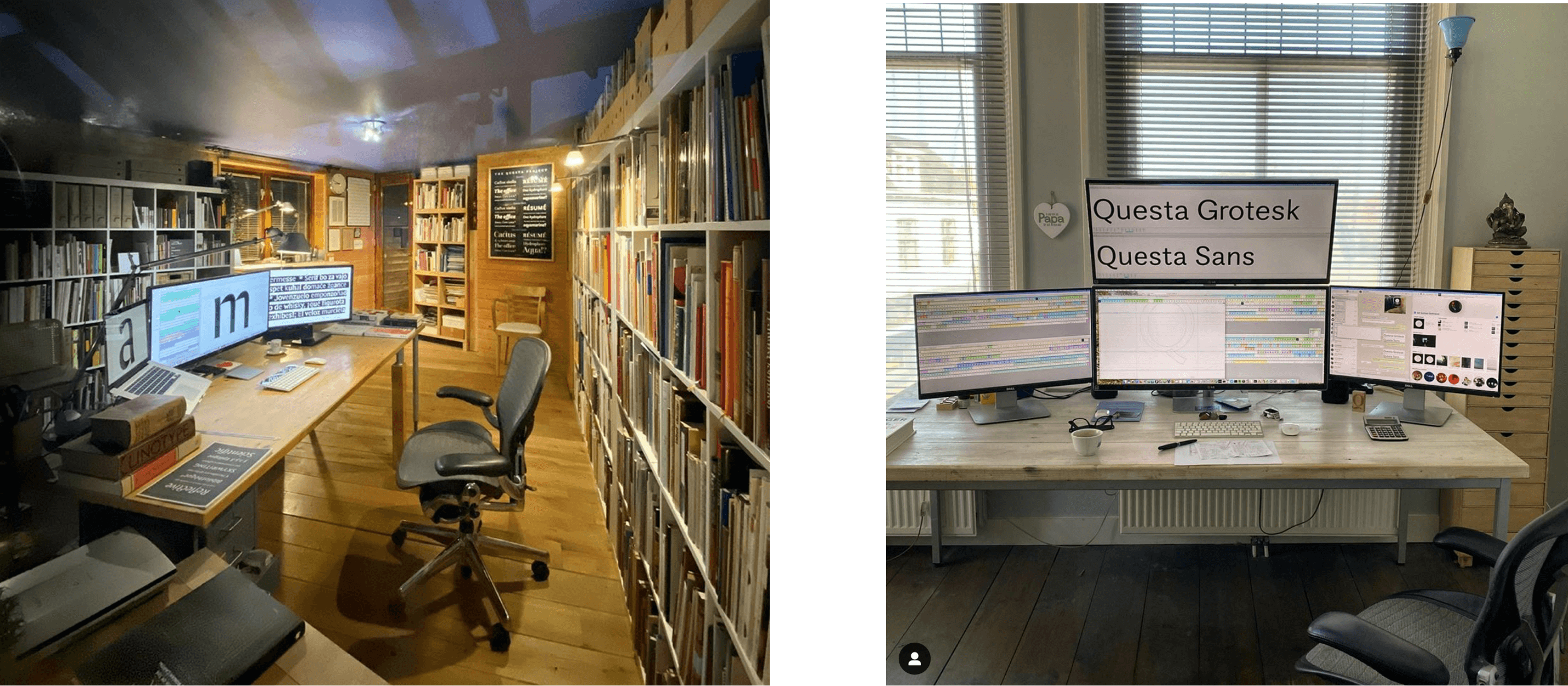
There is also a constant discussion in this type of work – whereby designers describe their decisions to clients, or each other, and collaborate on ideas to constantly challenge and improve outcomes.
Gerry explained that Instagram is one of the more common channels for typefaces designers to build up their reputation. This keeps them on track with what is going on in the industry.
Are you interested?
Gerry pointed out these essential steps for how one can approach font designing:
- Define a brief
- Have a basic idea for a family
- Think about:
-
-
- key dimensions
- stroke modulation
- optical alignment
- how they will look in smaller sizes
-
-
- Check either on a smaller screen or print out
Define a brief
Defining a brief is a cliché that you should not ignore. The focus is on what the font will be used for. Some typefaces will usually be used for running text, paragraphs, a specific combination of weights and styles, and some would be in an editorial environment that has multiple levels of hierarchy and needs to work in a number of weights or styles.
A successful typeface designer will define a brief in a way that makes clear a target typographical environment that the font is being optimised for. Some works are conceived for continuous text. Some are for very small sizes on digital screens. Others for large display use in short phrases, not full sentences at all.
Basic idea for the family
In this stage the designer needs to define the range of styles they need to have in terms of weights, differentiation of italics, boldness and other font elements.
‘Do you want it to attract attention to the emphasis of the text? Or do you want it to be subdued and let the eyes read along smoothly?’
The image below shows a range of scripts used to ensure the overall density of text is matching across all the text weights. Gerry explained that having an initial idea for your font is very important – it will give you a roadmap for designing it.
Key dimensions
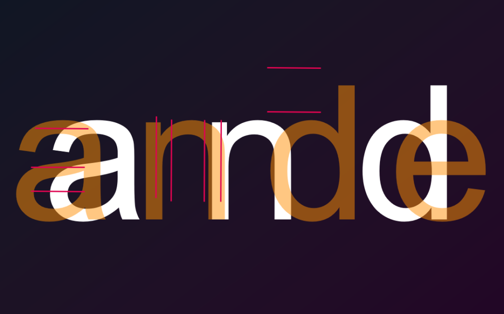
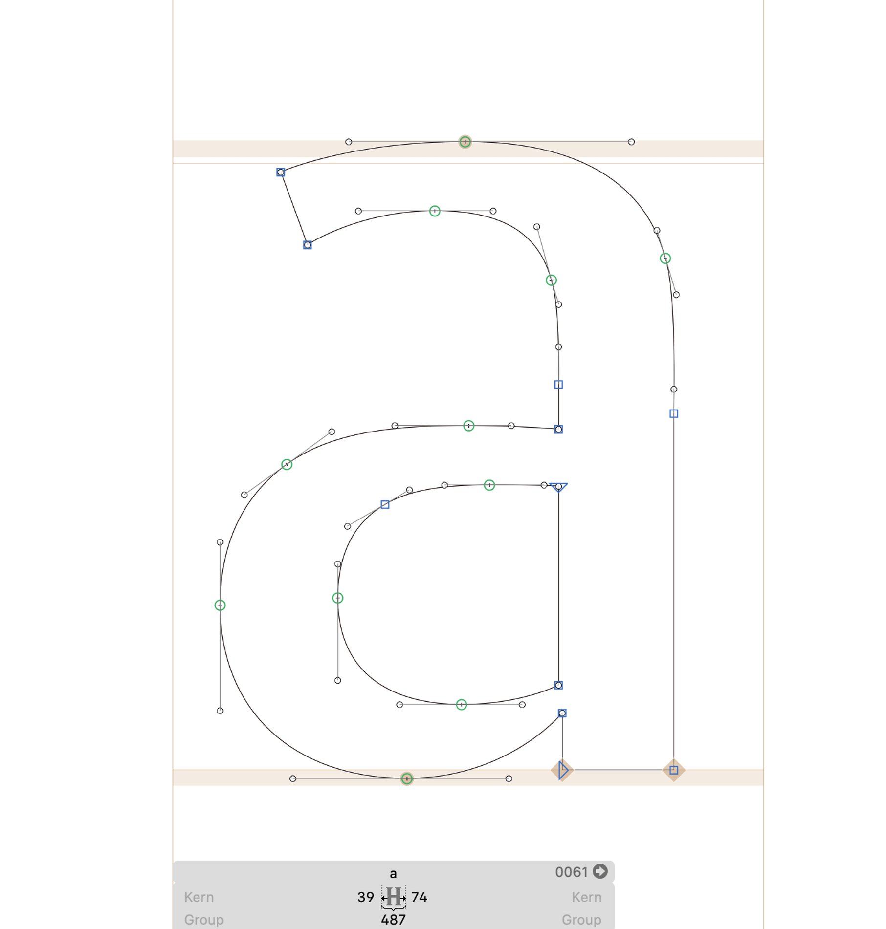
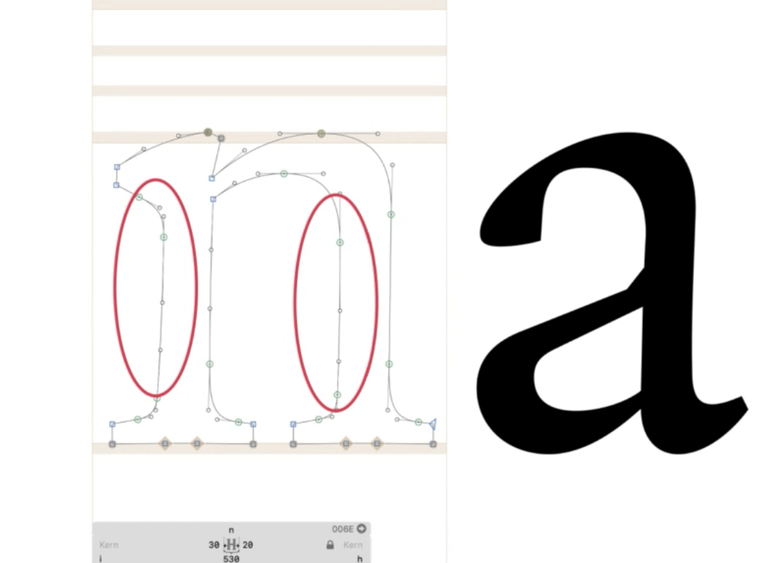
A typeface brief would give a layout of the family, now one must start looking at proportions. It is important to look at the relationship of the stroke thicknesses. In the example below, the horizontal division counter in the ‘a’ between the close and open counter has a lot to do with stylistic cues and genre of the typeface, so they connect the typeface to a historical set of typefaces. The relationship of the thickness, vertical strokes and width of the typeface (highlighted in the example) have been very consistent over the centuries. But more recently there is a trend towards slightly narrower typefaces, which is good for reading on smaller surfaces, devices or paper.
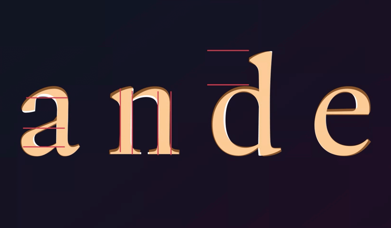
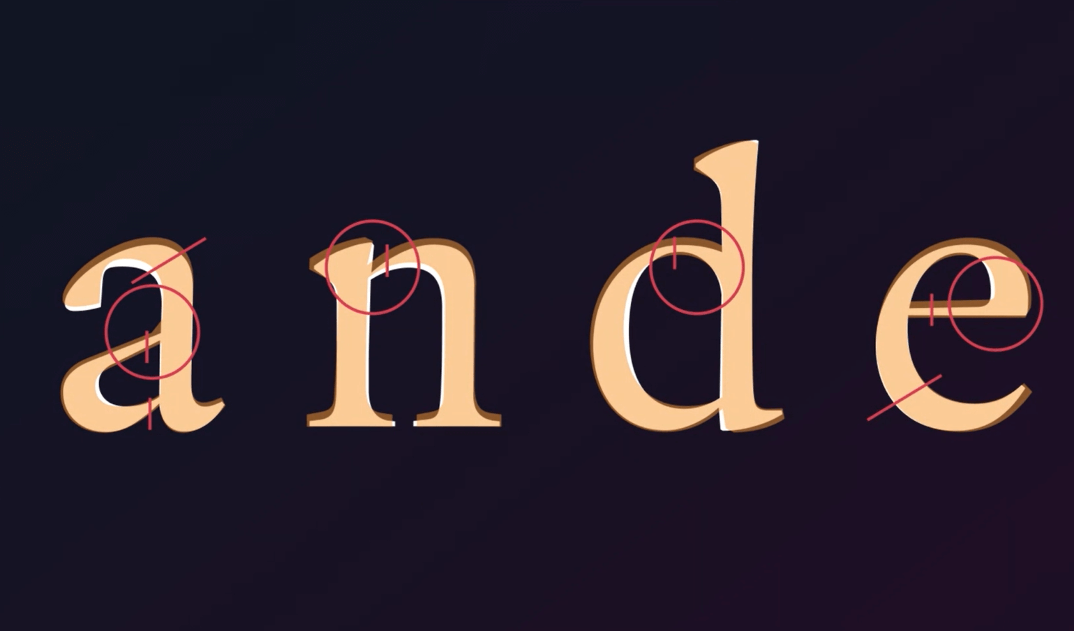
Stroke modulation
Stroke modulation has a lot of impact on the texture of a typeface. Here, the designer should have an idea of how strokes join in the letter, especially in the verticals (circled in the example). The example below shows the strokes in the joint counter in the ‘a’, the joiner across the ‘n’, the ‘d’ and the ‘e’. The handling of such details keep the typefaces uniform, with subtle variations. This is one of the areas where the designer gives personality to the typeface, There are some historical references that a designer should be aware of, but also there are opportunities for some originality!
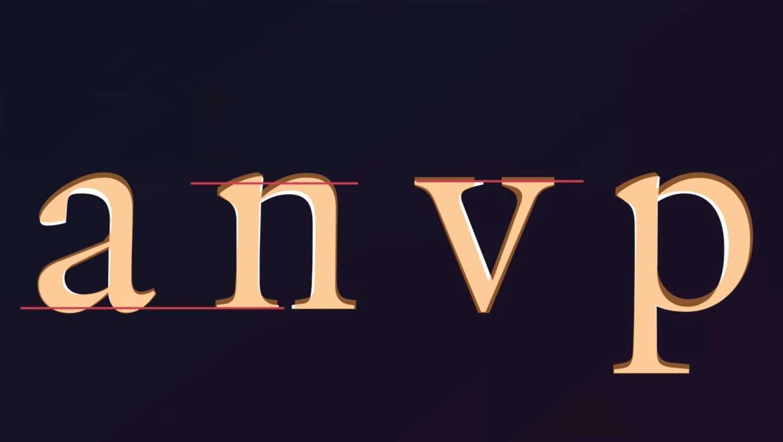
Optical alignment
This is an important factor is ensuring that the typeface looks consistent. This depends on how curved or pointed the bottom of a letter is, Gerry gave an example with the image below – the overshoot above the letter aligns with the line in order to appear the exact same. This means that the letter is balanced optically. This kind of detail work is essential, as it makes the typeface appear smoother and consistent in the reader’s eyes.
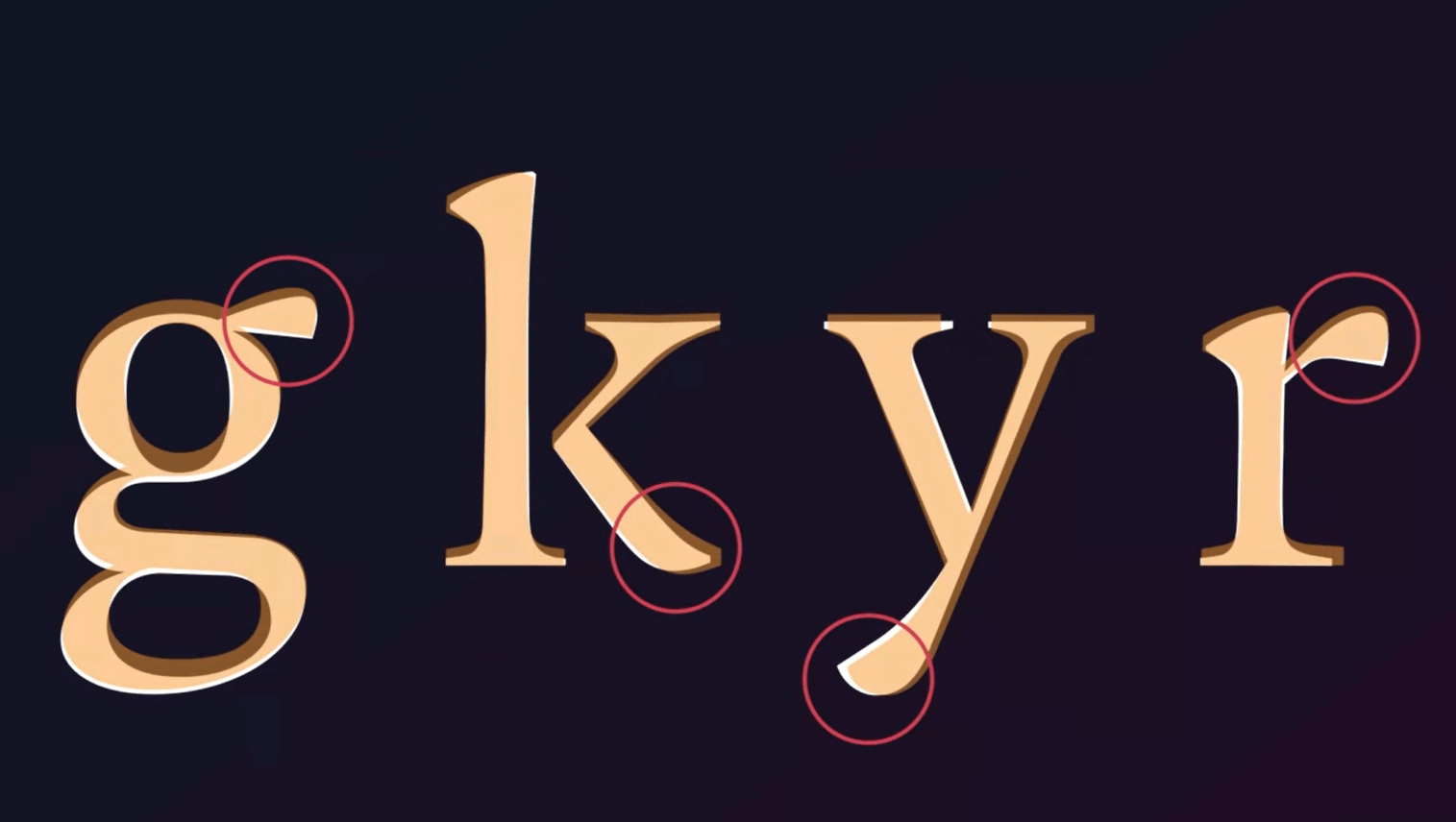
In/outstroke patterns
This decision adds more to the personality and individuality to the typeface, just like stroke modulation and homogeneity. These kinds of open terminals such as the starting points of letter strokes are something the designer can modulate quite a lot. Shades’ boldness or any constructed stroke style adds taste to the type. The example below shows how strokes and outstrokes give personality to a typeface.

Integration of exceptions
There are specific shapes in the letter such as the ear or terminals, and they can be used to introduce either uniqueness, distinction or reinforced consistency (shown in image below).
Many designers would spend time working on shapes to determine whether the typeface would stand out or not. Gerry explained that there are different optical sizes in types, so the designer could also handle these features differently depending on the optical sizes they are working on.
Two key challenges
There are two key challenges for a designer when creating a letterform – scale in working on-screens and shallow curves.
Scale in working on screens
This means that the designer will be looking at a closeup version of the typeface (Gerry’s example below) that would make it easy for the designer to make small detail changes. This used to be entirely done in printouts, but now screens have high resolution and are more reliable. A whole screen would be dedicated to preview!
Shallow curves
The other challenge are the shallow curves – having fine smooth curves on top of the letter or clunky shallow curves like the gentle swelling stem of the letter ‘n’ in the example below. To approach these, there would be a development in sketching, and working from the inside out. Being flexible with progressive development in sketching is essential in the beginning of the process.
Shallow curves in a letterform
Reflection
As a student, and not having a grip on the detail of what kind of plans and processes are considered when designing typefaces, I got an idea about how our MA type design students, tutored by Gerry, approach font design. They have to dot the i’s and cross the t’s! There are hundred of fascinating details to perfect in a successful font set. Fonts add value to our text: the correct choice of colour, text size and style seem to be vital for attracting and engaging readers. Gerry’s talk brought this to life brilliantly.
Gerry recommended a subscription to Eye magazine , so make sure you take a look if you’re interested. In normal times, you can access copies in the Department, too.
Also check out these valuable sources if you’re interested in font design:
Students’ thoughts
‘I liked the variation of information Gerry has shared; from how to become a typeface designer, to skills, to considerations when designing. It was a very informative and interesting talk!’ – Part 2 student
‘I got to know more about something that has interested me since I was a child, wanting to make my posters stand out from the rest by using my own designed typeface! it was really useful to learn more about exactly what goes on behind the scenes of designing typefaces professionally.’ – Sara, part 1 student
‘Seeing all the variety and history of the letters was
very interesting!’ – MA student