This week’s Baseline Shift welcomed our student-led diversity team – I am, we are… different by design – to organise a workshop and a talk about inclusivity and diversity in design and how we can encourage it more within the graphic design, communication and the arts. Diversity and inclusion has been more so than ever a burning issue for all of us this year, and staying aware is crucial for all of us to change our systems for a more overall inclusive society. The I am, we are… different by design team help us all to understand how as a designer you can make a change, and start discussions with the right tools.
The meaning of ‘inclusive design’
‘Having the conversation is a huge step towards inclusion in our field.’
In order to first do so, the team discussed the meaning of the term ‘inclusive design’ with students. Some students said:
‘Culture’
‘Designing for everyone by everyone’
‘Acknowledging and being interested in difference’
The team picked up on the word ‘culture’, and explained that it is a common misconception to think that everything to do with inclusivity in the industry ties itself to culture. In fact, they explained that the term grouped much bigger aspects of design that, in daily life we don’t necessarily pay attention to.
The team presented ‘inclusive design’ as a wide circle of possibilities. Extending beyond culture, inclusivity begins with considering the disabilities people may have, their gender, sexuality, age and more. For your design to truly cater to everyone’s needs, it is important to understand where the definition of inclusivity lies.
Designing for everyone
By understanding what inclusive design is, you automatically set yourself up to design for a wide audience. This entails a careful consideration of the spectrum of your user’s expectations and needs when handling or seeing your product. A good example of this was American artist and graphic designer Susan Kare’s creation of the mailbox icon.
Susan Kare’s mail box icons featuring (left) the approved proposal and (right) the unapproved first proposal she made.
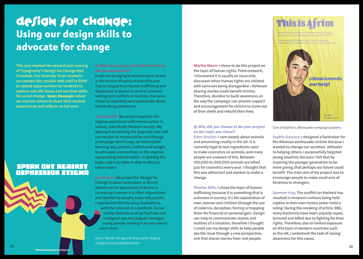
Kare’s first proposal for the email icon was refused (see second icon in the image above). The reason why was because mail boxes like this one are a common way for Americans to receive mail. An American user would know what the icon meant but for a non-American user, the icon would’ve been unrelatable and seem foreign. Conclusively, Kare’s envelope icon was a success in terms of making it relatable on a global and worldwide scale.
Learning how to be more inclusive is an increasingly prevalent concept throughout the duration of the course. In Part 2 you take on app design, and you are encouraged to consider how to tailor your app to a target user, carefully considering their needs and the problems they may encounter.
Understanding your user
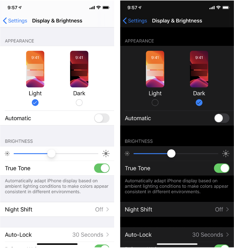
Understanding your user is the first step to creating a product that feels relatable and personal. In order to successfully achieve that in your designs, doing some research into your target audience is a great place to start. As we have seen previously with Kare’s icon proposals, gaining knowledge from the people you are designing for is essential. If you are creating an app for a certain age, say seniors, you would have to consider any disabilities they may have, such as vision problems or arthritis, and how they would interact with your app. The use of a light and dark mode for people with visual impairments is a great example of an inclusive feature of an app or a website for people with astigmatism. It is about adapting your designs to a more diverse audience.
‘It all comes back to the user.’
Light and dark mode.
The next step to understanding your user is to create user personas. They help you with empathising with your target audience by outlining specific problems that users may encounter with your product. The more you define clear problems or inconveniences your users may have, the more precise your solutions will be in satisfying your user’s needs.
An example of a successful understanding of your user needs, would be in the designing of a label on a product. Say your product contains certain allergens that could be lethal to anyone who is allergic; if your user has a learning difficulty, such as dyslexia, you would want to make sure your use of typography, contrast and size is suitable for your user’s needs.
Talk!
The main point we can take from this session is that learning about each other is crucial. Understanding your users comes first through doing a sufficient amount of research about them. This research doesn’t only just come from using the internet, but also through talking to your peers, whether they be of a different nationality, speak a different language and people who may be of a different age than yourself who may have a different way of perceiving and experiencing our society. Listening is the key component of learning from each other.
You will not only be building strong links with people who know your field, but also be broadening your mind and knowledge about how different people would use your product and resonate with it.
Getting involved
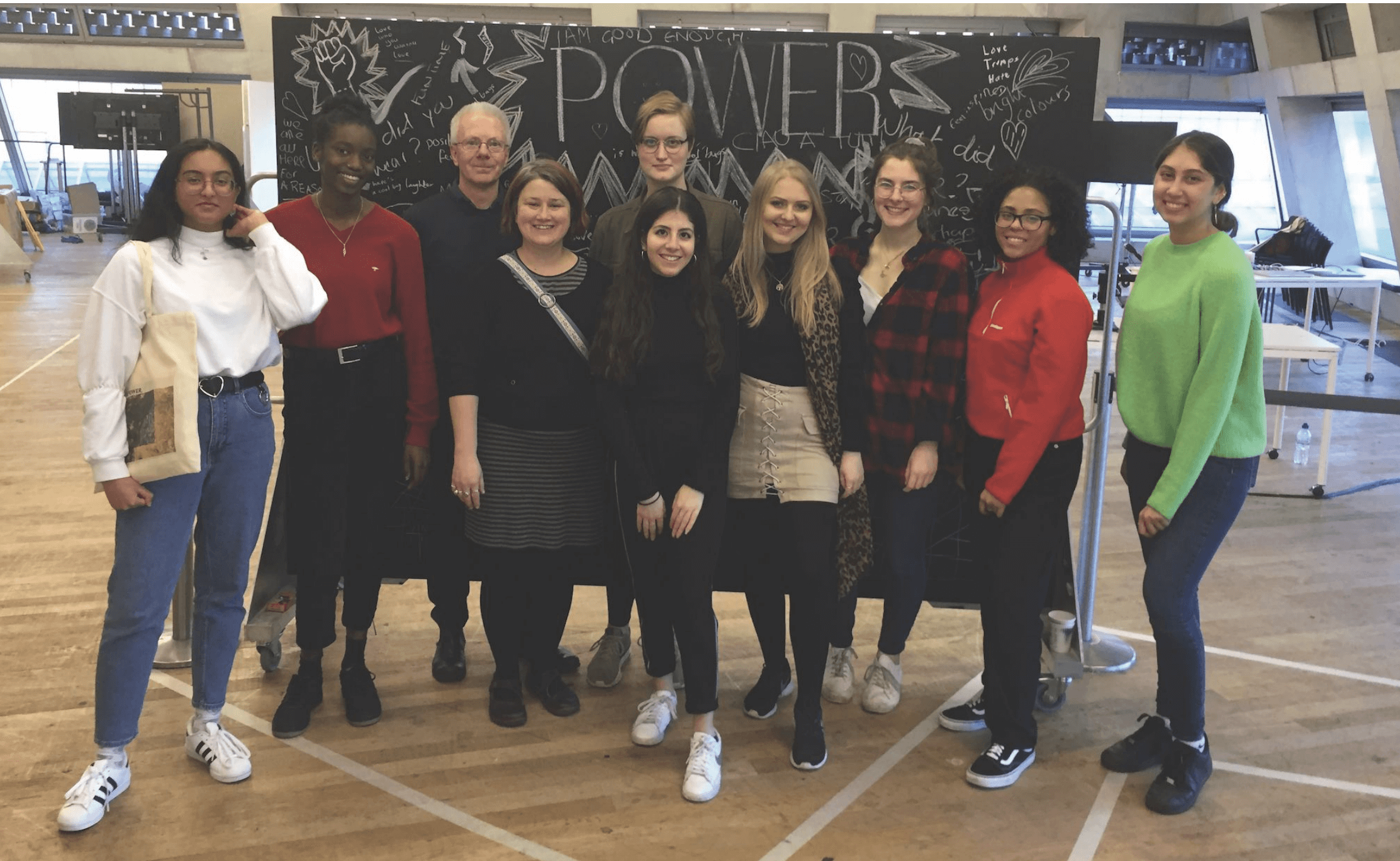
The course offers lots of opportunities for you to get involved with actively making design and the arts more inclusive. You can join the diversity team. Doing so offers a great deal of discussion about diversity within the arts and provides you with a set of valuable skills that you would benefit from after graduating. In previous years, the team have helped organise the Tate Exchange, where they get to host a workshop at the Tate Museum in London for people from all walks of life, and creatively think about a common topic.
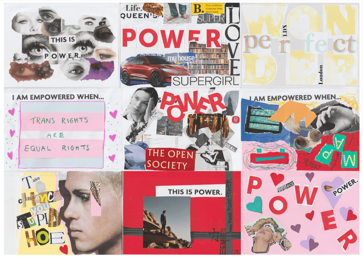
Work produced at this year’s Tate Exchange workshop on the notion of ‘power’.
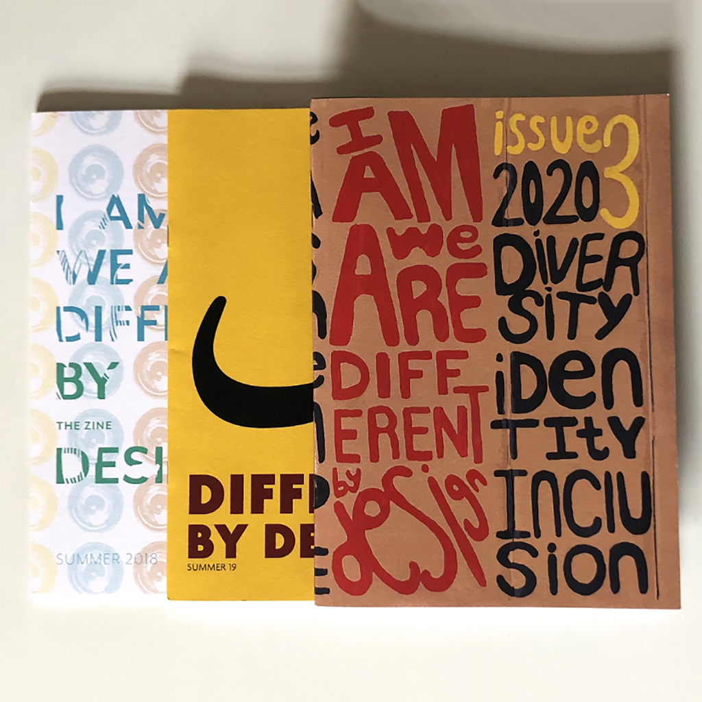
The team also published a zine fr the past three years in which they cover various topics regarding diversity in design, and interview people that are embracing it and celebrating differences. Issue 3 is now out, in which the team interviewed Greg Bunbury. You can pick up a copy in the department.
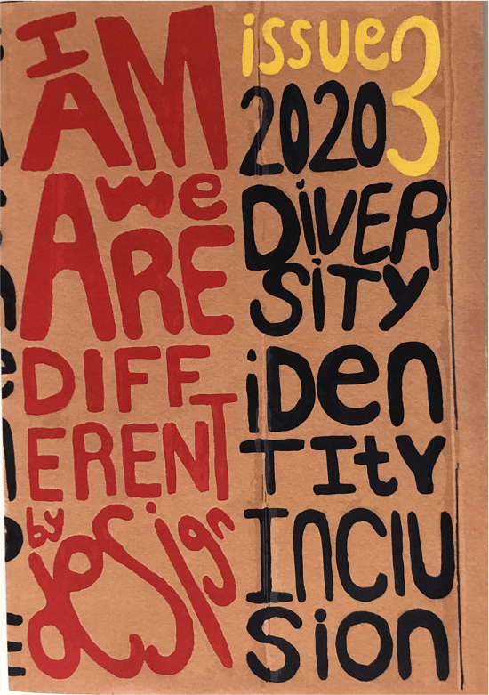
The cover of issue 3 of the zine.
The diversity team is a splendid example of the freedom you get as a student here in the department, to use design to make your voice heard. When the team was formed in 2017, they worked together with our lecturers to create the Part 3 module ‘Design for change’.
By getting involved with the team and letting your voice be heard, you learn how to overcome the challenges of using design to fight for what is right to you.
‘Challenge yourself and try and be more inclusive.’
A spread from issue 3 of the zine discussing the ‘Design for change’ module.
Reflection
Inclusive design is at the forefront of the industry right now. Consciously looking to be more inclusive whilst also partaking in the opportunities that the Department offers is the best way to build your confidence in what you can do as a student, and to create more impactful designs on the course. Being a part of something bigger than the curriculum is beneficial not only for your career, but for your practice as a designer. In the long run, having an understanding of the power you own as a designer is the greatest tool you have to create change for the better.
The team at the Tate Exchange earlier this year.
If you would like to join the team, feel free to contact the team via our Instagram: @uortypography
Students’ thoughts
‘I really enjoyed the subject matter that was discussed as I feel it’s something which needs to be discussed more and actions need to be taken into account especially how things are politically. What I valued most was how the team organise projects and work together and spread out the workload.’ – Part 1 student
‘Learning about the ways to become more inclusive in design was extremely useful, as graphic design is design for an audience.’ – Part 1 student