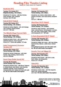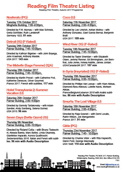
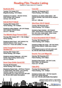
The first adjustment I did was the the space between the location and the director. The first feedback was that the space looked odd, I assumed that it was took big, so I adjusted the leading. This made my columns nearly have the same length, which overall made it neater. The 2nd feedback was the underlining of the director’s name. The feedback says that it was distracting from the location and time. Another feedback was that the director was not as important as the date and time. To resolve this, I underlined the location, date and time instead of the director.