
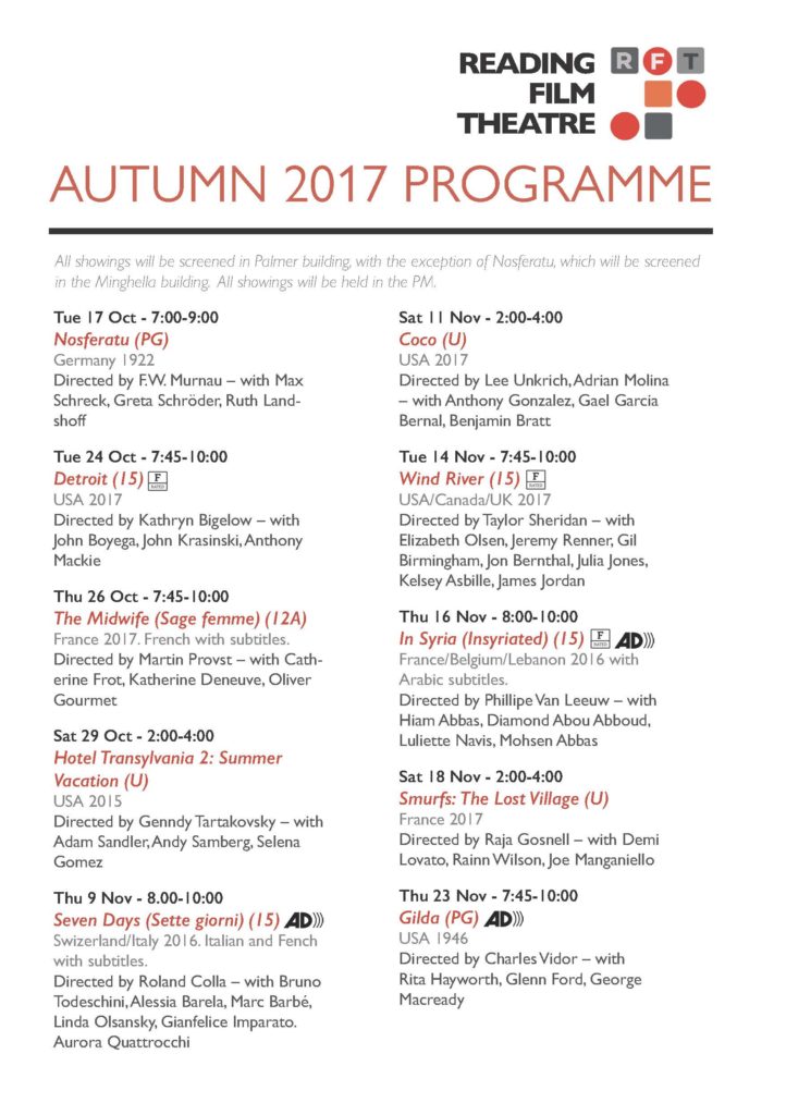
Last week in TY1INT we were given a mini week project to design a cinema leaflet of film listings. The project prompted us to think about the reader and how we could make the experience of reading a cinema leaflet easiest for a range of different users.
By the time I began the project I had already forgotten the shortcut for applying a paragraph style to text in InDesign. And now I’ve finished, I doubt I’ll ever forget it.
This project really helped me get a feel of using InDesign for my own work, outside of technical sessions where help is always at hand. I find that learning this way helps me remember shortcuts and learn handy things about the toolset provided in Indesign and how to use it to create interesting yet useful things.
I didn’t focus on the aesthetics of the leaflet as I wanted to get to grips with using a hierarchy of text in an applied manner. To start off with I found Reading film theatres logo to give the leaflet more of an identity and give myself a guide as to what colours to use. It was fun to see the variation of style you can achieve with a limited colour guide and using only one (or two) typefaces.
After today’s feedback session, I am aware of some errors made in my design that I will look out for in future work, including correct hyphenation, and being aware of separating info on line breaks. Overall I am quite happy with my outcome and maybe next time would focus on adding more visual identity to the leaflet.