
Brief
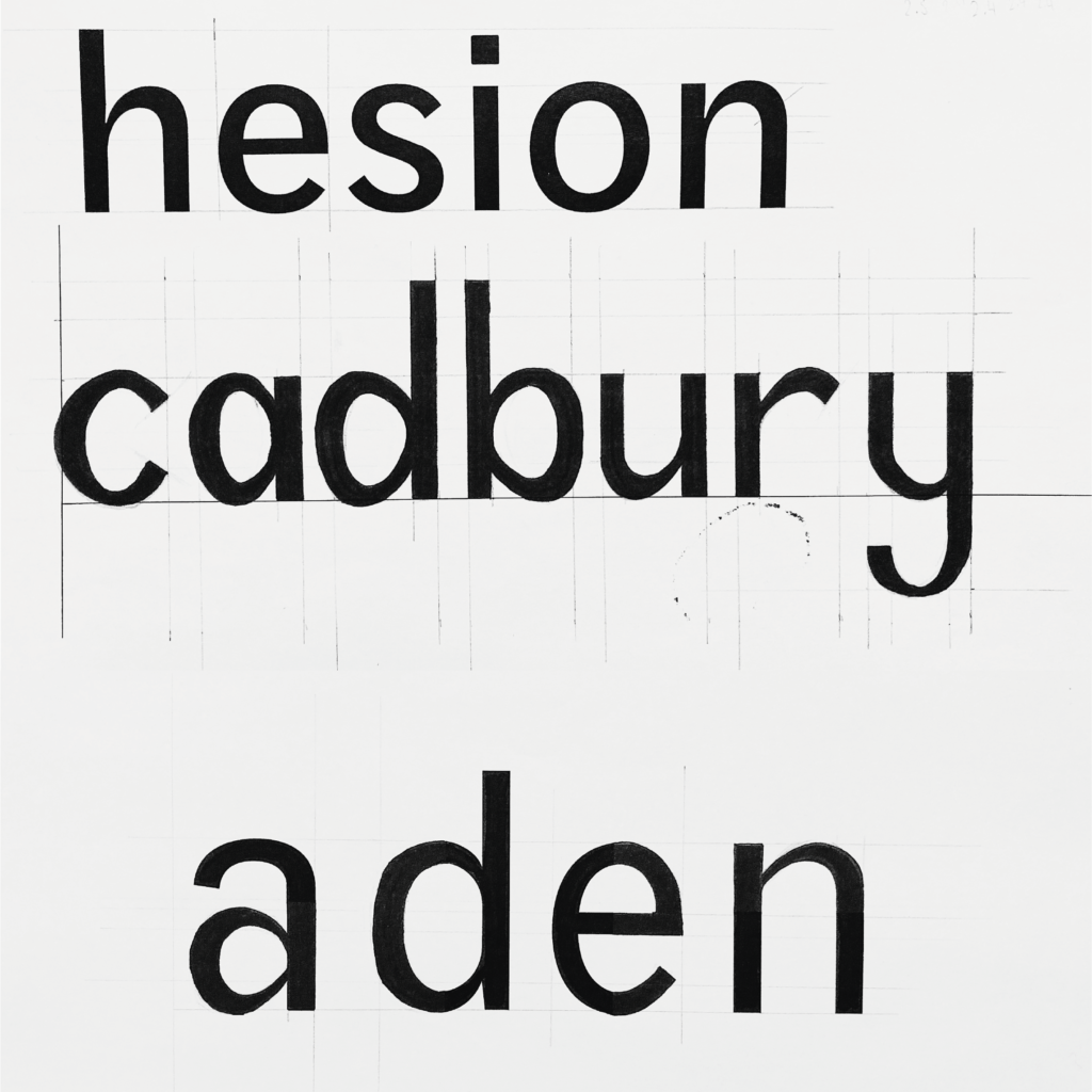
1) Choose one of the three suggested fonts. Using the letters ‘c a d b u r y’ draw how you would expect these letterforms to be presented in your chosen typeface.
2) Choose one of the three suggested fonts and complete the partially hidden letterforms.
Process
- Task 1: When recreating this typeface it was really helpful to have a scaled example directly above it. I was able to draw many measured reference lines which helped me to get proportions such as line width and x-height as accurate as I could. Where this helped me with general dimensions such as x-height and tracking, there were some elements of each letter which I did not figure out accurately. For example, I provided the ‘y’ in the first task with a very round and curved descender but this typeface actually has a much more straight descender such as is presented in this blog post. Furthermore, I drew a single story ‘a’ as opposed to a two story ‘a’, which was incorrect for this typeface. Though not perfect, I am quite pleased with the contrast on each of these letters and I think they are rather well proportioned to one another.
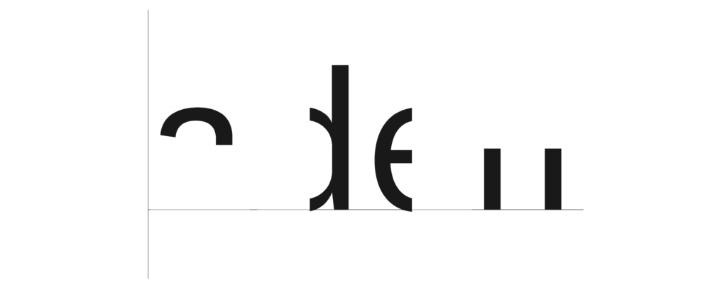
- Task 2: This task I found much simpler. Different sections of each letter were removed and we had to fill in the gaps as accurately as we could. Having observed what many of the letterforms should have looked like after finishing the first task, I had a much better idea of what to recreate here. Similarly to the first task, I drew out reference lines after measuring the scale of these letterforms. Whilst the proportions are quite accurate, I missed some very simple but key details within the letterforms themselves. The crossbar of the ‘e’ is presented slightly too thick. This could have been an error in technique when going over my sketches in fine liner. I also managed to overlook some subtle detail in the letter strokes of the ‘d’ and ‘n’. When compared to the official font, the strokes taper inwards slightly at the ends of the stroke next to where the shoulder joins. Additionally, my letter ‘a’ is too a-symmetrical. This typeface also adds a spur to the ‘a’. I found this to be quite uncharacteristic compared to the rest of the typeface which is why I unknowingly missed this detail.
Reflection
This project taught me to look, look again, then look again harder, especially when something seems rather simple to begin with. There is such a huge variety of typeface available these days, but no two are exactly the same and so it is important to be able to pay attention to the minute detail as it all comes together to create the unique font.