
Every time I add my flyer as media it seems to add a link to the PDF version of it. But anyway here is the link below to click on if you want to have a look.
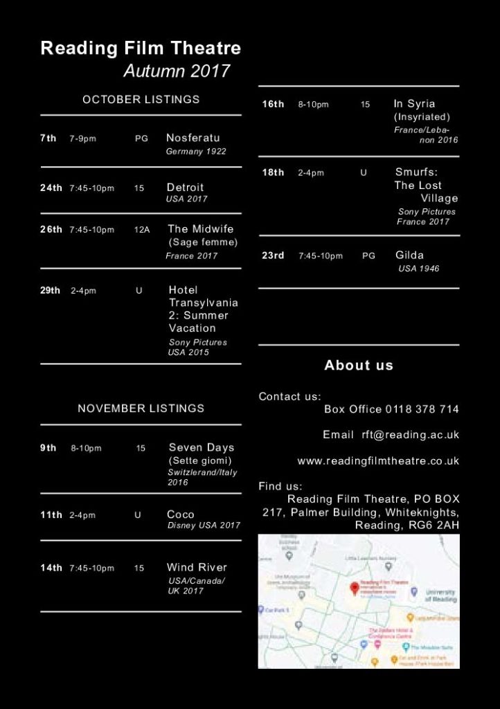
I chose to use only black and white, as I felt it differentiated it as a flyer rather than a poster (whilst keeping it simple). I used lines to separate each film and make it easier to read. I used a grid system within the 2 columns, to make the date, rating and time easier to follow and read rather than just a block of information.
I added in about us at the bottom as I believed that it is important to know who to contact and where to go.