Mind the gap
Gerry’s task
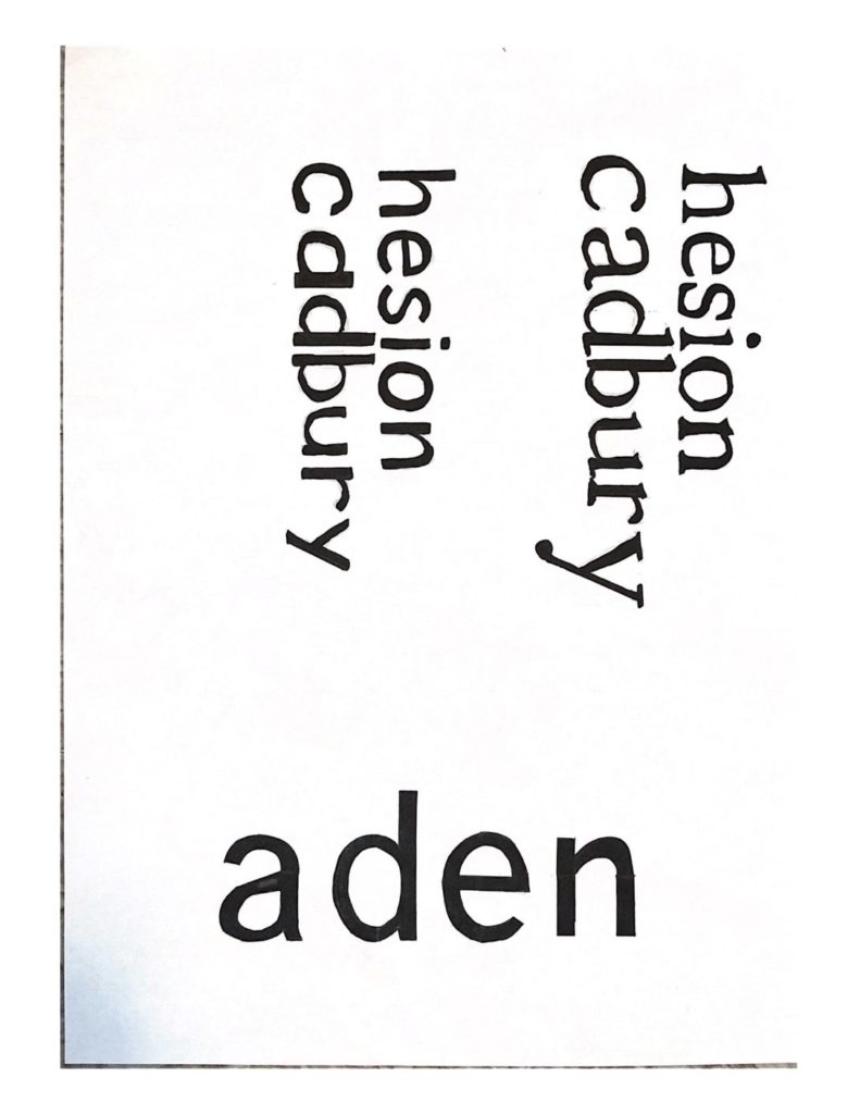
Gerry gave us two tasks for the day. The first was to look at the typeface that the word ‘hesion’ was written in for us, and to then imitate this and write ‘cadbury’ in the same font below. This was trickier than I thought as we had to imagine what the letters in ‘cadbury’ would look like, by using parts of the other letters in ‘hesion’ and analysing their shape, size and features. For example, one of the fonts had serifs and the other one didn’t, so I tried this task in both ways. I learnt that the most effective way for me to achieve the best outcome with my letters was to start by sketching out each letterform until it looked right. Then I would draw the outlines of each letter using a fine-liner and a ruler to sharpen the edges, and finally to fill in each shape using a thick marker pen. This way, I could achieve good, solid letterforms.
The afternoon task Gerry gave us was to fill in the gaps of letters which were only half printed and had missing parts. So we had to take what we could see from a section of each letter and use this to design the rest. There was some room to be creative, but we also had to make sure that the letters looked natural and each part blended in well to the other.
I liked this mini project, as it involved more hands-on sketching and enabled me to practice drawing different typefaces while encouraging me to look more closely at individual letters, rather than the font as a whole.

