
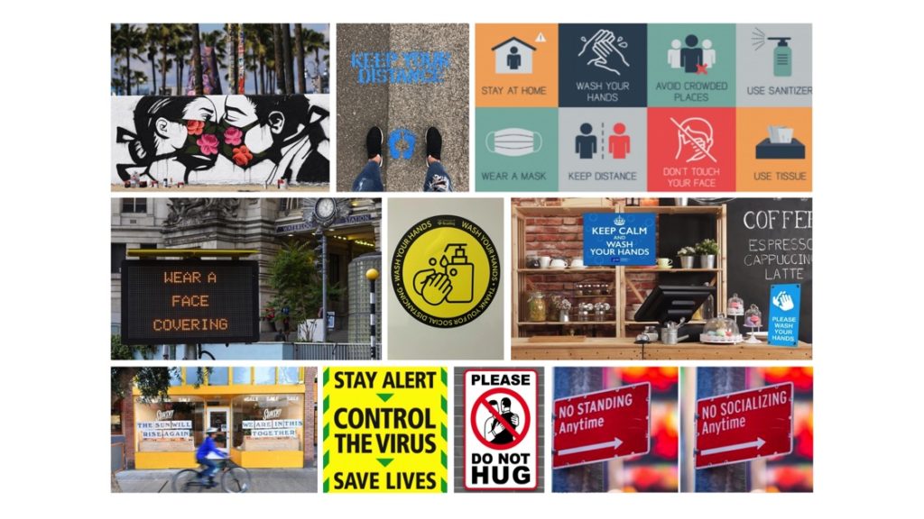
When studying my images( combination of own photographs and internet images), it made sense to divide them into four categories, Hands, Face, Space and Safe. It links with the meme ‘Wash hands, cover face, make space’ created by Boris Johnson. I felt the need to add ‘Safe’ to it to accommodate a category of pictures that I find necessary.
My categories share similarities in how they communicate, convey information, create awareness and offer warnings. All the categories share the aim of helping people with their decisions based on the information they see. They are similar in communicating information to the same audience/readers, and in how they use a range of verbal and non-verbal elements to convey a message. Similarities are also found across the four categories in how some signs are less effective than others due to overcrowding or illegibility. That reduces the impact and clarity of the message, and would surely cause difficulty with reading and comprehension, so people would move on and miss the message. There are also good signs in all four categories, which are easy to read, communicate concisely with few words and draw attention. The use of colour is also quite similar is all four categories. Colours that come up mostly are amber, blue and red. That is not a coincidence, but a result of the psychological effect that colours have on people. Amber is associated with caution, whereas red implies danger or warning. Blue stands for informing, trust and building relationships.
Differences between the categories are seen when it comes to the specific areas of focus. The Hands category emphasises the importance of washing hands and using hand sanitiser to protect ourselves from getting or spreading germs, whereas the Face category concerns itself with face coverings and protecting others. Space has the biggest variety of signs and its aim is to discourage physical contact. They vary from markings on pavements to socially distance, to road signs and various forms of signs in shops, all directed at encouraging consumers to distance from others. The category Safe is different from the rest in that it plays on the notion that people are unified through circumstances that affect everyone, and that we all play a role to keep ‘us’ safe. I also like that some of the images are more personalised and encouraging when compared to those that are purely functional and impersonal.
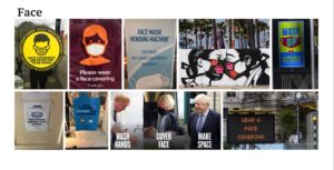
References for Face images:
Wear a face covering (electronic display)
Wash hands, cover face, make space
The five other images were taken by me on campus and in the Oracle shopping centre, Reading.
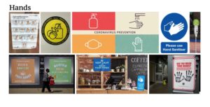
References for Hands Images:
The two other images were taken by me, also on campus and in the Oracle shopping centre, Reading.
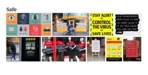
References for Safe images:
The two other images were taken by me in Reading town.
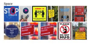
References for Space images:
No standing/socialising anytime
Two of the images were taken by me on campus and in the Oracle shopping centre, Reading.