
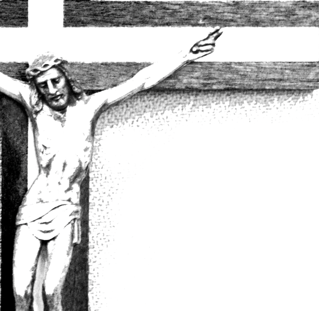
For todays brief, we were given a word to respond to. Mine was ‘Religion’, and with this I had to create an image or composition that clearly represented the word. I started. by drawing a spider diagram, writing down any words or ideas that related to religion to see what I could use as a subject. I liked the idea of using a crucifix as my subject as its shape is quite graphically symbolic and well known. I wasn’t sure on the tone I wanted to convey so I started writing down different questions, theories and ideas that people commonly had with religion. I liked the idea that god might not be this perfect image that he’s portrayed to be, and could actually be something sinister. I had this result after questioning why such tragedies happen in the world and why an all powerful being such as god would let them happen. I started questioning if he truly is god or the devil. I wanted to take this idea and inject it into the second image, which is supposed to change the tone of the first by adding an element.
Firstly I started photographing a crucifix that I borrowed. I used this as it was a large enough ornament that also had Jesus on it, making the first image represent the religion christianity, and the pain and suffering Jesus endured. I decided that the most universally understood message of the opposite of god was by turning the cross upside down, I felt that this would be a good way to show how God may in fact act more like the Antichrist. I pinned the cross to my dorms notice board, allowing the cross to be upright, and still have shadows falling down in the correct direction. I knew that I couldn’t just flip the image as the shadows wouldn’t be in the right direction, so I photographed the second image with its bottom sellotaped to the board so it wouldn’t fall forwards. I then uploaded the images to photoshop. I wanted to erase the pins and the sellotape, just to show the cross, which I did through using the clone tool in marked off areas via the section tool. I felt that this symbol and idea of God was very old fashioned so I wanted to replicate that feel. I increased the contrast and turned the images black and white to create an old illustration effect, whilst cleaning up the background. I didn’t want to overcrowd the images so I left them on white backgrounds and liked how the negative space became apart of the cross, suggesting purity. I thought that I could show resentment to the idea of God being the Antichrist through some sort of relic effect, as if someone had scratched and abused it in spite after reading it in a book. I found pngs of scratch marks by pens on paper and selected the outlines and and pasted it onto of the second image, putting the blend option as divide, which broke up the marks and made them distorted and more authentic. I decided to target the face and the script on the cross to emphasise a rejection of the identity and ideals of christianity.
![]()
![]()