

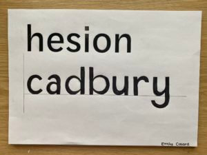
For Gerry’s project, we had two tasks. Firstly, using the provided letters ‘h e s i o n’ , to give us clues on the characteristics of the typeface, we had to draw the letters ‘c a d b u r y’. We had to pay attention to the contrasts of stroke sizes as well as the x height and many other aspects of the typeface. Overall, I was pleased with my outcome for this task, all though, there are definitely a few letters, such as the ‘a‘ and ‘b’ that needed alterations. ![]()
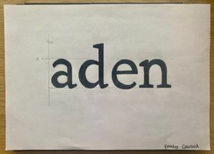
For the second task, we had to draw the missing parts of the letter forms. My outcome for this task can be seen below.
I found this typeface design project interesting as I was able to look at letter forms in more detail. I inspected the dimensions and angles of each character and discovered the relationships between different letters.