During Eric’s session on Monday, we were asked to venture outside and photograph examples of typography in the environment that caught our eye. I found the task interesting as it encouraged me to look at typography in a different way. I found myself paying more attention to the use of typography in the environment, how it was positioned, and the material it was made from.
We were given a couple of hours to take our photos before we went back to present three of our favourite outcomes, and discussed them with the group. It was interesting to see how all of our images differed from one another and who photographed similar examples.
We were then asked to edit and organise our images in a method of our choice. I found editing the photos an enjoyable task and decided to organise them based on perspective. I had three folders labelled “above”, “below” and “straight on” and organised them depending on how I had to capture the object.
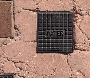
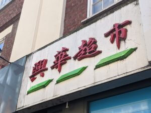
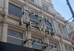
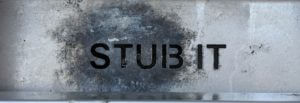
Here are some of my favourite outcomes from the session.