
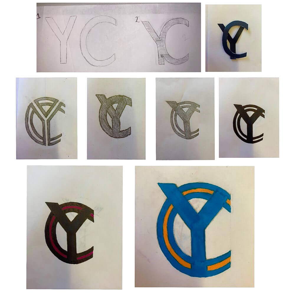
Our brief for this project was to create a graphic representation of our initials using either Futura or Garamond. To start with I simply brainstormed and sketched out a few ideas in both fonts. I chose to continue my exploration with the Futura font for the rest of the task as I felt that my initials were much clearer this way when attempting to merge them. I was struggling to find combinations and solutions due to my first initial, Y, being so angular and my second initial, C being the exact opposite. To combat this I drew and cut out the letters to experiment with them physically. This helped me massively as I could now visualise what my monogram could look like a lot easier, therefore allowing me to be more creative and push my experimentation further.
For my final design, I chose to combine two of my ideas, as you can see in the image above. Once I had finalised the structure of the design I then had a little extra time to experiment with colour. I chose to do black and purple for my first attempt with colour but found it was a little too dark and so didn’t stand out as much as I would have liked. For my second attempt, I chose light blue and orange. I went with light blue as it is the colour often associated with the city that I am from and seeing as it was my initials I thought this fit quite nicely. I chose orange purely for aesthetic reasons, as it made the monogram stand out just that little bit more.