Background
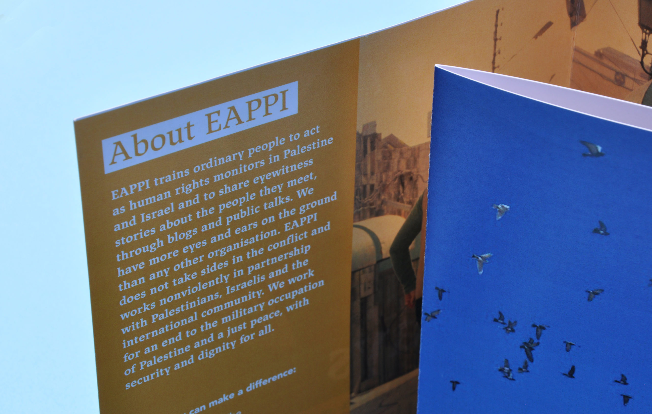
The Ecumenical Accompaniment Programme in Palestine and Israel (EAPPI) is an international programme coordinated by the World Council of Churches. Their organisation required a campaign booklet and postcard that could be used to raise awareness about the work EAPPI carry out, for example offering protection and mitigate friction between Palestine and Israel.
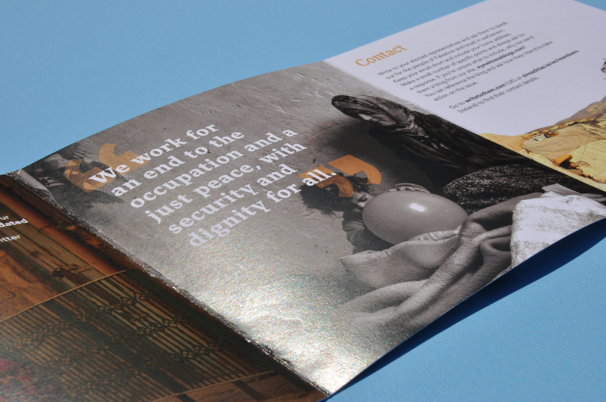
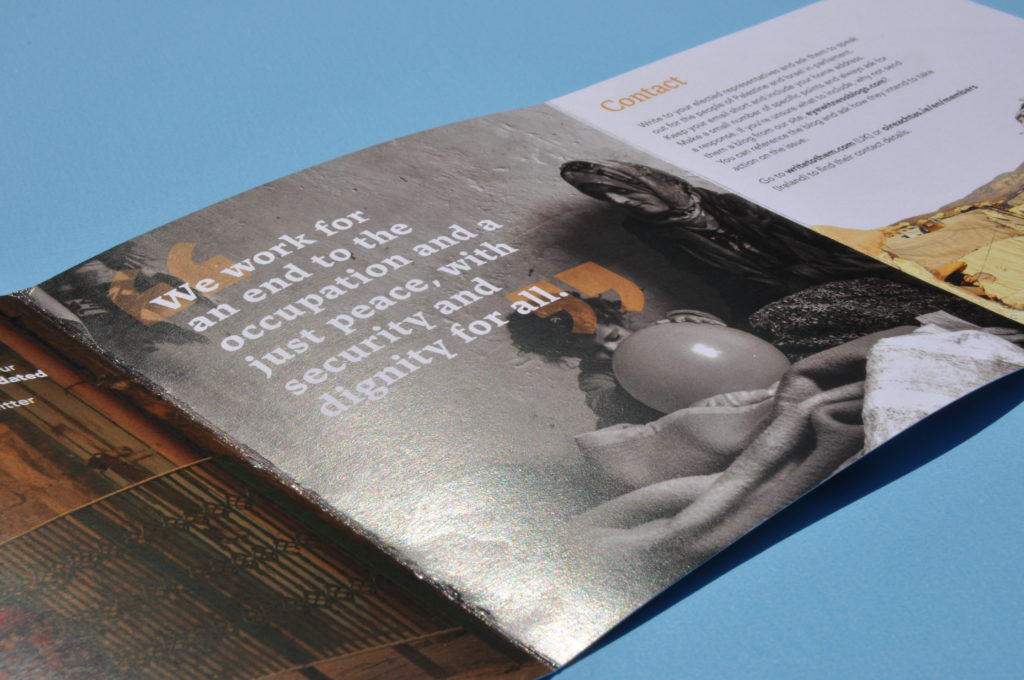
The conflict in Palestine and Israel is ongoing and EAPPI aims to mitigate the conflict through volunteers helping and donations, as it is a low budget programme. Our aim was to create an effective visual impact through our deliverables to ultimately spread awareness and elicit engagement with the audience.
The team consisted of two people, working cohesively alongside each other. Summer and Seniz collectively worked on both deliverables, the booklet and postcard, with EAPPI’s brand and ethos in mind. Both working on the research and design development stages, it was apparent that through meetings and communication we could work on different things at the same time. Ultimately benefiting us by improving our efficiency and adhering to our timeframe.
Restated brief
The Deliverables:
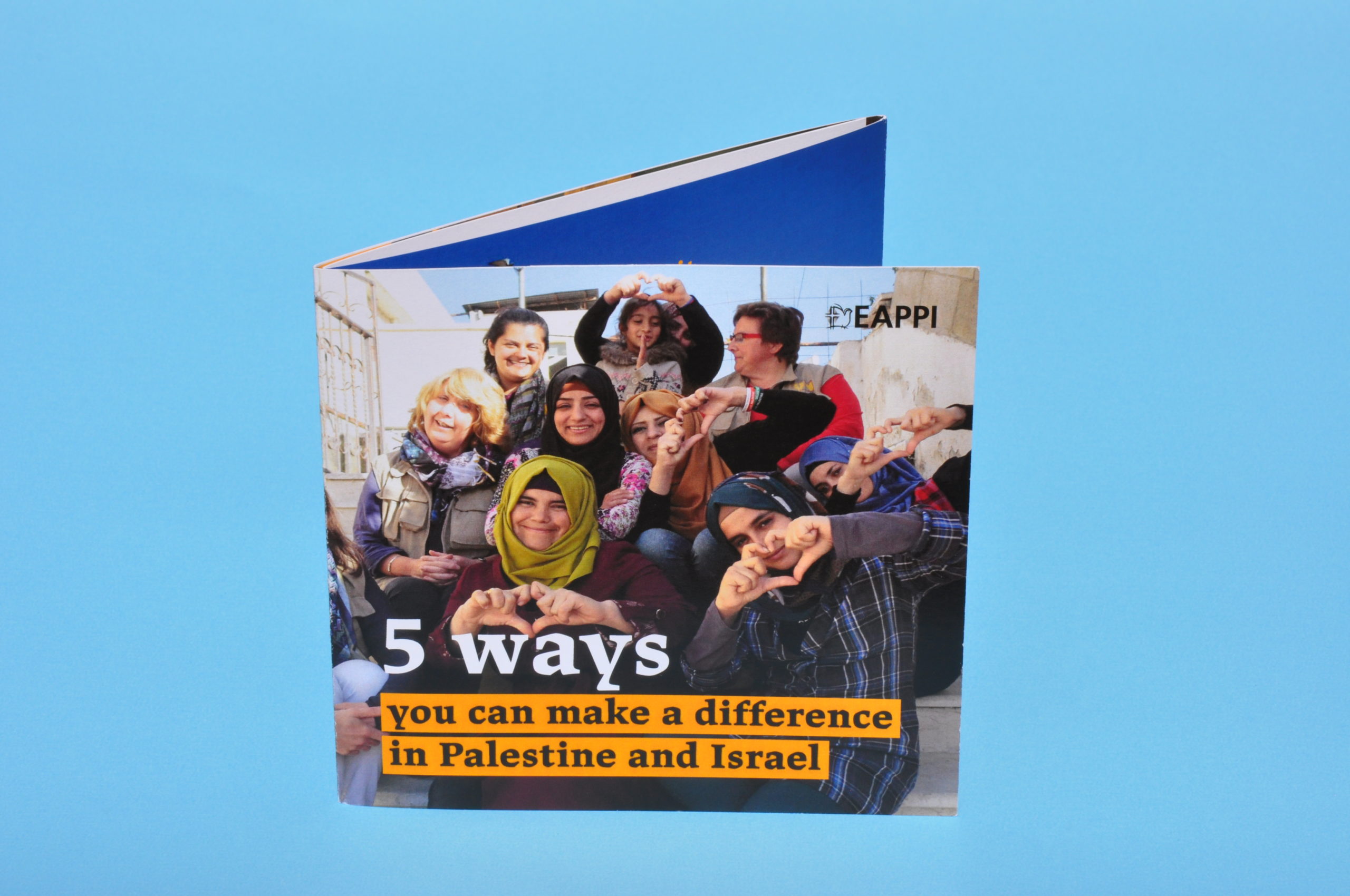
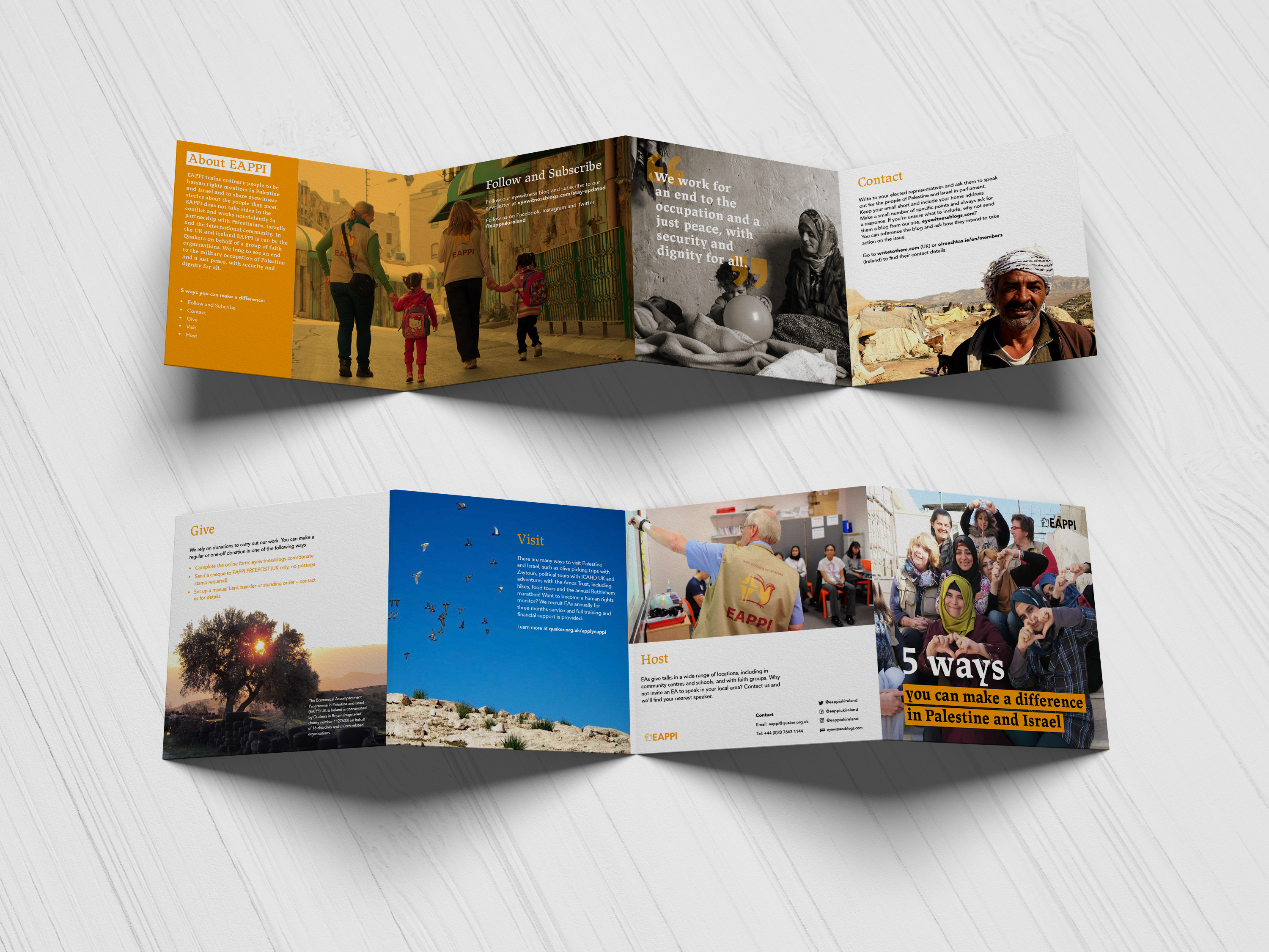
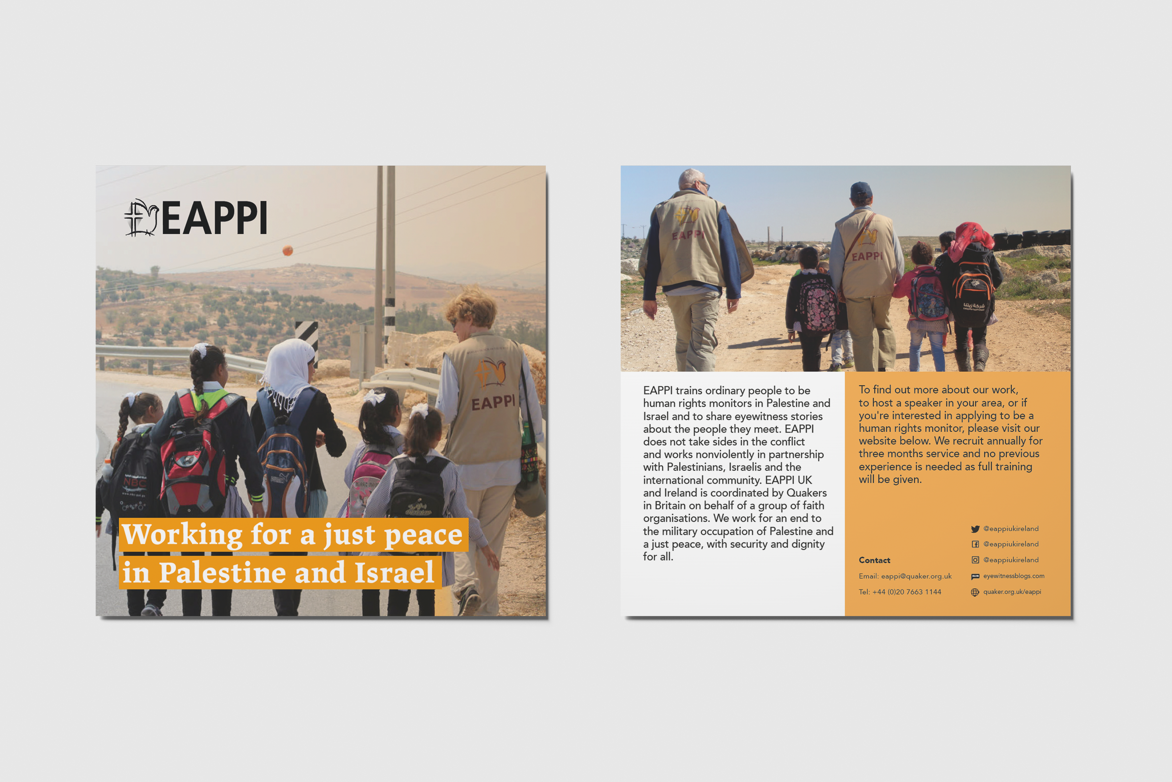
- A ‘what you can do’ booklet foldout, which embodies the ethos, what EAPPI do and how people can get involved. This would be produced at a small scale format due to, budgets and pricing.
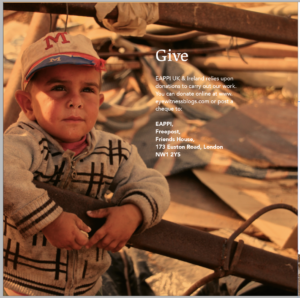
- An information postcardabout the programme, which is a summarised version of the booklet to be distributed to the public, with a focus on getting people to donate and follow them on social media.
A challenge that arose during the briefing stage was that the deliverables were uncertain. For example, the format size, printing aspects and the second deliverable was not finalised by the client’s team. Therefore, the client was unsure of these specifications, however these were solved shortly after. A main aim of the client was to spend as little money as possible due to their low budget as a charity. Therefore, with every format or production decision we made we had to consider this, such as keeping the format size quite small and not using a thick card stock.
Research
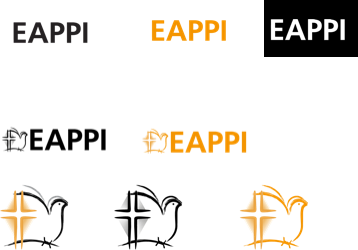
Initially, we educated ourselves on the background information about EAPPI through their website. This enabled us to understand the type of audience our client receives, the general public and people who are interested in helping the cause. However, it was through consulting with our client in meetings that enabled us to gain in-depth knowledge on the aspects we had to take into consideration. This included the Hex colour #Ed8000 of their brand and staying within the scheme of orange, black and white that our client requested. Also, the client gave us a link to their blogsite which was still under construction but displayed the typeface, appropriate logos, the type of content we would be working with and tone of voice. Using the information the client provided and our own, we further researched the way in which we wanted to approach this project.
After a few meetings with the client we were able to narrow down an appropriate format for the booklet and were advised to initially begin on this while they finalised what the second deliverable would be. This meant that further into our design process we were informed of the second deliverable being a postcard to advice individuals on the ethos, how people can get involved and a general overview of EAPPI. Due to already beginning the designing of the booklet, with forming an underlying grid, brand and visual identity, this made it more comfortable to produce an accompanying deliverable and we were able to achieve this efficiently.
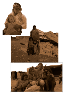
The client included us within a collaborative Adobe Lightroom group of all EAs best images of volunteers within Palestine and Israel, giving us a wide scope to design with. We were trusted to pick and use images we felt were appropriate for our design, however the client would advise us where necessary on whether some images represented the wrong message. For example, we were advised later on in the process to not use images of children’s faces for protection reasons and to represent a balance of genders within the EA worker images. This imagery was useful as it helped us to set the tone of the deliverables, bring a personal touch and create emotional connections.
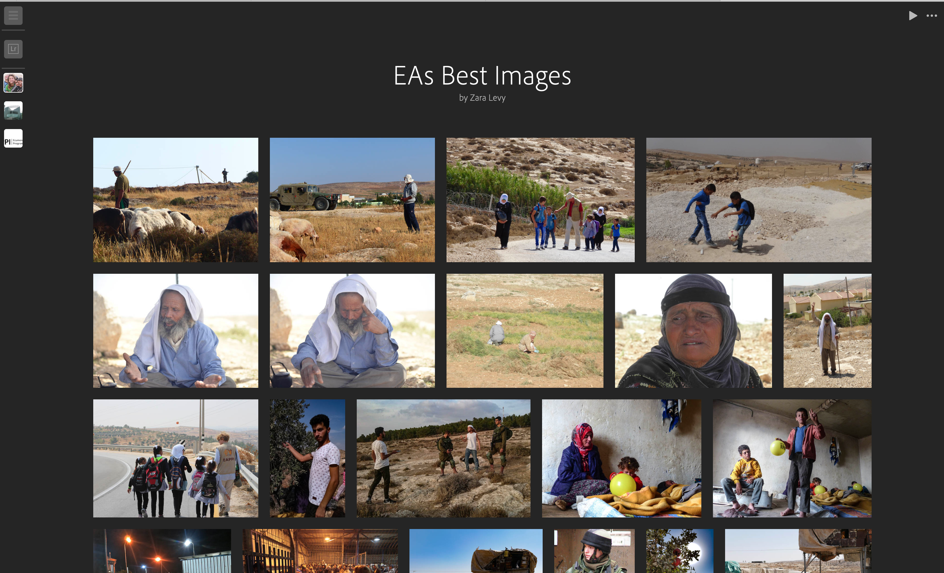
Creating a mood board allowed us to gain inspiration and generate ideas of current trends and styles within existing charity booklets. With a focus on the colour scheme, typeface, imagery and general design on the mood boards, it helped direct the design ideas process. We showed this to the client to get their opinion on the directions we could take the booklet and to understand their likes and dislikes. The client found this very useful as it helped us move forward to the designing stage.
Design Development
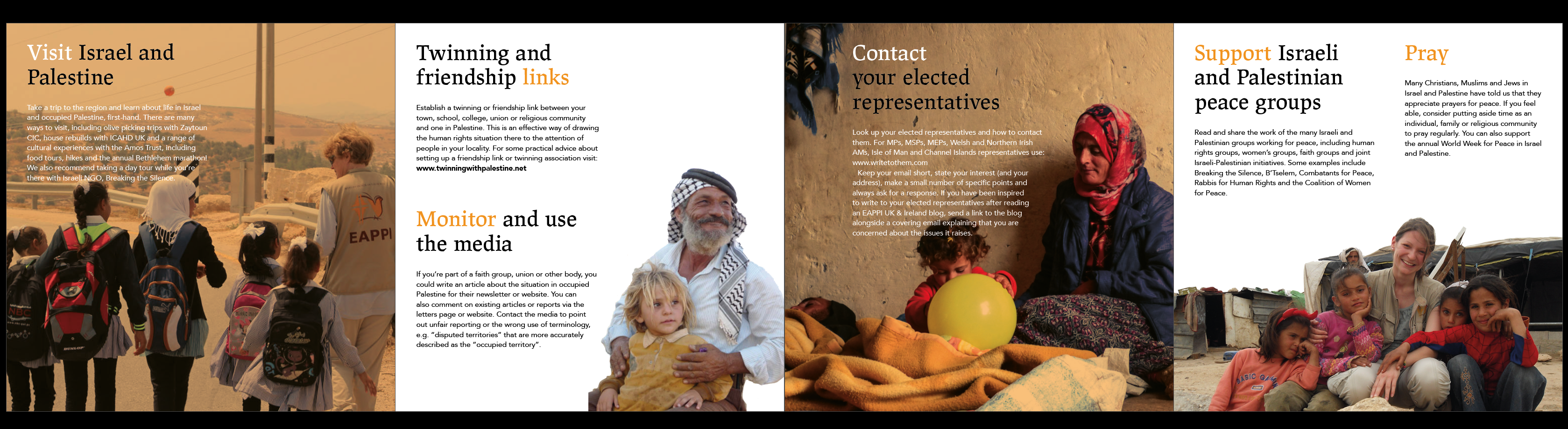
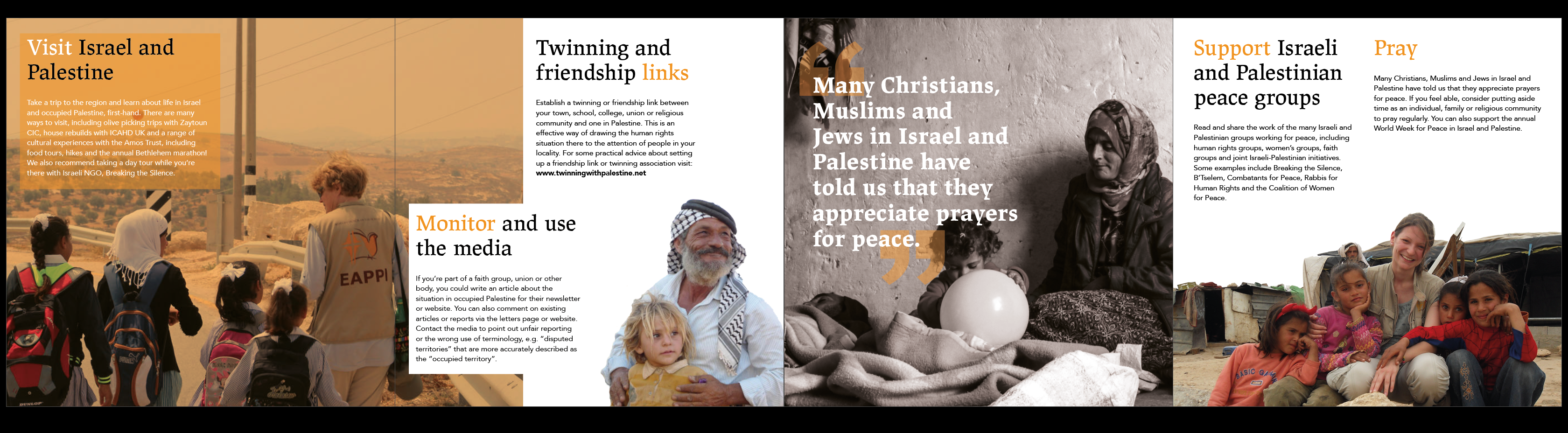
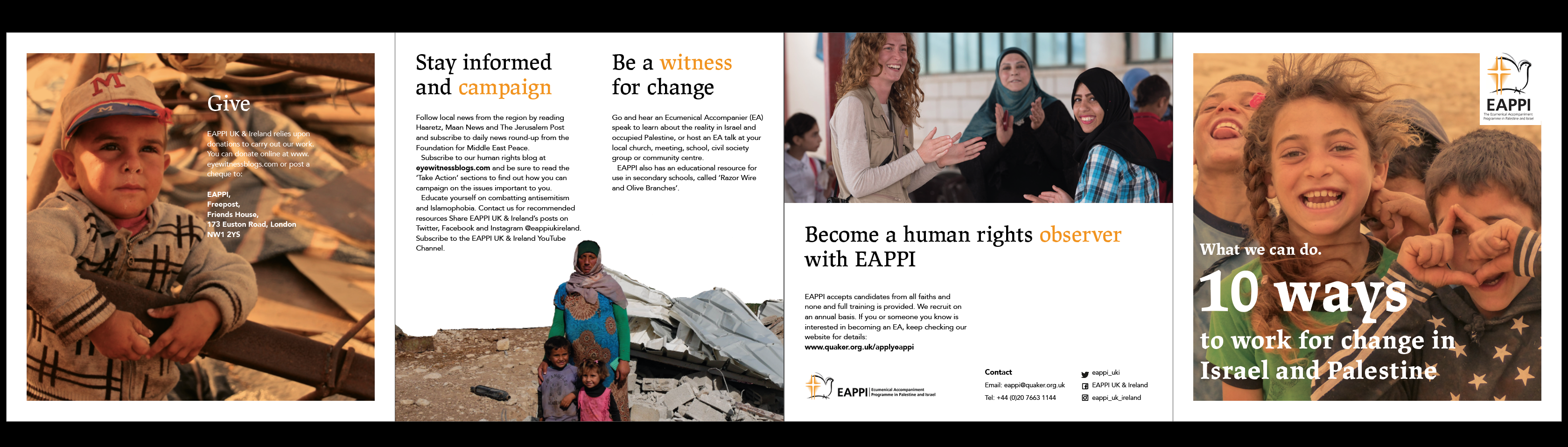
The booklet format the client preferred was a foldout. Initially the client provided us with an InDesign file which included a concertina layout, however we felt that this design was too impractical for the requirements they were asking for so we thus proposed our own layout designs. The format for the foldout is a 150mmx150mm roll fold document consisting of eight panels in total. The format of the postcard was one double-sided 150mmx150mm panel. These formats are quite small, which is appropriate for keeping a low budget and allowing audiences to carry them in their bags easily after a talk, whilst still containing all the relevant information needed.
Both deliverables were to be heavily brand based, including the orange, black and white colours. The design style the client wanted was bold emotive imagery for the booklet and volunteer based imagery for the postcard. Due to all deliverables being printed with the purpose of giving hope and inspiring others to join, the tone of the imagery and design needed to be uplifting. Therefore, we chose to use images of the serene scenery, the locals smiling and the EAPPI workers helping/teaching. We experimented with using orange tints and filters over the images to connect this to the overall colour scheme, such as exploring duo-tones. However, we felt that this over powered the design and most images worked best in their true colours, therefore we used the filters very sparingly.
Our team were invited to visit the EAPPI offices in London, to discuss the second deliverable further and to receive feedback on our initial booklet designs. After approval from our supervisor to show the client our designs, we travelled to London. This enabled us to get an in-depth insight into the client’s thoughts on the current state of the booklet. While meeting the client we met the CEO of EAPPI and she approved the design of the booklet thus far, which was reassuring for us moving forward. This enabled us to get a real life experience of meeting with clients in a design and working environment. Coming away from the meeting we established that the second deliverable would be a postcard using the same type choices and colour scheme but it had to include different imagery and show a different aspect of work EAPPI do. This meeting was extremely beneficial as the client had a thorough look at the booklet and made suggestions of what they preferred and what to not include.
The client supplied us with all the copy, images, typefaces and the colour palette. However, the typeface given by the client was Lapture, which we felt worked better as a display font and therefore suggested the use of another typeface for the body text. The client was more than happy with this but they requested a free and accessible typeface because they needed to carry this forward throughout other projects; for a coherent brand identity. Initially they suggested Helvetica, however we were hesitant towards this from knowledge we’ve learnt on our course. Therefore, we suggested for them to take Avenir into consideration because it’s a sans serif typeface which works well when scaled down and is a free font they can access. Its simplistic strokes are a contrast to the flamboyant Lapture creating clear differentiation between headings and body text. The client was first unsure but after displaying samples the client agreed and followed the typeface choice through.
Unexpectedly, our team also resulted in rendering and updating the EAPPI logo. We found a problem with their existing logo as it only came in black and had a white background. Therefore, we took this upon ourselves to edit the logos to add a white version and their brand’s orange version to their assets. The client was overjoyed with this and requested them all for future use.
Production
We originally created a production specification to view the potential prices of different formats and stock weights, however the client had decided to print externally. This was the plan until a week before all handover of artwork, which was when the client requested prices from DPS. Due to the low budget, we had to have a meeting with Geoff to explore our options of what stock we should use to be the cheapest. We then created a final production specification, received quotes and finalised press ready PDFs to send to print in time for the deadline. However, there was a slight miscommunication with the client as they had not fully confirmed the production to go ahead. They ultimately decided to stick with their own external printers as it was cheaper. Even though there was some confusion due to the tight timeframe, this did enable us to quickly create a clean press-ready PDF in a short turn-around. This was a beneficial insight into the production process because we had to adapt and learn how the process works. Overall, we efficiently sent the client the PDFs to print.
Final Outcomes
As a team we had to adapt very quickly to ensure we delivered the booklet in time for the client to print for a talk. Communication was held through constant emails, meetings and Skype throughout the process. Printing the elements and booklet to show the client helped us to visualise the final product as well as the client to understand our design. The client ultimately really appreciated this because they were able to interact and show the rest of the design team at EAPPI to ensure they picked up on any corrections. As a result of this, they recommended that we cut down the steps from ten to five because it did not coherently flow as a ten step document, thus agreeing that this would make the design feel less cluttered and have more breathing space. After many variations and revisions from showing both our supervisor and client, the client was happy with the design outcome. Overall, the final design is compact for the audience to carry and refer to throughout talks whilst also having a clear message. Thus, providing visual clarity depicting what EAPPI volunteers do while calling for action from the public.
The client printed 500 copies of the booklet and postcard and used them at their talk and will continue for their ongoing talks. The postcard and booklet both were praised on their visual identity and how we adhered to the brand guidelines. As we were fortunate enough to meet with some of the EAPPI clients in person we have developed further social media links with the organisation as they now follow Summer’s design account on Instagram.
Reflection
Throughout the duration of the project challenges were met. Our main challenge was the brand guidelines and making sure we produced the correct brand identity for the client. Furthermore, rearranging and condensing the content in order for it to fit the required format was difficult as we did not want to compromise the content the client gave us. However, reducing the steps helped to overcome this issue. Another challenge we faced was ensuring the format of the prints were not too adventurous due to the limiting budget. To work around this, we had to reduce the width of the foldout to ensure that when the client prints the booklet it would be more cost effective being produced on one sheet of card. The client’s limited availability was another factor which limited our efficiency. Although, we remained patient and utilised the help of the real job meetings and our supervisor to get any advice we needed.
Overall, the job ran smoothly and the client was really happy with the outcome of the deliverables. Even though we faced challenges, we learnt new skills which we can use for future use, such as working to time constraints, having a low budget and brand limitations. Working for a good cause was extremely uplifting and enlightening, which has emphasised to Seniz that this is the field she wants to work in. Working with clients outside the university was beneficial for us as designers, as we got to experience travelling for client meetings and working outside of the curriculum environment. This gave us a useful insight into the real world and how to work professionally. For future improvements, we would try to experiment more with the use of colour, the flow of the steps and to make the postcard feel more coherent with the foldout.
In conclusion, we thoroughly enjoyed the job and we were delighted with the outcome and feedback from the client. Specific feedback was that we were “dedicated” and produced “amazing work”. This job highlighted how working as a team to meet the requirements is effective and can produce an innovative design in an efficient way. Proceeding, we have gathered a great insight into the challenges being faced in Palestine and Israel and how we can get involved to help make a change.