

‘Ideas, materials, social media and activities in support of an evening of Typography-themed video-gaming in the Department, centred on Arcade Game Typography: The Art of Pixel Type by Toshi Omagari’.
Overview and Aims
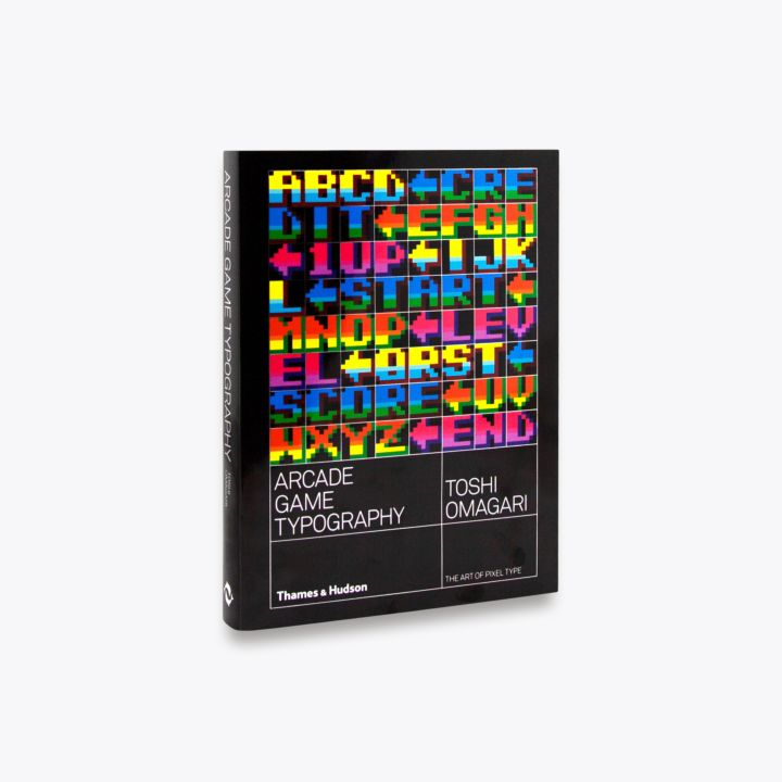
This real job is designed to support and promote Toshi Omagari, graduate of the University of Reading’s Typeface Design masters’ course, and his book ‘Arcade Game Typography: The Art of Pixel Type’. In order to do this, an evening of typography themed videogames will be played in the department and activities will be carried out during the day.
The main aim is to promote and celebrate Toshi Omagari and his book of arcade game typography, however, we also want to educate and challenge the knowledge that everyone has on the creation of arcade game typography.
Planning
The main deliverable for this project was the event itself, and so planning what we wanted to do on the actual day was critical. Some ideas that came out of planning were:
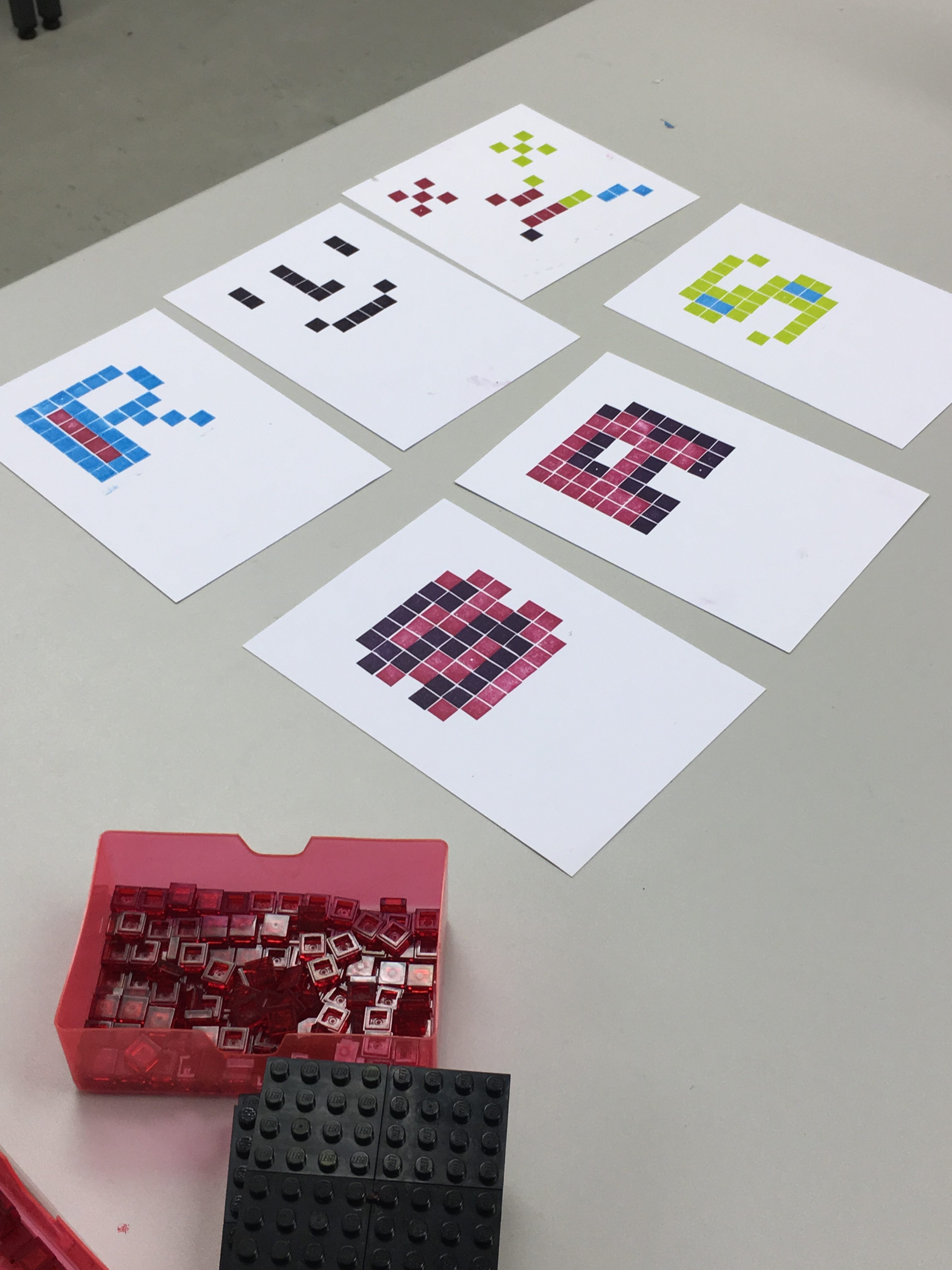
- Letterpress pixel fonts on 8×8, with overprinting – run it like a lego mosaic building workshop?
- Output a set of prints for Toshi?
- Screensaver for the video game screens
- Use pixel fonts masks in front of demo videos
- Demo vids could be blown up big
- Controller key guide for controlling MAME
- Mint some coins to use use as ‘I got next?
- Google sheet-based comments (UG column, PG column)
- Some way of customising the book with our outputs?
- Some way of hosting a digital record of the event and of our thoughts on the fonts?
- Live stream?
- Book signing / selling?
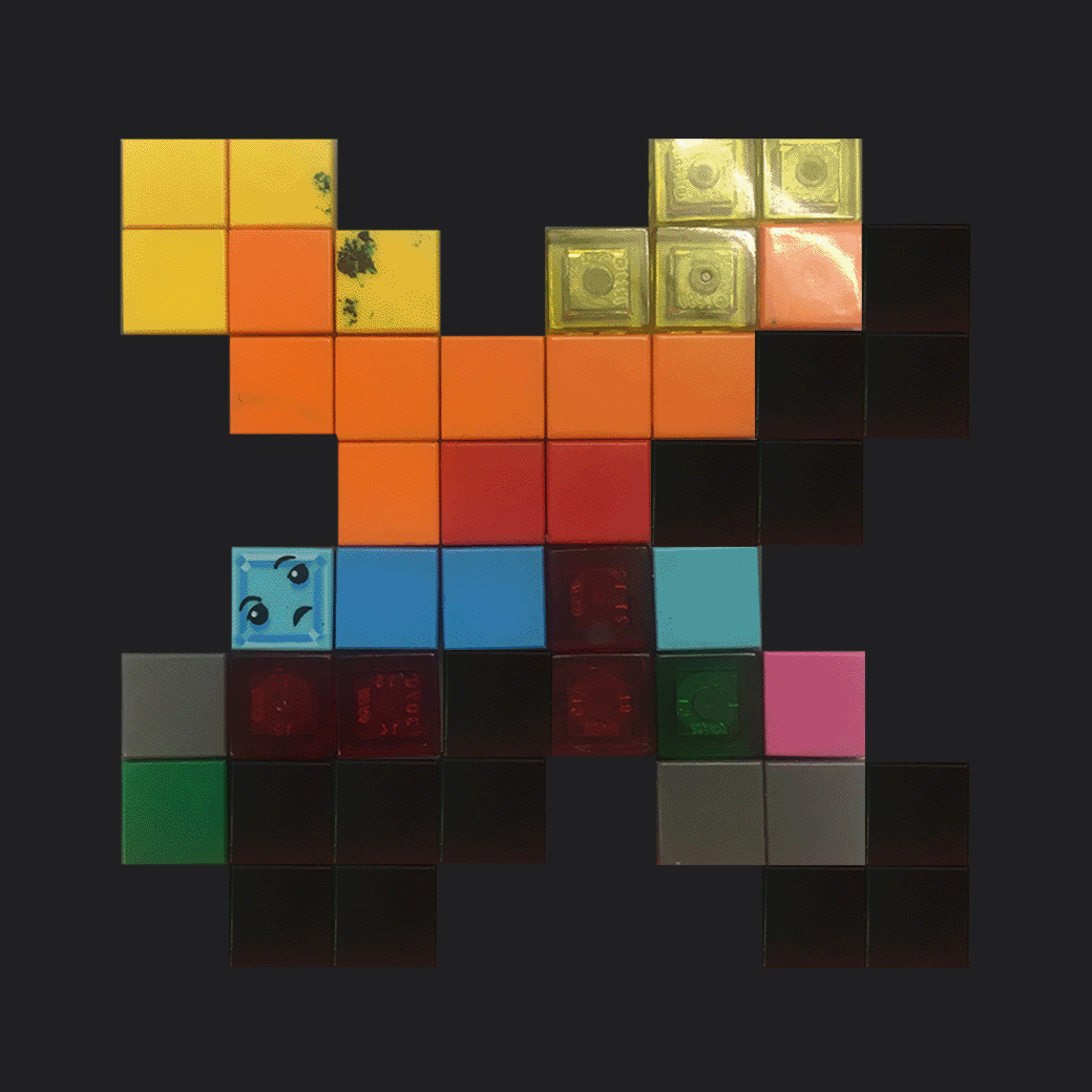
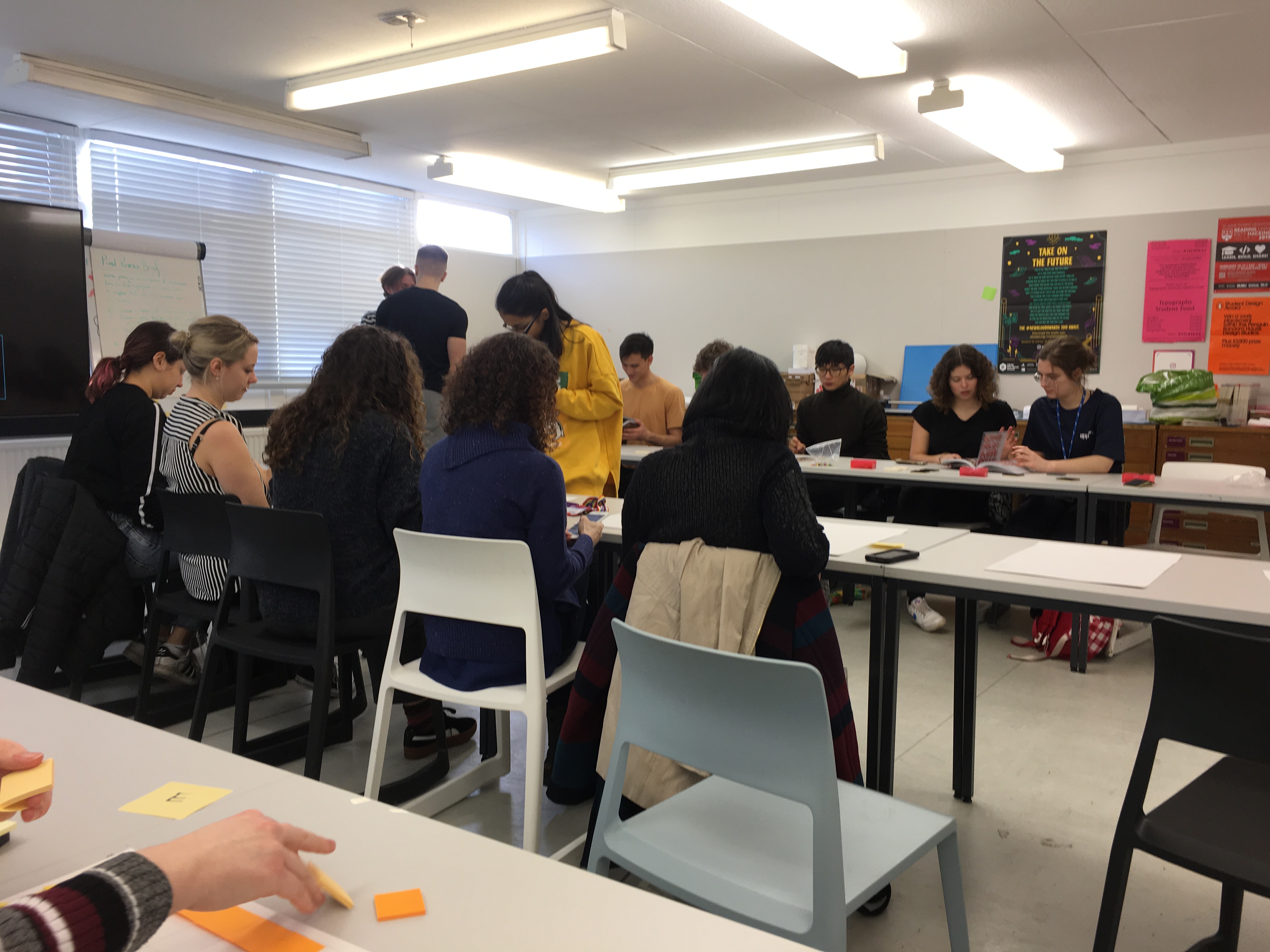
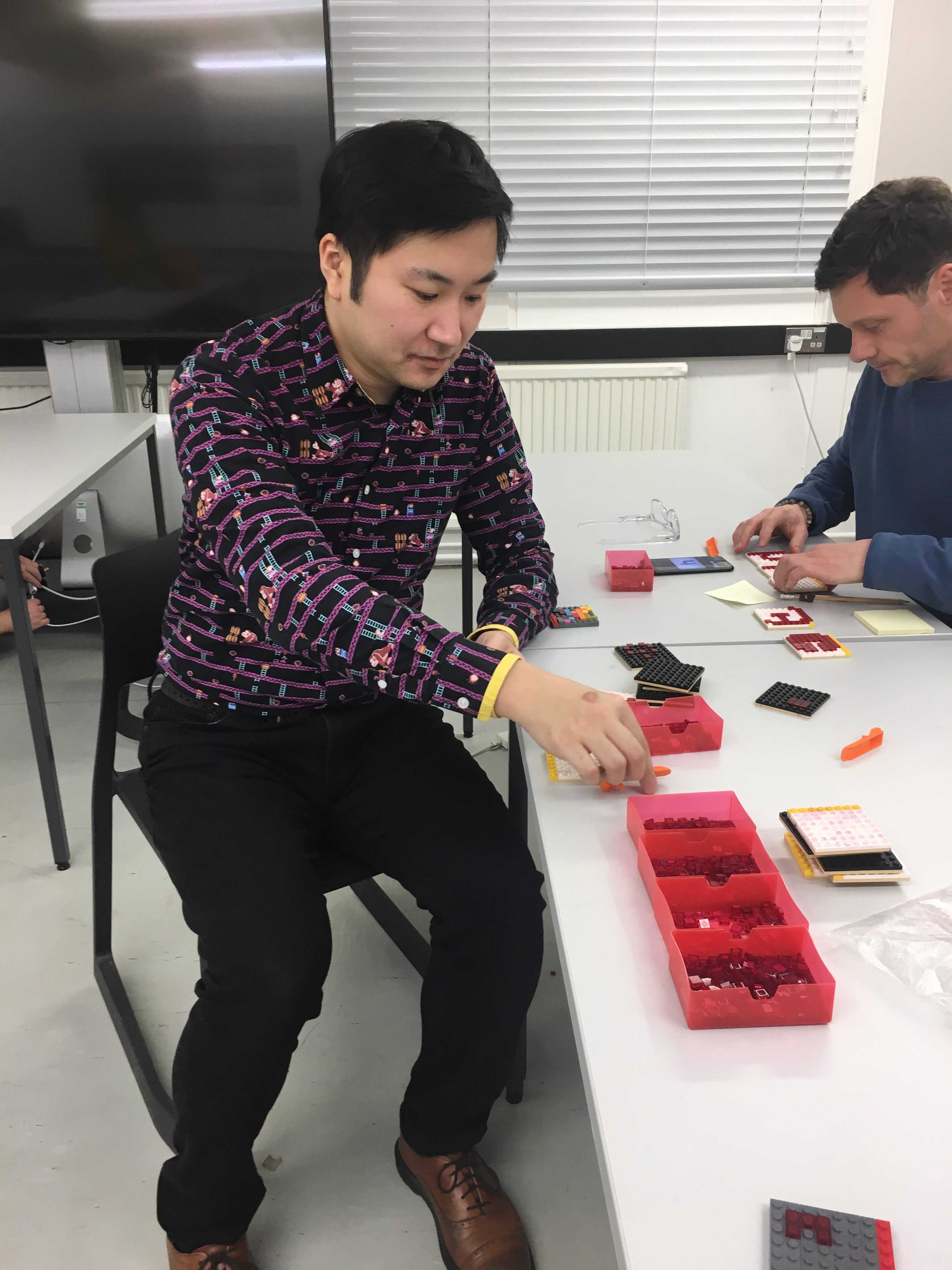
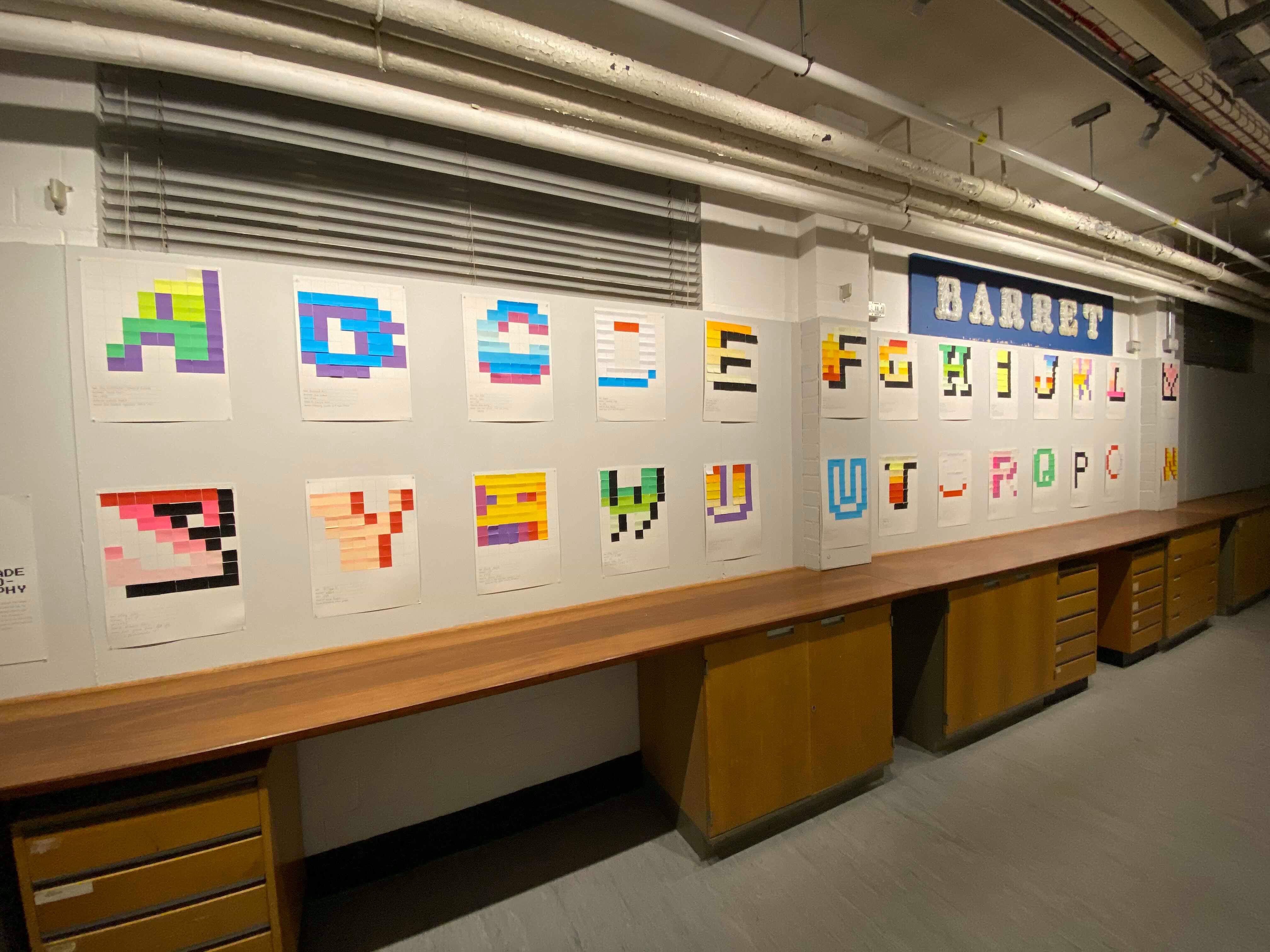
Whilst sifting through these ideas, the activities that were decided upon were to have a LEGO letterpress workshop, where students would create their own 8×8 pixel fonts, later to be joined by a similar workshop involving post-it-notes, where students would fill in an 8×8 grid using post-it-notes with their favourite designs from the book. Book signing and selling was something which commenced after Toshi’s fantastic baseline shift talk.
‘Whether you have grown up with video games or not, whether you are familiar with letterforms or not, I think there is something for anyone to enjoy in these pixel fonts. I also encourage you to make a colourful one yourself; you will appreciate the subtlety and craftsmanship of the art even more!’ – Toshi Omagari
Deliverables
As well as planning the event itself, I also had the challenge of creating all the promotional material that went along with it. Thankfully, I signed up to a Real Job I knew I would love designing for, and so thoroughly enjoyed the design process of all the following deliverables:
- Event itself; planning and catering
- Promotional poster(s)
- Instruction manual for controller
- Display screen advert
- Promotional videos: one for instagram, one to promote letterpress, and one for the department main entrance screen
- Instruction sheet for ‘hi-score’ Bubble Bobble game
Whilst trying to stick to this guide of deliverables, I ended up making a couple of extra bits for the event and modifying ones we already had in mind.
Skills
With the idea of having promotional videos, I knew that that meant I would have to learn some animation. I had never looked into animation before, but it’s something I’ve always been interested in learning, and so this was the perfect time to do so. The videos / gifs I made were done solely in Photoshop with the timeline feature, and I decided that I would ‘learn on the job’. Despite this, I’m incredibly proud of how these videos turned out, and I genuinely shocked myself with how quickly I picked up all the skills needed.
Another main skill I needed to focus on developing was solely planning an event. I had never planned an event before, and so learning how to best promote the event and go about catering for it was incredibly important. The success of the event determined how well I had promoted it, and essentially sold it to the students.
Video Advertisements
As well as the video seen above, in figure 2, I also created three other short videos for the promotion of the event, and for the night itself. Figure 3 shows the video made for the entrance screen, which would promote the event during the week. Figure 4 displays the promotion for the letterpress workshop, in order to promote the places left on the workshop list. Finally, figure 5 shows the video which was displayed on the entrance board on the night of the event, to act as a signpost.
Poster Design
For the poster design, I took inspiration from a couple of other ‘games night’ posters in order to get a grasp of the kind of atmosphere and feel I wanted my poster and branding to have.
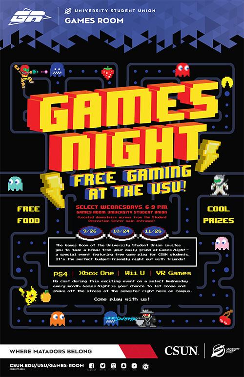
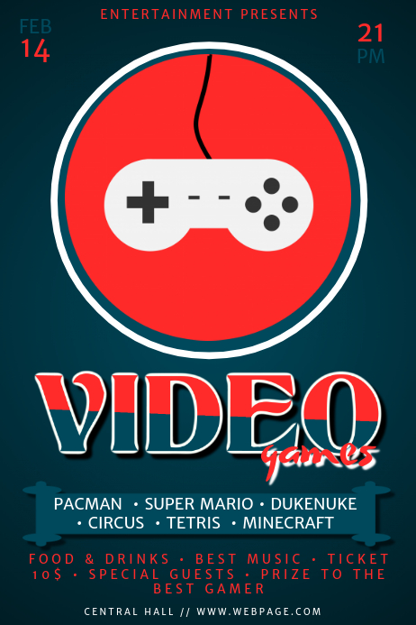
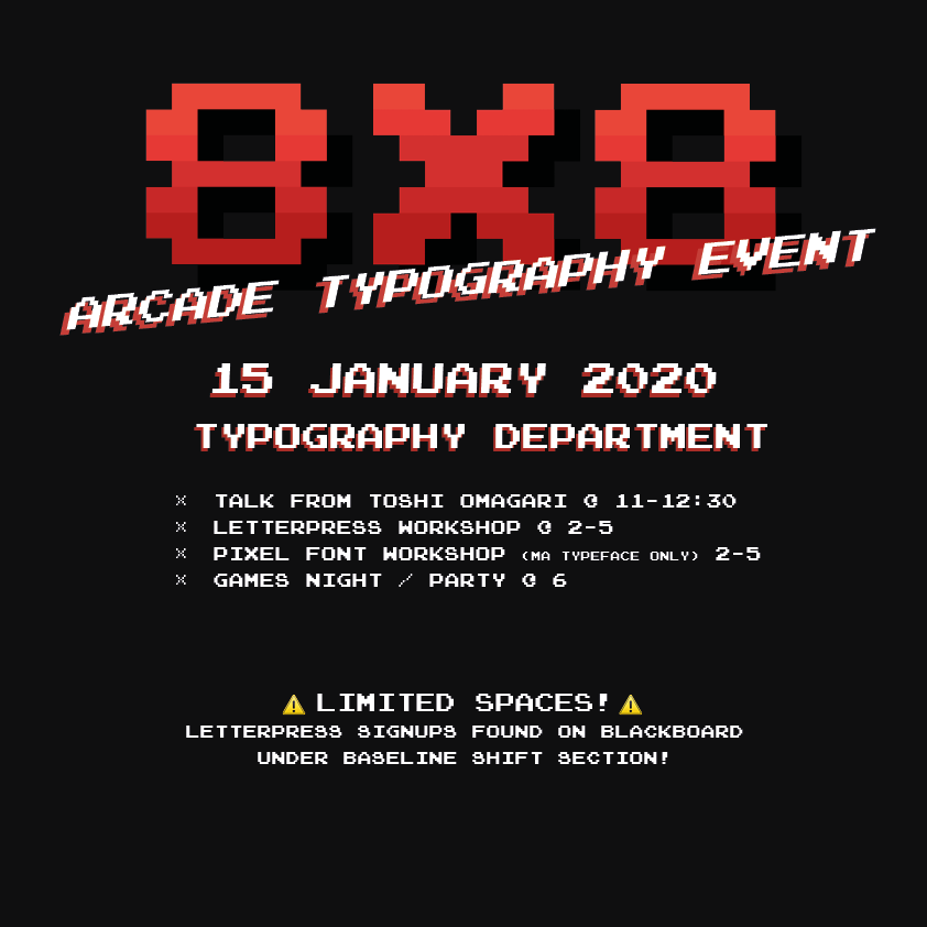
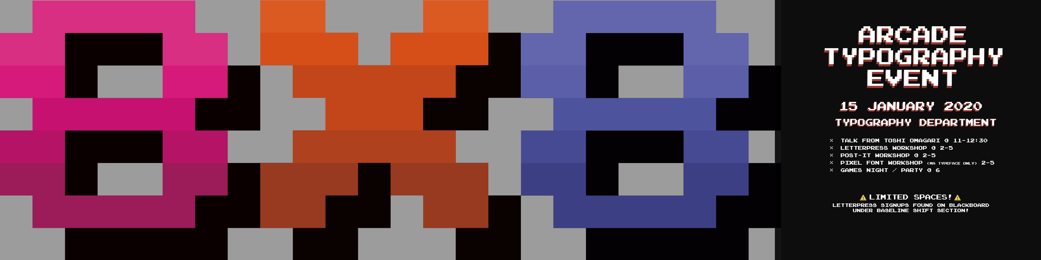
Figure 9 shows the first draft of my poster, which saw me take inspiration from figure 6 and 7, with the dark background and the pops of red. The logo is also seen here (8×8) and is seen in all publications whether this colour or recoloured (as seen in figure 10). The final, approved poster design was a set of four which would be displayed in a long line (see figure 10). The thought behind this was that the 8 X 8 would bring in the attention of the audience, and lead the eye to the final panel with all the information on which was displayed on a bold black background. As the posters were to be displayed around the department, it didn’t matter how much space we took up; there weren’t any constraints.
A couple of notes on the logo itself; originally I wanted to create a logo with the entire ‘8×8’ in an 8 pixel grid, and although this taught me a lot about the constraints involved when designing within so few pixels, it didn’t make for a very good logo in the end. Therefore, we scrapped that idea and moved on to creating a single character within the 8×8 grid, which was a lot easier, however there were still a lot of constraints when designing. The process of designing in this small space was so eyeopening, and was really interesting to see just what could be created with 64 pixels. In terms of the logo characters, I based my designs off the Atari typeface (Quiz Show), which is mentioned frequently throughout Toshi’s book.
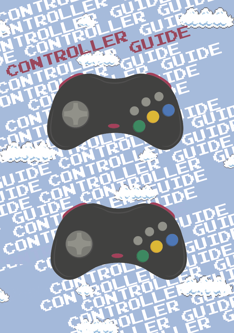
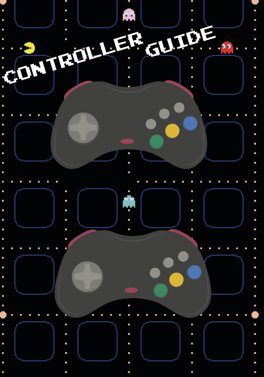
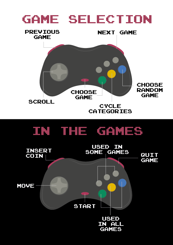
Controller guide / postcard
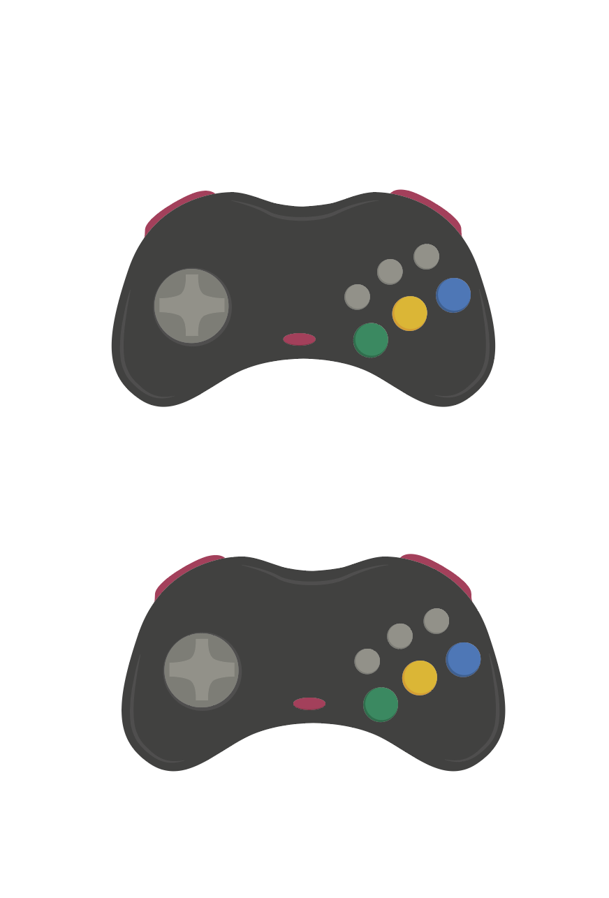
As the SEGA Saturn controller isn’t very commonly used nowadays, it was decided that an instruction guide should be made for students to use when they came to the games night. Figure 11 shows my illustration of the controllers, which would be labelled up as shown below. The images below show a couple of different ideas I had prior to the approved design (Figure 14/15), however, it was decided that the guide should be kept simple and so the separation of black and white on figure 14 shows the division between the two sets of controller buttons. It was later decided that these could be postcard size and taken away from the event as a souvenir, therefore, the back (figure 15) was designed to reflect the format of a postcard, with the intention that students / attendees of the games night would be able to get Toshi to write them a little message on the back.
Technical Skills
Along with all the design work, I helped with typing out all of the text for each game as seen in Toshi’s book, in order to display them on the screen alongside the games on the arcade MAME system. This was incredibly time consuming, however, it was very rewarding once it was finished and we could see all of the text within the database (see figure 16).
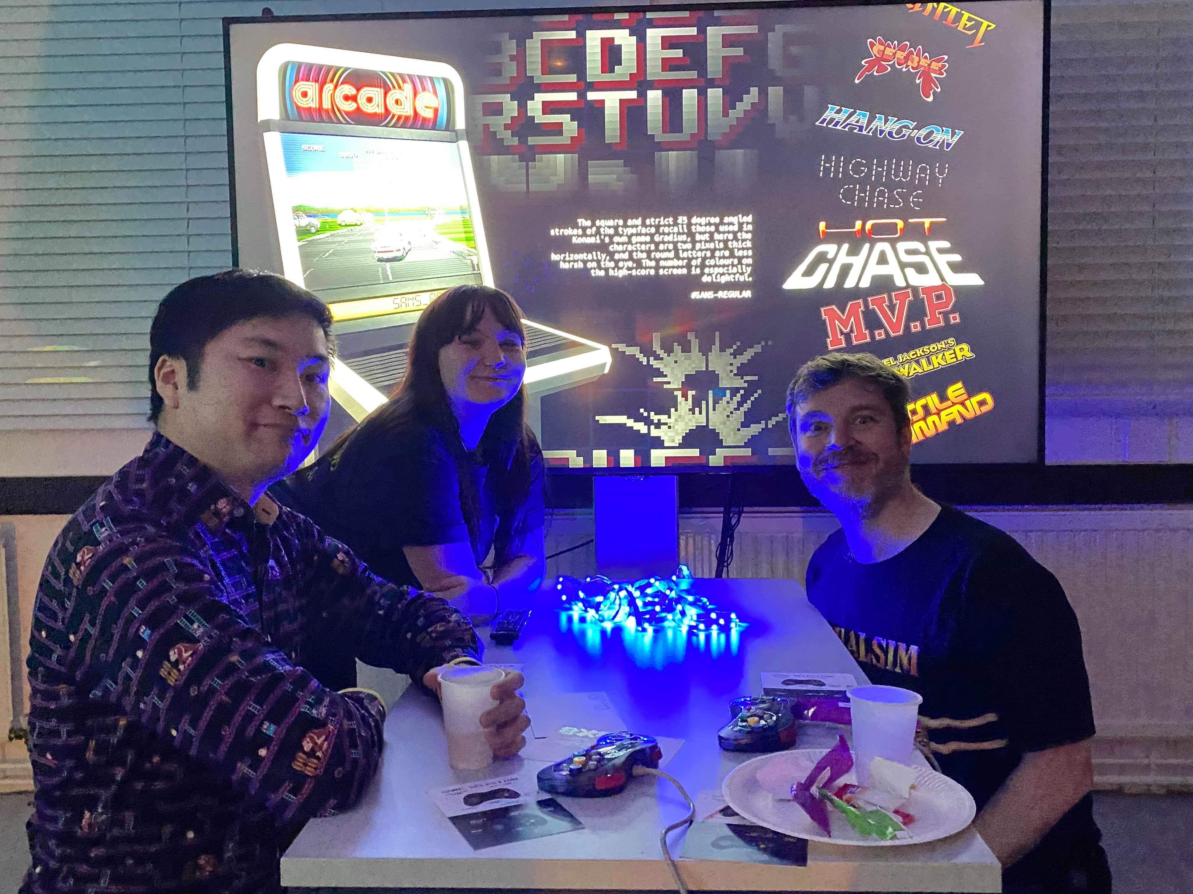
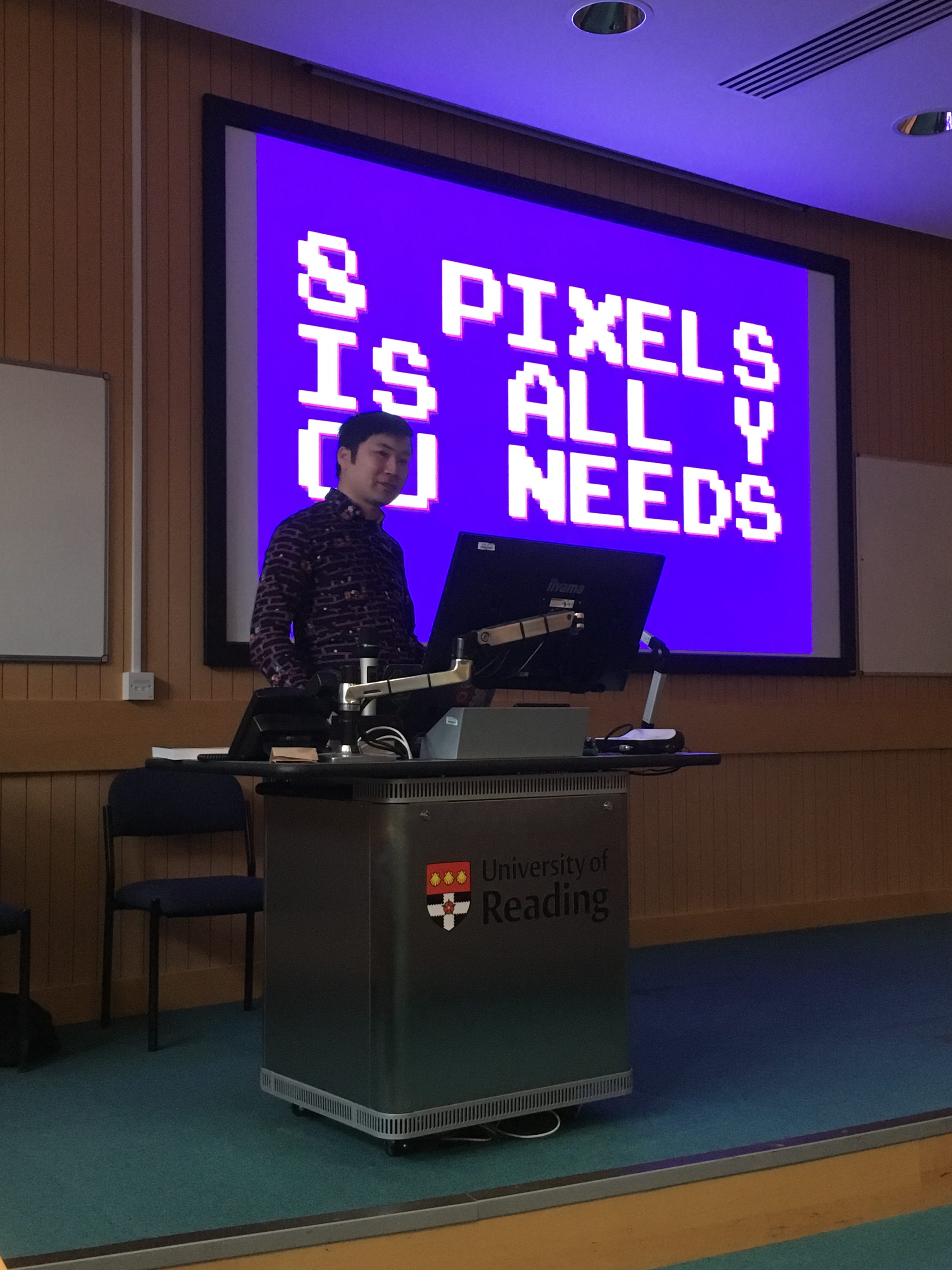
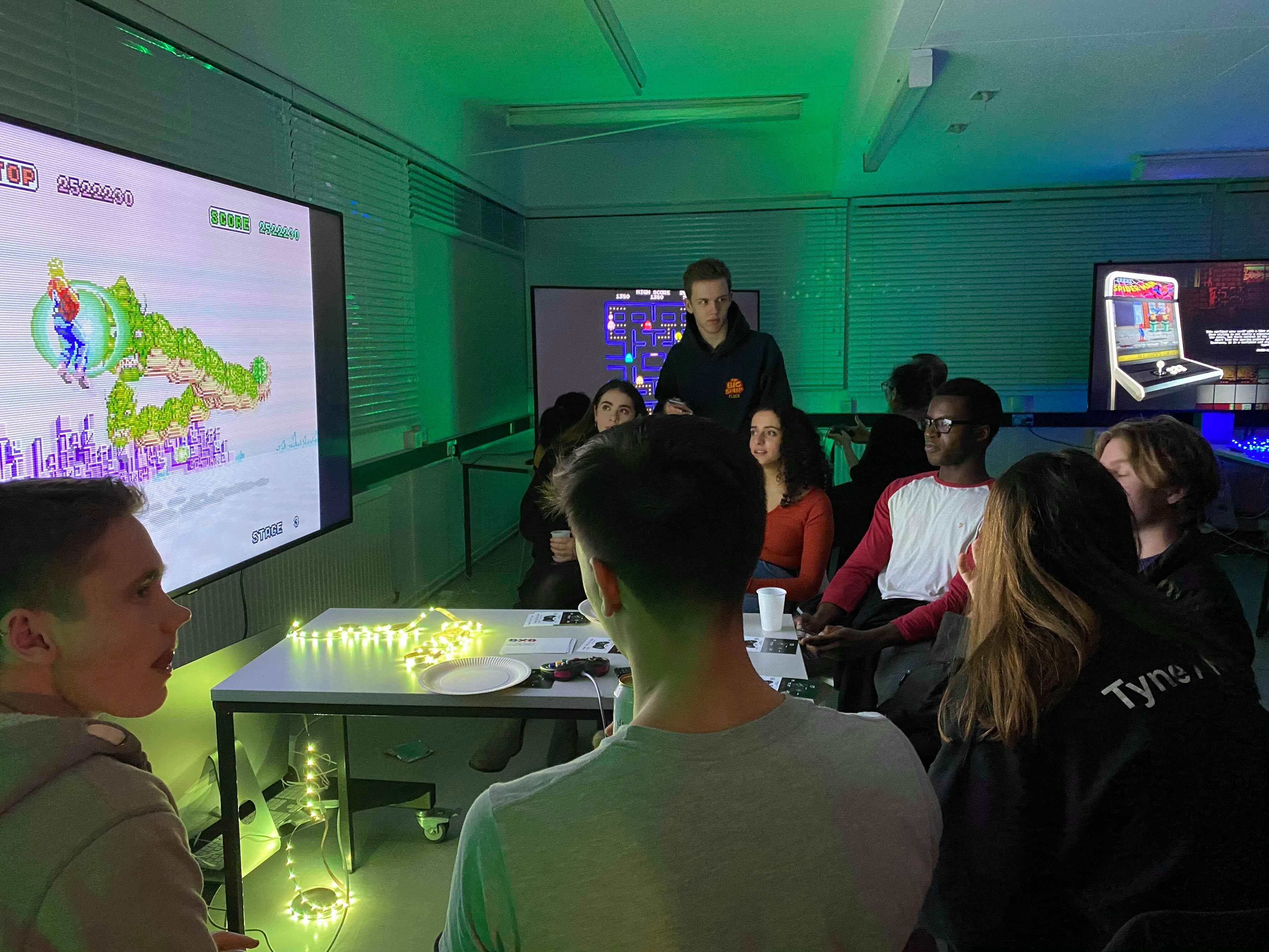
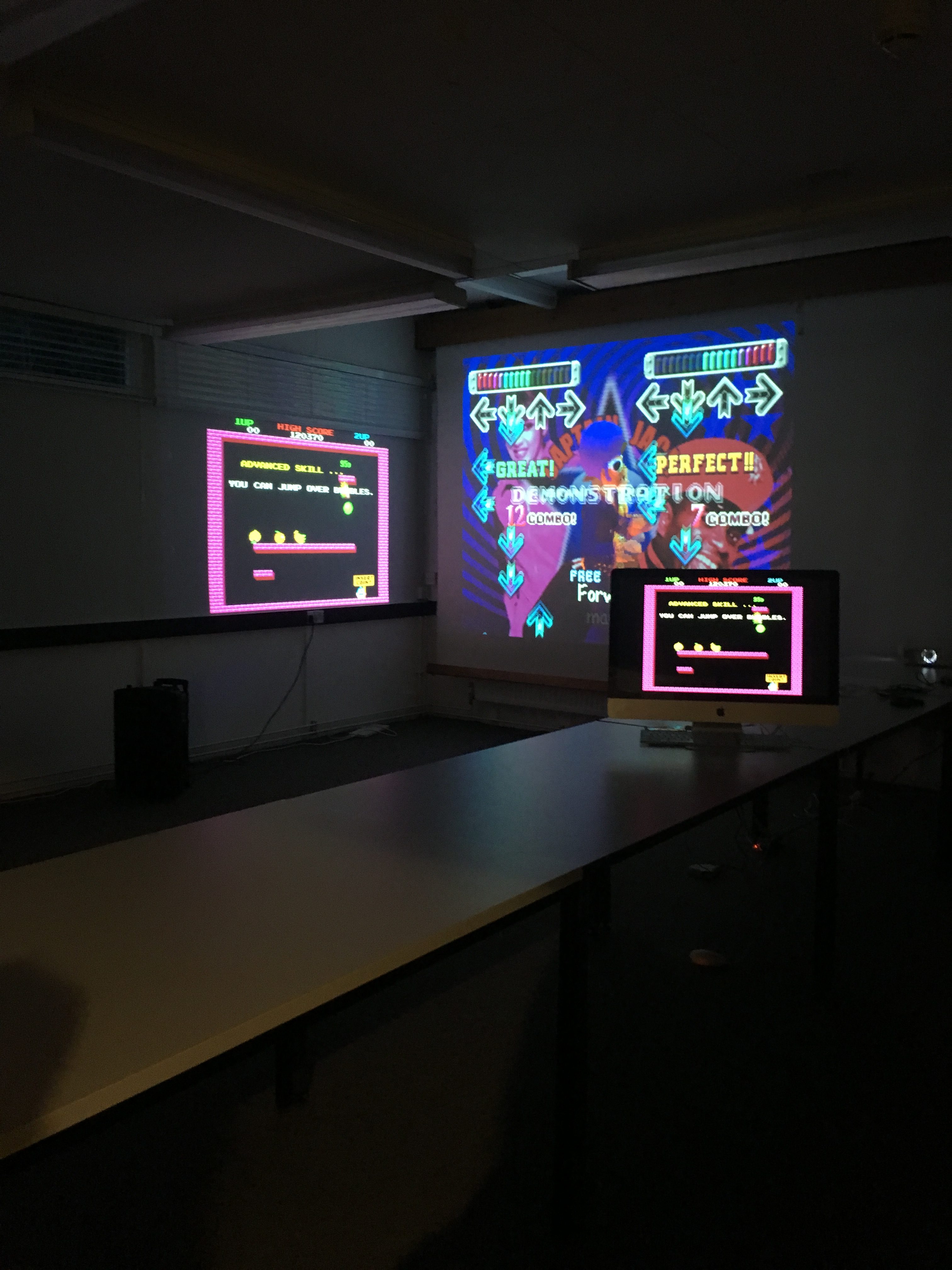
The Event
The success of this Real Job was down to the success of the event; if we could create enough hype for the event then it should be a very successful day and evening. We started the day with a talk from Toshi Omagari (figure 17), which was really insightful, especially for students who hadn’t picked up the book before.
‘Really intriguing to see a different side of typeface design compared to the usual serifs and san serifs. Seeing the changes in different pixel typefaces and how they have developed was really interesting’ – Joanne Tunbridge
‘Very interesting and different to all the other Baseline shift talks we’ve attended, would have been even better if I had background knowledge of the original games in the first place!’ – Ruth Bartley
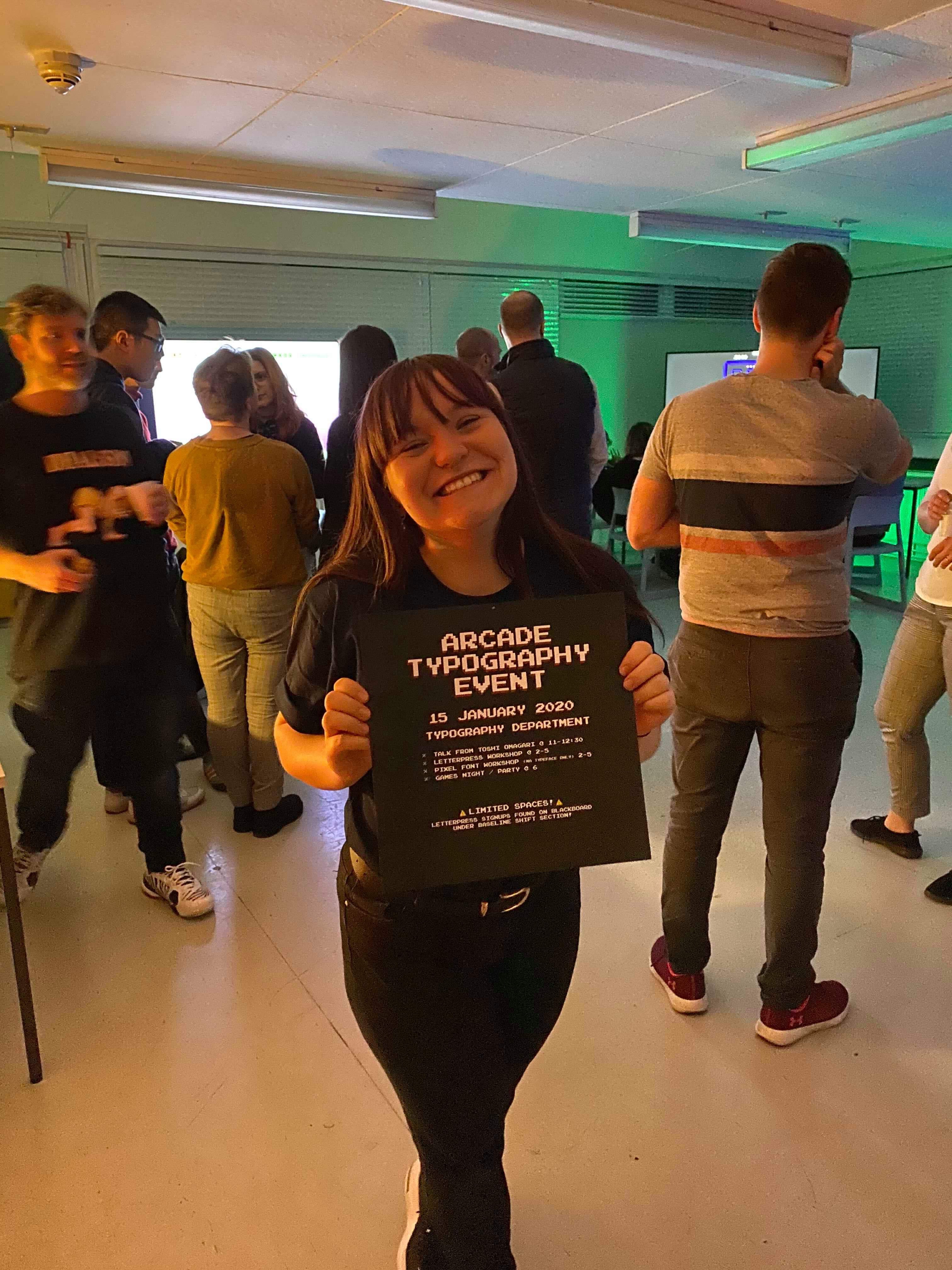
Other activities include the letterpress and the post-it-note workshops, as well as the MA typeface designer workshop run by Toshi himself. We managed to get some fantastic outputs which can be seen around the department, and created a great atmosphere which connected students through all years and staff members. It was truly something to be proud of. The following images were taken on the day of the event, and feature the baseline shift talk, both the letterpress and post-it workshops and the night itself. I think it’s safe to say it was thoroughly enjoyed by all.
Reflection
In reflection of the design work, and the event itself, I would say that it was a big success. The aims were all met and I went above and beyond the brief in order to make the day as great as possible. One thing I’d say I could’ve done better was been better in terms of sharing my files with my supervisor; I often didn’t send the files in the right format, however this was resolved after being alerted of my mistakes. I think the process was really eyeopening, and I have learnt so many new skills, as well as a LOT about pixel fonts (that’s what happens when you have to type up the characteristics of 200+ fonts!) ! I’m so glad I got the opportunity to work on this project, and I would love to explore pixel fonts in the future too.
👾GAME OVER 👾