BACKGROUND AND INITIAL BRIEF
The purpose of this project was to design a variety of deliverables for a one-day symposium on type and ephemera, that would bring together people with different perspectives on letterforms. The project presented the stimulating task to produce a visual identity for the event that would appeal to a more expansive audience than usual, as well as be effective on both digital platforms and physical outcomes.
We were conscious that although our client was someone we knew well, we understood that we still had to maintain a level of professionalism that is expected from us throughout the real job scheme. This meant we had to view Gerry separately both as our client and as a supervisor.
Our client allowed us to decide on what deliverables would be most appropriate to advertise and raise awareness for the event. We had to consider the platform of publicity that would have the biggest reach across different demographics, resulting in a range of deliverables from Instagram posts to physical postcards. Having such free reign with this project was an exciting opportunity that we made the most of, but it did present its challenges. It forced us to think more outside the box than usual since there were few limitations, so required us to fully consider the users and their journey.
OUR GROUP/COLLABORATION
Working as a pair it was easy for tasks to be split and delegated, subsequently we did not have specific roles. Though the tasks we did were sometimes individual, we always kept in touch for guidance and advice ensuring we were both on track with the real job and with our own objectives. Trello was an effective tool as we were able to monitor progress, tasks, and deadlines, encouraging us to consider all aspects of the project right from the start and not lose sight of the final event. Our regular meetings with Gerry and the real jobs team gave us clear direction for our next steps allowing the project to move forward. When we faced issues such as Aanand’s inability to attend all Real Job meetings due to work obligations, we dedicated extra time to areas of the project that needed focus and made time to speak to James and Geoff at other times. Overall, our communication and strong team bond allowed us to meet deadlines, and achieve a standard of work that we were happy with and we excelled to achieve a competent standard of work that was critically praised to be “to the client’s satisfaction” and was “thought [to look] wonderful.”
PROCESS
Initial Contact with the Client:
Our personal interest and existing understanding of ephemera made us keen to build a strong rapport with our client and learn from him. We wanted to show our dedication and interest in the project from the start. The initial meeting enabled us to gather key points that were the foundation for our research and design concepts moving forward:
- There needs to be a balance in visual style to appeal to both an older and younger demographic.
- It is imperative that there is an echo of the history of ephemera, which is inventive and original.
- It would be good if the designs could have a handmade and letterpress aesthetic, as the event is celebrating type and letterforms.
Gaining access and spending time exploring the ephemera room gave us the chance to meet a few members from the ephemera group, which was held every Wednesday morning. The opportunity to interact with both ephemera and the users, it provided us with an overall perspective of the whole ephemera organisation, and a voice of opinion other than our client.
Research
Our first stage of research involved exploring a range of similar events and seeing in what ways the events were promoted. We focused on events that were for smaller exhibitions or talks to keep the maximum capacity for the event and the user’s needs in mind. The research was valuable in highlighting the importance of creating almost a ‘brand identity’ that must be coherent across all the promotional outcomes, platforms, and deliverables for the day.
One of the first challenges we encountered when developing ideas was to ensure that the design would be deemed as universal. Therefore we had to target people who might have an interest which included looking at the ephemerist magazine’s target market. As our client wanted to expand this demographic to a younger audience, it became apparent that we had to develop a modern take on a more traditional subject. This meant that one of the most crucial aspects of our research was the mood board and visual research as it inspired us to focus on creating harmony between modern and traditional aesthetics.
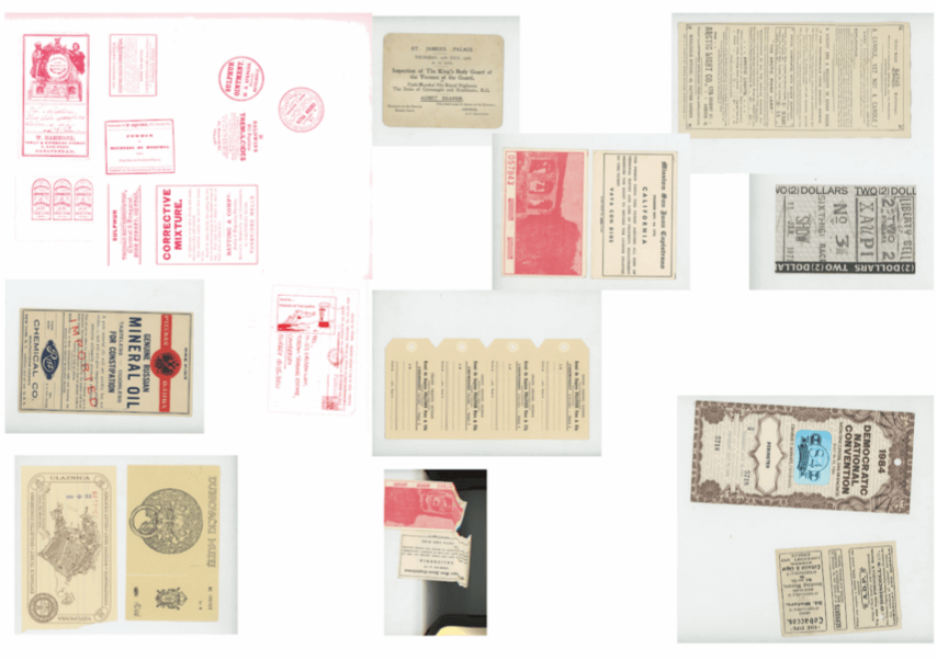 (Figure1) A sample of ephemera collected during the research stage, exploring aspects including typography, colour palettes and shapes
In order to inform the design stage we spent time researching and exploring the ephemera collection, looking at aspects like shape, colour and type. This enabled us to gain an understanding of the essence of ephemera, which was crucial for replicating that feeling in our outcomes. It gave us ideas of ways that we can mimic the character of ephemera through the use of typography and decorative extras. The research was beneficial as it showed us alternative typefaces and colour palettes, and how these can help create a ‘new and contemporary’ identity without losing the traditionality of ephemera.
Design Development
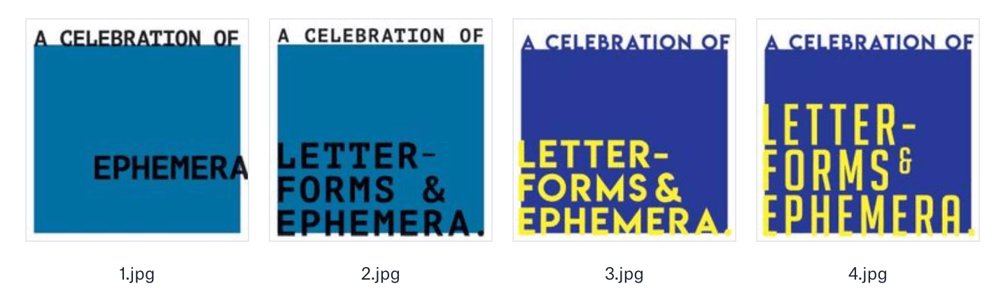
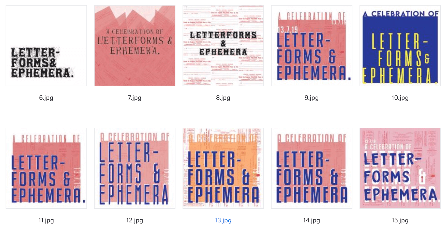
(Figure 2) Initial ideas, exploring type, colour and ephemera
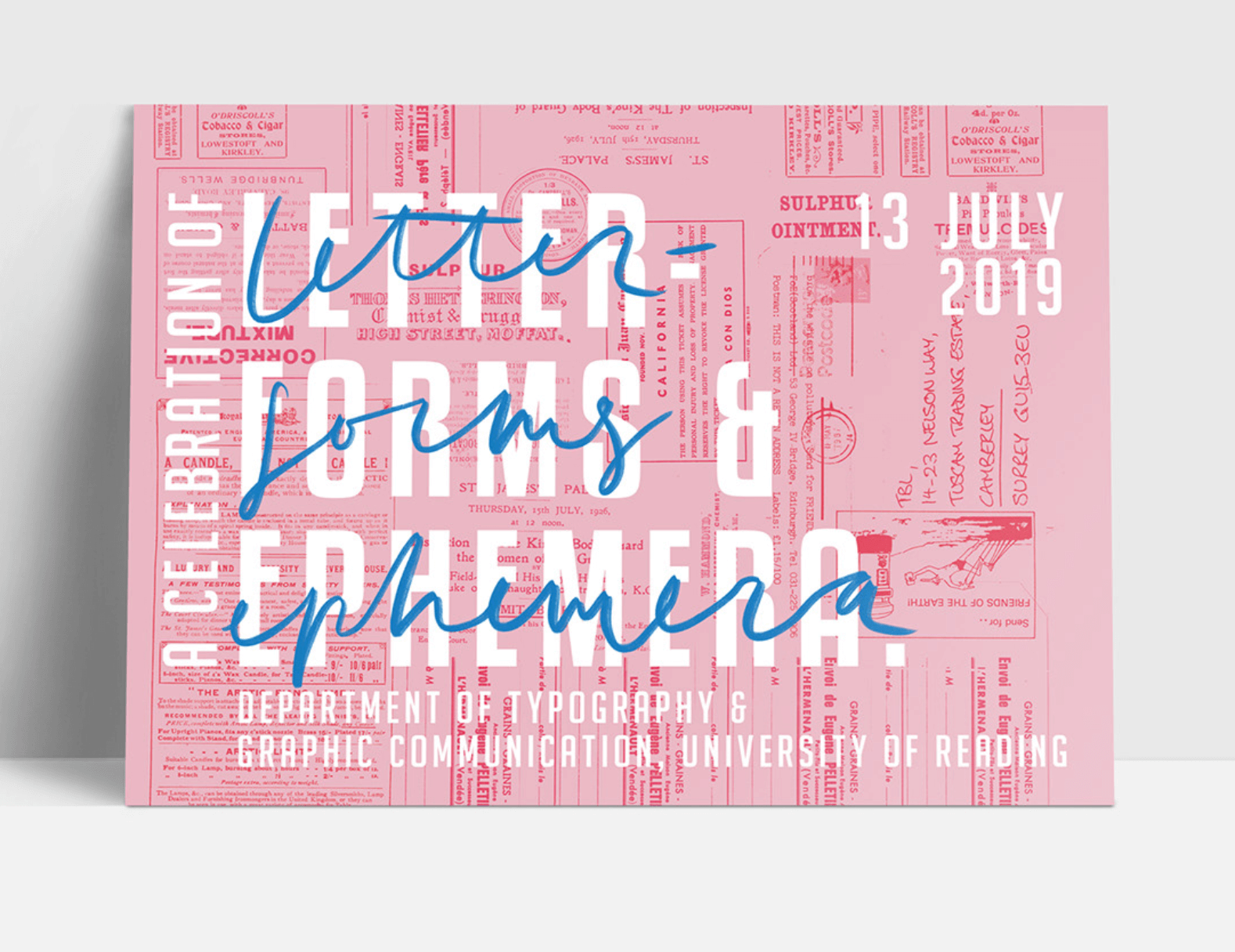
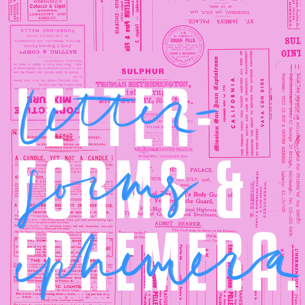
The initial scans of ephemera acted as the framework to our first deliverable, the postcard. Once we had decided on the concept we wanted to take further, we began to edit them and create collages of them. Both of us had similar ideas of what we wanted the graphic style for this project to look like, as it had to appeal to a wide audience. In order to achieve this, we explored the use of bright colours and bold styles, whilst contrasting this with the detailed aspects of ephemera.
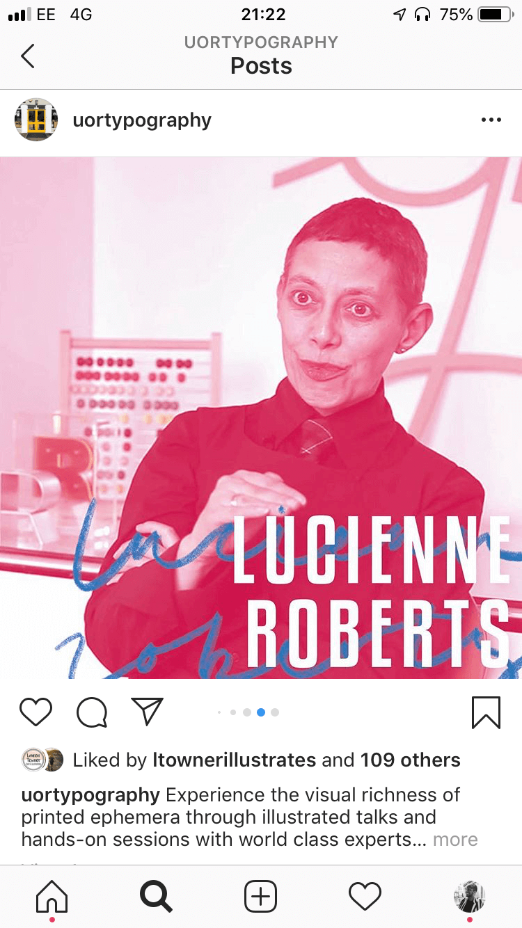
In response to feedback, we developed our concept – exploring layout, colour, and type, to take forward to show the client. We got positive feedback from Gerry, our client, and supervisor. He was very keen on the combination of hand lettering on the design, as it was felt it “added more depth to the design and made it more dynamic”. From this positive feedback, we felt it would be good to design the hand lettering our-self, which opened doors for our second deliverable, where the postcard evolved into a typographically animated piece. Although this was not necessary we thought it brought the design alive and draw more attention to it, which was reciprocated by our client who said “the animated lettering added a freshness that the subject might otherwise miss” highlighting, how our design outputs achieved our client’s objectives of appealing to a younger audience. We also achieved this by creating user profiles of the speakers from the event, that could be used as promotional material on social media, a platform that a younger demographic access daily. For our final output, we adapted our initial deliverable for a landscape ticket which had a schedule on the reverse. This was something that was required to be more functional than the first and second deliverable, as it was being given out at the event itself.
Michael Twyman recalled that the use of ephemera in our initial ideas had no relevance to the event, this meant it was important to access more relevant pieces of ephemera. Unfortunately, there was a lack of materials available in the ephemera room and typography server, as a result we compromised our design and used ephemera of a similar style and from a similar period. Although this was the case, our client thought “the job went really well considering…. The [un]availability of images with material from the sessions”.
Materiality and production
When considering the materiality of our deliverables, we wanted it to reflect the handmade and nostalgic feel that we got from looking through the ephemera collections. Our first idea we wanted to pursue from the beginning was letterpressing elements for our graphics. We would then letterpress each ticket by hand. However, after discussing this with Geoff, we realised that this would be time-consuming and would not give us the consistency between digital and physical items that we wanted. We overcame this obstacle by hand lettering parts of the title and animating it instead. This gave us the depth and added interest but stylistically stayed true to the essence of ephemera.
By not being able to letterpress our outcomes meant we were limited to the printers available in DPS. We also wanted to create a long reel of tickets, but again were at the hands of student limitations. Instead, we were able to mimic the handmade nature of ephemera with the Cricut machine which allowed for three tickets to be in a reel. We recognised the joy in being able to rip the individual tickets apart and we wanted to replicate this for the event’s schedule.
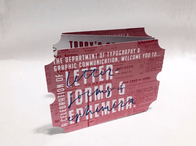 (Figure 3) Schedule of Events, ticket reel
CONCLUSION
The final promotional deliverables included an animation (posted on various social media), several speaker profile images (for social media) and a physical postcard. There was also a physical schedule given out on the day itself. The main graphic features a pink background, patterned with red ephemeral elements that were spoken about on the day. The blue text contrasted with the red added to the hierarchy and created a nostalgic identity for the event. Our simple colour scheme ensured that the design was successful in both physical and digital formats.