
Background
This is a project to design for the Reading Assembly. The Tate Exchange includes responses, workshops, talks and events, where you can join the conversation and collaborate in art making. This year the theme of the exchange will be ‘Movement’. The Reading Assembly is going to hosts some activities during the period 1 March to 3 March. The Reading Assembly was looking to create a printed programme for these events and activities.
The design aims to promote the activities held by the Reading Assembly and inform the audience on what activities are happening on the day. These programmes will be distributed and placed around the Blavatnik building during the three days events are happening. The Reading Assembly asked for the visual design of the leaflet to be consistent with that from last year in order to build a more consistent branding across time.
Design process
After some sketches, I created a few initial designs that have similar structures and visual design to the leaflet made for last year’s events but with a different way of organising information. The designs’ physical structure is a tri-folded A4 sheet. One side of the leaflet consists of essential information about the event and a brief description while the other side shows the detailed programme of the three-day event. After further consideration regarding the user scenario, I think the design was not suitable since the folded format may hinder the chance of visitors’ engagement as not much content was shown on the cover.
We decided to look into a more direct physical structure that would allow visitors to have a brief idea of the program through a first glance. The information is organised the same way where there is a side for promotional purposes with essential information and a brief description and another side for the detailed program. However, since the programme will not be folded, visitors can clearly see ‘Movement’, ‘Reading Assembly’ and, ‘Tate Exchange’.
The Reading Assembly is happy with the overall visual design of the leaflet. However, it was noted that the hierarchy of information was not quite right. They reflected that ‘Movement’ was taking too much attention and that it should associate more closely with ‘Reading Assembly’. My supervisor also flagged the importance of designing according to the genre of information so visitors can know what kind of information they can get from looking at the visual design.
With these feedbacks, I reconsidered the hierarchy and genre of the information and created a new design with a more functional purpose that communicates information effectively without unneeded elements that may distract or overpower the aim of the document.
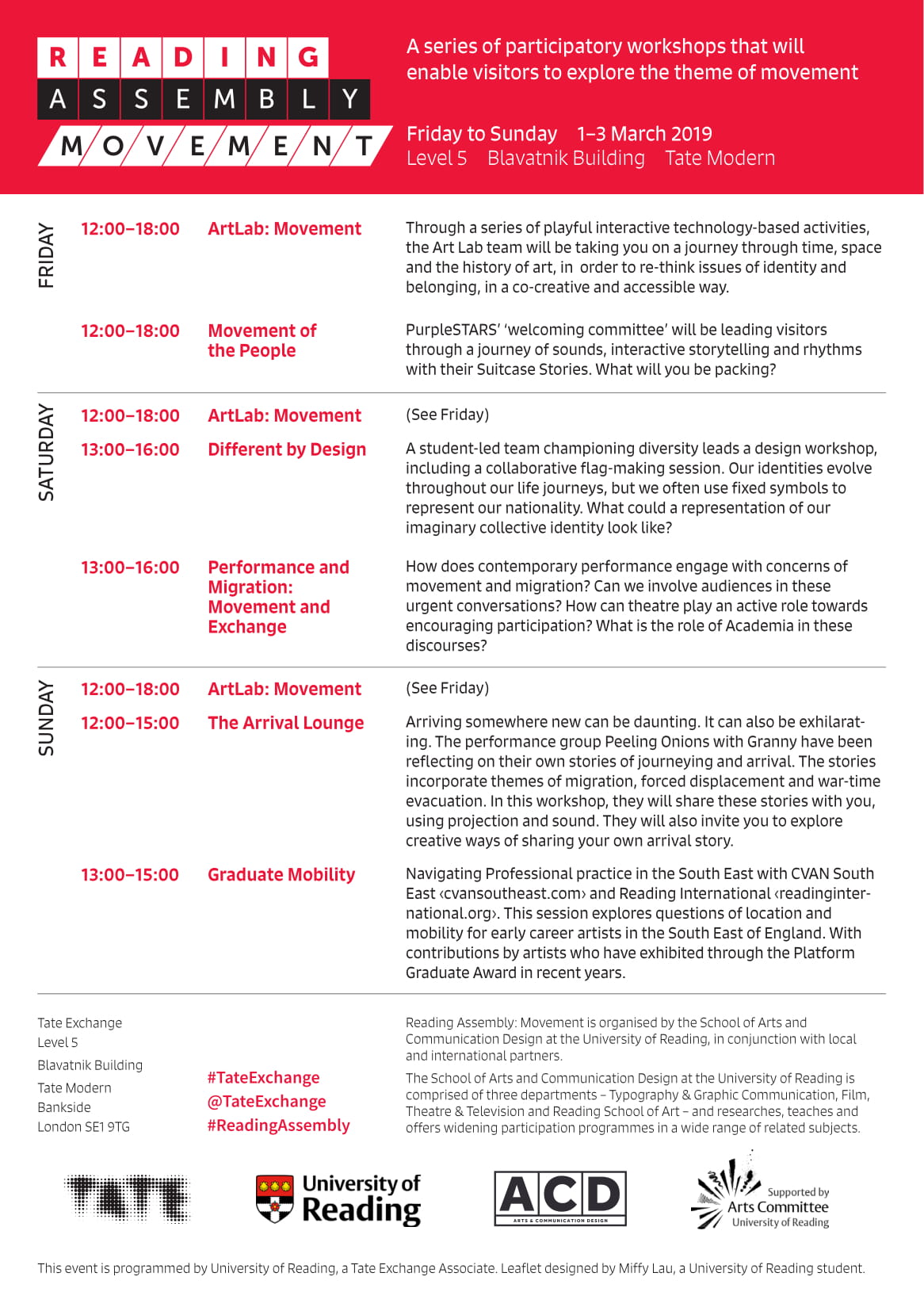
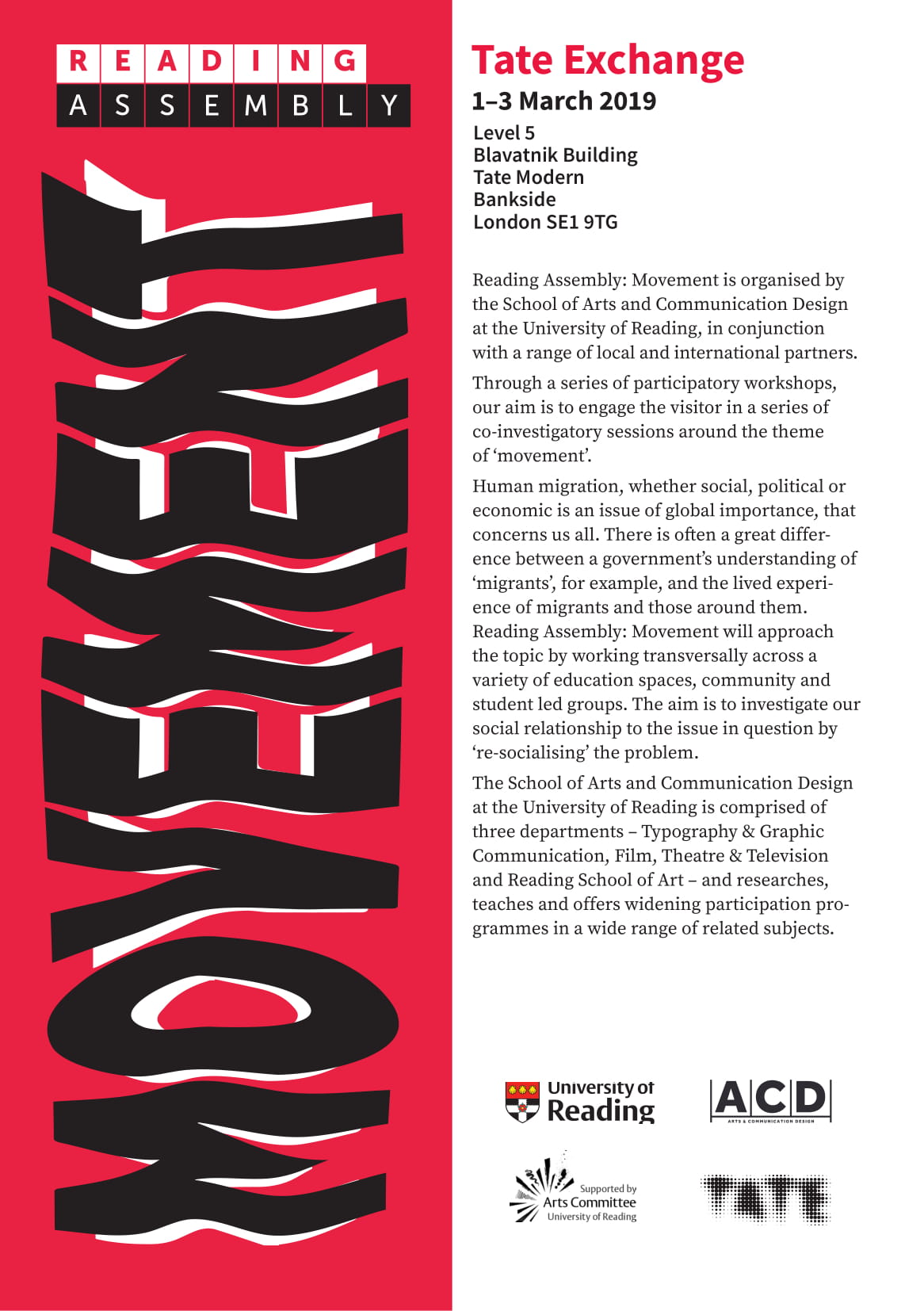
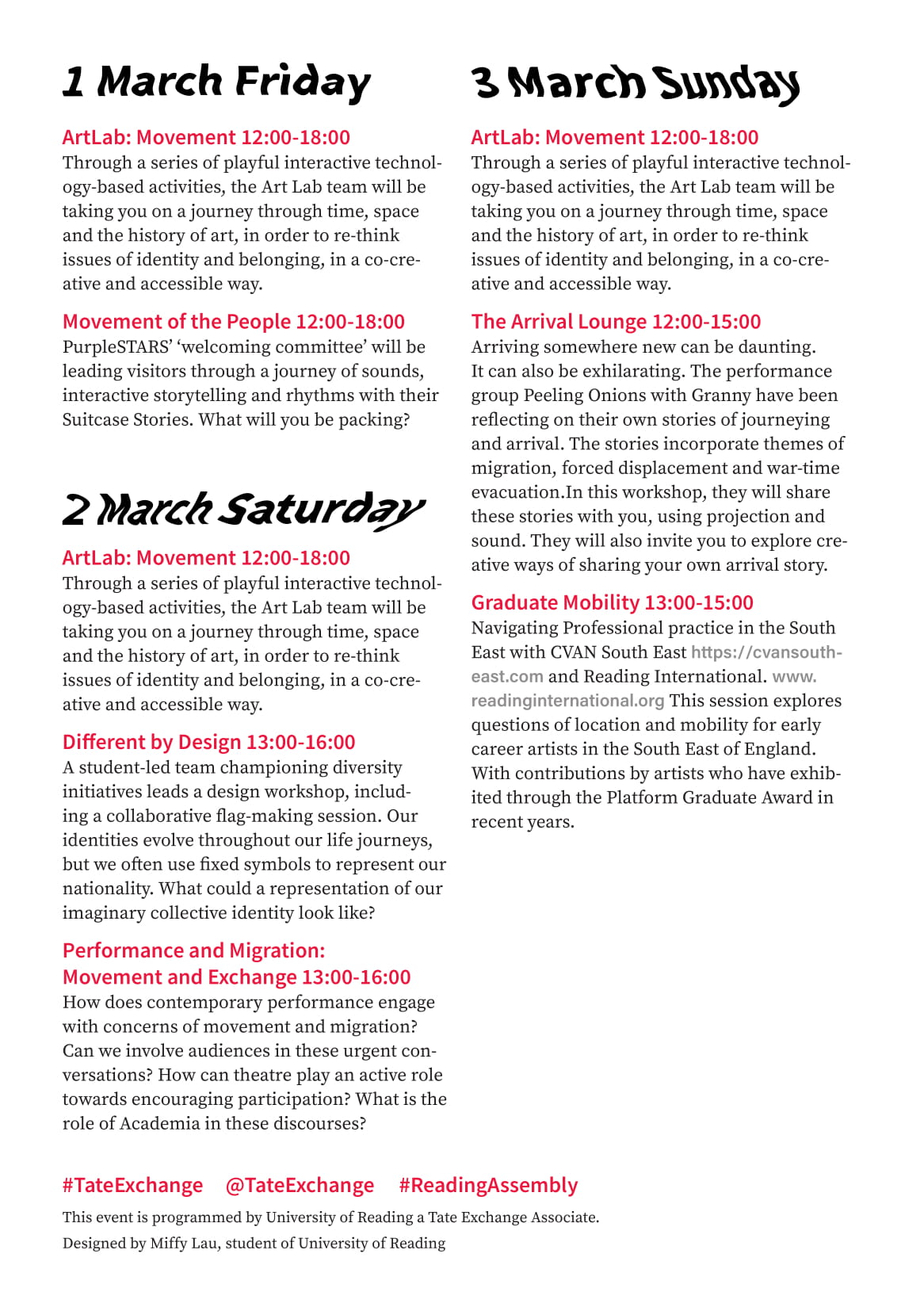
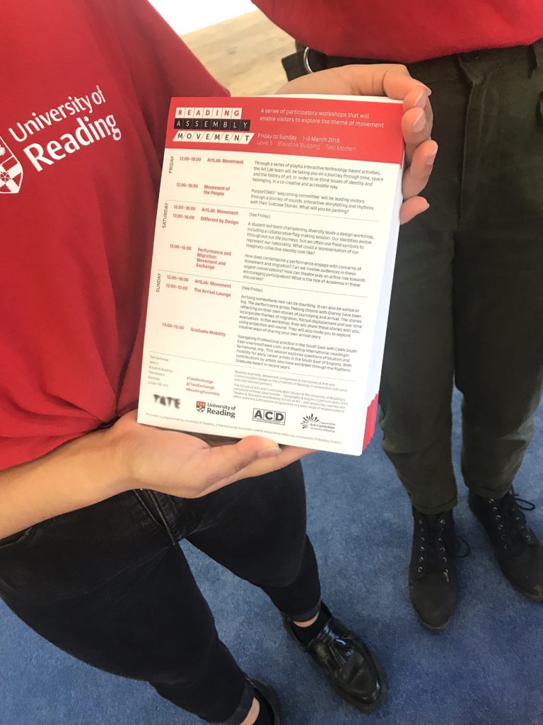
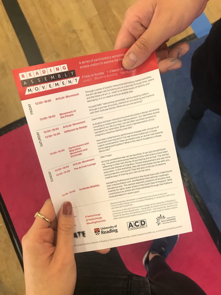
In this final version of the design, the programme across three days are displayed in the form of a time table at the centre of the leaflet. This allows visitors to understand that this document shows the timetable of a particular event at first glance. Further information on the organisers and sponsor are also clearly displayed at the top and bottom of the leaflet. The final layout of the design only takes up one side of the sheet, which helped reduced cost and a higher quantity than expected can be produced with the original budget.
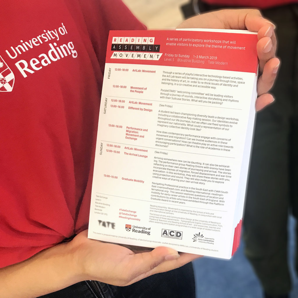
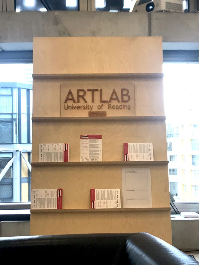
Overall, the design changed a lot based on the focus of the leaflet. In the earlier versions of the design, more emphasis was put to the promotional purpose of the leaflet. It aimed to be more eye-catching to attract visitors’ attention. However, after receiving feedback from the client and my supervisor, the focus of the design shifted to being more functional and transparent. The final design is definitely a more suitable and effective solution to the aim of this leaflet. Here are some images taken from the event that shows the design in the real scenario.
Reflection
Reflecting on the experience, there is definitely some room for improvement. The design of the leaflet shifted from trying to attract visitor’s information to being more functional. I believe that with more time, I could have done a better job at getting a balance between the two. More exploration should be done to find a solution that can create a higher visual impact to attract visitor’s attention without sacrificing the effectiveness and clarity or information communication.
This is a very valuable experience for me as a design student. Not only did I gain a chance of practising design thinking and skills. I also learnt a lot in terms of client facing and communication, print and production and project management. It is exciting to see the design go into the print and production stage. I learnt about how to prepare files for print and things to keep in mind during the process. Through this real job, I had a better understanding of the role of a designer. There is so much more to the process than the actual design. For example, copy editing played an essential role as the design developed into later stages. Under the guidance of my supervisor and the permission of my client, we made changes to some text in order to create a better information structure and flow.
Project management and client communication are some of the biggest challenges I faced in this job. This job was completed in one week from our first meeting to print. During this week, most of the communication with the client was through e-mails since she was not available to meet in person. We frequently communicated in the week so that the design can progress at a quicker pace to meet the deadline we set. This situation proofed that communication and planning is the key to making sure a job can run smoothly and effectively.
In the end, we are delighted to see that the leaflet worked effectively as a lot of visitors came into the venue with the leaflet in hand. The design created a positive impact, bringing more visitors to the event venue to participate in the activities.