
Background:
Mona Jibril and her business partners wanted to start a company that would provide a high quality line of nightwear and lingerie for women aged 40 to 65. They registered their business under the name Lula & Gabrielle and now needs a brand identity to reflect what they are selling. Their items include nightdresses, dressing gowns, underwear and pyjama sets.
Restated brief:
We are aiming to create a cohesive brand identity for Mona’s company. This will hopefully portray Lula & Gabrielle in a professional manner but also in a way that older women would feel connected to this brand. Their visual identity would be used across their labels and packaging for their products as well as on their website and also possibly on social media in the future.
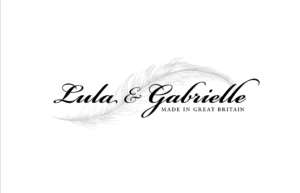
Mona had asked us to create a brand that included a sense of relaxation and high quality material. She asked us to include soft colours and a feather in the logo as a sense of softness that would reflect the material used on the products.
We agreed to create the following deliverables for our client:
- Logo
- Business cards
Research and ideation:
As there are many companies doing exactly what Mona is trying to achieve, i.e. Autograph, M&S Collection, Jasper Conran and Debenhams, Lula & Gabrielle has a high chance of succeeding in this ecumenic climate.
Some of the companies Mona has sourced inspiration from include:
- Victoria’s Secret
- Boux Avenue
- Agent Provocateur
We then looked at the logos for these companies, as well as the others named above, we noted various features that would make their business seem more appealing. These included:
- Script typefaces
- Feminine colours
- A minimalistic logo
- Sense of intimacy and elegance
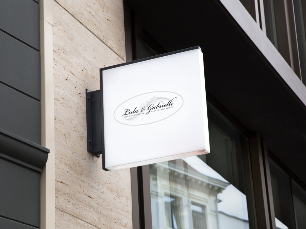
As Lula & Gabrielle is aimed at older women, we wanted to make sure the logo would be legible from a distance, although this proved to be hard due to the inclusion of a feather motif. The customers would hold a great source of value to the product they would be purchasing which means that the logo and brand identity all together has to prove that all of the products are elegant and worth buying.
Design development:
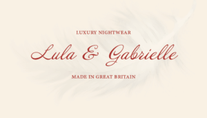
The logo
After sketching out several feather designs and other various logo ideas, we began exploring typography. We agreed that a script typeface would be more appropriate for the age range of the customers and soon began exploring different ways of incorporating the feather with the favoured typefaces.
Initial Logo Logo Designs Oval Logo Simplified Logo
We initially though that having the feather behind some of the type would make the type harder to read, especially for those hard of seeing. We soon conquered this issue by having the ampersand the only thing in front of the feather so that ‘Lula’ and ‘Gabrielle’ would still be legible. This became Mona’s favourite of the logos we had created and therefore became the final logo for her company.
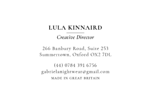
Business Cards
For the Lula & Gabrielle business cards, Mona had stated that she wanted to keep them as close to the logo as possible. We wanted to make sure that the business cards reflected the company but also the two main people behind the company’s name, so we made sure the typography we used reflected their feelings towards Lula & Gabrielle. Although there is very little colour on the business cards, we believe that once the brand is established, the logo will be known very well, with or without colour. As there was little colour in the logo and business cards, there was not much to worry about with the cost of production.
We created several ideas for the business cards before we got to the final design. This was mainly to do with the typography being used for the information.
Mona had wanted us to try and have all of the information on one side and the feather logo on the other, but this seemed too busy and tiring for many people to read, so we discarded this idea and went on to create minimalistic business cards.
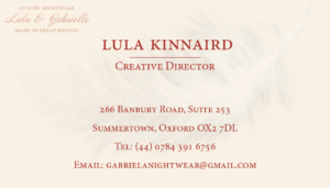
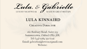
As we narrowed down what our client wanted and did not want, we were able to create the final version of the business card for her and her business partners. The new design was simplistic and easy to read but also included the brand identity of the company, which was the main aim.
Reflection:
Mona had given us mainly positive feedback for her company’s brand identity. We are unsure if these are currently in use, or if the company is still around due to the fact that we have had no contact with her and also we cannot find the company online anymore.
We do believe, however, that we were able to give our client a flexible logo which suited her and her company’s needs at the time and also was able to stand out amongst other companies that were considered her competition.
This particular job took longer than we thought to complete due to troubles with meeting the client and gaining feedback as she was very busy, but we are now astute in time management and hopefully this will show in the future.
Not all of our designs were featured in this report due to some of them being thrown out or being lost along the way.
From this project, we have learnt that we should be able to ask for more feedback or clarification on feedback instead of spending time trying to understand what the client may have meant. We were able to gain this understanding eventually, thus creating the brand identity for Lula & Gabrielle.
Coral Hoeren & June Lin